In this article, we’re going to talk about the top ten
most useful tools in Adobe Illustrator. Whether you’re into icon design, illustrations or any other craft, you’ll
definitely want to read this article, since you’ll learn something new and
interesting about the software that you use on a daily basis.
So, without
wasting any more precious time, let’s start the countdown with number ten,
which is the Ruler.
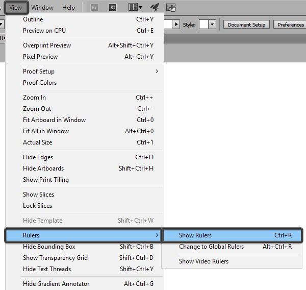
10. The Ruler
Whether you need to delimit your composition using precise guides or measure different objects off your Artboard, the Ruler should be your “go to tool”, since it was designed exactly
for that use.
Now, by default, the tool is hidden, but you can
easily make it visible by pressing Control-R
or by going to View > Rulers >
Show Rulers.
Once you turn it
on, you can easily measure or set reference points by clicking on the top or
left ruler bar and then dragging to create one or more guides, depending on
what you are trying to achieve.
I use rulers in
combination with the Grid almost all the time, since they allow me to achieve
balance within my compositions. They also make the process a lot easier, since I can precisely position everything using just a couple of clicks.
If you’ve never played with the tool before, I honestly
encourage you to try it out. I’m positive it will find a place within your
workflow as soon as you start seeing its potential.
You can give this quick tip a go since it will get you started with everything that you’ll need to know in order to master Illustrator’s Ruler tool.
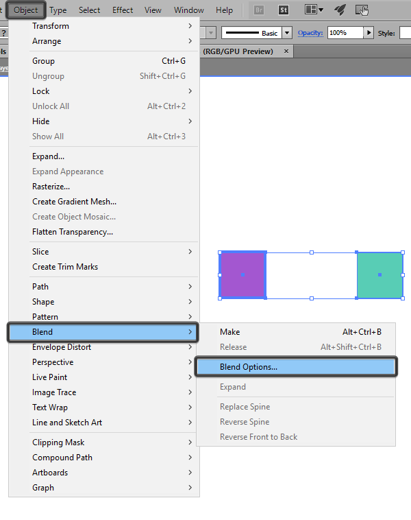
9. The Blend Tool
Number nine off
our list is the Blend Tool, and it’s probably one of the most feared and underrated tools among people just starting out, since it will take some time to get used to.
The thing is, the
tool isn’t all that complicated, but most of the time people just don’t know
what it can be used for.
Well, like most tools in Illustrator, the Blend
Tool is actually extremely versatile since it can be harnessed to create
repeating shape patterns, color palettes or, as the name implies, color blends
between two or multiple objects.
You can find it under the Object
> Blend submenu, where you can play with its options (Blend Options) and of course trigger it (Make
or Alt-Control-B) and create
whatever you are trying to achieve.
I use it when I need to create color
palettes based on handpicked colors but I’m not really sure which in-between tints
work best. It’s in these situations that I rely on the tool to automatically generate
the color values that work best, and almost all of the time, they actually do.
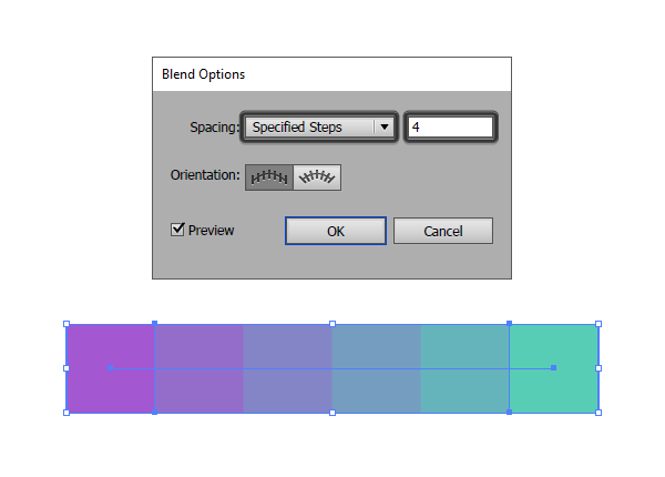
The cool thing
about the tool is that it’s really precise, since you can control how many
steps (colors or repeating objects) it generates, giving you full
control over the way it behaves.
If you use it to generate colors as I do, you should know that the
higher the number of steps you use, the softer the transition from one value to
another is, meaning that some of the colors might not be all that usable. Use a
smaller stepping value, and the tool will harden the transition, giving you colors
that you can actually use to build a palette.
To learn more, why not read our comprehensive guide on how to use the Blend Tool.
8. The Offset Path
Whether you’re
trying to create a larger copy of an already existing object or give your shapes
an outline, the Offset Path has you
covered.
As the name
implies, the tool works by pushing the path of a selected object towards the
outside, thus creating a larger version underneath that object that is
identical in form and color, but not in size.
I really love working with Offset
Paths when creating line icons, since using just a couple of clicks I can
easily achieve nice thick outlines that are far easier to select compared to
stroke paths.
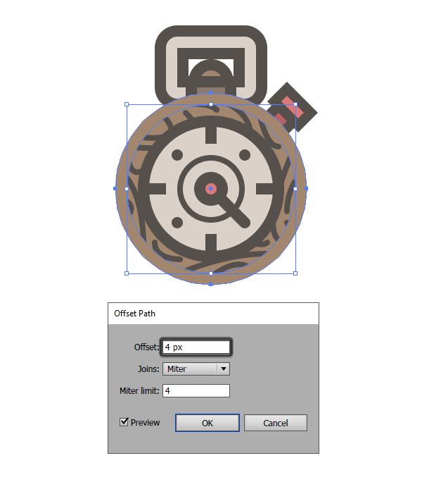
You can find the
tool under the Object > Path submenu,
and once you have an object selected and click on Offset Path you’ll be greeted with all the options that you need, from the size of your Offset to the
type of Joins and the Miter Limit.
I’m pretty sure
that you can find a use for it in your future projects, so be sure to check it
out and play a little bit with it at the end of this article.
If you’re into icon design, more exactly line icons, I recommend you read this tutorial that talks about how Offset Paths work since you’ll get a nice kick out of it.
7. The Clipping
Mask
Wow, this one was
probably one of those tools that I myself didn’t use all that often at the beginning,
but once I started to, it completely changed the way I saw my shapes and
compositions.
Now, if you don’t
know, a Clipping Mask is, as Adobe perfectly
puts it, an “object whose shape masks other artwork so that only areas that lie
within the shape are visible”.
Usually, when creating complex compositions, you might be quick to think
that the Pathfinder panel with its Shape Modes is the way to go if you
need to adjust the shape of your objects. But as I’ve learned the hard way, the
Clipping Mask can actually be a
better solution almost every time since it gives you complete power over
your masked shapes.
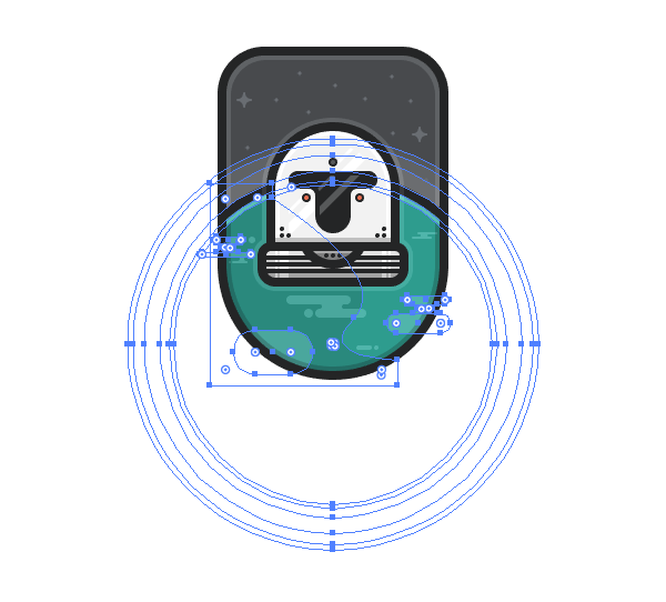
First, it’s
incredibly easy to use once you get the hang of it, giving you the power to
create complex and intricate shapes.
Secondly, the resulting
shapes are unbelievably easy to edit on the fly, since all shapes from within a
Clipping Mask can be resized,
repositioned and adjusted as long as you enter the Mask, which is something that you can’t do with Pathfinder.
You can read more about the advantages of using Clipping Masks over Pathfinder’s Shape Modes and see for yourself how to use it, and most importantly
why you should give it a try.
6. The Artboards
Panel
Next on our list
is the Artboards panel, which is
probably one of the biggest features that Illustrator
has to offer, since you can create projects with multiple assets within one
document, and view them all at the same time.
This way, you can create variations of a composition, explore different
styles, and have a direct comparison between them, making it easier to decide
which road to take.
Now, since the Artboard is the actual canvas
onto which we lay our artwork, it can also be a powerful exporting tool,
especially when dealing with icon packs, since you can create multiple Artboards, and assign one to each icon.
I won’t get into details, but I’ll leave you
with a link to an article that teaches you all there is to know about the process of using Artboards to export your assets.
5. The Layers
Panel
If the Artboards panel let you create a
multi-asset document, the Layers panel gives
you the power to create detailed compositions, using a logical structure that
allows you to easily identify and adjust the different sections of your artwork
without having to worry that you erased or misplaced an element by mistake.
Honestly, I use the panel with every project, since I like to establish a
shape-details hierarchy from the beginning, by labeling each section of my
composition, which in the end allows me to gradually work my way up until I
have a finished product.
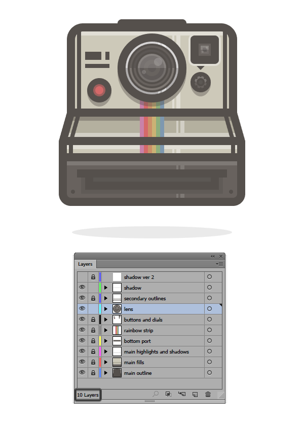
You can lock,
hide, rename and reposition each layer, which gives you a better view and
understanding of what you’re creating. This way, you can focus on one thing
at a time and explore different style options, which of course can be deleted or
hidden until you’ve made a final decision.
If you’re used to having just one layer, you probably know that it’s
really hard to keep up with each shape, especially when you have groups and
masks, so you might want to rethink your workflow by using multiple layers, which will make your life a lot easier.
Learn how you can become more efficient by reading this tutorial on how to organize your document using layers for a cleaner workflow.
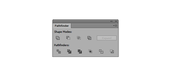
4. The Pathfinder
Panel
Number four off our list is the Pathfinder panel, or more exactly its
four different Shape Modes, which
allow you to create new shapes by manipulating the paths of two or more objects.
At this point, you might be thinking something’s off, since a
few lines ago I said that the Clipping
Mask is a better solution to Pathfinder.
Well, if you need to adjust shapes and add effects and other elements, Clipping Masks will
always be the more efficient way to go. But if you need to create an entirely
new shape from something as simple as a rectangle, then Pathfinder is the way to go.
You can use Unite,
Subtract, Intersect and Exclude to
create new and interesting shapes as long as you figure out which Mode is better suited for the job.
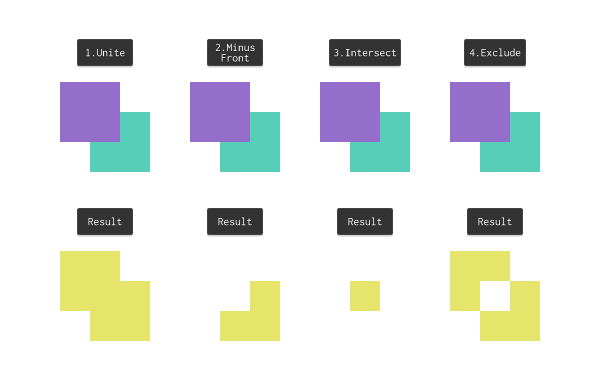
I personally use
the Minus Front Mode a lot when I
need to cut things in half since I can easily create a rectangle, position it
over my shape and then use it to create a cutout.
Sure, there
probably is a better solution for this, but as you’ll come to see in time, each
tool can become a means to something entirely different from one creative
tinkerer to another.
By default, the panel is hidden, so if you want to play with it you’ll
have to go to the View top menu and
scroll down until you find it within the list. As soon as you click on it, it
will appear within your screen, giving you the possibility to position it
wherever you want.
You can learn more about Pathfinder by reading this in-depth guide that shows you how to use Illustrator’s Shape Modes.
3. The Align Panel
Whether you want
to align an object to the Artboard or distribute multiple shapes at a specific distance, the Align panel is the best tool to handle the job. It’s easy to
use and blazing fast in every way.
I use it every
time with every project, since I can easily center my shapes to one another, or
align them to a specific side without having to worry that the alignment isn’t
perfect.
By default, some of the panel’s options are hidden, so you will have to
click on the little down-facing arrow and enable Show Options to make them visible.
Once you do that, you’ll have a new function
called Distribute Spacing, which will
allow you to precisely position two or more shapes at a specified distance from one another.
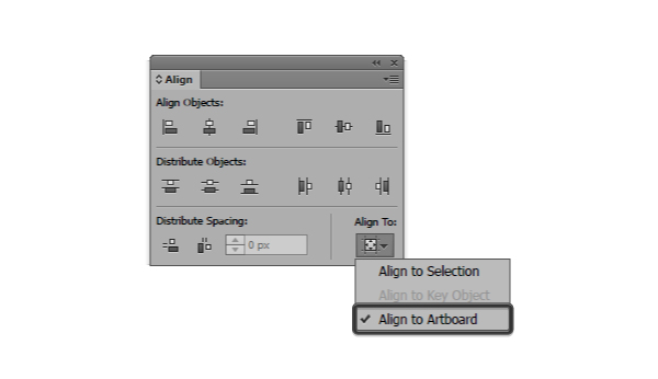
You’ll also gain
control over the way the alignment is done, since you can choose between a Key Object or the Artboard itself. Otherwise, Illustrator will always align your
objects to the first option.
I personally keep the Align To set
to Artboard, since if I need to
align an object to another one, I’ll simply select them and then click on the
one that I want to act as the Key Object
in order to set the alignment to it.
Find out more by checking out this comprehensive piece on how to use the Align panel’s options.
2. The Grid
I talked about Illustrator’s Grid system some time ago when I tried to go as in-depth as possible and
explain all there is to know about what it is, and how it can be used in order
to create better compositions.

Even though it’s been out there for some time, all the information in that article is still valid, so I advise you check it
out since I’m sure it will help you better understand how Illustrator works. Everything you create sits on top of a Grid, be it the default one or a
custom one of your own choosing.
1. Snap to Grid / Pixel Grid
The Grid itself is a strong tool, but once you start dabbling with pixel-perfect
compositions, you’ll have to combine its
power with that of the Snap to Grid
/ Pixel Grid in order to bring your
game to the next level.
I remember when I
started out I used to create without giving any attention to the whole “is it
pixel-crisp?” nature of my designs. Luckily for me, it didn’t take me long to
realize that in my line of work (which is icon design), being detail oriented and obsessed with the way your objects snap to the Pixel Grid can set your work
apart.
So, if you’ve never used the Snap
to Grid / Pixel Grid option from
within the View menu before, I
strongly advise you start learning and playing with it since at some point,
in some project, you’ll find that having the ability to create with perfection
is a must.
For some months
now I’ve been part of Adobe’s official test bench, where we’ve gotten the
chance to see the future of the Snap to
Pixel Grid, and even though things will change a bit, you’ll still be
ahead of the rest if you spend a couple of hours and read what you can on the
subject.
That being said, I’ll leave you with this in-depth article that talks
about how the Pixel Grid works, and shows you how to correctly use the Snap to option, which will probably come
in handy in future projects.
Time to Practice!
If you spend a
couple of hours with each of the listed tools, I guarantee you’ll become better at
what you do. These are the most used tools that top designers embrace on a daily basis, and they have proven to be the most useful.
I hope you’ve enjoyed the article and discovered something new along the
way.