In this tutorial I will show you how to create a simple responsive HTML email which will work in every email client, including the more troublesome mobile and tablet apps. It uses minimal media queries and a “fluid hybrid” approach to ensure maximum compatibility.
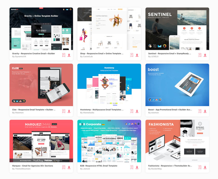
Popular HTML Email Templates on Envato Elements
If you’re looking for a ready-made, professional solution, grab one of our popular HTML email templates on Envato Elements. We have hundreds of responsive options all included with your Elements membership, with easy to customize features to get you started.
Not what you’re looking for? No problem, this tutorial will teach you how to build your own.
What We’re Building
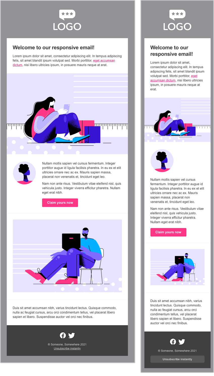
Here’s the responsive HTML email we’ll be building. Feel free to fork the pen and use it in your own work.
What’s The Best Way to Make an Email Template Responsive?
The process of making an HTML email responsive is a little different to making a web page responsive.
This is because the level of support for HTML and CSS standards varies widely across email services and apps. So while we can rely on things like media queries, flexbox, grid and JavaScript on the web, they aren’t always supported in HTML email (and JavaScript can never be used in email because it would pose a security risk, and as such is always stripped out).
Some email apps don’t support CSS media queries, which means we have to think carefully about how we build responsive email templates. Most notable in this camp is the Gmail app for Android and iOS, which supports media queries for Gmail accounts, but when used to read emails from another service (like Yahoo or an IMAP account), media queries are not supported. The Yahoo app for Android is another client that throws out your media queries unless you can implement a hack where you include the entire head of your document twice, but this can be stripped out by your sending platform.
These sorts of scenarios, along with the fact that Outlook for Windows only supports a subset of the CSS2.1 specification, means it can get a bit tricky building responsive emails that render perfectly everywhere.
The good news is that you can design and build a simple email that will look excellent in every mail app, including those that don’t support media queries, by using the fluid hybrid email coding method.
Why “Fluid Hybrid” is a Great Method for Creating Responsive Emails
The term “fluid hybrid” has evolved organically over time within the email development community. It’s a method whereby the responsiveness of the email is baked into the layout itself, without any need for media queries.
It’s known as fluid because we use a lot of percentage widths, and hybrid because we also implement some pixel max-widths on larger screens to limit the size of our elements. We combine all this with the use of Ghost Tables, which is table markup hidden inside conditional comments that only Outlook on Windows will render, another aspect turning the whole approach into a bit of a hybrid between old and new. Often, successfully blending old and new to achieve results is what email development is all about.
For a more in-depth look at the method, or if you would like to create a more complex layout, check out my other tutorial:

So using this method, here’s what we’ll be creating today:
Getting Started
Let’s start off with our blank canvas.
If you’re following along from scratch, grab the files from GitHub and create a new HTML document in the same directory as the /images folder.
Then, paste the following into your blank document:
<!DOCTYPE html>
<html lang="en" xmlns="https://www.w3.org/1999/xhtml" xmlns:o="urn:schemas-microsoft-com:office:office">
<head>
    <meta charset="utf-8">
    <meta name="viewport" content="width=device-width,initial-scale=1">
    <meta name="x-apple-disable-message-reformatting">
    <title></title>
    <!--[if mso]>
    <style>
        table {border-collapse:collapse;border-spacing:0;border:none;margin:0;}
        div, td {padding:0;}
        div {margin:0 !important;}
    </style>
    <noscript>
        <xml>
            <o:OfficeDocumentSettings>
            <o:PixelsPerInch>96</o:PixelsPerInch>
            </o:OfficeDocumentSettings>
        </xml>
    </noscript>
    <![endif]-->
    <style>
        table, td, div, h1, p {
            font-family: Arial, sans-serif;
        }
    </style>
</head>
<body style="margin:0;padding:0;word-spacing:normal;background-color:#939297;">
    <div role="article" aria-roledescription="email" lang="en" style="text-size-adjust:100%;-webkit-text-size-adjust:100%;-ms-text-size-adjust:100%;background-color:#939297;">
        [Scaffold goes here]
    </div>
</body>
</html>
What we are creating here is our basic page with its header, doctype and body. There are a few meta tags that help ensure our email displays properly on mobile, and some CSS and PNG sizing resets for Microsoft Outlook on Windows hidden inside conditional comments (the <!--[if mso]> bits). There’s also a basic style with our font-family settings, primarily to override Gmail webmail which otherwise applies its own fonts to these elements.
Finally we set up our body, and most crucial here is resetting the word-spacing, as Gmail sets this to a higher value which can upset your layouts (hat tip Mark Robbins). For better accessibility, we set up a div with a role of article which we then more accurately describe as the ’email’, the key area on the page, so that screen readers can provide clear context and navigation options to the user.
For a more detailed breakdown of all the elements here, check out my longer tutorial: Creating a Future-Proof Responsive Email Without Media Queries.
Creating an Outer Scaffold
Now let’s replace the [Scaffold goes here] marker with the following code:
<table role="presentation" style="width:100%;border:none;border-spacing:0;">
    <tr>
        <td align="center" style="padding:0;">
            [Ghost Table goes here]
        </td>
    </tr>
</table>
This scaffold is necessary so that our email will be centered across all email clients. We create a 100% wide table, and then set the border and border-spacing to zero. Then we create a row and table cell with no padding which has align="center" set so that its contents will be centered.
Note: clients will add a bit of padding to your unpadded cells if you don’t set them all to zero, as we have done here. (Setting padding on a table cell is the equivalent of the older method of setting cellpadding on the table element, and border-spacing set on a table is the CSS equivalent of the HTML cellspacing attribute on the table element.)
We have also set the table role to presentation. This is very important for accessibility, as it ensures that screen readers will only announce the content of the table, rather than the default of also announcing the structure, i.e. which row or column is currently being read out. (That behaviour is useful for actual tabular data but not when a table is used for layout.)
Creating A Ghost Table for Outlook on Windows
Before adding our main content container, we need to set up a Ghost Table: a rigid table with a fixed width that only renders in Outlook because it’s hidden inside some special Outlook-only conditional comments. We need to do this because our main container is going to use the CSS max-width property, and not all versions of Outlook for Windows support it. Without max-width support, the main container would explode to full-width when viewed in Outlook for Windows, so we need to contain it.
Replace the [Ghost Table goes here] marker with the following markup:
<!--[if mso]>
<table role="presentation" align="center" style="width:600px;">
<tr>
<td>
<![endif]-->
    [Container goes here]
<!--[if mso]>
</td>
</tr>
</table>
<![endif]-->
Note that the pixel width is set using CSS inside the style attribute, and not using as the HTML attribute, i.e. width="600". This is to ensure that Outlook correctly calculates the width when adjusting for different DPI settings on Windows. If you use the HTML attribute, you will find that the width of your email is calculated incorrectly and it will end up way too narrow.
Now we can go about adding our main content container, which is actually going to be a table.
Aside: Should You Use Tables or Divs for Building Responsive Emails?
Historically, almost all emails have been developed using tables, because this has been the only reliable way to get things rendering properly in everything from Lotus Notes to iOS Mail. The preference today is of course to use divs and modern HTML wherever possible: to reduce the amount of markup, improve accessibility, and generally try to move email in a more modern direction.
The continued popularity of Outlook for Windows however means that we still need to strike a balance between old and new, since Outlook on Windows only supports the CSS2.1 specification, and often in a rather patchy way. This is why we have to use Ghost Tables if we want to create div-based layouts, as mentioned above. But one issue with this approach is that you must double up on a lot of your CSS, since Outlook on Windows ignores or unreliably implements a lot of styling applied to divs, so you have to apply much of your styling separately to the Ghost Table too.
Often this doubling up doesn’t matter, particularly with complex layouts, since you save a lot of code (and complexity) by using divs instead of tables, so the additional markup isn’t a huge concern. Plus, your Outlook-specific CSS can live in the head of the email, inside conditional comments, so there’s no need apply your styles inline.
However, when creating a simple one-column email, it often feels like overkill (to me) to create and style all the divs and then have to wrap it all in a Ghost Table, where you also need to add the padding, margins and styling again to the different tables or cells — all this, when a single table would have done the trick by working for absolutely every client. Super-modern it may not be, but it does save quite a bit on file size, which is after all a very important factor when it comes to email that I don’t believe is worth sacrificing on principle. It also makes the email easier to debug and maintain.
So, as this email template is quite simple, for simplicity’s sake and to save on file size, I do indeed still use a single table which contains all the content and styling for every client. But it is just that: a single table. The whole layout only uses two tables and one ghost table, and I am very careful to ensure they are all set to role="presentation" to ensure they are accessible. However if I needed to include any more than two or three tables, I would be starting to rethink things.
With that out of the way, let’s go ahead and add the table in question to create our main container.
Adding Our Main Content Container
Replace the [Container goes here] marker with the following:
<table role="presentation" style="width:94%;max-width:600px;border:none;border-spacing:0;text-align:left;font-family:Arial,sans-serif;font-size:16px;line-height:22px;color:#363636;">
    [Rows go here]
</table>
Here we’re using the first major principle of the fluid hybrid method: creating a container that is a fluid percentage width but limited to a fixed maximum width in pixels.
Here you can see ours is set to be 94% wide on small screens, up until there’s enough space for the table to become its max-width of 600px wide. You can play around with both widths, for example if you set the width to 100%, there will be no “padding” on the sides when viewed on a small screen.
Because this table is going to contain all our content, I have added CSS for text styling which will be inherited by the cells and paragraphs inside the table. (The only exception to this is Comcast and Libero, two webmail clients who set some default text styling at the heading and paragraph level. We’re use fairly neutral typefaces here, so it’s not noticeable in this layout, but if you use a webfont or more distinctive typeface, you will need to set your font styling on your heading and paragraph tags for these clients.)
Now let’s add our first row of content.
Adding a Header with a Logo Image
Replacing the [Rows go here] marker, add the following table row markup:
<tr>
    <td style="padding:40px 30px 30px 30px;text-align:center;font-size:24px;font-weight:bold;">
        <a href="http://www.example.com/" style="text-decoration:none;"><img src="http://webdesign.tutsplus.com/images/logo.png" alt="Logo"></a>
    </td>
</tr>
Here we have our cell with some padding, and inside is a logo wrapped in a link. On the cell I have also set the text alignment, size and weight, so that our ALT text looks nice if people have images turned off, or they don’t load.
Configuring Our Logo Image
We want the logo image to be fluid at small sizes but limited to a maximum fixed width, just like our outer container.
Here I want it to be 80% wide on small screens (as it would look silly if it was 100% wide on a smartphone) up to the point where it reaches a maximum of 165px on larger screens. To implement all this, we can replace the img tag with this one:
<img src="http://webdesign.tutsplus.com/images/logo.png" width="165" alt="Logo" style="width:80%;max-width:165px;height:auto;border:none;text-decoration:none;color:#ffffff;">
The width="165" is very important for Outlook on Windows, as it will respect this size. For all other clients, in our style attribute, we set it to be 80% wide, with our pixel max-width, and set the height to auto so the image retains its aspect ratio. I have also included some colouring and styling to prevent the linked image ALT text rendering as blue with an underline.
And there we go! Our logo is done, and if you resize your window you’ll see it flow between 80% wide and 165px, whichever is smaller.
Creating a Heading with Text
Now we can insert our first content row, which has a heading and some introductory text. After the closing </tr> from above we can insert a fresh row:
<tr>
    <td style="padding:30px;background-color:#ffffff;">
        <h1 style="margin-top:0;margin-bottom:16px;font-size:26px;line-height:32px;font-weight:bold;letter-spacing:-0.02em;">Welcome to our responsive email!</h1>
        <p style="margin:0;">Lorem ipsum dolor sit amet, consectetur adipiscing elit. In tempus adipiscing felis, sit amet blandit ipsum volutpat sed. Morbi porttitor, <a href="http://www.example.com/" style="color:#e50d70;text-decoration:underline;">eget accumsan dictum</a>, nisi libero ultricies ipsum, in posuere mauris neque at erat.</p>
    </td>
</tr>
This is a pretty simple module: here we’ve just set our cell’s styles, and added a heading and paragraph, containing a link. We have also added some styling to our h1 and p tags so that we can customise their margins and adjust the appearance of the heading.
Adding a Full-Width Image
This is a simple matter, because the image will be 100% wide. We just need to set the width="600" for Outlook on Windows to ensure it doesn’t display at its native size there.
We can simply add the following after the </tr> above:
<tr>
    <td style="padding:0;font-size:24px;line-height:28px;font-weight:bold;">
        <a href="http://www.example.com/" style="text-decoration:none;"><img src="http://webdesign.tutsplus.com/images/1200x800-2.png" width="600" alt="" style="width:100%;height:auto;display:block;border:none;text-decoration:none;color:#363636;"></a>
    </td>
</tr>
Adding a Two Column Section that Stacks on Mobile
To add this layout, insert a new row after the previous closing </tr>:
<tr>
    <td style="padding:35px 30px 11px 30px;font-size:0;background-color:#ffffff;border-bottom:1px solid #f0f0f5;border-color:rgba(201,201,207,.35);">
        [Multiple columns go here]
    </td>
</tr>
You can see we’re setting the font-size to zero on this cell. This is because we are going to place two inline-block divs side-by-side inside this cell, and if there is a font size greater than zero, a gap can appear which causes them to stack.
I have also added a 1px bottom border on this row. I’ve added a fallback border of a solid #f0f0f5, but then as an enhancement I specify an RGBA colour which will use some transparency: rgba(201,201,207,.35). This is just a little trick to help improve the appearance of the email when viewed in Dark Mode. Outlook.com in particular doesn’t adjust border-color in Dark Mode, so you can be left with a generally dark email with really bright borders. It will however respect the transparency within our RGBA setting, so the semi-transparent shade will be laid over the adjusted background, resulting in less of a clash. Any clients that don’t respect RGBA will just fall back to the hex colour.
Setting our Column Widths
I want a left-hand column of 145px, and a right-hand column of 395px. Fluid hybrid columns work in a similar way to the outer wrapper. They are set to be fluid (here, 100% wide) up to a fixed pixel max-width, and at their max-width they should comfortably sit side-by-side, giving us a multi-column layout on larger screens.
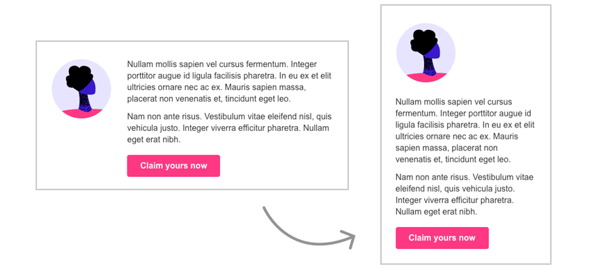
As soon as there isn’t sufficient space for the columns to side side-by-side, they still stack down on top of each other, and as the screen size becomes smaller than the column’s max-width, they remain a fluid 100% wide. In this way, we have a set of columns with responsiveness baked into them, which means we aren’t reliant on media queries to do these transformations for us. We can apply media queries on top of this behaviour to further fine-tune it in clients that support them.
As with our outer container, we need to use a Ghost Table for Outlook on Windows, because it doesn’t support the CSS we need to achieve this. So we need set up a two column ghost table for Outlook on Windows.
Replace the [Multiple columns go here] marker with the following:
<!--[if mso]>
<table role="presentation" width="100%">
<tr>
<td style="width:145px;" align="left" valign="top">
<![endif]-->
    <div class="col-sml" style="display:inline-block;width:100%;max-width:145px;vertical-align:top;text-align:left;">
        [Left column content]
    </div>
<!--[if mso]>
</td>
<td style="width:395px;padding-bottom:20px;" valign="top">
<![endif]-->
    <div class="col-lge" style="display:inline-block;width:100%;max-width:395px;vertical-align:top;padding-bottom:20px;">
        [Right column content]
    </div>
<!--[if mso]>
</td>
</tr>
</table>
<![endif]-->
As mentioned in the aside above, you can see how this method requires some doubling up. We have the first column in our Ghost Table, where I have set the width, the text alignment to left, and vertical alignment to top, all done using a mixture of HTML and CSS. Then the div inside, div.col-sml, has all of the same settings again, this time all in the CSS.
On the right column div, div.col-lge, a similar setup follows, and you can also see that we have to double up on the padding. Outlook on Windows does not apply padding to divs reliably (and for this reason I completely disable it by setting padding:0; on all divs in the conditional <style> block for Outlook in the head of our document). Therefore we need to add the same padding to both the div and the container cell in the Ghost Table. Outlook won’t apply the div padding, and other clients obviously ignore the Outlook-only code. Despite all of this however, this is an extremely stable and reliable to create this kind of layout, and we can be sure things are going to render perfectly everywhere.
Finally, the crucial ingredient on the divs is display:inline-block, which is going to ensure the columns float next to each other, and as inline-block divs, they will obey the text-align property on their container. You’ll recall that we set text-align:left; on this entire table, so these divs will stick to the left when they stack.
Now our two column structure is done! It’s time for some cosmetic adjustments, and to add our content.
Adding Font Styling
We need to add some font styling back to our divs, since they don’t inherit it reliably across all mail clients, plus we zeroed our font size a couple of levels up. So let’s add this to the style attribute of div.col-sml:
font-family:Arial,sans-serif;font-size:14px;color:#363636;
Similarly, add this to the style attribute of div.col-lge:
font-family:Arial,sans-serif;font-size:16px;line-height:22px;color:#363636;
Now inside div.col-sml we’ll add a fluid hybrid image, configured much like our header logo. Replace [Left column content] with this:
<img src="http://webdesign.tutsplus.com/images/icon.png" width="115" alt="" style="width:80%;max-width:115px;margin-bottom:20px;">
And inside div.col-lge we’ll add some text and a link that follows Mark Robbin’s template for links styled as buttons. Replace [Right column content] with this:
<p style="margin-top:0;margin-bottom:12px;">Nullam mollis sapien vel cursus fermentum. Integer porttitor augue id ligula facilisis pharetra. In eu ex et elit ultricies ornare nec ac ex. Mauris sapien massa, placerat non venenatis et, tincidunt eget leo.</p> <p style="margin-top:0;margin-bottom:18px;">Nam non ante risus. Vestibulum vitae eleifend nisl, quis vehicula justo. Integer viverra efficitur pharetra. Nullam eget erat nibh.</p> <p style="margin:0;"><a href="https://example.com/" style="background: #ff3884; text-decoration: none; padding: 10px 25px; color: #ffffff; border-radius: 4px; display:inline-block; mso-padding-alt:0;text-underline-color:#ff3884"><!--[if mso]><i style="letter-spacing: 25px;mso-font-width:-100%;mso-text-raise:20pt"> </i><![endif]--><span style="mso-text-raise:10pt;font-weight:bold;">Claim yours now</span><!--[if mso]><i style="letter-spacing: 25px;mso-font-width:-100%"> </i><![endif]--></a></p>
The whole row comes together like this:
<tr>
<td style="padding:35px 30px 11px 30px;font-size:0;background-color:#ffffff;border-bottom:1px solid #f0f0f5;border-color:rgba(201,201,207,.35);">
<!--[if mso]>
<table role="presentation" width="100%">
<tr>
<td style="width:145px;" align="left" valign="top">
<![endif]-->
<div class="col-sml" style="display:inline-block;width:100%;max-width:145px;vertical-align:top;text-align:left;font-family:Arial,sans-serif;font-size:14px;color:#363636;">
<img src="http://webdesign.tutsplus.com/images/icon.png" width="115" alt="" style="width:80%;max-width:115px;margin-bottom:20px;">
</div>
<!--[if mso]>
</td>
<td style="width:395px;padding-bottom:20px;" valign="top">
<![endif]-->
<div class="col-lge" style="display:inline-block;width:100%;max-width:395px;vertical-align:top;padding-bottom:20px;font-family:Arial,sans-serif;font-size:16px;line-height:22px;color:#363636;">
<p style="margin-top:0;margin-bottom:12px;">Nullam mollis sapien vel cursus fermentum. Integer porttitor augue id ligula facilisis pharetra. In eu ex et elit ultricies ornare nec ac ex. Mauris sapien massa, placerat non venenatis et, tincidunt eget leo.</p>
<p style="margin-top:0;margin-bottom:18px;">Nam non ante risus. Vestibulum vitae eleifend nisl, quis vehicula justo. Integer viverra efficitur pharetra. Nullam eget erat nibh.</p>
<p style="margin:0;"><a href="https://example.com/" style="background: #ff3884; text-decoration: none; padding: 10px 25px; color: #ffffff; border-radius: 4px; display:inline-block; mso-padding-alt:0;text-underline-color:#ff3884"><!--[if mso]><i style="letter-spacing: 25px;mso-font-width:-100%;mso-text-raise:20pt"> </i><![endif]--><span style="mso-text-raise:10pt;font-weight:bold;">Claim yours now</span><!--[if mso]><i style="letter-spacing: 25px;mso-font-width:-100%"> </i><![endif]--></a></p>
</div>
<!--[if mso]>
</td>
</tr>
</table>
<![endif]-->
</td>
</tr>
And there you have it! If you refresh and then resize your browser, you will see that our columns now stack when the available space becomes too small, and they return to sit side-by-side when there is enough space.
Adding a Full Width Image and Text with Padding
This is basically identical to our previous full width image and text modules, except that there is a border underneath the image, and generous padding. Since we’re using 30px padding all around, from a 600px wide layout, that leaves us 540px for the image.
This entire block can sit after the previous closing </tr>:
<tr>
    <td style="padding:30px;font-size:24px;line-height:28px;font-weight:bold;background-color:#ffffff;border-bottom:1px solid #f0f0f5;border-color:rgba(201,201,207,.35);">
        <a href="http://www.example.com/" style="text-decoration:none;"><img src="http://webdesign.tutsplus.com/images/1200x800-1.png" width="540" alt="" style="width:100%;height:auto;border:none;text-decoration:none;color:#363636;"></a>
    </td>
</tr>
<tr>
    <td style="padding:30px;background-color:#ffffff;">
        <p style="margin:0;">Duis sit amet accumsan nibh, varius tincidunt lectus. Quisque commodo, nulla ac feugiat cursus, arcu orci condimentum tellus, vel placerat libero sapien et libero. Suspendisse auctor vel orci nec finibus.</p>
    </td>
</tr>
Creating the Footer
Add a new row after the previous </tr>:
<tr>
    <td style="padding:30px;text-align:center;font-size:12px;background-color:#404040;color:#cccccc;">
        [Footer content goes here]
    </td>
</tr>
This sets up a dark background colour, as well as text alignment and a base font size that will be inherited by our images for their ALT text.
Next, we’ll add our two social icons. These are just going to be added inside a paragraph tag, with a simple space between them. We will set our images to display:inline-block to ensure they obey our centered text alignment setting.
We can replace the [Footer content goes here] marker with our paragraph containing the icons:
<p style="margin:0 0 8px 0;"><a href="http://www.facebook.com/" style="text-decoration:none;"><img src="http://webdesign.tutsplus.com/images/facebook.png" width="40" height="40" alt="f" style="display:inline-block;color:#cccccc;"></a> <a href="http://www.twitter.com/" style="text-decoration:none;"><img src="images/twitter.png" width="40" height="40" alt="t" style="display:inline-block;color:#cccccc;"></a></p>
Underneath this, add another paragraph with some copyright information and an unsubscribe link. We’ll add the class unsub to the a tag so that we can enhance it a little bit later:
<p style="margin:0;font-size:14px;line-height:20px;">® Someone, Somewhere 2021<br><a class="unsub" href="http://www.example.com/" style="color:#cccccc;text-decoration:underline;">Unsubscribe instantly</a></p>
Our Layout is Done
That’s our final row, so the layout is now complete! If you preview you it in your browser, everything should be looking great.
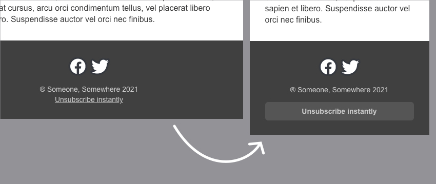
At this point, we can add some media queries to enhance how our email displays on smaller devices that support them. Since we’re still looking at the footer, we’ll start with the unsubscribe button mentioned above.
Optimising Buttons for Mobile
We’ll turn our footer link into a nice fat button on smaller devices, since this will make it easier to tap with a finger.
If we return to the <head> of the document, we can insert the following code inside our <style> block underneath our font rule:
@media screen and (max-width: 530px) {
    .unsub {
        display: block;
        padding: 8px;
        margin-top: 14px;
        border-radius: 6px;
        background-color: #555555;
        text-decoration: none !important;
        font-weight: bold;
    }
}
This media query will change the appearance of our button on screens that are narrower than 530px wide.
Now if you refresh and make your screen smaller, you will see the link turns into a nicely tappable button:
Further Enhancements With Media Queries
We can now also add a few other enhancements to our layout. At the moment, when viewed on smaller screens, our two columns stack down to sit on top of each other, but at some sizes the text column is a lot narrower than the screen. Since most apps do support media queries, we have a good chance of improving how this looks in a lot of places. Inside the same media query as above, @media screen and (max-width:530px), after the closing } of the .unsub declaration block, we can add:
.col-lge {
    max-width: 100% !important;
}
This will override the default max-width of 395px and ensure the text spans full width on all screen sizes up to 530px wide.
Another thing we can fine-tune is the fact that the columns stack immediately once there’s not enough room for them to sit together. In reality, there might be some cases where a user’s screen is a tiny bit smaller than 600px wide, perhaps on a tablet app with a fat sidebar or because they are using Gmail webmail with a narrow preview panel enabled. In these cases, we might want to ensure the two-colum layout does display, so we can configure this with our CSS.
After the closing } of the media query above, add a second one:
@media screen and (min-width: 531px) {
    .col-sml {
        max-width: 27% !important;
    }
    .col-lge {
        max-width: 73% !important;
    }
}
This one picks up where our previous one left off – it went up to max 530px, then from 531px and up we’ll ensure the columns always appear side by side by overriding our pixel max-widths and instead specifying percentages.
So there we have it! All together, your <style> tag should look like this:
<style>
    table, td, div, h1, p {
        font-family: Arial, sans-serif;
    }
    @media screen and (max-width: 530px) {
        .unsub {
            display: block;
            padding: 8px;
            margin-top: 14px;
            border-radius: 6px;
            background-color: #555555;
            text-decoration: none !important;
            font-weight: bold;
        }
        .col-lge {
            max-width: 100% !important;
        }
    }
    @media screen and (min-width: 531px) {
        .col-sml {
            max-width: 27% !important;
        }
        .col-lge {
            max-width: 73% !important;
        }
    }
</style>
If there is anything else you want to tweak with media queries, go ahead and do it here!
Test and Go!
Finally, as always, make sure you test really well using live devices and a web preview service like Litmus or Email on Acid.
Enjoy creating responsive email templates that look great in every email client!
Download Email Templates
If you need more options, then one of our responsive email templates may be just what you need. Subscribe to Envato Elements and you’ll be given unlimited access to hundreds of customizable email templates, as well as stock photography, icons, graphics, and many other creative assets for your projects.
 Campaign Monitor18 Great Campaign Monitor Templates for Email and Newsletters
-
MailChimpBest Mailchimp Templates to Level Up Your Business Email Newsletter 2021
-
MailChimpMastering MailChimp: Best Templates and Email Tips for MailChimp Newsletters

More HTML Email Tutorials
To take what you’ve learned to the next level! Check out our Mastering HTML Email learning guide for more tutorials on HTML email templates, email design, coding responsive email, accessibility, marketing, transactional email, email service providers (ESPs), development workflow tips, and more!


