
One of the best ways for content sites to make a profit is through affiliate marketing. After all, it’s an industry that has shown an average growth rate of 10% in the last five years. Moreover, it’s projected to hit the $6.8 billion mark in 2020. The industry is like a big cake, and everyone is invited to take a piece.
However, if you want to make affiliate marketing a steady source of income, you’ll need to compete with many publishers. Just think of it this way: back in 2016, as many as 84% of them participated in affiliate schemes.
So, if you’re in it for the long-run, you need to work hard to stand out. And what better way than to optimize your design for increasing conversions?
If you’re looking to up your game, here are the best design strategies to boost your affiliate sales.
1. Never settle for subpar image quality
One of the biggest design mistakes you can make with your affiliate posts is to feature low-quality product images.
Not sure why? Think about it this way:
The basis on which humans form impressions (whether of a person, website, or product) is through visual information. So, regardless of how good you present that same product to be, if the feature image you chose is grainy, poorly lit, or shows it unfavorably, it won’t generate sales.
Luckily, this is an easy fix. All you’ve got to do is create a set of guidelines, then stick to them:
- Have all photos in your posts be the same dimensions
- Aim for uniformity – if you choose a product image with a white background, all other images on the page should have the same background
- Include more than one photo to allow your readers to browse
- Optimize all images for SEO to support organic traffic
- You get bonus points if you do your own photography – this way, you can coordinate the visual appearance of your post with the web design, creating a more coherent whole.
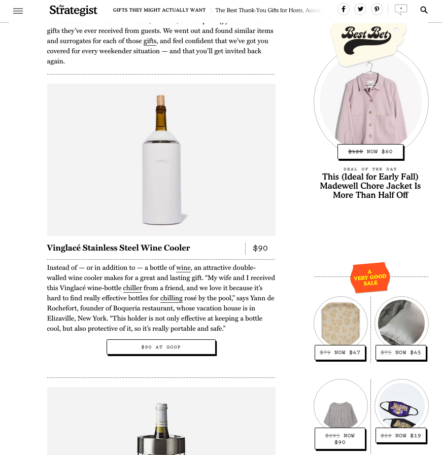
For a website that does a great job of adapting product pictures to fit in with its design, check out The Strategist. Their gift guides look so professionally put together that it’s hard to believe they’re not all from the same store.
2. Keep things simple
Maximalist design can look amazing. And it definitely has its place on the internet.
However, if you’re presenting more than a single product, and you want to boost sales, you should probably choose to go the other route.
Whether you subscribe to minimalism or not, do your best to make all information easy to consume. Moreover, your CTA buttons should stand out while still complementing the rest of the page.
Though it may take some experimenting, try to go with a layout that allows you to make the most of your content. For some sites, this is going to be a table, like this one used by SavvySleeper.
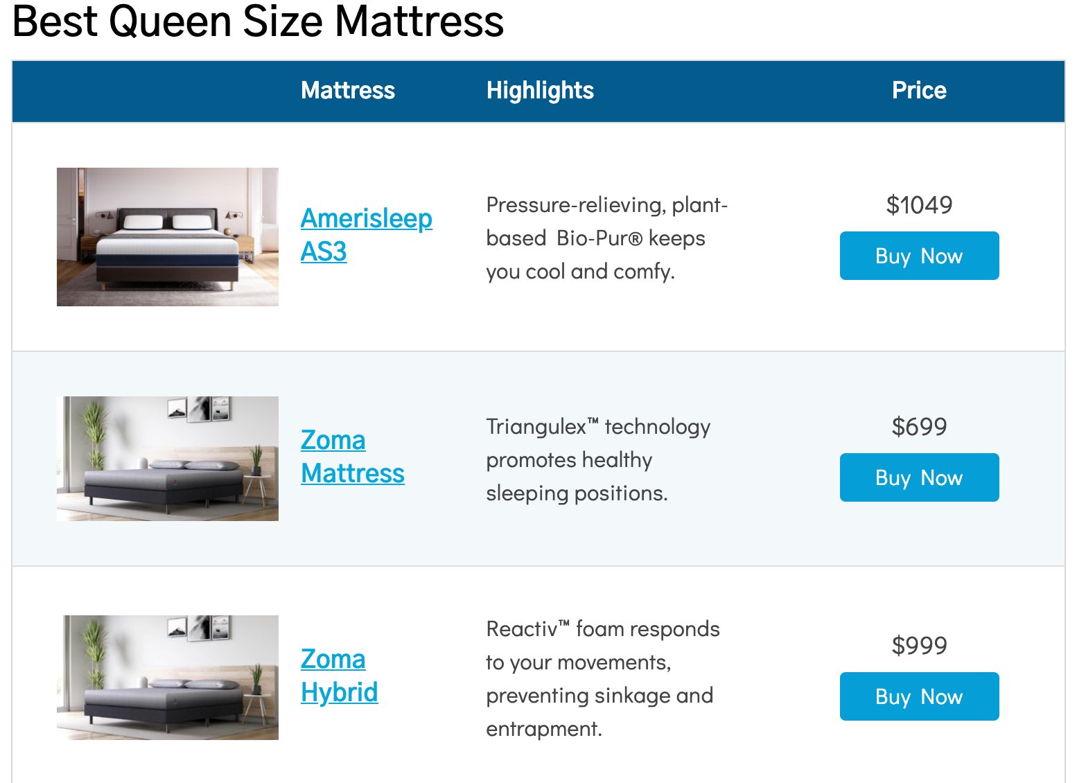
It gives readers access to all the notable information about a product, as well as quick links that lead to the relevant stores.
Other content sites, however, will do better with just a basic list, as seen on RunRepeat.
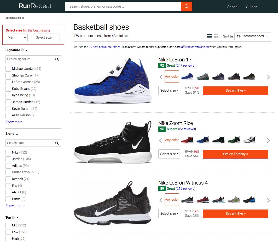
Though less informative at first glance, these lists are an excellent choice – especially for those content sites that tend to compare a large number of products or services.
3. Let your design show off your expertise
Chances are, you have in-depth knowledge of the subjects you’re covering. So why not show your expertise off and build your authority in your niche?
The best thing about giving knowledgeable advice is that it’s easily done with the simplest design strategies. Just adding a tag to the products you want to highlight will automatically draw your readers’ attention to the right section of the website.
You can do as many as you deem appropriate. A single “Top Pick” helps you accentuate the best item in your buying guide. However, if you know that your readers don’t all have the same buying needs, you can create several categories. Choose from options like “Best Value for Money,” “Budget Buys,” “Top Quality Pick,” or anything else that’s relevant for the topic you’re covering.
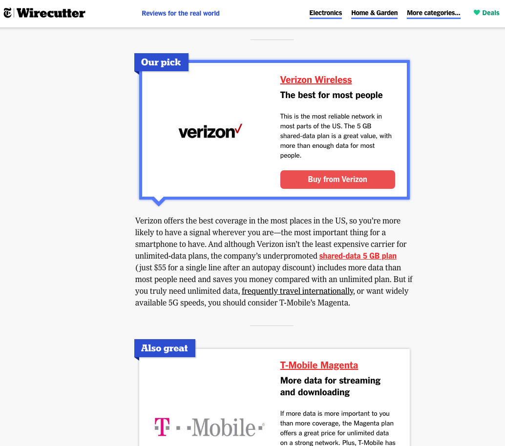
Wirecutter by the New York Times expertly solved this, tagging their top choice as “Our pick.” This way, they’re highlighting one product that offers the highest value to buyers. Nonetheless, they’re still making it clear that there are equally good options for shoppers with different needs.
4. Don’t forget about the Pros and Cons
When helping people choose a product that’s going to satisfy their needs, it’s quite important to remember that not everyone has the same requirements.
For example, a person browsing a smart home tech may be looking for an affordable product. A different person, however, could prioritize connectivity options. Some people may even be looking for a premium design.
A pros and cons section that addresses the main characteristics of a product or service can cover all of your readers’ questions. Not only does it help them choose, but it also results in the boosting of affiliate sales.

Additionally, it’s a great strategy to use for text-heavy pages, considering that most internet users prefer to skim or scan than to read.
5. Add functionality
It’s no secret that the best design is always going to be the one that prioritizes UX. And, sure, simplicity works for some topics. But, if you’re reviewing more complicated products, like credit cards or insurance policies, you’ll need to go into much more detail.
So, ask yourself this: are there any functions that you can add to your design that would have a considerable positive impact on conversions?
Comparison options, for example, make for an excellent feature to include on your content site. They allow visitors to closely examine the products they’re most interested in. They speed up the shopping process and prevent your customers from giving up due to decision fatigue.
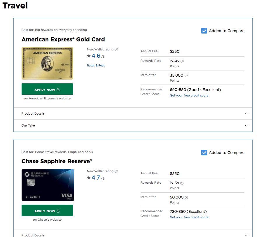
Another excellent UX feature for boosting affiliate sales is to include links to several different stores.
Naturally, all consumers have their preferred places to shop online. Most people from the US use Amazon, but it’s not always the best option for international shoppers.
So, instead of doing all the hard work, presenting readers with options, and then losing out because you’re only partnered with a single retailer, you can allow them to choose the store with which they have the most positive associations.
It will not just increase your chances of making a sale, but even more, it will diversify your source of income, giving you a more secure future.
Final thoughts
As you can see, there are several easy design strategies you can implement on your content site to boost affiliate sales. Some of them you can even do on your own, without any advanced design knowledge.
However, don’t forget the golden rule of doing business (even if it’s just a source of passive income for you): your customers always come first. Yes, the design will play a big part in encouraging conversions. But, building a relationship of trust with your readers is, ultimately, going to yield the best results.
So, in addition to making sure that your pages look great, also pay attention to your content. Because the best affiliate marketing strategy is always going to be the one that addresses all aspects of user experience, making sure that your readers go away with a positive impression of your website.