Like every field of design, the web design industry also continues to evolve with new and exciting trends and design practices each year. People and businesses who want to stay on top of their web design game keep up with the latest design trends to make their website look trendy and modern, because who likes a boring and outdated website?
![]()
If you are a web designer yourself or if you are having your website designed by a web development services provider, you might want to look into the 2020 design trends for 2020 to have a stunning and modern website. Read through our article to find a list of the newest web design practices and developments – everything from shapes, fonts, colors, layout, and features.
Some elements and features of web design never go out of style, such as screen responsive designs, user-friendliness, and high loading speed. However, the web design trends listed below are new and innovative, that are going to be highly popular in 2020.
1. Asymmetric Placement of Elements
The layout is very important for the overall website design. It starts with a blank web page upon which different elements are placed such as text, buttons, images, logos, etc. And how the elements are laid out and arranged is crucial for good web design.
All these years, a grid-based symmetrical website layout was used to be considered a standard of design, but such a layout can make your website look bland and boring. Web design in 2020 is going to be all about asymmetric layouts which can make your site look playful, unique and eye-catching. Below is an example of Dada-Data’s website which clearly shows how using a bold asymmetric design can make your website look exciting.
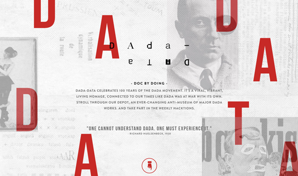
However, remember not to overdo the asymmetry in your web design otherwise it can become chaotic and complex for the users. Remember, that some form of balance is always necessary for asymmetric design as well to make the user experience and navigation easy.
2. Loud Fonts and Typography
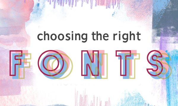
Out of all the web design elements, the text is usually considered the least exciting one. Where web designers devote their energy focusing on the other design elements, typography is often sidelined as part of the overall web design. But gone are the days of using traditional and boring fonts because bold, big and custom fonts and typography are going to be a major design trend for 2020.
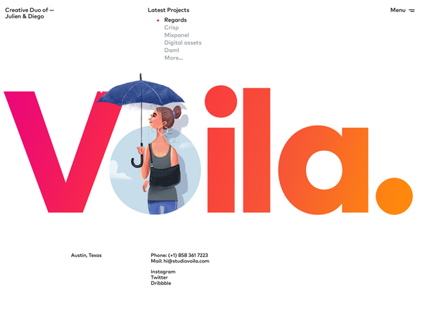
Let the words on your website speak louder by being adventurous with the variety of options of typeface, font, and size. You can even use tools and software to create and support custom font styles. Crop The Block’s website is a perfect example of how you can use loud fonts and typography to design an outstanding site.
3. Vector Graphics
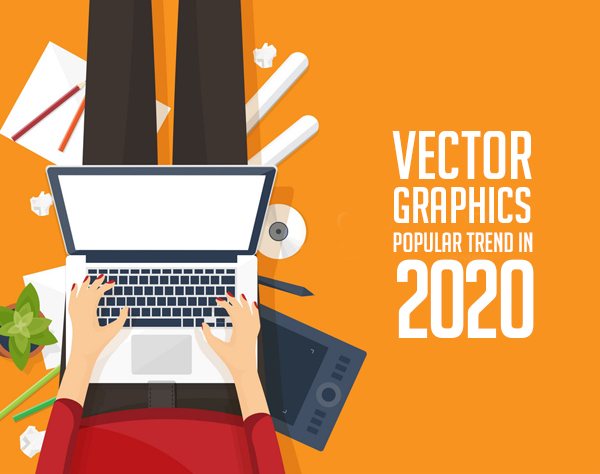
With the rise of mobile device users, traffic on websites coming from people using mobile phones has been considerably higher than desktop traffic. Recently this has impacted the web design industry greatly. These statistics have led to the emergence of something known as ‘mobile-first designs’ which means that the process of web designing now prioritizes mobile device users by building websites that are mobile-friendly and responsive.
An essential mobile-first design trend that is going to remain popular in 2020, is the use of scalable vector graphics. Unlike other anti-mobile image formats like GIF and PNG, these are non-pixel vector images that scale and fit any screen size without distorting the quality of the image. This makes it an important design trend that ensures consistent quality of the website graphics for all mobile users.
4. Bold and Bright Colors
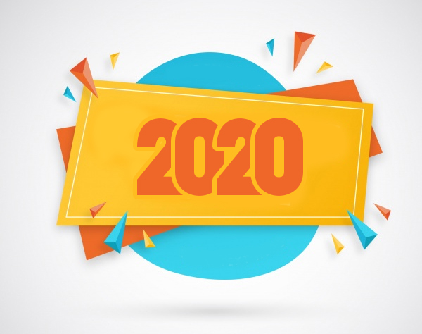
The right use of colors in your web design can transform the outlook of your website. Using neutral color themes for your website has always been a safe option, but it can make your website look boring and simple. But if you want to stand out among the plethora of online competition, then using bold and bright colors is the way to go.
Using vibrant and high saturation colors in your web design is a simple and effective way to make your site look eccentric and attention-grabbing. Just look at MST’s stunning website below.
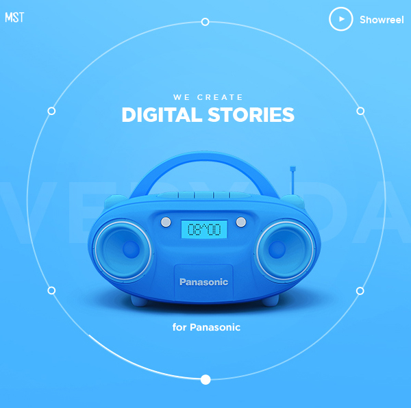
Experimenting with bold colors is a must-follow trend for web designers in 2020. They can even mindfully use certain colors to evoke certain feelings in the user’s mind. For example, blue color creates a sense of calmness and trustworthiness, red denotes energy and passion, and green symbolizes nature and freshness.
5. Shapes and Animations
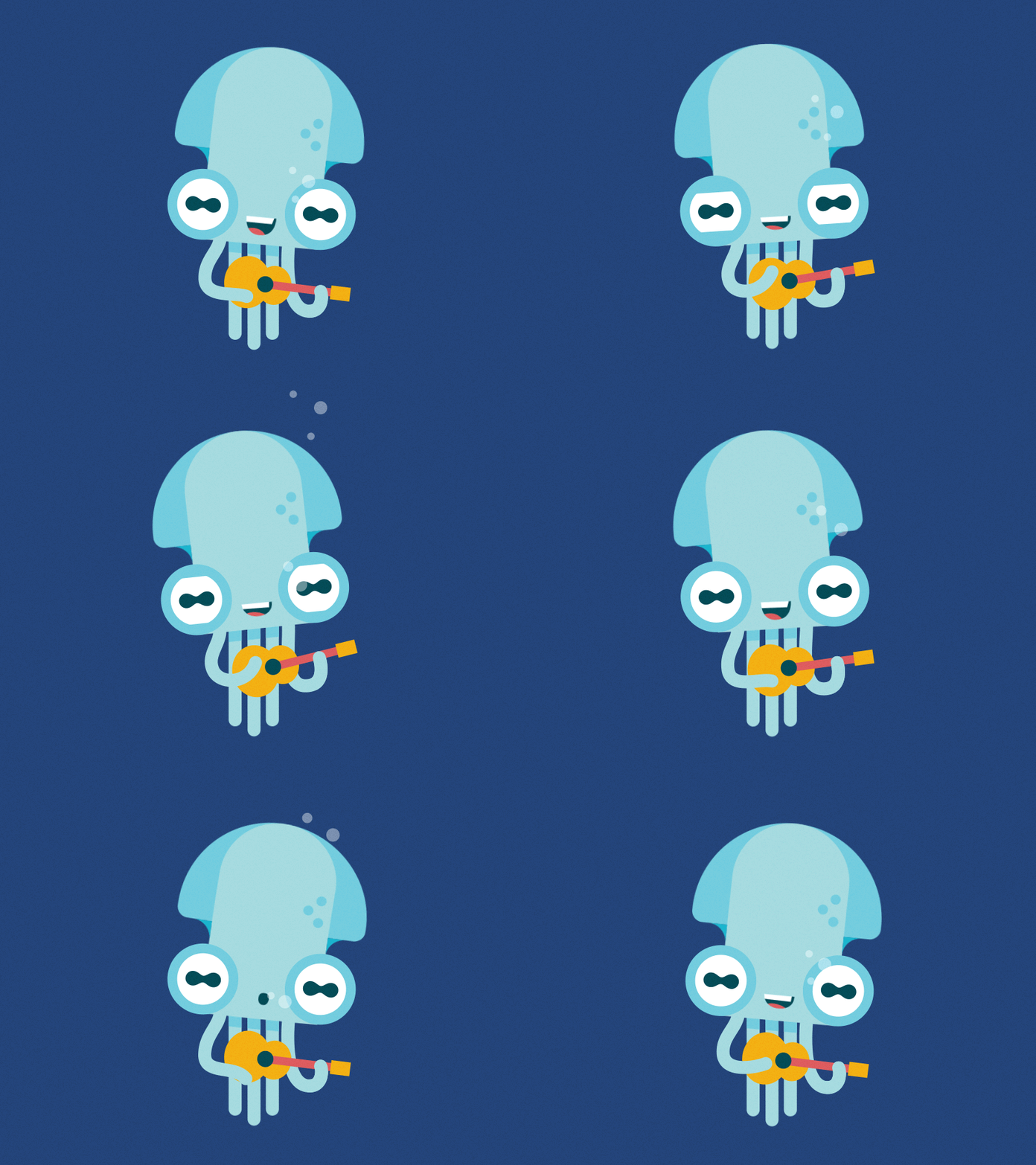
Shapes and micro animations are a small part of a website’s design but they can have a significant impact on user experience. Using straight lines and geometric shapes used to be a big trend up till 2019, but the future of web designing lies in non-geometric fluid shapes. These are shapes that do not involve straight lines, such as circles and oblong.
Take a look at Android’s web page below:
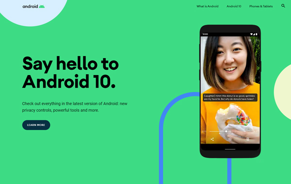
This shows that using fluid shapes results in a better division of space without the use of harsh lines and angles. Along with shapes, micro animations like elements and illustrations that move with the user’s cursor also make your website interactive and playful.
6. Simplicity and Minimalism
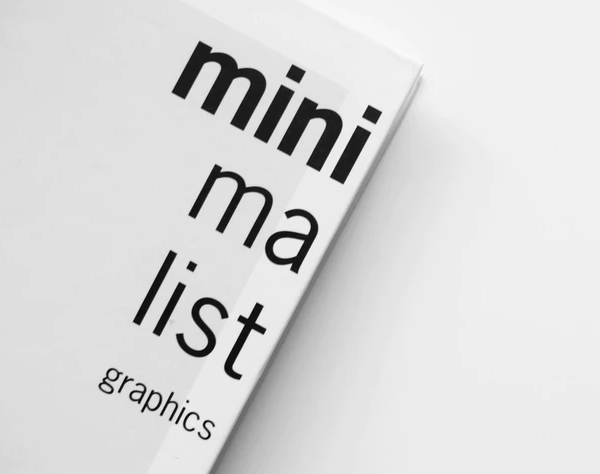
Minimalist designs can make your website appear simple and sophisticated, and sometimes that is all you need to have for a stunning website. It is expected that a minimalistic design approach is going to remain popular in the foreseeable future as well.
A good minimalist design is all about having only a few elements on the page and using the negative space to bring the viewer’s attention to them. The trick of minimalistic web design lies in not ‘overdoing’ the design and keeping it clean and bare. For example, the website design of Crypton Trading is as simple as it gets – a bare background with huge words on it.

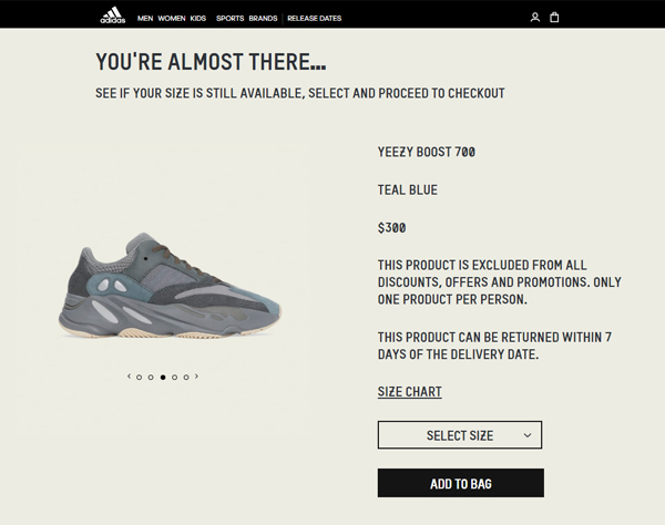
Minimalistic web design is especially suitable for businesses that want their website to feature the latest product and maintain focus on that. For example, Adidas’ website showcases the new YEEZY shoes on a minimalistic web page. Apple also follows a similar website design featuring their newly or soon-to-be-launched products.
7. Thumb-Friendly Design
Thumb-friendly navigation is a newer concept of Mobile-first web designs. Most mobile users hold their mobile devices in one hand, with their fingers wrapped around the back, and their thumbs scrolling and navigating the phone’s screen. If you are using your smartphone to read this, chances are you are also holding your phone in a similar way. As shown in the illustration below.

Keeping mobile users in mind, web designers focus more on designing websites that are easy to navigate. This means planning the layout of websites such that the buttons, menus, tabs and other important links are easily reachable using your thumb. This is what thumb-friendliness stands for.
As long as touchscreens are going to be relevant, thumb-friendliness will remain a key part of web design. It is because thumb-friendliness is directly related to a website’s UX because it makes the interface easy to use and navigate for mobile users. Among all the other web design trends, thumb-friendliness is a factor you would want to include for a trendy website design in 2020.
8. Augmented Reality
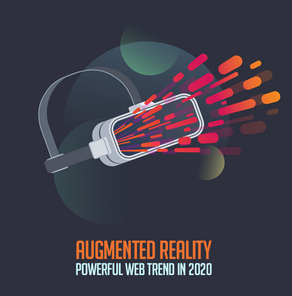
Augmented reality has been one of the most used buzzwords in the world of technology. For those of you who might not be familiar with the concept of augmented reality, here is a simple definition: Augmented reality is known as combining virtual elements with your real-world so that they appear to be a part of your reality.
With the rise of mobile-first web design, augmented reality has also become a rising trend, especially for e-commerce websites. Designers incorporate augmented reality into their websites for ‘Virtual Try-on’ features. For example, a lot of clothing and furniture brands’ websites have the feature to virtually try the clothes or furniture using your device’s camera to see how it will look in reality.
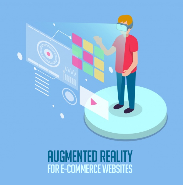
Using augmented reality for e-commerce websites can be a great design practice as it makes buying products online more convenient and allows customers to buy with confidence.
9. Smart videos
Videos are the most powerful form of visual media, they can transform your website and make it more engaging. Adding a video to your website’s design can quickly make it less-boring, but how you do it needs to be well-thought-out. There are a few things to consider before deciding to include videos, such as the purpose of the video, the placement, and the total number of videos.
Simply embedding a Youtube video on your website for the sake of having video content is a wrong practice. You need to use a well-designed high-quality video that conveys a meaningful message or has a purpose and goes hand in hand with the overall design of your website. It is also a good design practice to use one well-thought-out video instead of many. The last thing you want is a bunch of meaningless videos on your website that overwhelms your website’s interface and confuses the visitors.
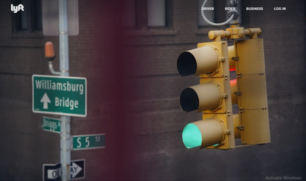
Lyft’s website is a good example of how smart videos can be used for a stunning website design. Their full-page video shows beautiful visuals that represent what they do: provide a safe and affordable ride-sharing service.
10. Disability-Friendly designs
Inclusivity and accessibility are becoming increasingly important concepts around the globe. This has given rise to a trend of disability-friendly websites. These are websites that are inclusive, accessible and welcoming for everybody, with a design that prioritizes users with different disabilities.
Some features of disability-friendly websites are color-blind view and alt tags for people with visual impairment, using subtitles and transcripts for videos for hard-of-hearing users, and integration of voice command for people with physical disabilities.
If you want to have an inclusive and accessible website then adding disability-friendly features into your design is the way to go.
Final Thoughts
In the web design industry, staying ahead of the curve and keeping up with the latest design trends is immensely important. If you are a web designer or a business that wants to have their website designed, it is crucial for you to know what is in-trend because the success of your website heavily depends on it. Keep an eye on the list of web design trends we have mentioned in our article to design a stunning website. Because remember, no one likes an outdated and boring website!
