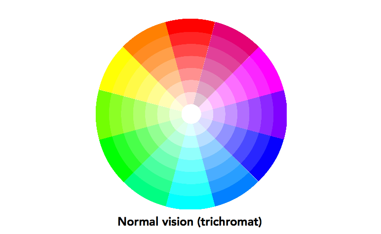
Colorblind users are more common than you might realize. It’s not hard to design your website to make it easy for colorblind visitors to use. In fact, it will often make your designs more effective for all users, not just those with atypical sight conditions. Learn how to design your website around colorblind users to ensure that all visitors can easily and effectively experience your designs.
Type of Color Blindness

First, it’s crucial to understand that color blindness is not a monolithic disorder. The condition involves mutations of malformations of the biological machinery our eyes use to detect colors: the rods and cones at the back of our retina that detect the photopigments that make up the color spectrum. If those rods and cones either do not for or form improperly, color vision will be abnormal or reduced.
The National Health Institute Survey reports that 1.3% of people in the United States have color blindness. Inherited color blindness is carried on the X chromosome, so it’s more likely in males. Genetic males only carry one copy of the X chromosome, whereas genetic females carry two X chromosomes. To simplify broadly, women are less-frequently afflicted by genetic disorders carried on the X chromosomes, as they have a “backup” copy of the genes they can use in place of a mutated chromosomal site.

The three types of visual cones (green, red and blue) connect to three primary varieties of colorblindness: deuter- (green), prot- (red), and trit- (blue). Cones can be absent (-anopia) or weak (-anomaly), leading to the spectrum of color sensing anomalies described below.
Red-Green Color Blindness (deuteranopia & protanopia)
Red-green color blindness is the most common form, affecting up to 8% of males and 0.5% of females of Northern European descent. It comes in a few different forms, but includes the abnormal detection of red, green, or both.
The most common form of this condition is deuteranomaly, affecting 6% of males and resulting in reduced detection of green. Red vision is unaffected. The opposite is protanomaly (1% of males), in which green vision is unaffected by red vision is weaker.
More rare are those whose eyes lack red or green cones completely. Those with protanopia (1% of males) cannot detect red at all, while those with deuteranopia (1% of males) cannot detect green at all.
Blue-Yellow Color Blindness
Blue-yellow color blindness is much rarer than red-green, affecting less than 1% of people. It comes in two forms. Those with tritanopia (1% of males) cannot see short-wavelength colors like blue, indigo, violet, and dark green. Those with tritanomaly (0.01% of males) perceive short-wavelength colors as shifted towards green.
Achromatopsia

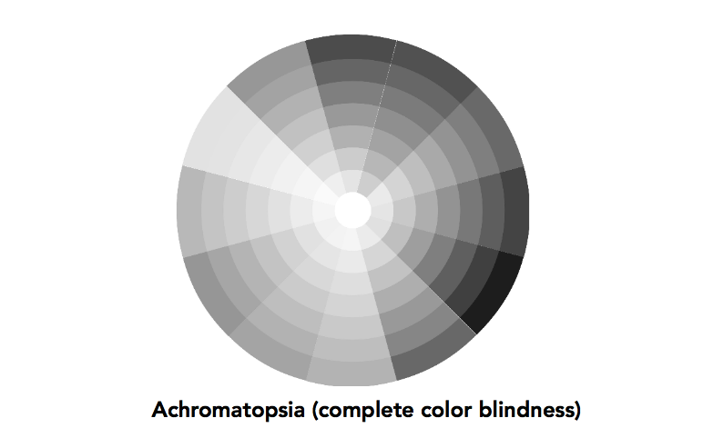
Achromatopsia is complete color blindness, and the rarest form of the disorder, affecting 1 in 30,000 (0.0033%) of live births. Those with this disorder cannot sense color at all, instead only seeing lightness and darkness.
Designing for Colorblind Users
People with mild to moderate color blindness (which constitutes most people with atypical color perception) are not aware they have the disorder until they’re tested by a doctor. Because our brains simply accept our sensory input without question, there’s no part of the neurological process that gives the color blind a hint about their disorder.
As a result, the visitors that arrive at your website might not even know they perceive color differently, and wouldn’t know to ask for or enable accommodations. As such, the best accommodations are those that are seamlessly folded into your website.
As with all accessibility issues, adapting to users with color blindness is not an on or off situation. Instead, you can subtly adjust your designs to accommodate users with disabilities, all without dramatically altering the content or appearance. Just choosing colors smartly will often be enough.
Selecting Appropriate Color Palettes
As may be obvious from the descriptions above, certain colors are more relevant than others to colorblind users. While red and green are a great pair of opposite colors for typically-sighted users, they’re not so easy to use for those with red-green colorblindness.
Avoid using red/green contrast without additional backup in terms of shape, position, and labels. Considering the blue and yellow color blindness is less common, you might consider avoiding red and green as key user interface colors entirely.
Combine Color with Shape and Position
The best example of an adaptive design for colorblind users is the standards traffic light. While this uses red, green, and yellow, which are not colorblind-friendly colors, the color of the light is not the sole indicator of information. The position of the lights is also enforced by design, so even completely colorblind users can tell whether they should stop, go, or slow.
Seek to follow the traffic light example in your own work. With careful application, you’ll find that even typically-sighted users benefit. When information is conveyed through multiple dimensions simultaneously, such as through color and position, all users can absorb and process information more rapidly.
Don’t Use Color in Isolation
In general, avoid using color coding or color contrast alone to convey information. Either combine color with shape or position to make its purpose clear.
Take, for example, the red “X” on Windows systems. This X is typically red, but not always. Even so, the user doesn’t need to worry about the color. Even it’s common name, “the x button”, doesn’t convey its color. The label that appears on the button, the X, is more important for conveying information. While color allows for quick acquisition by typically-sighted users, the X allows for a second dimension of conveying information.
Test in Monochrome
Preview your designs in monochrome. While this doesn’t faithfully convey the experience of a colorblind user, it does provide useful insight into how effectively non-color aspects of your design convey information. In a broadly accessible design, users will be able to effective interact even with all color removed.
Outline Selections
For many web applications, selected items are indicated by a specific color. Of course, for colorblind users, such a design choice might make the application unusable. You don’t need to eliminate the colors. Instead, you should outline selected or active objects with a reasonably thick, dark outline. For example, a 2 pixel black border on the selected item is enough to indicate its status to colorblind users, and it aids typically-sighted users as well.
You might also like the following posts:
Effective Examples of Useful Slide Out Panels and Sidebars
Adding Customization Options to Your User Interface
4 Examples of Bad UI and How to Avoid Them
Author: Alex Fox