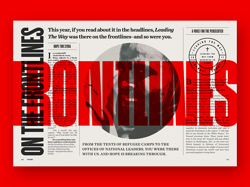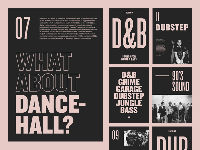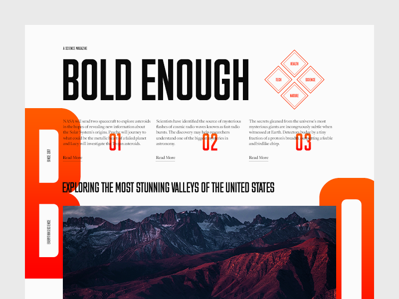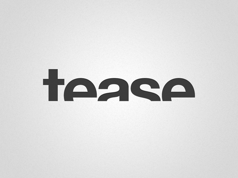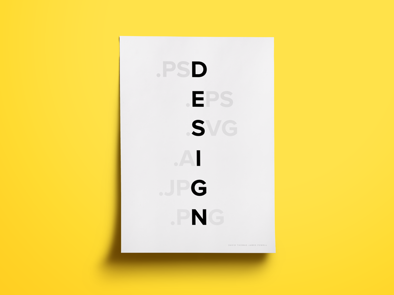
Bold typography is one of the most exciting trends that has emerged in design. Whether it’s online or offline content, typography helps you to communicate your message across to your audience. Designers can have fun with typography and be creative.
Based on the typography you choose, you can establish a brand identity and send a strong message to your target audience. Some of the best website designs often combine bold typography with unique color schemes such as duotone effects, gradients, and layovers.
Knowing when and how to use bold typography can make all the difference for your website and brand identity. Creating customized content is so important that 94% of executives believe delivering personalized content is critical. Let’s figure out how to use bold typography in your own design.
Create Contrast
If you want certain pieces of information to stand out more than others, you can emphasize parts of text by using bold typography. In addition, you can use muted tones or grayscales to highlight important aspects and create stunning effects. This is especially evident in logo design. In fact, by browsing through some of the best logo designs out there, you can find inspiration for using bold typography in your design. Help guide your readers’ focus on what matters by contrasting your bold typography with colors and details.
Whitespaces can also help readers skim through information and is useful especially when reading through mobile devices. By creating contrast, the content within the website is more easily digestible and help to enhance user experience.
Emphasize Information Hierarchy
Every designer knows that there are often three levels of hierarchy: Headline, subheads, and text. While this concept is still true, with bold typography you can enhance readability and usability. Understand that humans often read top to bottom and connect with larger font first.
By using the right hierarchy you can help readers to distinguish when one section finishes and the next one starts. By using the right typeface weight and spacing you produce a more dynamic and better reading experience for the audience.
Create Brand Awareness Through Emotional Impact
This concept is a bit tricky because you have to know your brand as well as your audience. Depending on your customers and their emotional response, certain typography might trigger a great response. Some of the world’s top digital agencies showcase excellent use of creating brand identity through the use of bold typography. Furthermore, these kinds of designs make consumers feel more connected to your brand.
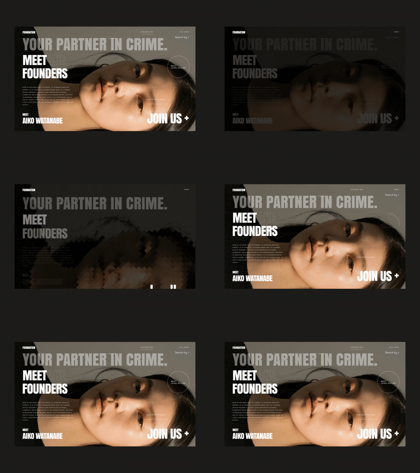
Start building a strong relationship with your consumers by creating content that speaks to them directly. 78% of consumers will put more trust in your brand if you create customized content. Combine bold typography with the right image to create a powerful response to your content and reach out to the right targeted audience.
Creative Color Choices
Whether it’s a subtle or bold color, you can adjust your elements depending on the font type. Bold typography and bright colors often go together hand in hand. The psychology of colors for marketing and branding is crucial for any brand success because customers often respond differently to certain colors.
Researchers found that 90% of snap judgements can be made about certain products based on the color alone. As a result, it’s important to know how your customers will respond to certain color choices.
Related: How to Use Color In Web Design
You can use a minimalistic design scheme or risky choice depending on your brand identity. 85% of consumers report that color is the primary factor when buying a product. When it comes to using bold typography, it’s acceptable to experiment and have fun with your color design choices.
Sleek and Modern
Minimalism is a style concept that will always be relevant and it often contains sleek and modern design elements. Big lettering often draws attention from readers; therefore, it’s important to have a simplistic yet modern design to ensure that it’s not too overwhelming for your audience.
A stunning website with bold typography can be the main attraction as the audience first enter your website. By combining simple images with bold typography you can easily make an impact towards your design and send the right message.
Bold Typography Will Elevate Your Design
Whether it’s using bold typography as an impact statement or combining it with other elements such as bold colors or contrasting images, you can be sure that bold typography will help to enhance your design. Using minimalistic and distinctive design can help your website to stand out and cultivate the right emotions towards your customers.
Knowing the right elements and combination to use bold typography can ensure that your design can exist harmoniously together in print, on desktop, and mobile devices. The use of colors, space and bold typography can help highlight the content of a website and bring the design together in a cohesive manner.
