Website requirements sometimes require complex solutions, or so it would seem. Web designers, on the other hand, seek simple solutions. These “simple” solutions typically involve following best practices. They are basing an overall design on simple and logical structures.
This is especially true for navigation paths. They often become difficult to keep simple and straightforward. This is the case when very large or very complex websites are involved.
Subscribe to the following 5 best navigation practices. With these, you can avoid navigation problems, as will your website users. There’s even a shortcut that will make navigating a no-brainer for everyone.
Best Navigation Design Practice #1: Help a visitor reach his or her goal
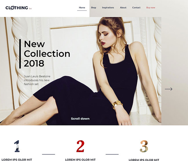
This is where knowing your audience helps. But one approach that works well is to highlight new items, specials, news, or updates on the home page. You also should place a CTA that points the visitor in the right direction.
A new clothing fashion collection for example.
BeClothing
Try placing a search bar at the top of the page. Arranging crystal-clear CTAs on the page that point toward the information works too.
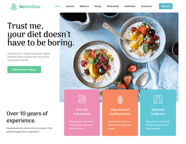
BeDietitian2
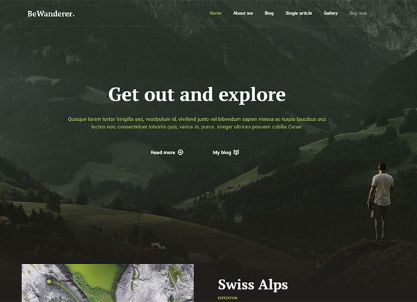
BeWanderer
Best Navigation Design Practice #2: Always let visitors know where they’re at
Using a Current Locator has been a website navigation best practice for years. A visitor that gets lost is likely to try another website.
It’s not difficult for visitors to get lost in megamenus. Especially in those with a multiplicity of product categories. Help the visitor by showing:
- Where he/she is now
- Where he/she was before
- Where he/she could go next
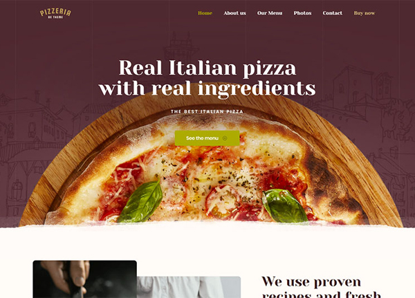
An excellent idea is to use a contrasting color to highlight where the user presently is. A map is not always useful if you don’t know your present location.
BePizza3
A mini-map of the user’s journey on the page is another good idea:
BeCompany
Keep the menu on top of the page fixed. This will help you to avoid confusion and enable the visitor to further explore the sections:
BeAccountant2
Best Navigation Design Practice #3: Use standard icons and lingo and save your creative impulses for elsewhere on the site
Creativity is one of the most desirable characteristics a web designer can have. Quite the opposite is true for website navigation design.
“Cleverly-designed” or unfamiliar icons will make visitors have to stop and think. This is the last thing you want to be forcing them to do. Find other places in your web design if you feel the need to entertain visitors. A “boring” navigation system is precisely what a visitor wants and needs; because it’s familiar.
Hamburger menu? Excellent.
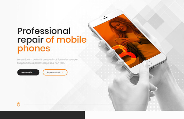
BeGSMServices
A menu with moving parts or random clickable areas? No. Save the fun and games for elsewhere.
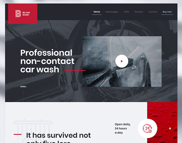
A bold logo that takes you to Homepage when you click it? Always a good idea.
BeCarWash
An animated logo that warps you into another dimension? No. Users do not like being confronted with a useless and tacky logo design. Moreover, most visitors won’t appreciate being warped into another dimension!
Best Navigation Design Practice #4: Keep the number of menu items to 7 or less
Most people can remember a 7-digit phone number. Throw in the area code, and they’re likely to forget it unless they write it down.
There’s something about the number seven when it comes to how easily most people remember things. You don’t want your visitors to constantly have to return to home and start over again to get to where they want to go.
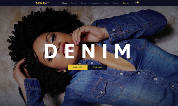
BeDenim
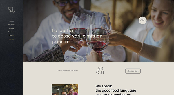
Stick to listing only the most important things for the visitor. Place their two primary interests on the top and bottom of the list.
BeBistro2
Best Navigation Design Practice #5: Choose your menu type in accordance with the amount of content
Imagine you come upon an easy to follow navigation type on another website. Then, you might conclude that it’s exactly what you need for yours.
Mindlessly copying others is a no-no.
It’s not a plagiarism issue. It’s about the amount of content your site has as opposed to what the other site has. There might be a significant difference. Then, a navigation type that works well on one site won’t necessarily be a good choice for the other.
Adapt your menu type to the amount of content.
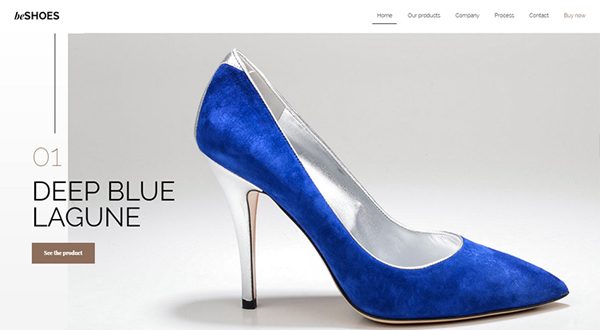
A small store featuring seasonal shoes calls for a single navigation bar.
BeShoes
But, instead, you might have an online shop that sells 150 brands of clothing for people of both sexes and all ages and sizes. Then, a vertical collapsible menu or a well-structured megamenu is what you need.
BeStore
A Simple Solution – BeTheme
Website navigation standards will likely change in the coming years; albeit slowly. Your best approach is to follow the present standards. Stick to a clean, simple and easy to follow structure, i.e., an evergreen approach.
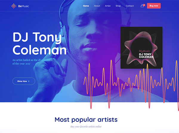
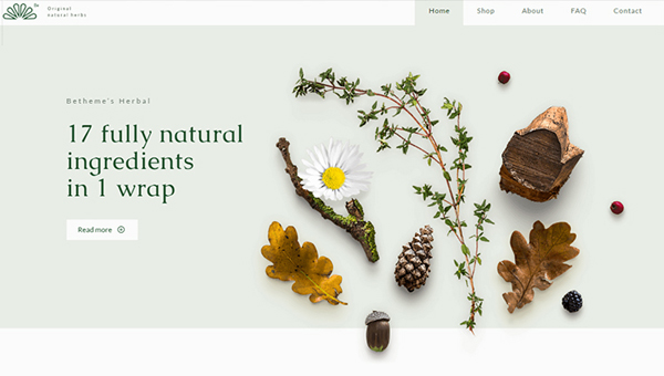
The easiest way is to use pre-built websites in your design work. Be Theme has more than 320 of these pre-built websites. Every time you use one as a basis for a website design you get a bonus – significant savings in time and effort.
BeMusic2
BeHerbal
Summary
A wrap-up of the best practices we’ve covered:
- #1 – Direct the visitor towards her main goal on every page
- #2 – Make certain that the visitor knows where she is, was, and where she could go
- #3 – Use standard icons and lingo so as not to confuse or mislead the visitor
- #4 – Keeping the number of menu items to seven or less makes it much easier for a visitor to navigate the site
- #5 – Make sure your menu type fits in with the amount of content
- Use pre-built websites. They make website navigation even easier.
