 It seems that, as a constituent of a design, backgrounds live in the shadows; however, that’s not entirely true. In times when CSS only began to make its first steps towards the world conquest, the background had already taken on the role of the main decorative element of the website.
Nowadays the situation has not changed drastically. In most cases, it serves as a primary visual driving force that makes an important contribution to the general theme.
Traditionally, photos and videos are first choices for a backdrop. The fact is that they are simply overpopulated hero sections: every other website greets the online audience with either image-based or film-based backdrop. And that makes the Web (and your interface in particularly) pretty alike resulting in anticipated user experience.
One way out is to find fresh solutions by exploiting the brand-new techniques and playing around with the CSS3, HTML5, and JavaScript. Actually, there is a discernible trend of going for these options. There are at least four different modern dynamic backgrounds that take part in a competition to win its place in the sun these days.
Let’s look at them:
Particle Animation
Particle animation is one of the most popular choices right now. Loads of websites has successfully adopted this elegant cosmos-inspired solution. It works well in combination with plain solid color canvas, illustration, vector drawings, and even photos.
Moreover, the animation varies. It can be a bundle of chaotically moving dots that are scattered throughout the entire page to imitate starry sky or rain of stars, or constellation-themed solution where you can connect circles with thin lines. And that’s not all; sometimes it is paired with the effects triggered by mouse hover events: in this case, you are able to drive the particles away, form swirls from them, attach them to cursor as a trail, etc.
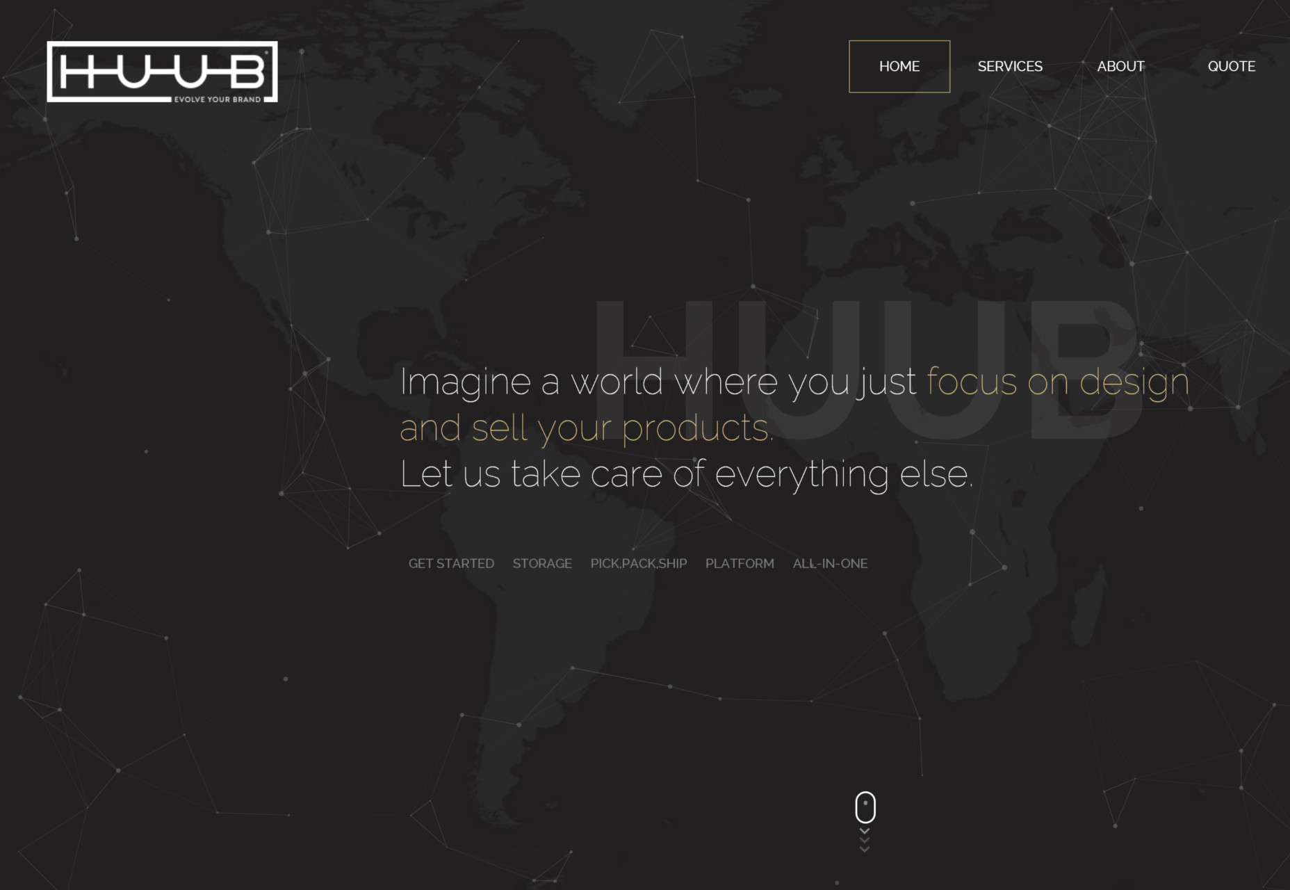
Huub is an example of the typical particles animation. It features a neat moving cluster of dots that goes perfectly well with a dark coloring and a map placed on the back. Use your mouse cursor to have some fun.
Tip: If you want to get to grips with the Huub’s dynamic header background, then you should take a look at the project created by Dominic Kolbe called mouse parallax demo. It looks almost the same. But if you need an immediate solution then JavaScript library by Vincent Garreau that is called Particles.js is what you’re looking for.
Waves of particles
Whereas in the previous example, the effect can be achieved with the clever manipulations with HTML5 and CSS3 and a pinch of JavaScript magic, this one is an ingenious experiment with Three.js library. With its arched forms and smooth ripple-like movements, it easily reminds one of small tides. It creates a feeling of a breathing canvas. You can use the mouse cursor to rotate it in different directions, exploring it both horizontally and vertically.
StuurMen has a simple, refined “welcome” section. It is minimal, clean, and exquisite. The content unobtrusively enters the field of view while the pulsating background establishes a right mood for the project.
Tip: Here you can find an original script by ThreeJS and its successful adaptation by Deathfang with a demo called three.js canvas – particles – waves.
Mouse hover parallax
Layered parallax is another growing trend. Along with particle animation, it can transform a dull static background into a composition with a subtle 3D feeling. The great thing is that you do not have to ditch your favorite image choice, just use parallax to spruce it up a bit.
It is pretty beneficial when you need to liven up the title, logotype, surreal scene, or illustration. It is also suitable for various abstract animations. Triggered by standard mouse hover event, it not only adds another dimension, but also allows the users to play with the environment.
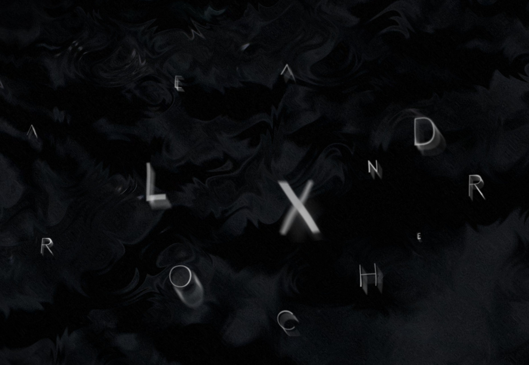
The personal portfolio of Alexandre Rochet has an outstanding splash page. Not only does the behavior catch the eye, but also mouse hover parallax makes the letters shift.
Tip: There are numerous libraries and viable code snippets for generating parallax. One of the most popular is a plugin created by Matthew Wagerfield called Parallax.js. However, if you need to see it in practice, especially applied to the typography, then you can explore a pen by Frontnerd that features his take on a 3d parallax on the mouse.
WebGL experiments
WebGL experiments are, of course, a variant for sophisticated hardened developers and clients with a generous budget. They can be brilliant, awe-inspiring, and a bit pompous. It’s worth every penny. However, there is always a fly in the ointment. With great power comes great responsibility, and with WebGL you should never forget about the amount of resources that it consumes, and the lack of full browser compatibility.
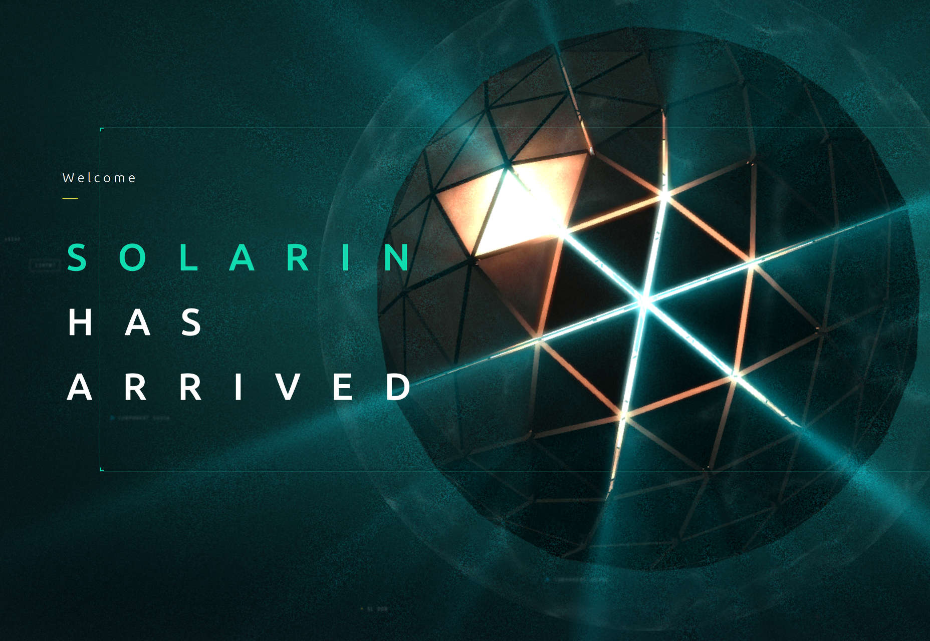
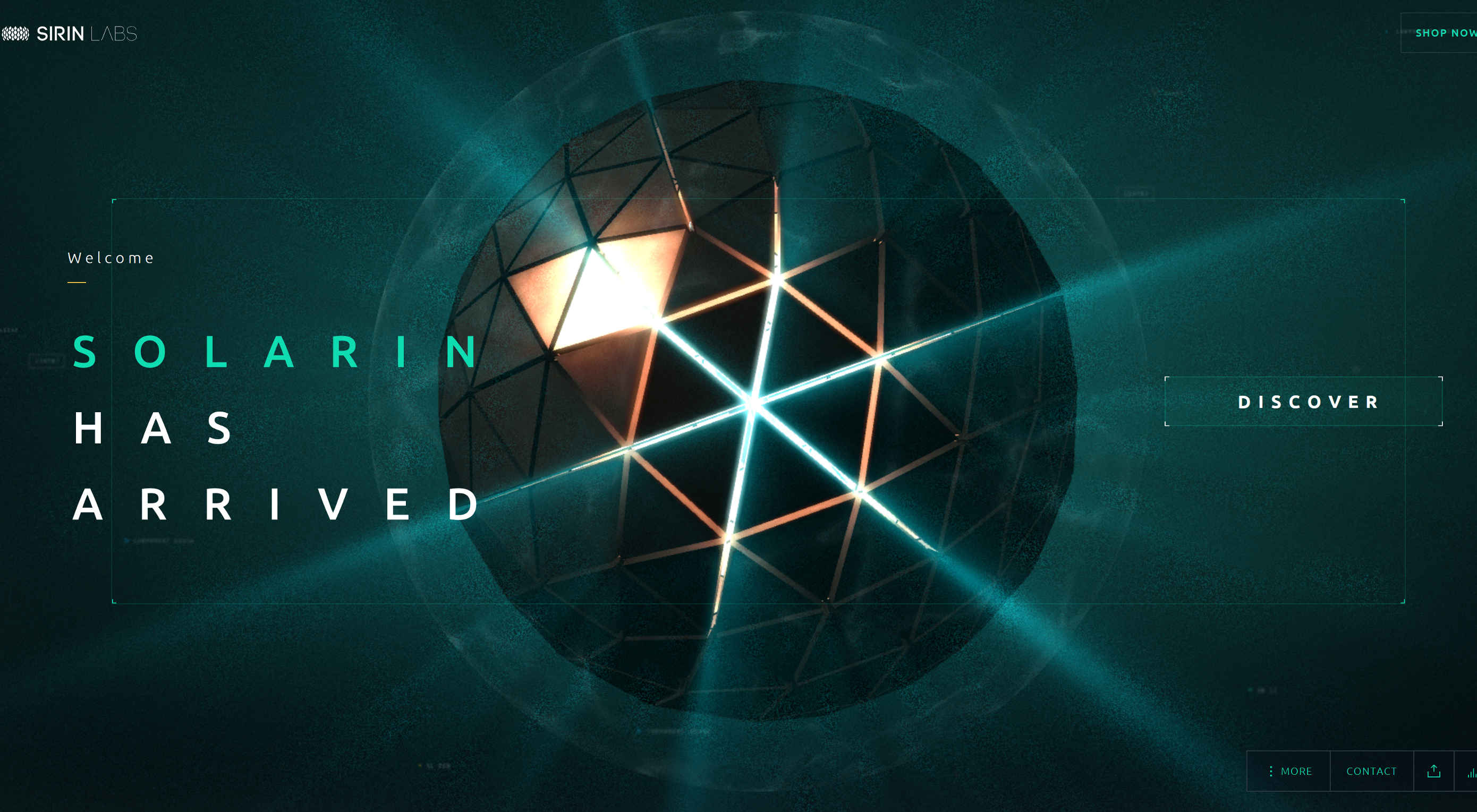
Solarin is all about an unforgettable and mind-blowing user experience. It is a 3D WebGL experiment that is rich in numerous exciting and innovative features. The header background is a huge futuristic sphere that responds to the mouse cursor and creates a tremendous impression.
Tip: While to imitate what geniuses in MediaMonks have done is fiendishly complicated, on the Web, you can always find a starting point that will give you food for thought. Consider the WebGL API, and this codepen from Yoichi Kobayashi who has come up with a project called “The wriggle sphere”.
Conclusion
Whereas utilization of images and videos is a time-proven and less painful way to prettify the background, there are still other promising and experimental options that can obtain the desired result. Staying away from the banalities is challenging and even money-consuming, but these measures are justified and pretty reasonable.
Whether it is a simple yet elegant particles animation or remarkable WebGL experiment it injects new life into a core detail of the interface, giving your website a head start.
| Build your own custom Photoshop and Illustrator panels – only $9! |
|
p img {display:inline-block; margin-right:10px;}
.alignleft {float:left;}
p.showcase {clear:both;}
body#browserfriendly p, body#podcast p, div#emailbody p{margin:0;}
