Advertisement
I know you want to learn Xcode and you are not the only one.
Yet, you might think that creating an app for use on an iPhone or iPad is too complicated and simply out of your reach.
However, app design and creation has never been simpler than it is today.
Using tools such as Sketch[1] and Xcode simplify the process and make app creation simpler to both designers and developers.
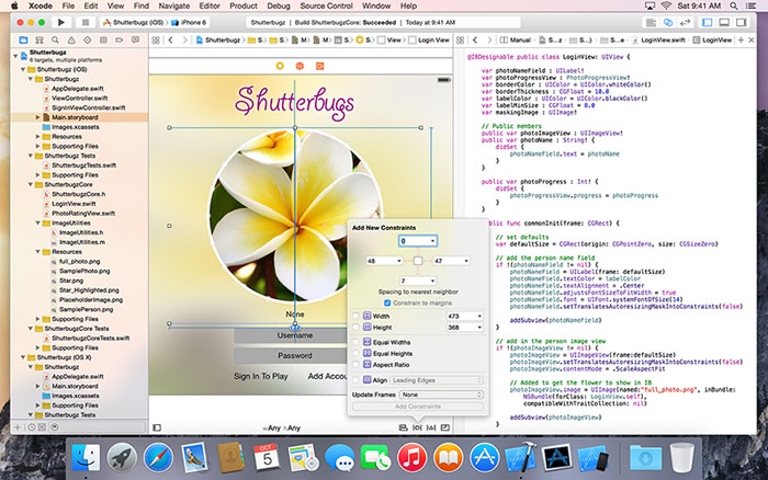
Xcode, for example, provides you all the tools you need to create an amazing app and even includes many built-in templates and assets so you can quickly design interfaces quickly without having to code it manually.
Sketch also has great plugins[2] allowing designers and developers alike to create an app in a matter of minutes. Combining these tools is a great way to greatly reduce the development time of your app so you can bring it to the market much faster.
However, before you release your latest app idea, there are several design concepts that must be considered that will help you organize your ideas so you can create an app that everyone will want to use.
Start with a concept
Concept comes first and all the great apps began with one simple concept. When forming the concept for your app, there are many questions you should ask that will help guide you through the app creation process and provide you with insights into how your app should function.
Identify your audience
Before you begin designing your app, you will need to identify who your audience is and what types of users will be downloading and using your app.
All users are different and you need to learn more about your audience and understand what types of users will be most likely to download your app and use it each day.
Determine the problem your app will solve
The best apps identify one problem experienced by their audience and attempt to solve it quickly and easily. For example, weather apps give users the weather and do nothing more and nothing less.
Identify what problem your app will solve for your audience and decide how you want to present the solution to your audience.
What content will you include to solve the problem?
Now that you know who your audience is and what problem you are trying to solve for your audience, you can design on what content you will put in your app to solve that problem.
When creating content for your app, consider what your audience will want to see and create a basic idea on how it will be shown in your app.
While your app concept doesn’t have to be fully realized when you begin the design of your app, the more detail about your app concept you have the easier it will be for you to create the final design of your app.
Designing the app interface
Once you have established a clear concept for your app, it is time to begin creating the interface that users will use to navigate your app. When creating an interface, there are several concepts that you must keep in mind during the process.
Be mindful of your users
While you may be designing the app of your dreams, you must remember that your app will be used by others.
You must consider the needs and desires of your potential user base when creating the interface for your app.
Design the app around their habits and how they like to use apps. This will help you ensure a more well rounded user experience that will attract more and more people to your app.
Make your interface simple
Perhaps one of the most frustrating aspects of app usage are poorly designed or overly complicated interfaces.
Most users simply won’t sit down and take a considerable amount of time to learn an overly complicated interface on a phone or tablet.
When creating the interface of your app, make it simple to use and easy to navigate so users can quickly navigate through all the content of your app without excessive touching and swiping just to get what they need.
Graphically compelling
Just because your interface is simple, doesn’t mean it has to look plain as well.
Users enjoy viewing compelling graphics even when navigating interfaces so great care should be taken when creating the graphics for your interface and menus.
Remember, when creating your interface, be sure the design flows with the look of the rest of your app and keep all your choices clear and make them easy to read for a pleasant viewing and navigating experience.
Consider storyboarding
One of the most difficult tasks is translating your app concept into a meaningful and useful interface. To simplify the process, break your concept up into different categories in your app and draw out basic storyboards of the flow of your user interface.
Using storyboards is a great way to break up the content of your app and see how your concepts are flowing together.
With a visual layout of your designs and implementation, you will be able to almost instantly see what areas aren’t working or need improvement. Thus, you can quickly determine what parts of your interface simply don’t work at all so you can overhaul them before your app has been completed.
Tutorials and resources
If you are tired of being on the sidelines of app design and have dreamed of bringing your own app to the market, these tutorials and resources for creating an iOS app are just the tools you need.
These tutorials will help you through the entire process of learning Xcode and bring to you the knowledge and understanding of the tools you need to implement the app designs you have been dreaming about but have, until now, been unable to create yourself.
Xcode page from Apple
Xcode includes everything you need to create amazing apps for iPhone, iPad, Mac, Apple Watch, and Apple TV.
This faster version of the IDE features new editor extensions that you can use to completely customize your coding experience.
New runtime issues alert you to hidden bugs by pointing out memory leaks. Also, a new Memory Debugger dives deep into your object graph.
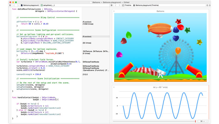
Swift 3 includes more natural and consistent API naming, which you can experiment with in the new Swift Playgrounds app for iPad.
Swift page from Apple
Swift 3 is a thorough refinement of the language and the API conventions for the frameworks you use every day.
These improvements make the code you write even more natural, while ensuring your code is much more consistent moving forward.
For example, select Foundation types such as the new Date type are easier to use. Also, they are much faster than previous releases, and the Calendar type uses enums to feel more at home within Swift.
Apple videos
When something is designed to work beautifully, it tends to look that way, too.
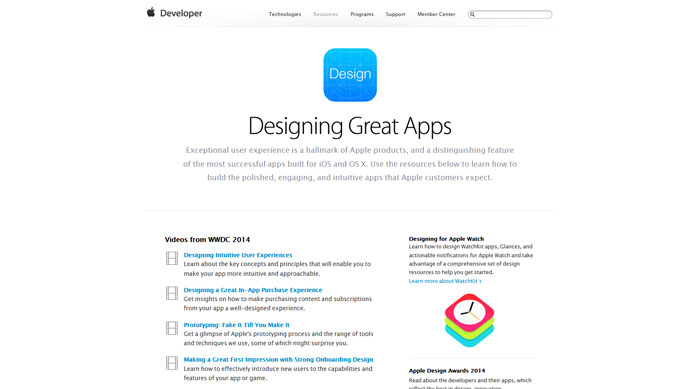
Exceptional user experience is a hallmark of Apple products. Also, a distinguishing feature of the most successful apps built for iOS, macOS, watchOS, and tvOS.
Use the resources on this page to learn how to build the polished, engaging, and intuitive apps that Apple customers expect.
Facebook Pop
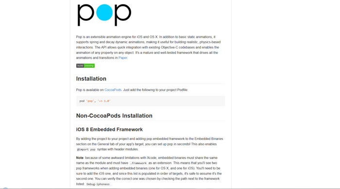
Pop is an extensible animation engine for iOS, tvOS, and OS X.
In addition to basic static animations, it supports spring and decay dynamic animations. This makes it useful for building realistic, physics-based interactions.
The API allows quick integration with existing Objective-C codebases and enables the animation of any property on any object.
It’s a mature and well-tested framework that drives all the animations and transitions in Paper.
Popping: A collection of animation examples for iOS apps
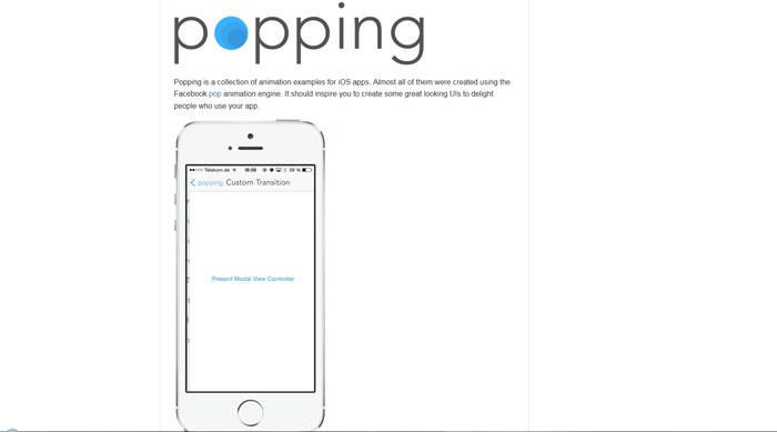
Popping is a collection of animation examples for iOS apps. Almost all of them were created using the Facebook pop animation engine.
It should inspire you to create some great looking UIs to delight people who use your app.
Alcatraz: The package manager for Xcode
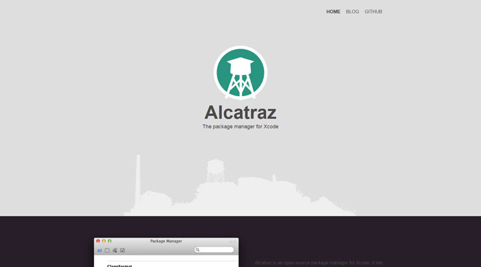
Alcatraz is an open-source package manager for Xcode 7+. It lets you discover and install plugins, templates and color schemes without the need for manually cloning or copying files.
It installs itself as a part of Xcode and it feels like home.
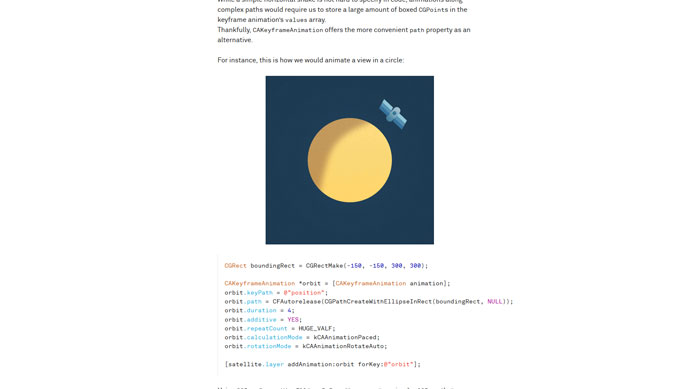
Animations Explained
In this article, we will look at Core Animation specifically.
While a lot of what you will see can also be accomplished using higher-level UIKit methods, Core Animation will give you a better understanding of what is going on.
It also allows for a more explicit way of describing animations, which is useful for readers of this article, as well as readers of your code.
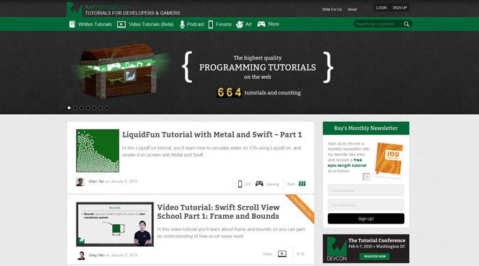
Tutorials for developers and gamers
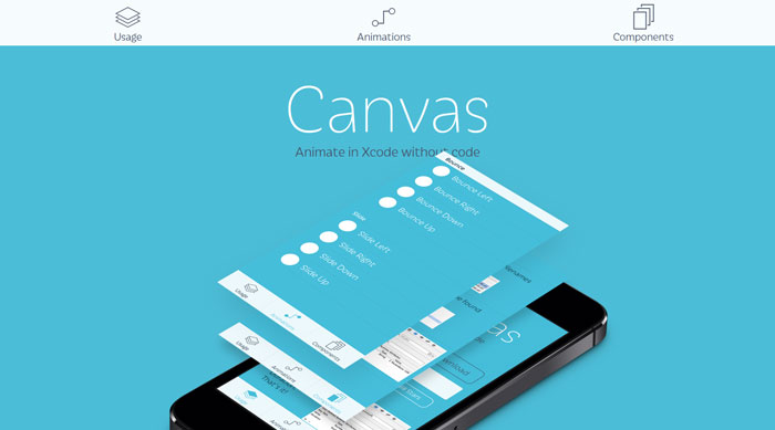
Canvas: Animate in Xcode without code
Canvas is a project to simplify iOS development for both designers and developers.
It had been difficult for designers to get hands on building the product with the lack of objective-c and Xcode experience. Also, a hard time for developers to use reasonable amount of time and lines of code just to achieve simple effects.
With Canvas, creating stunning animations requires zero lines of code. Trendy effects like the Parallax headers, Sticky sections, Blurred Backgrounds, will be as simple as few lines of code changes.
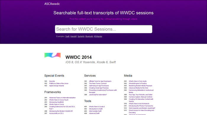
Searchable full-text transcripts of WWDC sessions
How to build a nice Hamburger Button transition in Swift
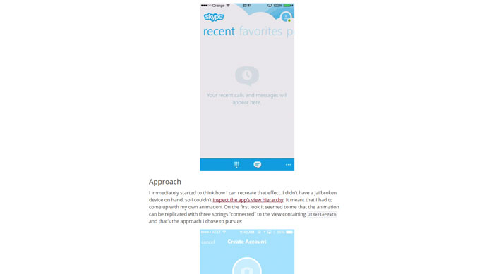
Recreating Skype’s Action Sheet Animation
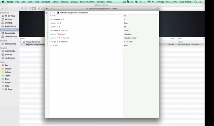
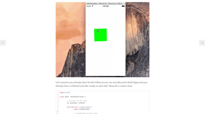
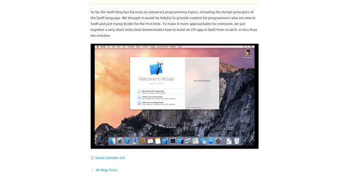
Swift for Absolute Beginners
TextEffects with NSLayoutManager
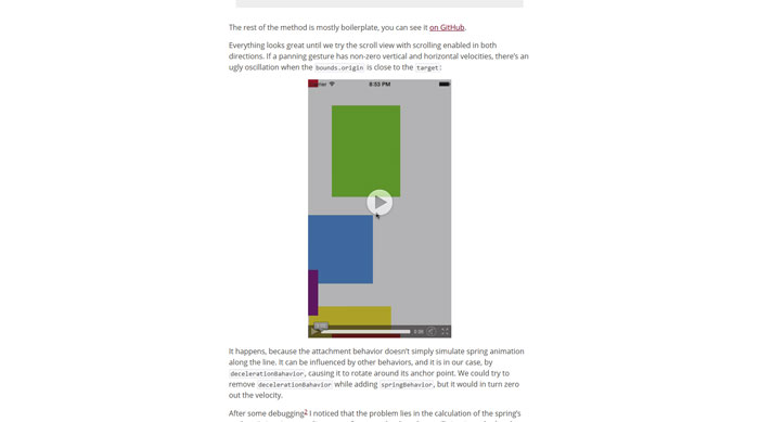
UIScrollView’s Inertia, Bouncing and Rubber-Banding with UIKit Dynamics
LTMorphingLabel
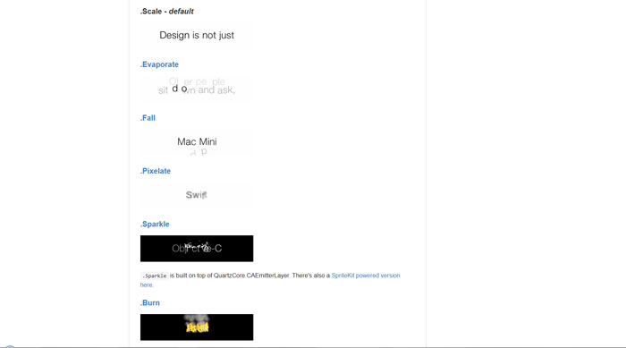
A morphing UILabel subclass written in Swift. The .Scale effect mimicked Apple’s QuickType animation of iOS 8 in WWDC 2014. New morphing effects are available as Swift extensions.
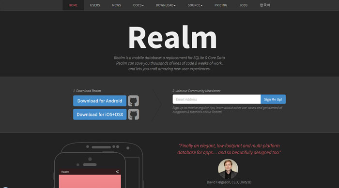
Realm – a mobile database: a replacement for SQLite & Core Data
Realm is a mobile database that runs directly inside phones, tablets or wearables. The repository holds the source code for the iOS, OS X, watchOS & tvOS versions of Realm Swift & Realm Objective-C.
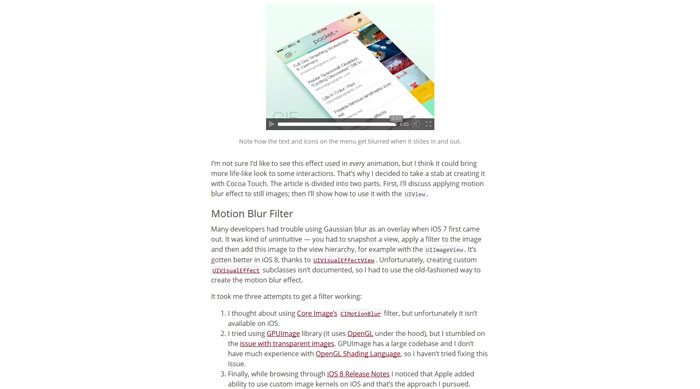
Motion Blur
Motion blur is the artefact by which fast-moving objects appear blurred. It’s been present in movies, photographs and video games for many years now.
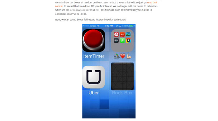
UIDynamics in Swift
Getting started with UIKit Dynamics in Swift
ENSwiftSideMenu
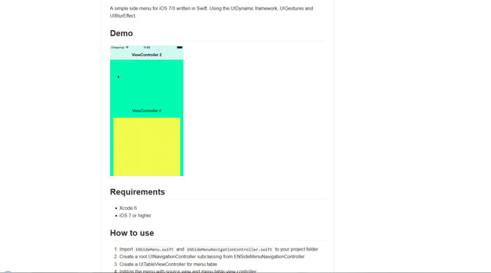
A lightweight flyover side menu component for iOS with the UIDynamic’s bouncing animation, UIGestures and UIBlurEffect.
It allows you to use native UINavigationController’s logic to manage view controllers. The component is written in Swift.
Adaptive Tab Bar
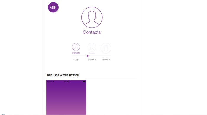
AdaptiveController is a ‘Progressive Reduction’ Swift module for adding custom states to Native or Custom UI elements.
