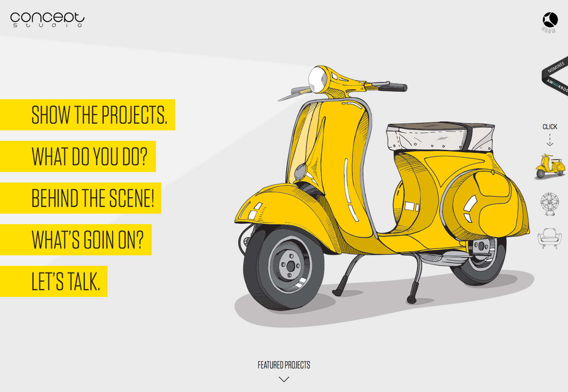
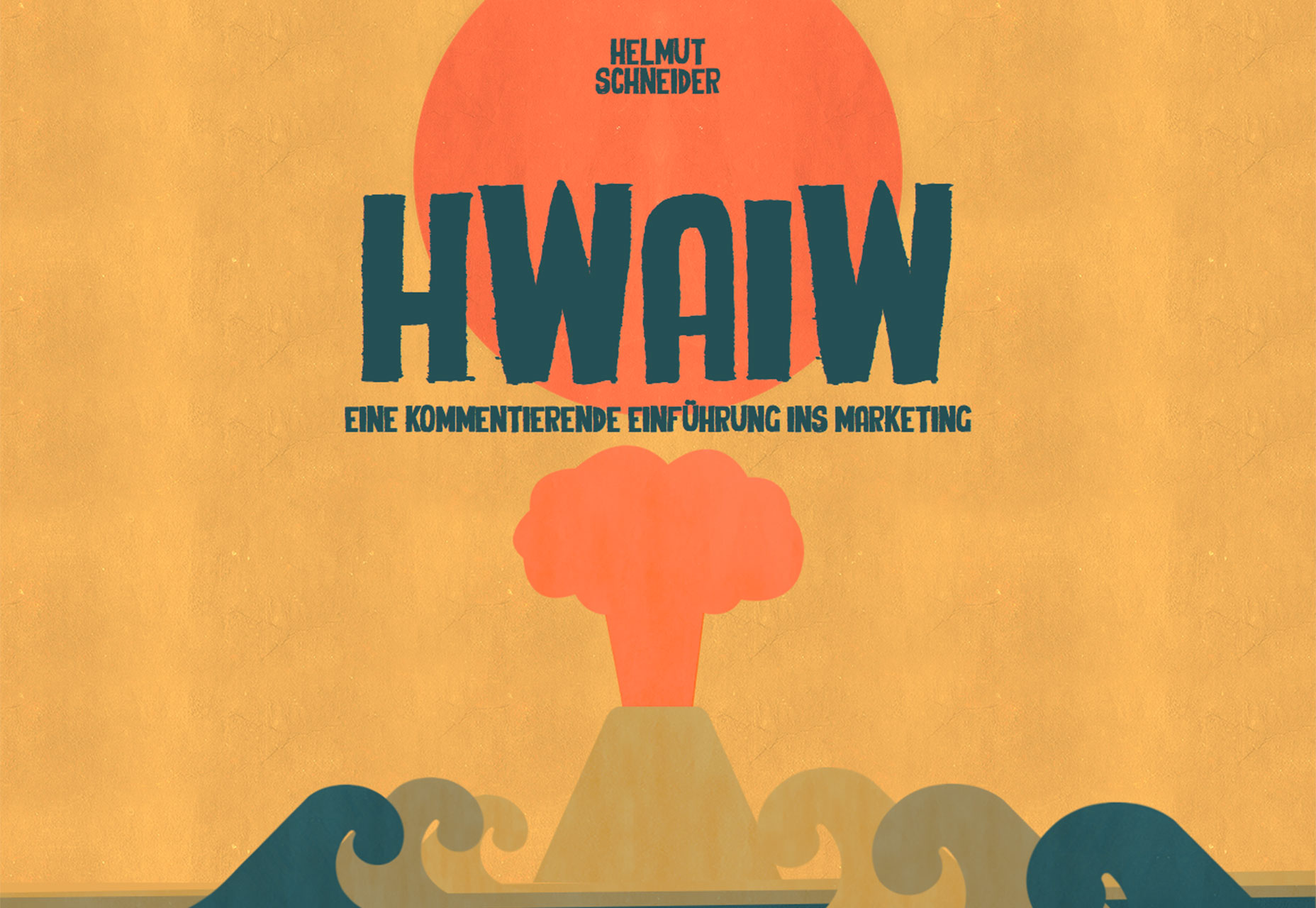
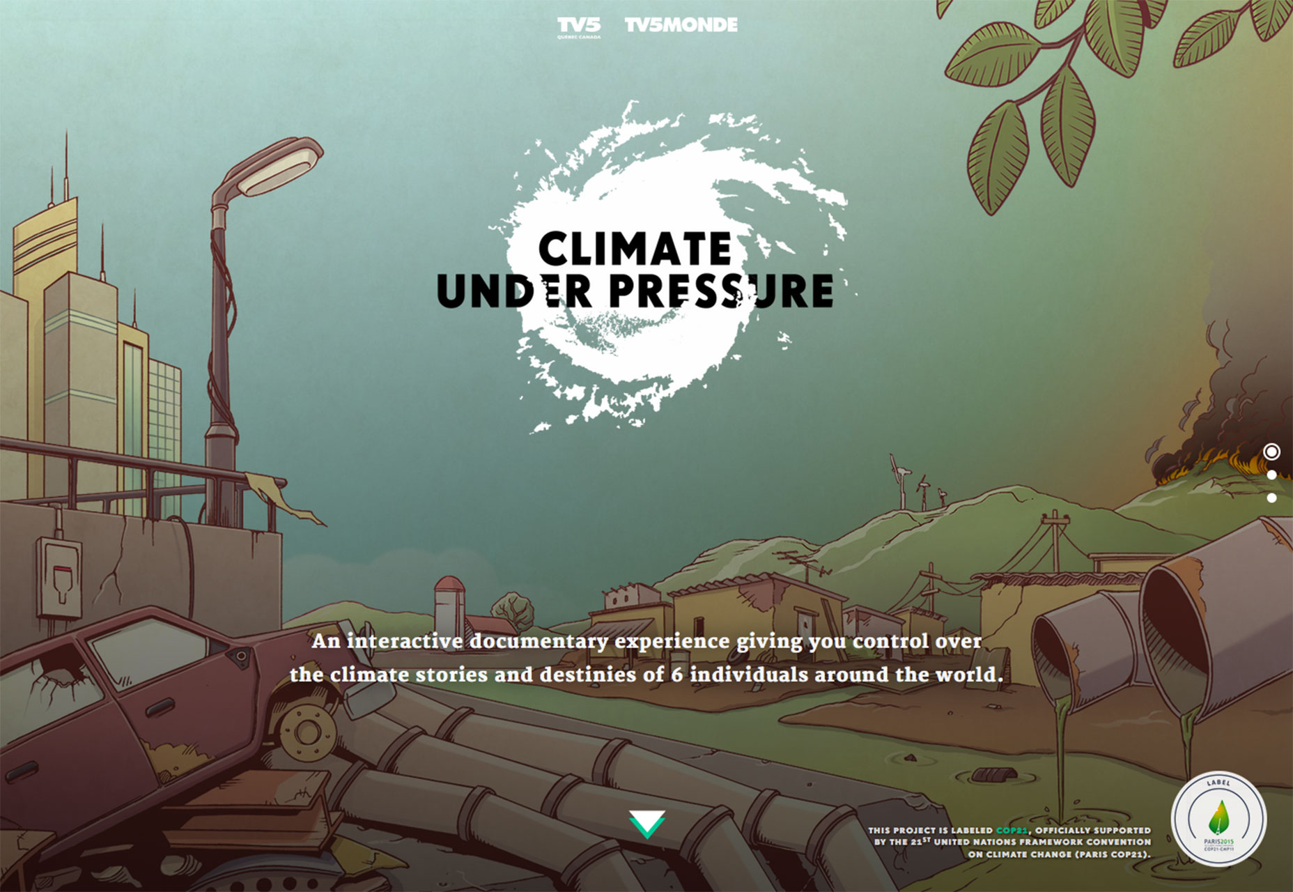
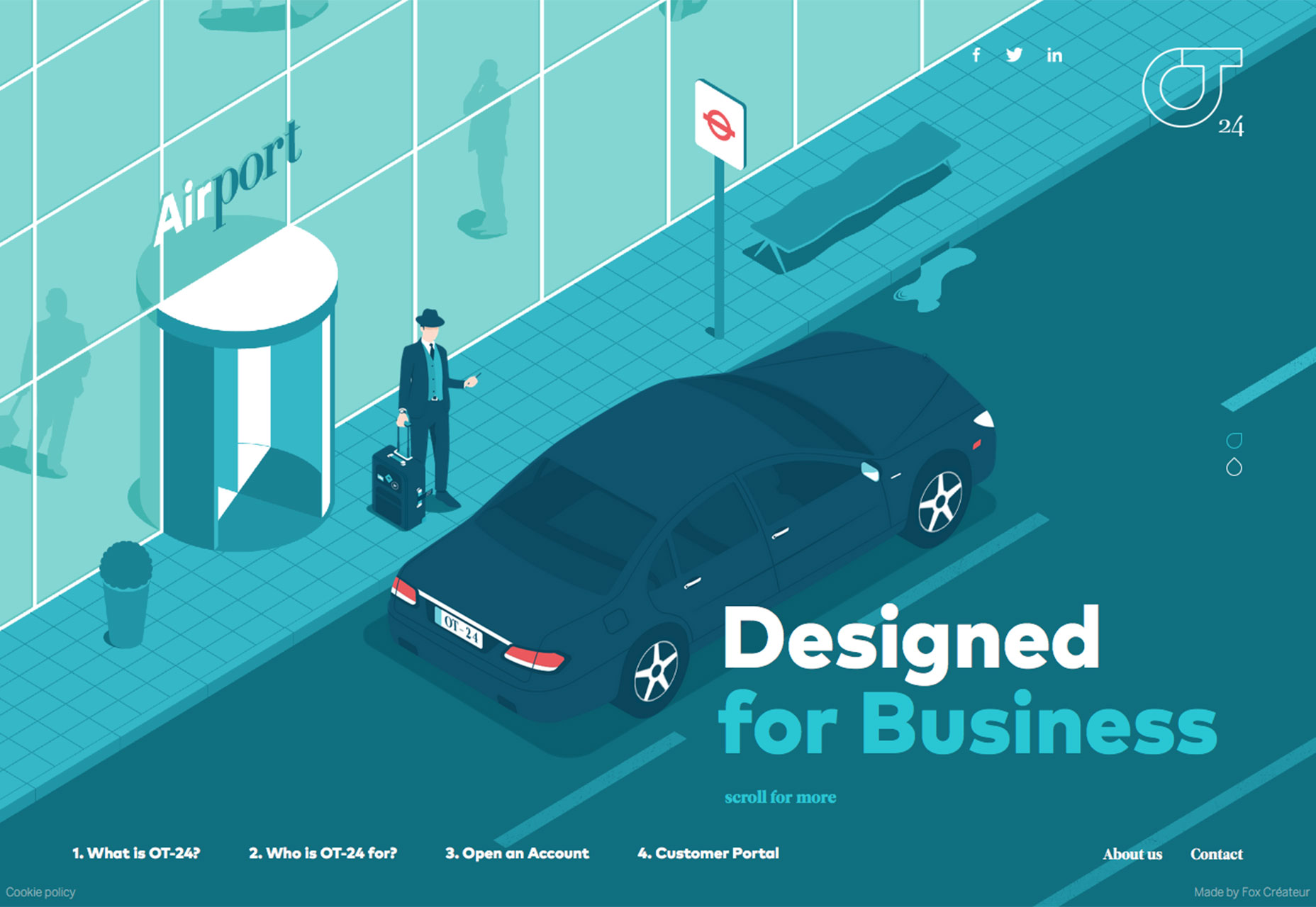
Illustrations are taking over the Web. Designers are creating websites with everything from full-screen illustrations to hand-drawn divots that are used throughout projects. It’s a trend that’s likely to keep growing because illustrations make a design feel custom (even if it’s not).
Here’s how to make the most of them in your design.
Website illustration 101
Illustrations are a versatile and fun way to create a custom website design. From hand drawn images, to elements, to lettering, everything about a fully-illustrated or sketched image, looks and feels one of a kind. That’s one of the reasons it is so popular.
But there are plenty of other reasons designers are jumping on the illustration trend:
- Illustrations allow users to picture themselves in the scene you are setting because it does not focus on actual other people.
- There’s an element of whimsy that can only be accomplished with a drawing.
- Illustrations can mesh reality and imagination for a design that is extraordinary.
- Customization is easy when you are drawing the art elements.
- Illustrations are often quite colorful and can help you take advantage of the big, bright color trend.
- The technique is usable even if you aren’t an illustrator thanks to design kits or packs that are full of illustrated parts that can be used throughout a project.
- Illustrations can take on many different moods or styles, from sketches to elaborate drawings to computer-generated graphics.
Hero-style illustrations
Because hero headers are big, this is one of the easiest places to see the illustration trend. It’s also being used for a large number of sites from portfolios to retail to app preview pages.
What’s nice about an illustrated hero image is that there’s enough room for a quite complex piece of artwork. Small details, shading and color and interactions all have room to breathe, making it easier for users to explore each element.
There are a few tricks to all this complex illustrating:
- The artwork has to be good. Users aren’t going to spend any time looking at an illustration that they don’t get or is just a sloppy mess. So take time and care with it.
- While the illustration may have depths of complexity, the overall message should be simple. Know what the image is supposed to say and make sure the elements contribute to the message.
- Work with a professional. Just because you can draw hearts on a napkin does not mean you are ready to draw a full-scale website illustration. This process takes time and planning to really work. (And it can be expensive, so make sure this is the right aesthetic before you dive in.)
Add simple animation
While a static drawing can have a lot of impact on its own, the Web is alive with movement these days. Pair an illustration with subtle animations or scroll effects to encourage users to click around.
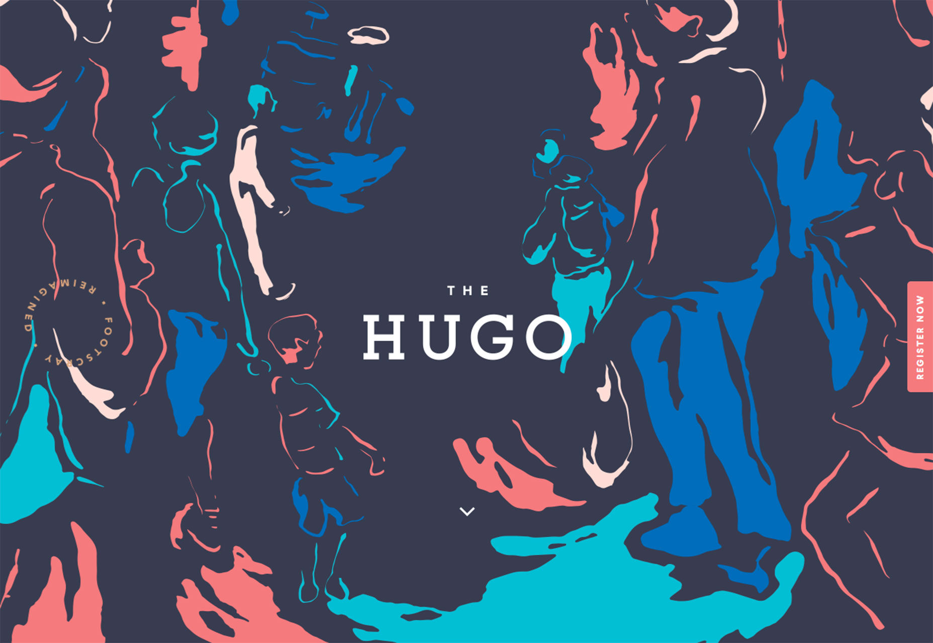
Small subtle movements, such as the spinning text in the website for The Hugo, helps draw the eye into the design. Small animations can also help users understand what actions to perform while visiting a site. This can be especially true for illustrations that include a lot of elements or have an overall “busy” design.
These little surprises can encourage site visitors to linger and look around as well. Hover animations are a particularly nice bonus for users that can serve both as a fun element and navigational tool.
Illustrated icons or UI elements
If an all-out illustrated website design is not your thing, consider a few illustrated icons or user interface elements. This is a simple way to ease into the trend. (And there are plenty of icon and UI kits out there that feature illustrated styles to help you get started.)
Illustrated elements can add a touch of whimsy to a site that might otherwise feel too formal. Something to try is an illustrated outline icon. This style is easy to drop in almost any design, works great with images and any color scheme, and provides a consistent visual theme from page to page.
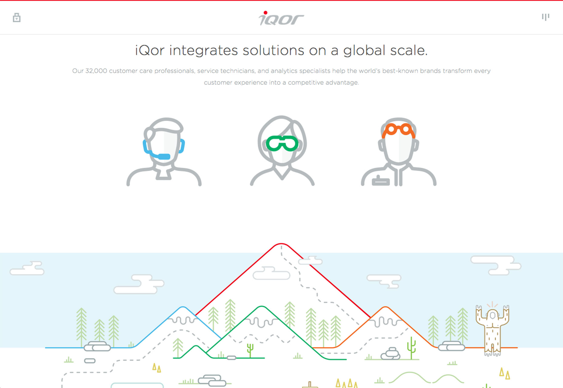
If you want to go a step beyond icons, think oversized UI elements. Iqor, uses illustrated buttons in larger sizes to guide users and make the site a little more fun. The illustrated style flows from page to page with large elements using the same three pops of color. The result is fun and consistent and just a little bit unexpected from the customer care business.
Hand-drawn lettering
Another big trend in website design is custom typography. Combine the concepts of illustration and lettering for a hand-drawn logo, main text block or typographic art element. This text-based visual can have a big impact (especially when it is oversized or used as the main art element in the design).
The trick here is moderation. With the hand-drawn lettering style, you’ll want to stick to a single block of text or text element for this effect. Multiple uses of a custom text block can be overwhelming for users and can impact readability. It’s important to make sure that words are still quite clear and that users have no trouble understanding the message.
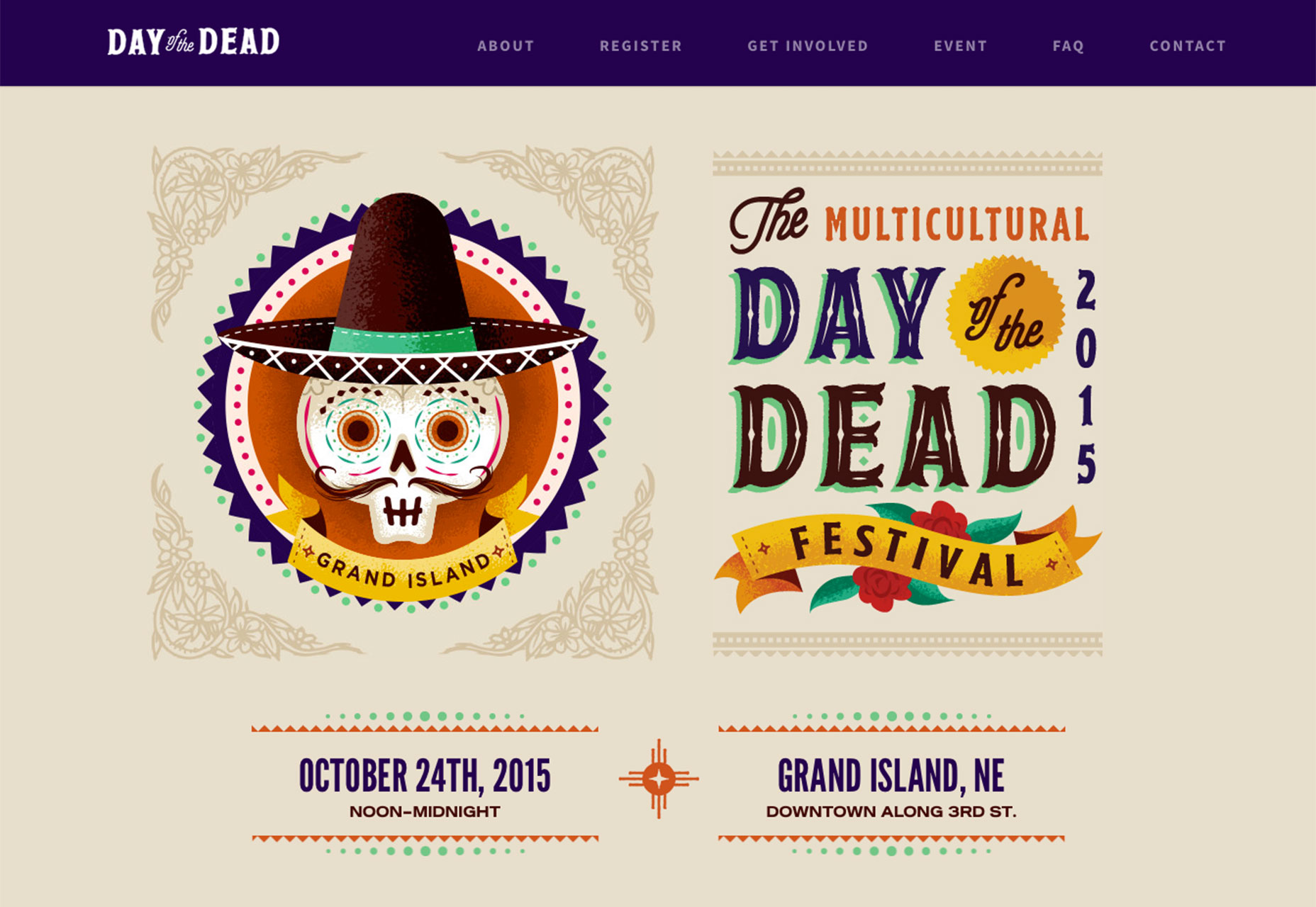
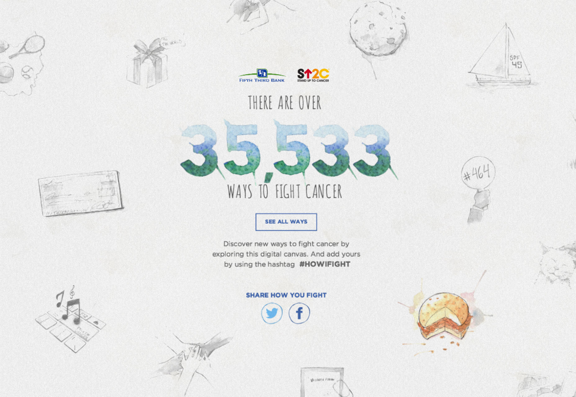
Both Day of the Dead and Stand Up to Cancer, do a great job with hand-lettering for a simple message. Day of the Dead uses other illustrations, easy sans serif typography and photos to help pull users through the rest of the site. The end result is fun and easy to follow. Stand up to Cancer uses more of a watercolor style that is all illustration based, but relies on more standard typefaces for readability. Both are good options for working with custom-style lettering.
Conclusion
While breaking into the world of illustration for website design projects might seem a little intimidating at first, it is something that many designers can do. From drawing by hand to having computer assistance or working with a kit, the options are pretty limitless.
It’s something to think about when it comes to those projects that demand doing something a little different. And it’s trendy enough that you might get asked about creating something in this style. So this is a good time to freshen up your sketching skills and think about ways an illustrated website design framework could work for you.
