Summary:
AI features must solve real problems, not be implemented for novelty. Unnecessary AI chatbots and features can harm rather than help users.
Generative AI has been bringing plenty of change over the past two years. While it’s substantially changing what and how we design, some things stay the same. One important UX principle is still true: Whether they’re AI-driven or not, products, features, and services must solve users’ problems.
Technology for Technology’s Sake
Implementing cool new technology for its own sake has rarely worked out well.
Historical Example: Flash Plugins
If you (like me) were around and online in the 1990s-2000s, you may remember when Flash plugins were all the rage.
(If you weren’t born or online then, Flash plugins were a technology that allowed designers to create interactive animations and multimedia web content, which were otherwise difficult to achieve at the time.)
Unfortunately, most of those Flash plugins were pretty awful. They tended to have notoriously bad usability — so much so that Jakob Nielsen wrote an article titled “Flash: 99% Bad.”
Products Need to Solve Problems
Why did Flash fail so often? Because many web designers were using that technology for its own sake, not because it was the right tool to address user needs and problems.
Unfortunately, we haven’t learned our lesson about chasing after shiny new technology. Today, we’re see lots of companies that rushed into implementing useless AI features and chatbots.
(We can’t say this loud enough: AI chat is not always the answer.)
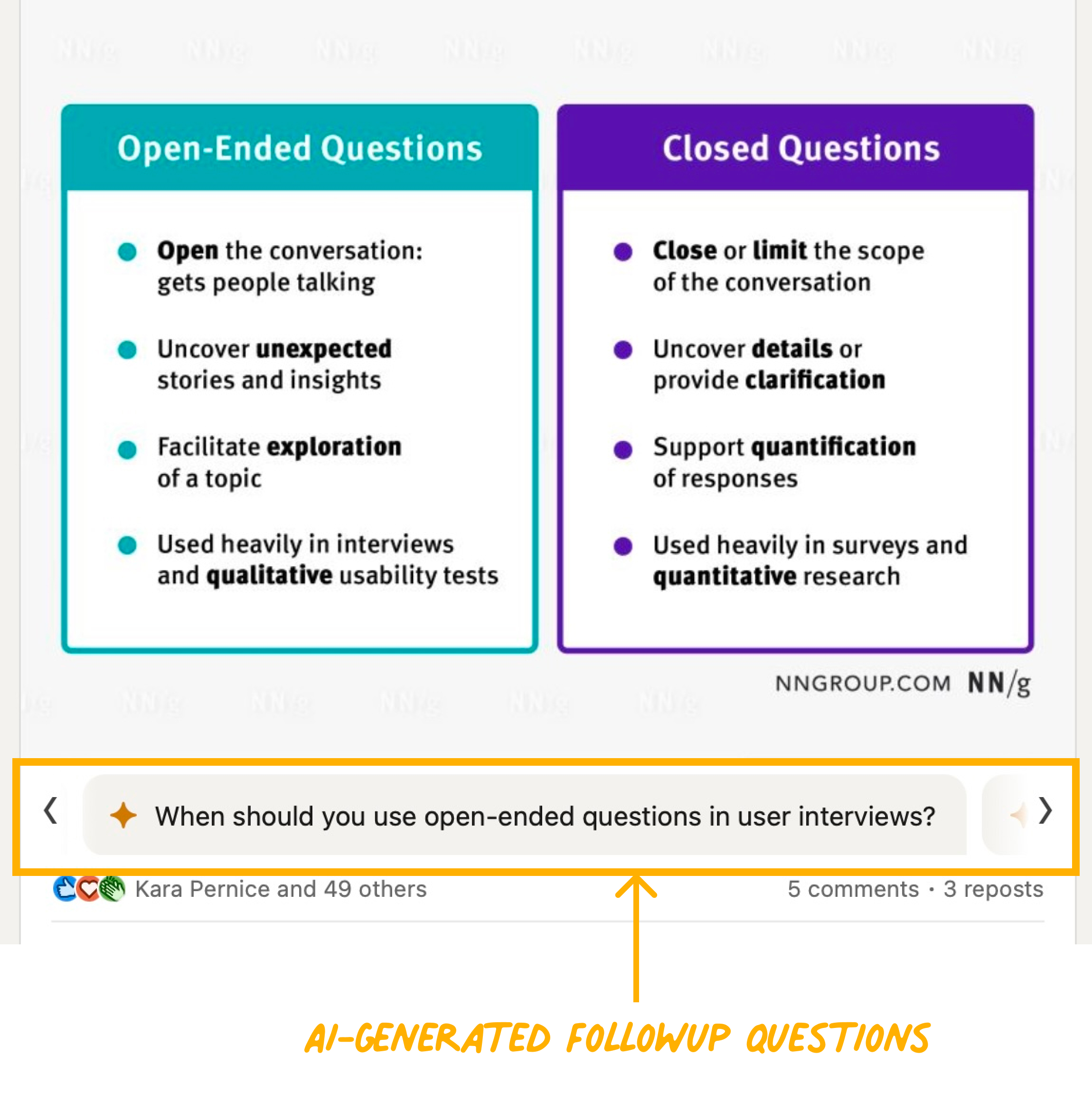
2023 was particularly rife with these rushed and poorly thought-out features, as companies scrambled to latch onto the AI craze. For example, LinkedIn loudly launched (and then quietly retired) AI-generated followup questions that appeared at the bottom of each post. These questions were often laughably generic, shallow, and unhelpful.

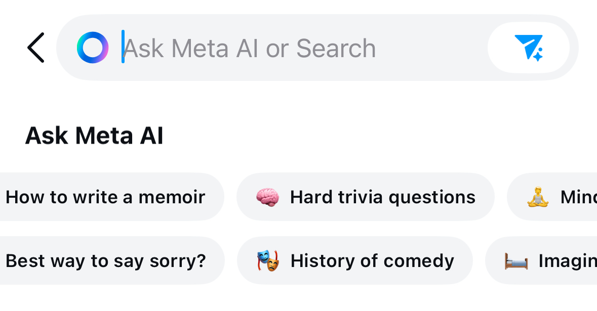
This year, Meta also infuriated its users by turning the Instagram search field into an AI chat.

I highly doubt that any actual Instagram user was sitting around and wishing that Instagram could tell them the best way to say sorry. The only thing worse than an unnecessary AI chat is an unnecessary AI chat that blocks a useful feature like search.
Let’s all remember a core tenet of our field: technology should serve people, not the other way around.
AI Features Must Solve Problems
Don’t get me wrong, AI has incredible potential to solve user pain points. Adobe Lightroom has many examples of well-designed AI features that make photo editing faster and less annoying.
For example, removing unwanted objects is much easier with AI assistance. Before AI, only the smallest and simplest items (like a piece of garbage on a beach) could be easily edited out of photos. Disguising or removing larger objects was substantially more challenging, especially if the rest of the image was complex and diverse.
Lightroom’s generative AI Remove feature works almost exactly like the legacy Remove feature did: users select the parameters for how they want the tool to behave and then paint over the area containing the object to be removed. (Compare this seamless interaction pattern to Instagram’s clunky chat/search hybrid, which violates existing mental models.)
That isn’t a sexy or flashy feature, but it makes a big difference to anyone who edits photos. (Similar features are rolling out to smartphones now as well, and they help all people who take photos, not just photographers.)
Communicating AI Value
It isn’t enough to create AI features that provide user value — we also need to communicate that value to users in a way that makes sense to them.
The world of AI is full of jargon that’s confusing even to us, people who work in tech. (That’s why we created a glossary of AI terms.) For general consumers outside our field, the terminology is baffling. It’s up to designers to figure out how to contextualize AI features and products so they actually seem useful.
Again, this isn’t new — for example, anyone who’s ever shopped for a new TV has had to confront a slew of technical terms.
As a Google One user, I was recently prompted to upgrade to its new AI-powered features. The promotion leaned heavily into technical jargon. It certainly assumed that the reader was already familiar with Gemini, Google’s AI chatbot. However, even as someone with decent AI literacy, I didn’t find any of the selling points enticing.

For example, one selling point read, Experience a 1-million token context window. Well, I know that’s an impressive quantity of tokens compared to other models (which is more than most consumers would know), but it still doesn’t help me envision how that would make a difference in my life.
When clicked, this selling point revealed a tooltip that read:
With our next-generation model, 1.5 Pro
Far more capable at logical reasoning, analysis, coding, and creative collaboration so you can get more done, faster.
The user benefit was hidden behind the tooltip! This design violates a key principle of writing persuasively: lead with benefits, follow with features. Simply flipping these points to lead with the benefit that AI provides for my work would be much more compelling.
AI Features Still Require Design
Generative AI is not magic. It doesn’t eliminate the need to conduct research and design thoughtfully. Even AI-powered products and features will still require a deep understanding of your users, their use cases, their unmet needs, and their mental models.
We still need to offer features that solve problems and deliver AI features as intuitively as possible. We still need to help people understand how to interact with our designs, even when they’re conversational.
There’s a significant cost to launching poorly considered, poorly designed AI features before they’re ready. Even one bad experience with an AI feature can make users avoid trying them again.