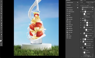
Color saturation in Photoshop is a subtle setting, but an important one. In this image, for example, the colour of the strawberries looks almost radioactive, and the bananas should be much paler.


Step 1
To remedy these issues, create a saturation check layer, which is a Selective Color adjustment layer right at the top of the layer stack.
Step 2
Now, go through all of the color channels and bring the blacks down to -100. Then bring the blacks of the white, gray, and black channels to 100. This is going to make your image look crazy!
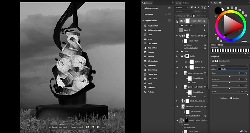
What you’re seeing is the saturation of your different elements. The more saturated an object, the brighter it looks. So the strawberries in this image, unsurprisingly, are the brightest and thus the most saturated thing on the canvas.
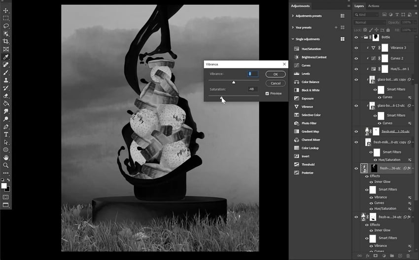
Step 3
Create and clip a Vibrance adjustment layer into our fruit group, and bring down the saturation so that the fruit is no longer radioactive.
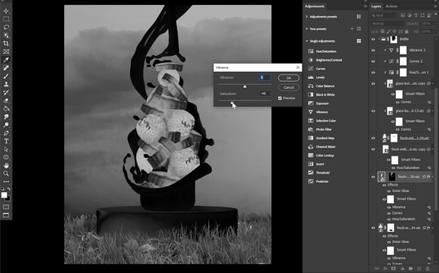
Step 4
The bigger splash of milk at the back of the image is also brighter than the others, so add a Vibrance adjustment to all of the milk splashes and start bringing them in line with each other.

Step 5
Both the sky and the grass seem quite oversaturated, so they also need to be toned down.