During the usability testing phase, gathering as much information as possible about how users understand designs/product is essential. The objectives of usability testing often differ across studies. They typically uncover product or service design issues, discover opportunities for enhancement, and gain insight into the target user’s behaviour and preferences [1].
Tools like Figma and Sketch are excellent for creating prototypes that can be used to test design aesthetics, flows, and simple interactions of your product. However, these low-fidelity prototypes fall short if your app requires more complex logic or interactions that follow a specific sequence or involve gestures.
Another significant reason why validating low-fidelity prototypes is difficult lies in determining whether the results originate from the prototype itself or the essence of the evaluated design concept [2].
Some of the main disadvantages of low-fidelity prototypes are:
- Limited error checking — Low-fidelity prototypes often cannot detect user errors thoroughly, making it challenging to identify potential issues early in the design process [3].
- Facilitator-driven — The effectiveness of low-fidelity prototypes largely depends on the skill and knowledge of the facilitator, which can sometimes result in biased outcomes [3].
- Navigational and flow limitations — Due to their simplistic nature, low-fidelity prototypes may not accurately represent the navigation and flow of an application, potentially leading to unforeseen challenges in the later stages of development [3].
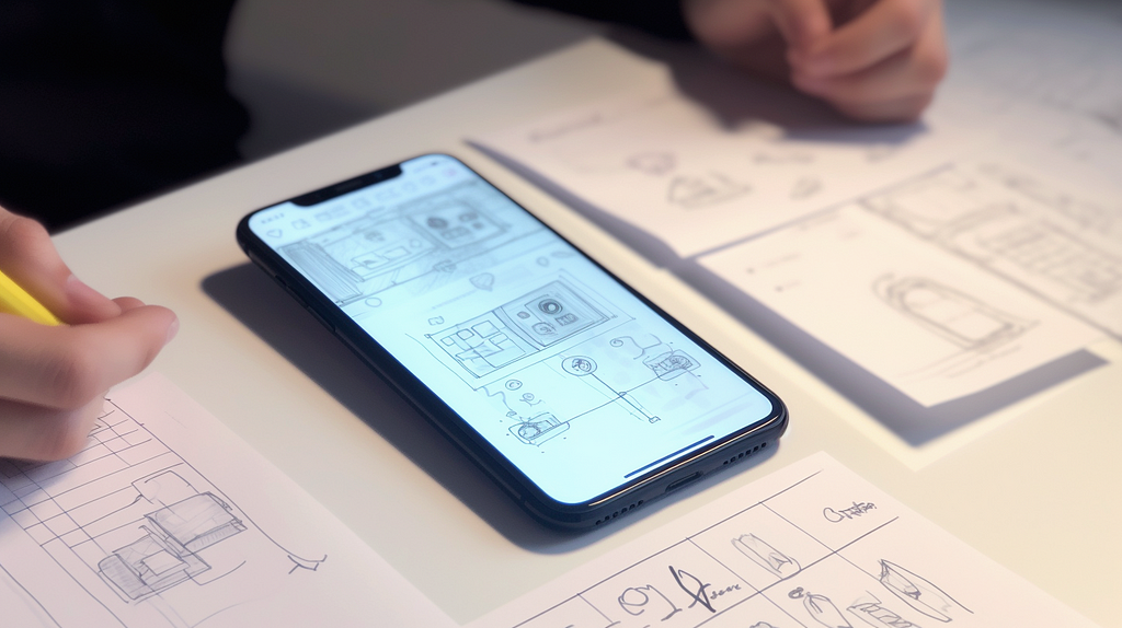
In contrast, high-fidelity tools provide the freedom to create prototypes of any complexity, allowing you to test even the most sophisticated designs [4]. They give you the power to bring your vision to life without over-explaining or obstructing the creative process. Using high-fidelity designs helps users to experience and engage with your prototype fully. This hands-on approach simplifies the user’s journey and allows you to bring your user much closer to the possible final product [2]. So, let your prototype speak for itself with the help of high-fidelity tools to deliver an immersive and satisfying user experience.
In the past, high-fidelity prototypes were less popular since developers constructed them directly in code. This led to extended build times, resistance from developers when asked to modify prototypes, and the fragile nature of high-fidelity prototypes due to even minor bugs potentially breaking the whole prototype [2].
Nowadays, with the help of modern design tools, building and updating high-fidelity prototypes has become a quick and efficient process that can be done within hours.
My go-to tool is ProtoPie, which I use for personal and work projects, especially when I need to test projects created in Figma. By importing the designs into ProtoPie and adding the necessary functionality, I conduct usability and A/B testing to gather user feedback and collect as much data as possible during the testing phases.
At my previous jobs, I used ProtoPie to develop high-fidelity prototypes to future-proof ideas before building them. By testing those prototypes with real customers, I could identify the most challenging aspects of the new features and refine them by adding possible functionality to the initial prototypes.
Below are some of the most crucial things that enable you to build a high-fidelity prototype in ProtoPie that feels like an app from the store.
Input Fields
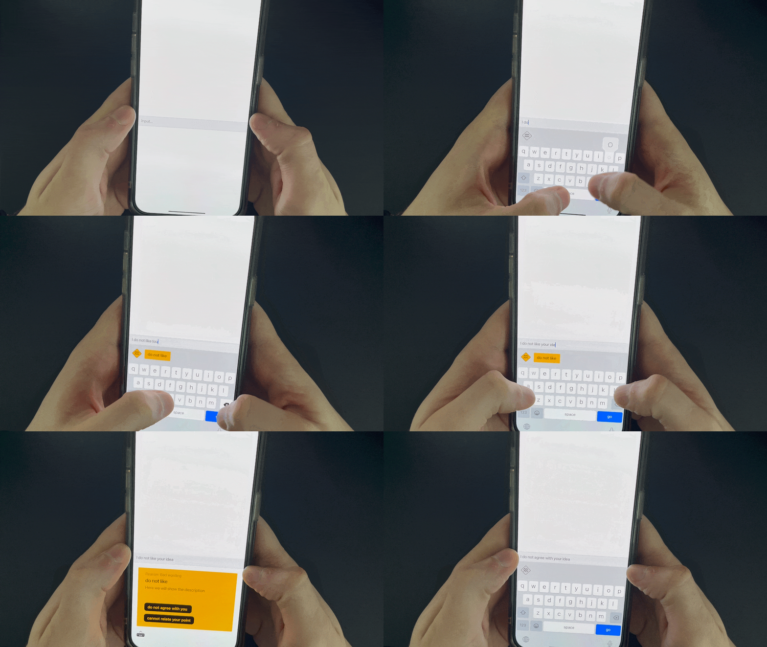
Text inputs are super important in user interactions, but many prototyping tools don’t handle them well. When you add input fields to your prototypes, you’re giving users an experience that feels a lot like a real app. This way, they get more engaged, and you can spot any issues that might have slipped by otherwise. By catching and fixing these problems early, you’ll make the app easier to use and more enjoyable for your users.
Using a prototyping tool with text input functionality helps you understand how users interact with your app and what they expect from it. This will help you better fine-tune design elements like input field size, placeholder text, and error messages, improve the position of fields to the keyboard and input validation. All these little details help elevate the overall experience and catch all issues even before investing time in development.
3D Touch (Long press with physical feedback)
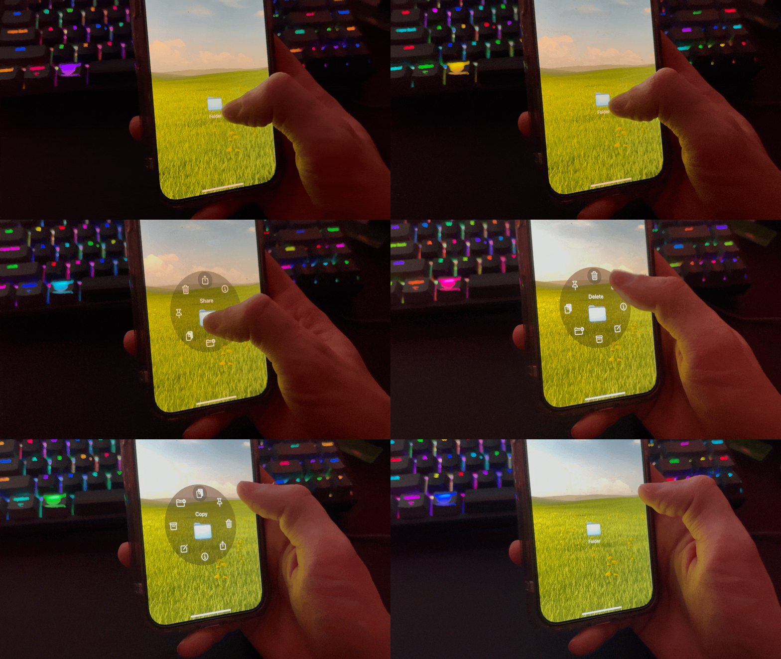
Another feature that can be prototyped and tested with users is 3D Touch or Long Press. 3D Touch feature plays a crucial role in app design, particularly when balancing functionality and aesthetics on compact screens or gesture-based apps. Experimenting with 3D Touch during the usability study stage can help you to validate its effectiveness in various contexts, such as button presses, notifications, or gesture-based interactions and the overall discoverability of features.
Influence user behaviour
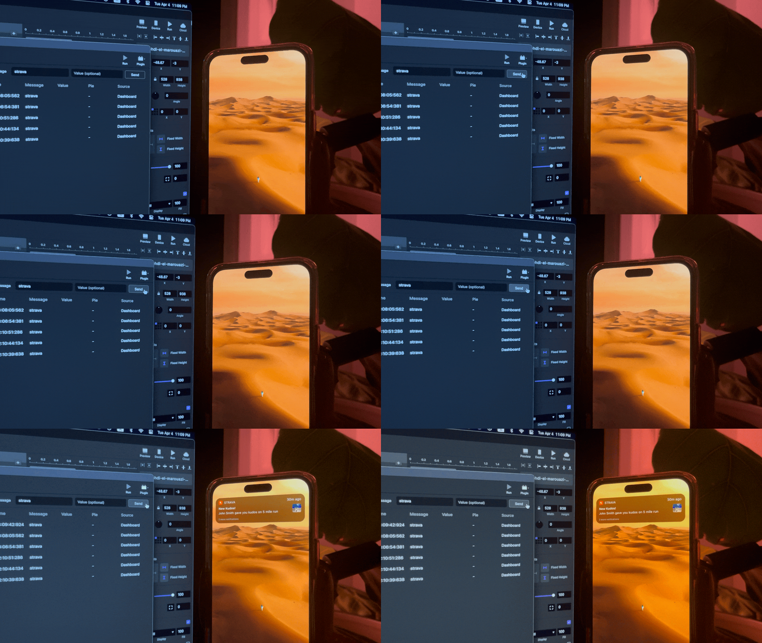
Another cool way to make your prototype feel like a real app is by using ProtoPie Connect. With this tool, you can test your design ideas faster and spot usability issues with things like messages, notifications, and onboarding guidance. It lets you, as an observer, send “messages” to the prototype when the user actively uses your app and trigger the behaviour you want to test. By watching how users react to unexpected real-life interactions, you can learn much about how to improve the design.
One fun thing you can do with ProtoPie Connect is to create a messenger experience that feels like you’re using WhatsApp. This way, you can see how users interact with your design in a more realistic setting. And guess what? You can even use ProtoPie Connect to hook your app up to IoT devices, but that’s a whole other story. Anyway, ProtoPie Connect is a handy tool for making your prototypes feel more like the real deal.
Sophisticated Interactions

When I was working on a business messenger app, the design required many gesture-based interactions like navigating through user profiles with custom widgets and managing daily messaging tasks efficiently. This functionality went beyond the capabilities of basic prototyping tools like Figma and Sketch, so I built a prototype of the messenger with several interactions to test.
With this prototype, I conducted usability testing with some users. This allowed me to gather feedback on how the swiping gesture performed in various contexts, such as managing large conversation threads, switching between messages and tasks, and repeatedly sending message templates.
Some usability issues discovered during the testing phase included occasional lag during swiping, difficulty distinguishing between tasks and conversations, and users accidentally tapping the “mark as read” action while navigating through the message history. These insights helped me refine the prototype and improve before building those features.
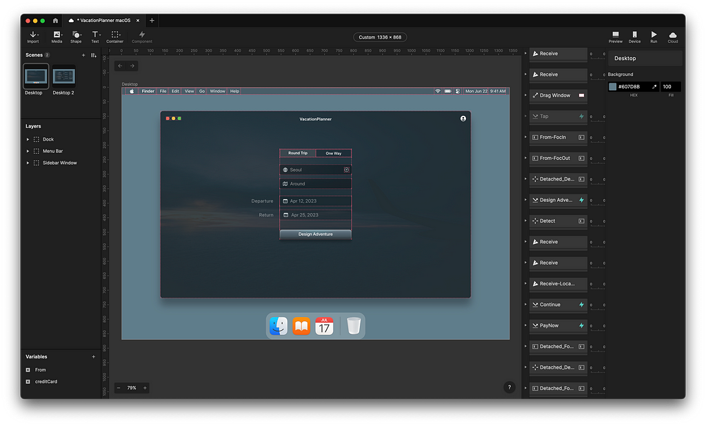
High-fidelity prototyping is a vital ingredient for facilitating user testing. It equips you with the ability to craft vivid, interactive prototypes that let users dive into the experience of the almost-finished product. These tools yield priceless insights into user behaviour and preferences that help to fine-tune designs and achieve optimal usability and satisfaction. Adopting high-fidelity prototyping enables you to tackle potential issues at the onset of the development process and deliver an intuitive user experience. So, when it comes to shaping the product, high-fidelity prototyping is your trusted partner, granting you the power to construct an experience that connects with users and surpasses their expectations.
Resources
[1] Moran, Kate. “Usability Testing 101.” _Nielsen Norman Group_, 1 Dec. 2019, www.nngroup.com/articles/usability-testing-101/.
[2] van Harmelen, M. Exploratory user interface design using scenarios and prototypes. In Sutcliffe A. and Macaulay L. (Eds.). People and Computers V: Proceedings of the Fifth Conference of the British Computer Society (Cambridge, Cambridge University Press 1989).
[3] Rudd, Jim, et al. “Low vs. High-Fidelity Prototyping Debate.” _Interactions_, vol. 3, no. 1, Jan. 1996, pp. 76–85. _DOI.org, https://doi.org/10.1145/223500.223514.
[4] Wong, Y.Y. (1992). Rough and Ready Prototypes: Lessons from Graphic Design. Short Papers Proceedings of CHI ’92, Monterey, CA, 83–84.
How high-fidelity prototypes can enhance user testing was originally published in UX Collective on Medium, where people are continuing the conversation by highlighting and responding to this story.