
Shape design is not really a new concept. It is a method which uses a shape (or shapes) as the most endearing element in the design, against all other elements which are present. To point it out, it is not just uses standard shapes against a basic background. It is using lines, curves, and symmetry to create flow and harmony in a design. This concept is rather important especially when designing UX.
Designers usually ask themselves multiple questions about this. Does the curve make the design too awkward? Is the shape creating a ‘too repetitive’ design element? Are the curves clean enough? Are the curves TOO clean? Even the slightest awkward curve or straight line could make an entire difference to design.
Using shapes in design is an age-old technique which is used by graphic designers all over the world. It is as old as time, that even older designers know how to utilize shape design in their work.
How can we use Shape design?
Shapes to create flow and harmony
Flow and harmony are among the biggest design factors considered in UX. There are many considerations, in fact. How far away is the information from the button? Is the button too small or too big? Would the shape of the button be appropriate for this design? Are the images or information placed in too awkward positions? Flow and harmony can be easily controlled by shapes. Shapes don’t have to be drastically changed and manipulated to create an impressive effect on design. In fact, even simple changes can make all the difference.
Here are great examples from Dorian Iten’s website on how simple changes in shape, lines, and curves create so much difference in design:
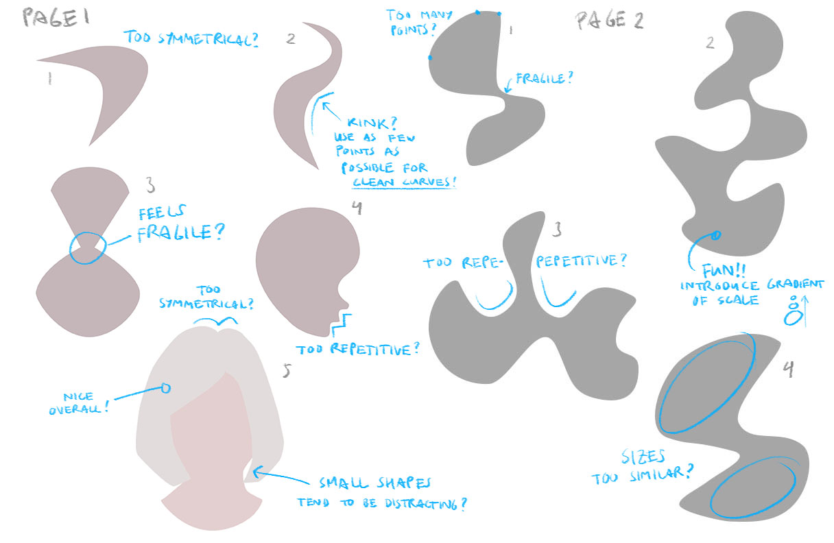
Conceptual Product Image Source: Dorian Iten
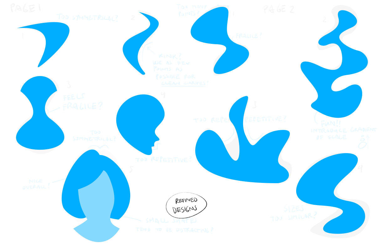
Final Product Image Source: Dorian Iten
Shapes as Backgrounds
In the advent of abstract design, shapes play a big role in creating backgrounds. Gone are the days when backgrounds are mere solid colors. Geometric designs are very trendy in UX and website design nowadays. It gives a very simplistic approach to designing, but leads to very impressive end-products. However, shape placement in backgrounds are essential to not make it too overwhelming.
Here are some examples when shapes are used as backgrounds:

Image by Денис Марчук from Pixabay
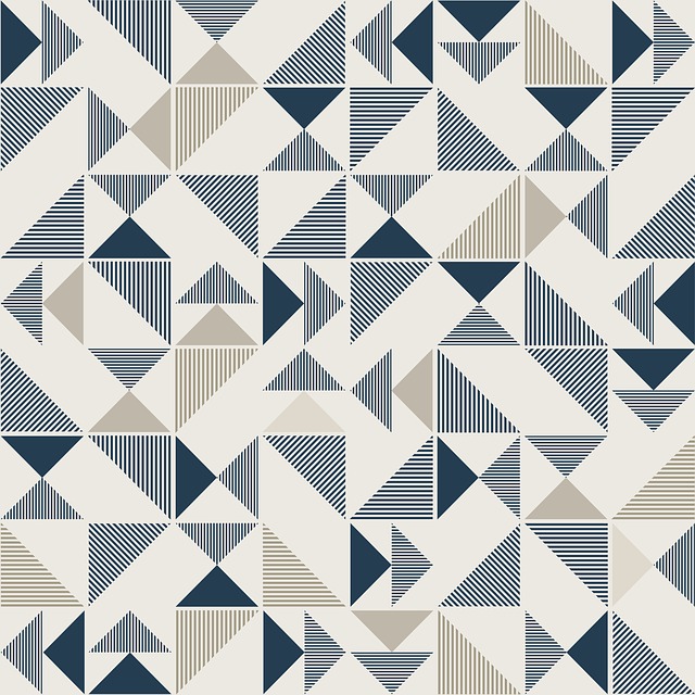
Image by colli13designs from Pixabay
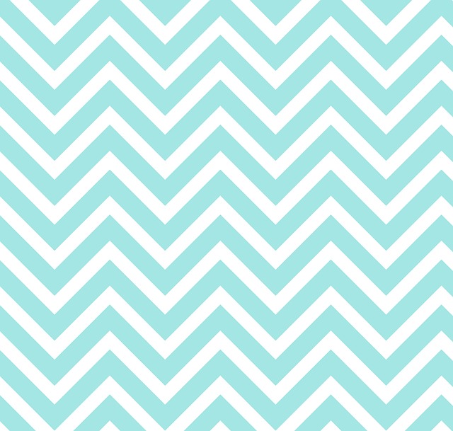
Image by No-longer-here from Pixabay
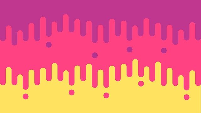
Image by DavidRockDesign from Pixabay
Also, since minimalism is such a trend nowadays, shapes in backgrounds are a great way to introduce subtle elements in the design.
Basic shapes in illustrations
Just as how this author has described it, it is very common to see organic elements designed from basic shapes. For instance, using circles and ovals for clouds. Or using triangles and rectangles for mountains. This kind of illustration technique creates simplistic, cartoon-like end results. These design techniques are on trend nowadays.
Here are some examples:
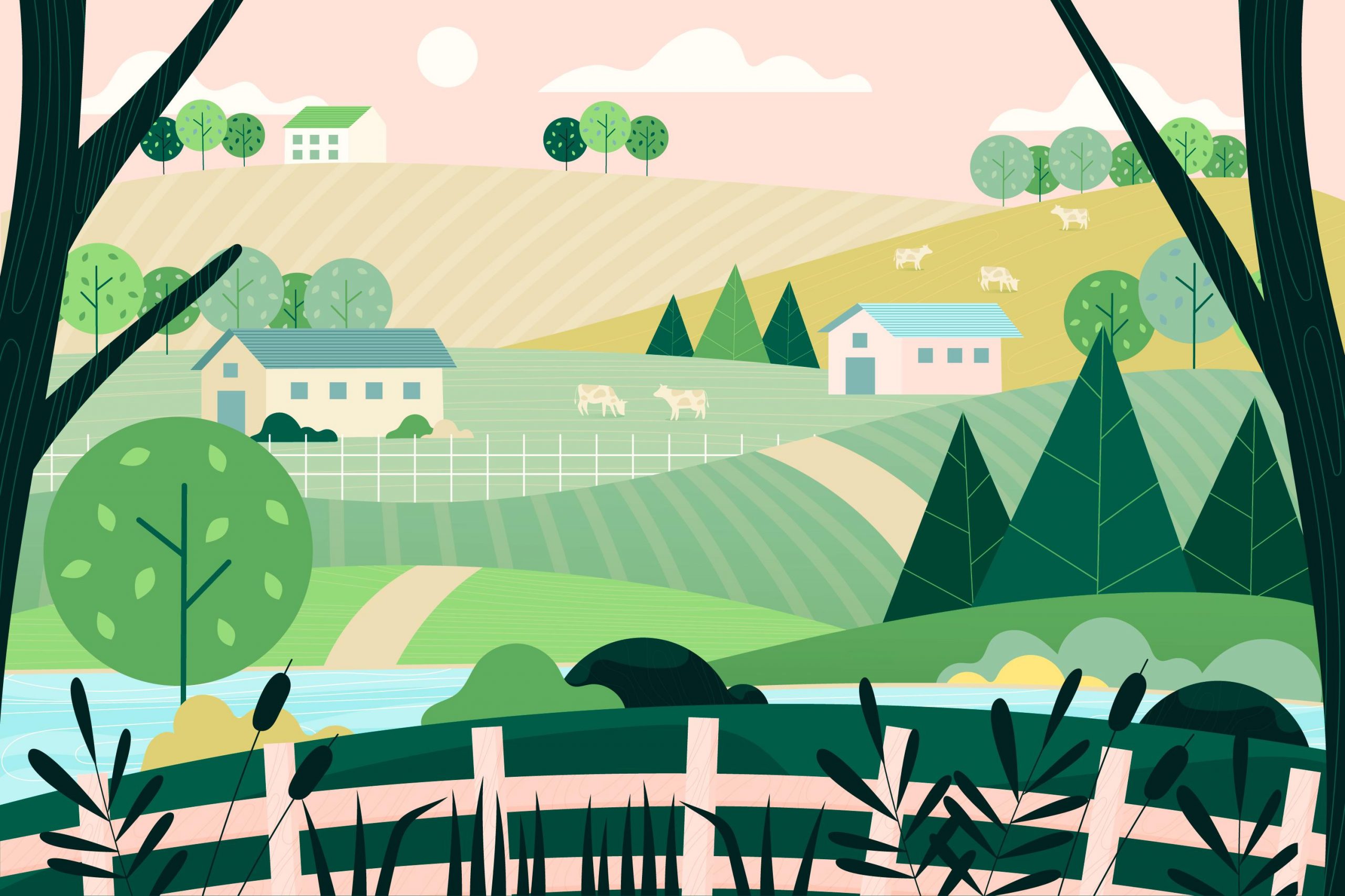
Image Source: Pikisuperstar

Image by Syaibatul Hamdi from Pixabay
Shapes for texture
In the same way that shapes are great to use as backgrounds, these are also great to create texture.
Here are some great examples where shapes are used to create impressive texture:

Image by Pexels from Pixabay
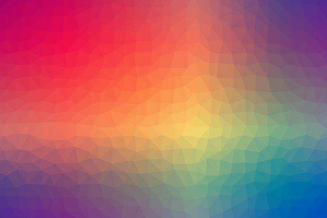
Image by Денис Марчук from Pixabay
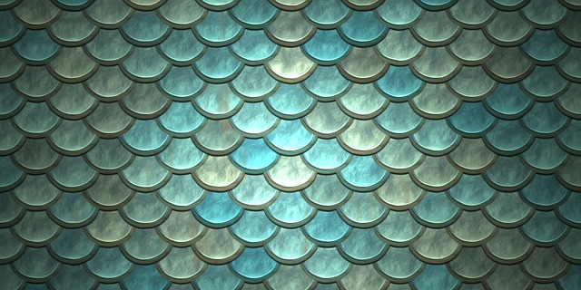
Image by Pete Linforth from Pixabay
There are many ways to use shape design in UX. The idea is very vast and UX designers can easily take on any method to experiment. Shape design could be used not only for design elements in websites or mobile apps. Instead, shape design is a consideration that could be used to create flow and harmony in design. It is not just a measure of how creative a designer is, but it is also a measure of how well we can use simple elements (aka shapes) to create impressive UX designs.
Also read: 24 Brilliant Shopify Store Designs
Author: Sangalang Kristine
Civil Engineer by profession, Writer by passion. Serving readers since 2014 on different niches like Science, Current Events, Tech, and Travel.