Logos are not just a simple image that refers to a certain brand or business. It is much more than that. Logos are the face of a brand. It encompasses the history, mission, and vision of a company. Creating a logo might sound very interesting, but it is a task that requires a lot of patience and dedication.
Before creating a logo for your business or brand, you need to have an in-depth insight into the basic points that should be taken care of. First, you need to understand the importance of a logo.
Why Logo Is So Important?
The logo is a combination of text, shapes, and images. It is the most compact way to showcase your brand image and portray your brand message. It is the first step of creating engagements with the audiences.
There are multiple reasons why a logo is so much important for a business. Here is a brief point-out of the matter.
- It grabs the audience attention
- Creates the first impression of your brand
- It portrays the unique identity for your brand
- Segregates you from the crowd
- Carries customer loyalty
These are some of the most basic reasons behind the importance of a logo for any business.
Just as a personalized website gives your business an authentic identity, a logo gives it the face. Creating an attractive website with a stunning logo is not that tough anymore. You can check Shopify for both purposes.
Now comes to the logo creation. There are several essential points to keep in mind while you are creating a logo. These points will help you to create a structure on which the foundation of creating a great logo stands.
Let’s take a look at some of the most important points to look out for while designing a logo.
10 Most Important Rules to Follow
1. Pen Down Your Thoughts
It might sound a little old-fashioned, but it undoubtedly very much effective. Whatever thought you have regarding designing your logo, first you start to sketch it on a paper. It will produce a great outline for your design.
These drafts will help you to analyze well and to come up with better ideas. This process is a bit time consuming, but definitely worthy.
2. Express Yourself

While designing your logo, the first responsibility you have is that the logo should describe the brand or the business expressively. It should create a unique identity as well as portray the company image.
The logo should carry the history, mission, vision of the company and it should connect to people well and inspire or influence them in a way.
One of the most famous entrepreneurs of all time, Mr. Steve Jobs, when he invented Apple, came up with an interesting logo of an apple that had a bite.
According to many, this symbolizes the apple that led Isaac Newton to seek for gravity and the bite on it symbolizes the urge of consumption of knowledge.
This was an example for, a logo is not just an image, but has a great depth as well.
3. Keep It Simple

Though you should design a logo in such a way that it expresses your brand completely, but not create one that looks very complex or messy. It will even confuse people.
Keep your logo design simple and attractive. So that audiences can understand it and connect to it well. A simpler logo has a better effect on audience attention than a complex one.
As an example, you can look at one of the best e-commerce platform, Flipkart. They came up with a logo with bright colors and a simple design that attracts the audience.
4. Sizes

Size is a great factor behind the design of a logo. Depending upon the kind of the purpose, the logo can be shown in different places.
It might be held on a huge banner or as a website logo or even on small devices like mobiles. So, make sure to design your logo in such a way that looks good and readable across all devices.
5. Color Consideration
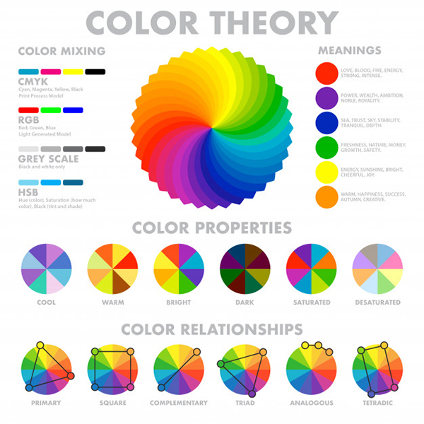
Color is an essential factor when creating a logo. Color not only carries an in-depth message for your brand but it should be eye-soothing for the audiences as well.
Colors do have inner meanings; colors portray emotions as well. So, whenever you are creating a logo, you should choose colors as per your needs as well as the inner message.
6. Clear Your Statement

It is the best way to connect to your audiences if you can make a statement through your logo. Make use of bold yet eye-soothing colors, tricky yet attractive design ideas, and shapes or images that will speak for themselves.
7. Keep Balance

Keeping a good balance and symmetry in your logo is very important. Scientifically our eyes love symmetric images.
Suppose your logo has a text, in which one letter is too big and the next one is too small, then it will create an imbalance to the audience’s eyes and can have a reverse impact. Avoid these types of mistakes and design your logo symmetric with balanced width, height, lines, weight, etc.
8. Choose Fonts Wisely
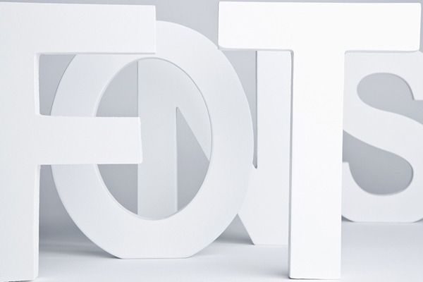
Fonts matter a lot. Fonts carry a message. Choose your fonts carefully while designing a logo. It will add up a lot to your design.
Don’t go for a too uncommon or complex font in order to create an attractive logo. Keep it simple and sober. Keep the purposes in mind as well. If you are creating a logo for say a hospital website, then using fonts that look funky would be a big mistake.
9. 3-D Looks

This is a great trend nowadays. You can see various logos that have a 3-D effect. It looks not only good but 3-D visuals catch the audience’s attention more.
So, you can definitely try this one out as well. But make sure the design shouldn’t go too complex.
10. Maintain Originality

This point might sound very normal, but it is as important as others and even more in some cases. This has to be added up to this list.
You may copy someone else’s logo and make a slight change of colors, fonts, or something more, but it won’t do good for your brand. So, be original, and come up with your own ideas.
Conclusion
The above-mentioned points are the most basic yet effective tips to take care of. Hope this helps you to create a great logo for your purpose.
