My recent book Pro CSS3 Animation walked the reader through a simple version of a 3D flip image gallery. After publication, I wanted to take it further: thus, this article.
The UI challenge addressed here is the same focused on in many of my other CSS 3Dworks, such as the Origami UI: we live in a world of increasingly diversified screens, with smaller sizes rapidly becoming the norm. That demands a reconsideration of space: rather than placing captions below photographs, we might want to place them behind the image, to be revealed with a mouseover or tap action.
Creating The Basic Gallery
The markup for the image flip gallery couldn’t be much simpler:
<div class="flip-3d">
<figure>
<img src="yacht.jpg" alt="">
<figcaption>Yacht</figcaption>
</figure>
</div>
<div class="flip-3d">
<figure>
<img src="bee.jpg" alt="">
<figcaption>Bee</figcaption>
</figure>
</div>
<div class="flip-3d">
<figure>
<img src="queenstown.jpg" alt="">
<figcaption>Queens-town</figcaption>
</figure>
</div>
Note the outer divfor each figure, which will be used to create a 3D context for the gallery content.
To gain the 3D effect shown in the example, we need to do three things:
- Make each
figcaptioncover the same area as the responsive image it describes. - Reverse that caption, placing it on the other side of the image.
- Create a dropshadow that will move with the image, without adding any extra markup.
The Initial CSS
First, the basics: we need to manipulate the figure elements in 3D space. We achieve that by placing a perspective property on the figure’s common parent element:
div.flip-3d {
perspective: 1200px; width: 30%; float: left;
}
(Note that the CSS code is shown without any vendor prefixes in order to save space and preserve clarity).
Next, place the scalable figure elements beside each other with float and make the images within them responsive. To keep the transition of the figure elements as efficient as possible, we define in advance that we will only be tracking the element’s transformation. We also add the frequently-forgotten transform-style property, which will come in handy later.
div.flip-3d figure {
position: relative;
transform-style: preserve-3d;
transition: 1s transform;
font-size: 1.6rem;
}
div.flip-3d figure img {
width: 100%; height: auto;
}
(I’ve added an @media query to the code to simplify the gallery on smaller displays and narrowed browser windows, which is not shown here).
Positioning The Captions
The captions are placed perfectly on top of the images by using position: absolute(possible only because the figure elements are position: relative). Using half a turn (i.e. a 180° rotation) and a tiny translate value places the captions “behind” the images, so long as the transform-style property is applied correctly to the figure element. (You might want to take a look at what happens when you remove the property).
div.flip-3d figure figcaption {
position: absolute;
width: 100%; height: 100%; top: 0;
transform: rotateY(.5turn) translateZ(1px);
background: rgba(255,255,255,0.9);
text-align: center;
padding-top: 45%;
opacity: 0.6;
transition: 1s .5s opacity;
}
The text is placed in the center of the caption using a small cheat, and provided with a white background that is half-transparent. It’s completely possible to create a completely opaque figcaption, turning the image into a 3d postcard, but I prefer the visual effect of fading in the background. Note that this fade-in will be delayed by a half second so that it starts halfway through the rotation of the figure, which we have already set to last one second.
Setting The Rotations
Now that the gallery has been set up, creating the animations is simplicity itself:
div.flip-3d:hover figure { transform: rotateY(.5turn); }
div.flip-3d:hover figure figcaption { opacity: 1; }
Adding The Shadows
I was intrigued by the possibility of adding shadows below the images, a goal that was complicated by three issues:
- The shadows should be created without adding any extra markup;
- They had to be wide and thin: in other words, not the actual size or shape of the image – eliminating
box-shadowanddrop-shadow. - The shadows had to rotate in their own plane while moving with the image.
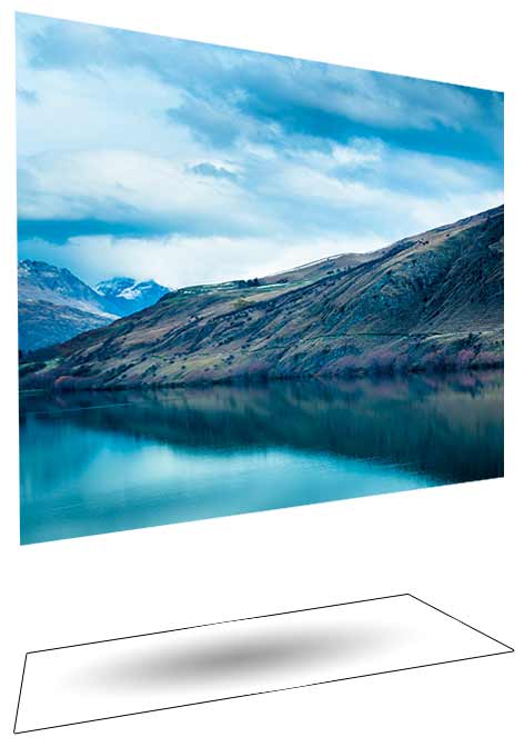
The solution I came up with was to use generated content filled with a radial gradient, creating the impression of a shadow “linked” to its originating element:
div.flip-3d figure:after {
content: " "; display: block;
height: 8vw; width: 100%;
transform: rotateX(90deg);
background-image: radial-gradient(ellipse closest-side, rgba(0, 0, 0, 0.05) 0%, rgba(0, 0, 0, 0) 100%);
}
It’s probably easiest to see the final effect in an illustration from a different angle:

That’s it! I hope that this might provide a kernel of inspiration for your own uses of CSS 3D.
