Minimalism is the hype not just on posters and billboards but in the web as well. More and more people are finally coming to realize that “less is more”. In retrospect, the popularity of minimalist design had something to do with the onset popularity of internet capable devices.
When Apple mashed a music player, phone, and computer all into one device, people were so excited that they can surf the web on-the-go. It was a new thing in 2007, but now surfing on mobile devices is ubiquitous. According to Google’s findings, 69 percent of US mobile users access the internet on their phones daily. The only problem was, people had a hard time surfing the web in their tiny screens. Hello minimalist design!
Welcome To The Reign of The Minimalists
The rise of minimalist design has been directly proportional to the increased usage of internet access through mobiles. And that percentage is always on the rise, according to Google. Even web design tools are promoting simple design, that’s where Twitter Bootstrap is heading. That’s where we’re willing to go as well so here are some trends in minimalist web design:
1. Grid Based Design
Responsive GS – A minimal responsive grid system
No more embellishments. Bottom line is that grid based designs are clean. Clients love grid based designs because they project organized content. This may mean less get ups regarding design, but it is an effective reach towards usability. In the end, that is the goal – easy website navigation to turn prospect customers into buyers.
Related
- Design sites using the Responsive Grid System– .net magazine
- Six Rule-Breaking Websites That Defy The Design Grid – Crazzyegg Blog
2. Creative Typography
Typography is the foundation of a good web design. It is the only design aspect that conveys a message as well. But, there are a few typography blunders to watch out for. First, do not put too much different typography. It is important to maintain consistency in the tone and theme of the website. Keep the different fonts to a few to get a unified look. Next is readability. Hand-written typography is gaining some reps and they look absolutely cool and organic. Be cautious though, because you shouldn’t sacrifice readability for design.
3. Whitespace, with Bold Color Accents
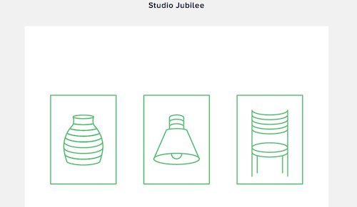
Great use of whitespace by Studio Jubilee
Minimalists have takes simplicity to its core – black and white. Well not rigid black & white, but with a bright color accent. That is to say, 95% black & white, and 5% color. It’s the new design classic that works because it emphasizes what needs to be noticed. Plus, it makes the designer’s job simpler because there is less fuss to be created and more content to be highlighted. Another crucial aspect to note is whitespace. The amount of whitespace must be gargantuan to give the website room to breathe. Adapt this mindset: just because there is room for “one more thing” doesn’t necessarily mean there needs to be something there.
Related
- Whitespace in Web Design: What It Is and Why You Should Use It – Treehouse Blog
- Negative Space Logos with Examples and Analysis – Desizn Tech
- A Look Into The Effective Use Of Whitespace In Design – Designwoop
4. Hierarchy: Direct Attention on The Main Element
Websites need an organized hierarchy. What should the most attention-grabbing aspect be? How should the site lead the visitors to the call to action pitch? Should the company logo be the main face of the website or should it be in type? There must be a simple flow of elements that is effective in converting visitors to buyers. Messages, graphic, themes should be simple and very few but very powerful in asserting the brand of the company and the message that must be conveyed.
Related
- Siiimple.com – Minimal web design gallery
- Minimal Sites
Simplicity will have its rule in 2013. This will be a fad among web designers but there will be clients who would choose otherwise. These clients would be those who want to build “ad heavy” sites. There are many who are trying to make money off of Google Ads with tons of advertisements on their sites. These types of clients will certainly not go for the minimalist trend.
Bottom line: minimalist works. There is no trade-off with going simple. It’s actually a trade-up. Simple design is effective only when executed correctly. The widespread fallacy is that “simple is easy” – it’s not! It requires a mature designer to make simple work.


