Creating style guides is fast becoming common practise for web designers, especially when dealing with content heavy sites. With a website style guide, designers are able to set and maintain a look and feel by creating a set of rules which the design follows. The process becomes flexible, easily updateable and consistent.
During this tutorial I’m going to demonstrate how you can implement a style guide in your own site or project.
What Exactly is a Style Guide?
Style guides have been around for quite a while now. Even before the days of the web, companies often needed to create consistent and unified visuals for their brand. This was and still is achieved through the use of brand or identity guidelines. Such guidelines are usually set out in a document and can contain information such as:
- Brand colors
- Typography, such as fonts, sizes, leading etc.
- Logo positioning and how to use in different situations ie. print layout can differ from web layout
- Tone of voice
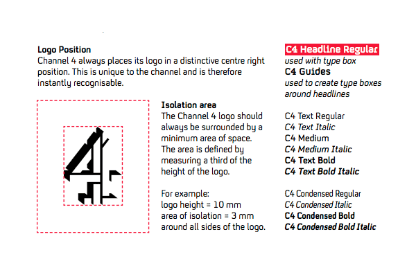
Exactly what is contained in a brand/identity guide is dependant on the company. It can be anything from a single page document, right through to a massively comprehensive document such as the English TV channel, Channel 4′s style guide.
Web style guides work in a similar way to brand/identity guidelines, the only difference being that you’re not creating an identity for a brand, but rather an identity for a website. This time the brand is the website and, as such, a style guide is set out to create consistency and unity within a website’s design.
When Might I Use a Style Guide?
I’m not saying that a style guide should be written for every website that you’re involved with, but sometimes it does make a lot of sense to create one.
For example, it might be a good idea..
- ..when a website is content heavy and has a lot of content that needs to be displayed in different ways.
- ..when working within large teams on a site. A guide can come in handy as every component of the site must be consistently built, no matter which member of the team has created it. Even if the member of the team is a newcomer. Another benefit for teams is that by having fixed definition and naming conventions for each website component you are able to communicate more clearly and effectively exactly which module component is being referred to.
- ..when a site needs to be updated easily, or frequently has new features added to it.
The way in which we design websites is currently going through a shift. We are starting to realize that designing websites on a page-by-page basis may no longer be the appropriate solution in some circumstances. By creating a system and structure such as a style guide it allows us to see the bigger picture of how a website can fit together, making the whole process of updating the site a lot more manageable.
Now that you understand a little bit more about a website’s style guide, let’s take a look at some examples.
Examples of Website Style Guides
Twitter Bootstrap
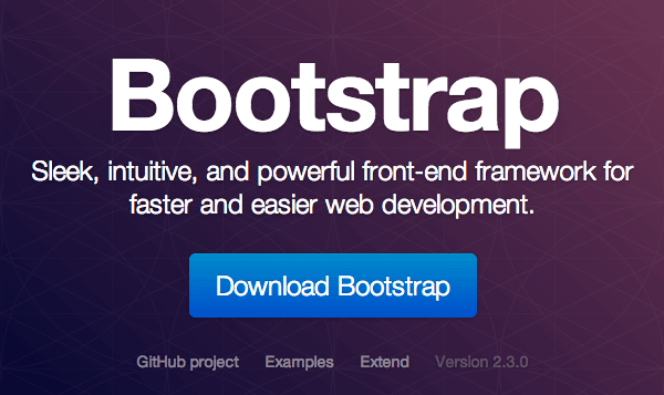
Probably the most well known style rules for a website can be found within Twitters’ Bootstrap. Although not specifically a style guide for twitter.com, a number of its components can be found on twitter.com and are used a lot for Twitter’s internal applications.
Github
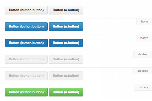
Github is a good example of a website which needs to utilize a style guide. Github have a team of designers and developers working on its product and it’s therefore essential to maintain consistency no matter who is working on new features and sections for the site.
MailChimp
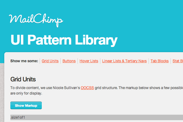
If you look at this image of MailChimp’s style guide you’ll see various components from around the MailChimp website. One thing you may have noticed is MailChimp’s user-friendly human approach to the dialogue it uses throughout its site. This is consistent because Mailchimp have created a set of rules which this tone of voice must adhere to.
Creating a Website Style Guide in Photoshop
What you decide to include in your style guide will vary depending on the site that you are designing for. For example, a social networking site will have different components to that of a movie review site.
You can be as detailed or as brief as you like, but the more detailed you are the more unified your design will be.
When creating a style guide it’s important to include all the situations that an element or component might find itself in. For example, you should consider different states for buttons and inputs, as well as current menu items etc. These should be demonstrated within your .PSD file.
Tip: You can toggle various visual states within Photoshop by using Layer Comps. Take a look at our recent tutorial on the subject.
Step 1: The Preparation
In this example I’m going to create a style guide for a blog. The blog style guide will consist of components – these are:
- Author card
- Blog post
- Comment
- Buttons
- Pagination
- Form elements
- Tables
I am also going to be using the following six colors:
- blue #a4d4e8 – This will be used as the primary color
- green #aee1a3 – This will be used as a secondary color
- red #f67f77 – This will be used as a secondary color and for error warnings
- black #474747 – This will be used as a primary text color
- dark grey #919191 – This will be used as a secondary text color
- light grey #e7e2de – This will be used for outlines
All inputs and buttons will use a border-radius of 5px, whilst all component widgets will have a border radius of 0px making them rectangular in shape.
Step 2: Setting up our Document
Firstly, setup a new document workspace. I’ve decided to set mine up at 580px wide. This is a comfortable size to work on and represents a good sized space for a module-based design.
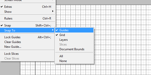
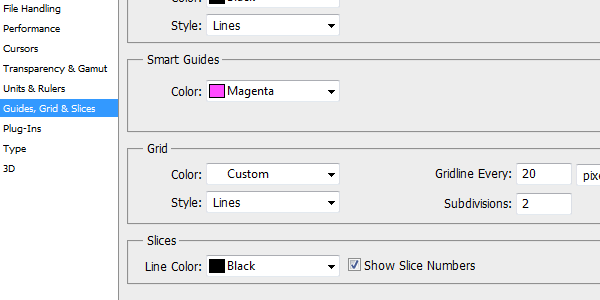
I’m using a grid (View > Show > Grid) to assist me in my design and keep everything well aligned. I’ve chosen to use a 20px x 20px grid with a subdivision every 10px. This can be altered by going to Preferences > Guides, Grid and Slices.
You will then see the screen below. Here you can change the grid spacing to whatever you choose, but I find that a 20px gridline with subdivisions set to 2 works well. I’ve also set up some guides at 460px wide on either side of my document to give me a helping hand. In addition to this it can be good to turn on ‘snap’ by going to View > Snap. This will ensure that your elements end up at exact pixel measurements and don’t wander off with stray sub-pixel measurements.
Step 3: The Author Component
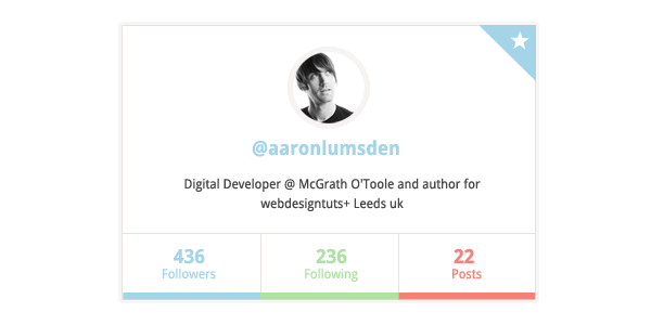
The first thing we’re going to create is the author component module. Social networks like Twitter have made these author cards quite popular recently and I thought it might be nice to use it as part of our web site style guide. This way each author of our blog can have their own author card.
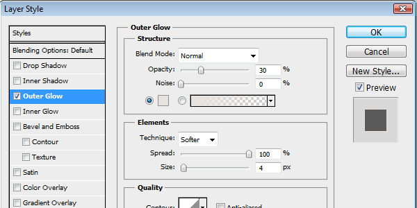
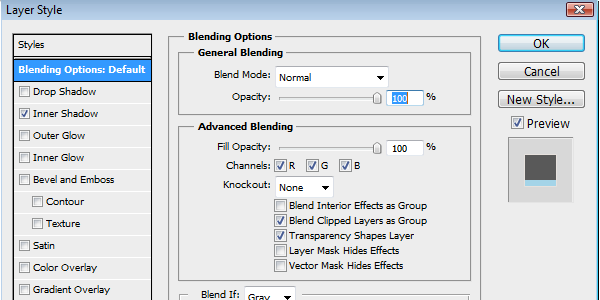
Start by selecting the shape tool and select a foreground color of white. With this selected, create a 380x250px rectangle. Once this has been created, right-click on on the layer for that shape and select ‘blending options’. The blending options panel should now pop up. From the left hand sidebar of the popup select ‘Stroke’ and give it a stroke size of 1px. The color we are going to use is the light gray #e7e2de taken from our color set.
Now select ‘Outer glow’ and set the color of the outer glow to the same color but lower the opacity of it to 80. Set the spread of the glow to 100% and the size of it to 4. This will give our component a border with a thick glow that is disguised as a border.
The layer styles that we have just created are going to be used a lot in other elements we create later on, but here’s a quick tip on how to use the same layer styles on any other element. If you right-click on the layer of the element that we have just created and click ‘Copy layer styles’. This will do exactly what it says and allow you to paste it on any other layer that you have. To do this simply right-click on the layer you want to add the style to and select ‘paste layer style’. Make a note of this as we’ll be using it quite a bit throughout this tut. We’ll refer to this particular layer style for this element as the ‘main layer style’.
For the author avatar, take an example of a photo and resize it to 75px x 75px. Then select the ‘Elliptical marquee’ tool and drag your cursor over the image, starting from the top left hand corner down to the bottom right. Hold shift whilst you are doing this to constrain proportions and create a perfect circle. Then once you have created a selection over the image, copy this and then paste it into your style guide document. Copy and paste our ‘main layer style’ element and then edit the layer styles and remove the stroke.
To create the three stats boxes, firstly create three white rectangle shapes that can be divided equally between the 380px. Once you have done this, take one of them and open up the layer styles panel again by right-clicking on the layer. Then select ‘Inner shadow’. Make sure the ‘blend mode’ is set to normal and the opacity to 100%. Set the angle to ‘-90′ and change the distance to 5px. For the color, use our primary blue color #a4d4e8. Then repeat this process on the other 2 stat boxes but this time change their inner shadow colors to each of our secondary colors; green #aee1a3 and red #f67f77. Then add the text for each statistic. In mine I’ve chosen to show the number of followers, following and posts.
To add the text and bio of the author I’ve chosen to use ‘Droid Sans’, available as a Google web font.
For the little corner triangle in the top right of the author card create a 50px x 50px square with our primary color blue and then select the ‘polygonal lasso tool’. Draw a straight line from the top left of the square to the bottom right and then draw around the left part of the square. Once this is done select Layer > Layer Mask > Hide Selection and this will create the triangle.
For the star select the ‘Polygon’ shape tool. Make sure sides is set to ’5′ in the top menu. Then select the little arrow that is situated next to the word ‘Sides’. Select star and ‘Indent sides by’ to 50%. Then draw a white star on top of the triangle and place it in the top right hand corner of the author card.
Step 4: The Blog Post Component
The blog post component is created the same way in which we created the main element of the author card above.
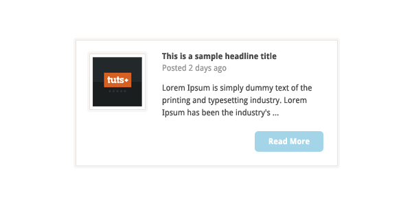
I’ve then added the ‘main layer style’ to this. The 70px x 70px image thumbnail is placed to the inner left of this. I’ve created three different text styles; the main headline, the date and the paragraph text. To the bottom right I’ve added a ‘read more’ button. See step 6 for creating the buttons.
Step 5: The Comment Component
To create the actual comment bubble create a 316px x 90px rounded rectangle and add the ‘main layer style’ to this.
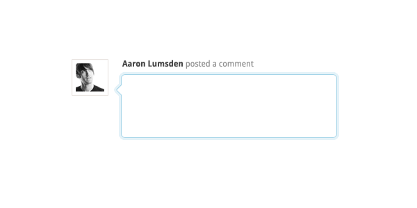
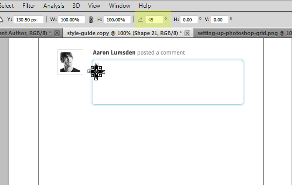
Create a 15px x 15px square shape and rotate this Edit > Transform Path > Rotate, then from the options menu, rotate it by 45 degrees. Select the actual shape layer and go to Edit > Copy then go to the large rounded rectangle that we’ve just created. Ensure that the square is lined up to wherever you want the tip to go. Then go to Edit > Paste and this will merge the two shapes. Add the main layer style to this and there is the speech bubble!
I’ve decided to add two post comment components; one being a standard comment component and the other being an author comment. For the author example I’ve changed the stroke to be the primary blue color.
Step 6: Buttons
The buttons are relatively easy to create because we established some guidelines before getting going within our style guide.
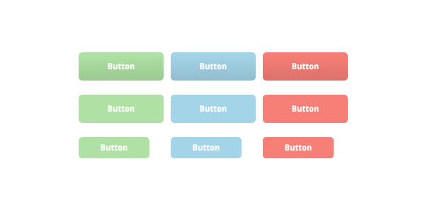
To create a large button select the ’rounded rectangle’ tool. From the ‘options’ bar make sure that radius is set to ’5px’ and draw a 125px x 40px primary blue rectangle. Then add the text of your choice. Duplicate the layer by right-clicking on the layer and selecting ‘Duplicate layer’. Once you have done this change its color to one of our secondary colors. Repeat this process for the button with the other secondary color. Also, repeat this process for the small buttons but this time make the rectangles 30px x 105px and for the ‘call to action button’ make it 374px x 40px.
For the hover states I have added a subtle gradient by adding a ‘gradient overlay’ layer style. Set the color mode to ‘Normal’ and the opacity to 10% with the gradient going from black to white. This will just be enough of a hint that a user has rolled over the button.
For the grouped button set, create a rounded rectangle 380px x 30px wide and then split it into four equally sized buttons. You can do this either by drawing a 1px pencil line or by cutting out sections with a 1px ‘rectangular marquee’ tool.
Step 7: Pagination
The pagination is created in a similar way to the grouped button set that we just created above. But this time, instead of creating it into four equally sized buttons, create ten equally sized square buttons with the arrow buttons on either end a little larger. The image below demonstrates this. For the arrows I’ve used some pre-made shapes that are specifically for web design arrows.
Step 8: Forms
By now you should have realised how easy we are making life for ourselves by repeating a lot of elements and styles. The great thing about this is that it creates consistency within our design.
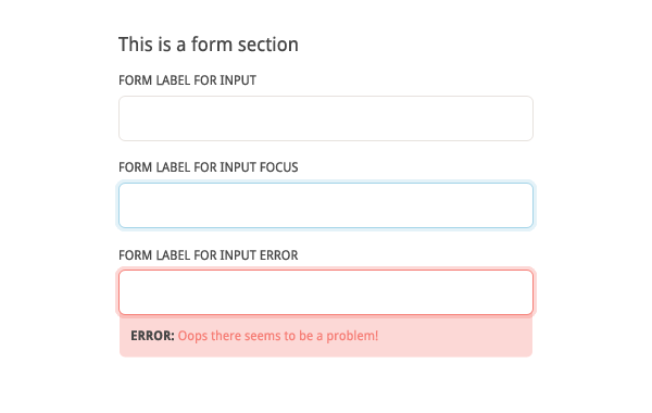
The inputs and textareas for this set is created using the methods that we used earlier. For the inputs draw a 380px x 40px rounded rectangle and apply the stroke color. Extend the height of the textarea a little to around 90px. For the focus on the elements I’ve used our ‘main layer style’ and added an extra element for error and success messages.
Conclusion
It’s up to you how many elements you want to create for your style guide. You will know the requirements for the site you are working on and will be aware what you will and won’t need for it. The great thing about creating a style guide is that any elements you introduce in the future will have rules and practises that need to be stuck to and will allow for consistency within this.
It will create familiarity with users and allow for an overall better experience both aesthetically and functionally.