Why am I talking about The Artist and the reasons for its popularity? It’s because parallels can be drawn to why it became so popular and the emerging popularity of retro and vintage themes in web design. As I said, people love to connect with an era that is long gone and the use of design elements that allow them to go back in time, go a long way in propping up the interest quotient of websites.
Let’s take a look at ten ways that will give your website the retro look:
Think Retro
When I first started experimenting with retro designs, I faced a huge ideation problem. I couldn’t escape the impact that contemporary design trends had on my psyche. I needed to think beyond them and this was something that was really very difficult. But, I found a simple enough solution to my problem. Before I start conceptualizing a retro design, I usually go through old magazines and newspapers, posters, advertisement clippings, and anything else that will allow me to think retro. It’s not too difficult to get your hands on such resources; the World Wide Web is a huge resource of all kinds of retro information. So, make use of it.
The Focus Must Be On Simple Shapes
When you are thinking retro or vintage, you need to think simple. Designs of the past were characterized by simple shapes being used to create the necessary impact. A shape like a circle was used to pretty good effect in adverts and posters and even the earliest websites focused on the use of simple shapes to create maximum impact on website visitors. Circles surrounded by a floral pattern and simple typography are but one example of commonly used retro design patterns.
Limited Use Of Colors
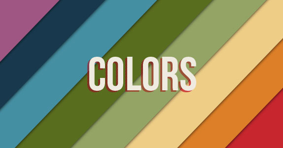
It’s important to limit the use of colors while giving your website the retro look. Even if you can’t stop yourself from using colors, make sure that you don’t use a bright color palette. Creating full-color prints is very easy today, but back then, it was very expensive and not many designers/businesses could afford to or had access to them. So they depended on two-toned coloring to come up with colorful designs. So, if you are thinking of creating a retro website, a black-white, orange–yellow, or cream-brown kind of combination will do well.
Fonts And Typefaces
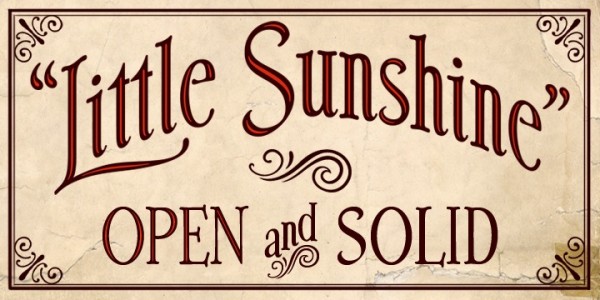
One of the important pre-requisites of a retro or vintage website is a retro typeface. Choose a font and typeface that immediately captures the styling of the era or period that you want to showcase through your design. I have seen plenty of web designs that got everything right about their visuals when it comes to the vintage look, but went wrong with the selection of typefaces. Don’t make that mistake. If you check out some of the designs of the retro era, designers used typography techniques like font repositioning and even pixel strokes to add some uniqueness to their designs; there is no harm in replicating these methods in your website design. You could even think about merging a vintage style with modern typography if it keeps the look. Use your imagination to get the blend you are looking for.
Putting Your Design Through The Blender
If you add a vintage dimension to your design, why not blend your objects and colors in the style that you think gives your website the vintage look. It’s one of the easier ways of giving your design an old world look. Busy designers who are tasked with coming up with retro designs very often use the Blending Mode in Photoshop and Illustrator to come up with retro-looking visuals.
Go Retro With Borders
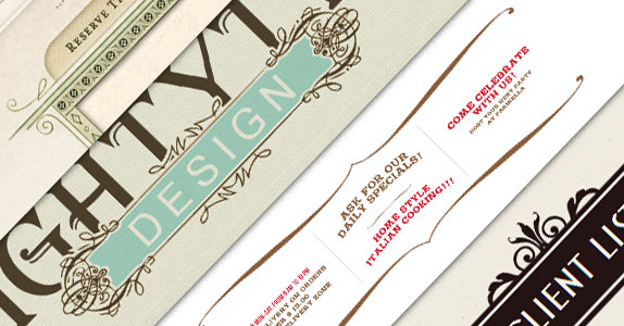
The use of borders in design will never go out of fashion. The use of ornamental borders for highlighting content or framing images and those simple shapes that we talked about earlier is another great way for retrofitting your web design.
Badge Of Honor
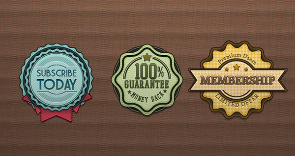
If you take a look at many of the websites that have been designed to give out a retro feel, you will find most of them use badges. The use of contrasting colors and design subtlety is a hallmark of all such badges. Why are badges used on such websites? Well, just pick any badge and give it a good hard look. Its simple design and limited utility make it a perfect fit for retro design.
Cropped Images
We had earlier talked about how simple shapes play a crucial role in creating a retro feel. The use of image cropping and layer masks helps you make use of images that have been styled to match the rest of your website. For example, if the focus of your website is on using circular shapes, a photograph that you want to use on the site can be cropped into a circle to blend with the overall theme of your design.
Using Texture
The use of correct texture has saved many websites from becoming non-entities. Great texture makes for great websites and texture comes to the rescue of retro websites as well. Use texture with all the subtlety at your disposal and your website will give out the correct retro vibes. If you don’t make an attempt to integrate retro texture into your website’s layout, I guarantee you it won’t be able to generate any visual interest.
Get Inspired from Retro websites
Do what other websites are doing. Get inspired from them and come up with your own retro designs. Getting inspired from the more popular websites going around is one of the better ways of designing a website with a retro look and feel.
If you are planning to design a website with a retro or vintage look, veer away from modern design techniques like flash, rainbow fonts, large background images and others. You can only deliver a retro effect through your website, if you dig into the memories of the days bygone and making this ‘past’ your point of reference.
Read more at http://designrfix.com/web-design/10-ways-giving-website-retro#0D6TgzHHMxIHWeKw.99

