The Gutenberg block editor for WordPress has changed how we create content within the CMS. But it’s also opened up some new possibilities on the front end as well.
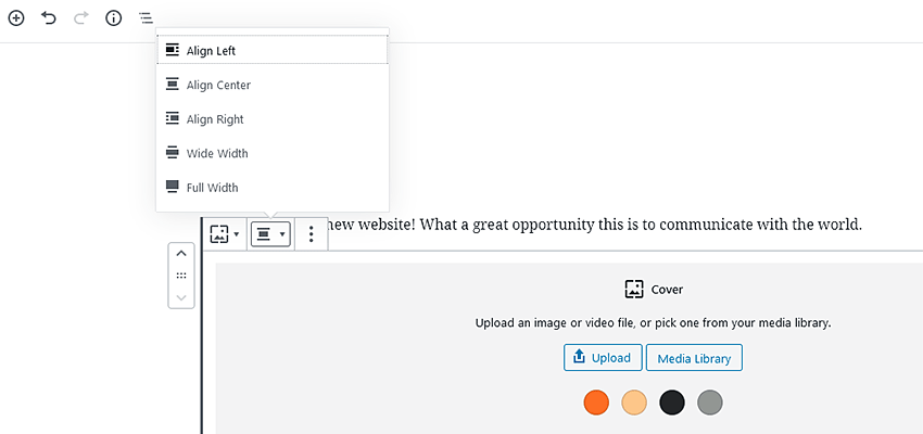
One of the more interesting developments in this area is the ability to add “full” or “wide” blocks to a page or post. This feature adds the potential for a Gutenberg block to break out from the default width of a theme’s content – something that was nearly impossible in the old Classic Editor.
There are a number of possible uses for a full or wide-aligned block. You could, for instance, introduce new page sections with a full-width cover block that overlays text on an image background. Or you might leverage the feature to build a can’t-miss call-to-action area. Just about any type of content could be added here, which is part of the appeal.
However, there is one small caveat: Your theme must support full and wide-aligned blocks. Thankfully, it’s rather easy to do. The following is a quick tutorial for adding wide alignment support to your WordPress theme and styling the blocks via CSS.
Unlimited Downloads: 500+ Premium WordPress Plugins
1,000,000+ WordPress Plugins & Themes, WooCommerce Addons & Themes, Design Assets, and much more!
Adding Theme Support
The first step involves adding a single line of code to your active theme’s functions.php file. Download this file from your website if you haven’t already done so (it can be found in the /wp-content/themes/yourtheme/ folder – substituting “yourtheme” for the actual name of the folder). Then, copy and paste the following PHP snippet:
add_theme_support( 'align-wide' );
Once you’ve added the code, upload the changed functions.php file back into your theme’s folder.
This code will signify that you want to turn on full and wide-aligned blocks. Now, when you log into WordPress and go to the page/post editor, you should notice that some blocks (not all) have the new “Full” and “Wide” alignment options.
Using a Commercial or Default Theme?
If you’re using a commercial or default WordPress theme, you’ll want to make sure you’re utilizing a child theme. This will let you make changes to the theme without potentially losing them after an update.
Basic Block Styling
Styling a wide or full-aligned block can be a little tricky. And there are a number of different techniques floating around. The one we’ll use here came from this example on CodePen.
@media screen and (min-width: 960px) {
     .alignwide, .alignfull {
          width:  100vw;
          max-width:  100vw;
          margin-left:  calc(50% - 50vw);
     }
}
Notice that we’re using a CSS media query to only integrate this style when the screen size is 960 pixels or wider. That’s because we won’t necessarily want this effect on smaller screens.
In this case, we have used the same styles for both block alignments. Of course, it’s entirely possible to style them separately so that they each offer a unique look on the front end.
It’s also worth noting a potential drawback: A horizontal scrollbar may appear on some layouts when using this technique. That can be taken care of via CSS with the following added to the body element:
body {
     overflow-x:  hidden;
}
The Results
Now that we’ve turned on the ability for full and wide-aligned blocks, it’s time to test things out. Here, we’ve created a page with a cover block, set to a wide alignment.
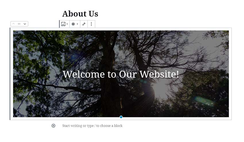

When looking at the front end of the website, the cover block works as intended. The element spans the entire width of the page, while the content below stays within the theme’s predefined 960-pixel width.
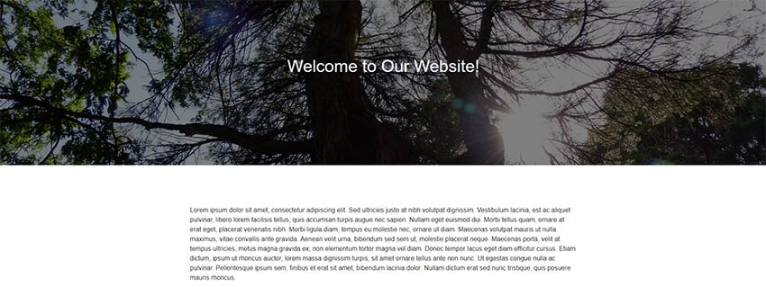

Using just the default styles, this element really stands out. Still, there are plenty of opportunities to do more with the design.
By adding extra CSS classes or targeting specific blocks, we have a full arsenal of design possibilities at our disposal. Things like backgrounds, borders or clipping paths can add a unique touch.
Going Wide with WordPress Themes
In a default installation, Gutenberg doesn’t provide all the bells and whistles of a page builder plugin. But block alignments do allow us to dabble in that territory.
That’s a good thing, because web design has evolved from the days when the Classic Editor first appeared. Back then, websites tended to use a uniform content width throughout.
These days, full-width sections are among the more popular and useful layout choices. The ability to take advantage of this without the need for plugins or theme hacks makes WordPress all the better for designers.
