The other day I stumbled across this awesome Dribbble shot by Michael Crawford for one of his invented projects Adult Protection Agency, a playful reminder that the art of growing up is becoming an endangered skill in our ever-devolving world 🙂
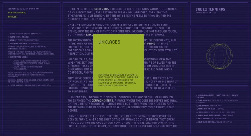
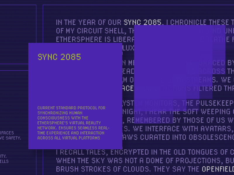
A wonderful integration of the Minesweeper game concept gave me this small idea of making a tooltip that forms from “pixel” boxes. So I grabbed my favorite UI theme direction which is Cyberpunk-inspired and made this tiny prototype using different animations for how the “pixels” appear. The pixels are made up of classic divs.

The rows and columns are set as CSS variables and the required amount of elements is created on the fly. The layout is grid based and we set the grid template using the variables. The rest is GSAP magic where we play with how the pixel boxes animate in.
The possibilities here are many: you can make the pixels emerge from one corner or from the center, or even apply a gooey filter to it for an organic twist!
Depending on the amount of rows and columns, you can also achieve unique effects; for example, if you just use one row you create a “sliced” look.
A similar kind of technique can also be found in demo 8 of our Motion Trail Animations where we break an image apart using clip paths.
In the demo I used some futuristic UI details, like an animated globe made by Mykl and some serious glitch action. If you would like to know more about how to create a glitch animation in CSS we got you covered.
Hope you enjoy this and bring it to the next level! Think of modals of cookie banners where you invert the logic and make the boxes disappear!
Have fun and thanks for checking by!
