
When using typography on the web, there are many things to keep in mind in order to create a page that provides clear access to the content and presents it in a legible way. Typically this can be broken down into two buckets: Readability and Legibility. Readability refers to the way in which words and blocks of type are arranged on a page. Legibility refers to how a typeface is designed and how well one individual character can be distinguished from another. For the sake of this article, I’ll talk a bit about both, suggesting some specific techniques to improve your typography.
Legibility
Let’s talk legibility first. It’s important to understand what makes one typeface more legible than another. When choosing a typeface, it all depends on how you plan to use it. Ask yourself some basic questions: What size will the text be used at? Will it appear as body copy or a headline? Does it need to be a workhorse or will it be used more as eye candy? Will it be paired with another font? Does the appearance of the typeface complement the subject matter?
It’s also important to keep in mind that different typefaces were designed for different uses. For example, the original Garamond was designed to be highly legible when printed in a large body of text. Some also say it was the most eco-friendly font of its time, conserving ink usage. Bell Centennial is a typeface commissioned by AT&T in the 1970′s, designed to be used in telephone directories. These directories were made from cheap paper and for this reason Bell Centennial was designed in a way to accommodate ink spread during the printing process. On the digital side, there are fonts that have been designed specifically for the screen such as Georgia and Verdana. Azura is a relatively recent font designed specifically for reading text on screen.
In short, it helps to know the intended context of the typeface you are considering using. Some fonts are indeed quite flexible, include several weights and they can be used in several ways. Others are more constrained, designed to be used very specifically.
This leads us into the first of a few things to remember concerning a typeface’s legibility:
Display vs. Text
Some typefaces were designed to be used large, such as in headlines. Usually these typefaces are less readable at smaller sizes and should not be used for body copy. These are called display faces. The typeface shown below, Knockout, is one of my favorite display faces.

Other typefaces are designed specifically to be used in large areas of smaller body copy. These are called text or body faces.
There are many variations in between. Typically, what I do is find a face that I think is appropriate for the task, keeping in mind that I plan to pair it with another font, and try it out. I’ve already filtered out all of the fonts that I don’t think are appropriate for the task, but if you’re just beginning, it may take some trial and error.
Serif vs. Sans Serif
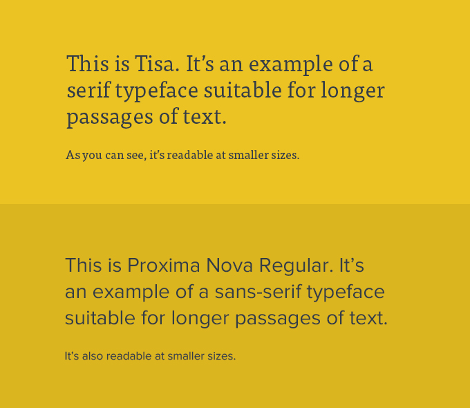
So which is more legible: serif or sans-serif typefaces? History tells us that serif faces have always been regarded as more legible, as they were almost always used in print for large passages of text. The serif faces allow the eye to flow more easily over the text, improving reading speed and decreasing eye fatigue.
That said, there are many readable sans-serif faces. Online it seems sans-serif faces are being used more for body text than ever. I think there are several reasons for this. The simpler letterforms seem to work better with current design trends and can feel more modern. Also, we typically don’t read large passages of text on a website, so sans-serif fonts do just fine in shorter chunks of copy.
It should be noted that there is debate on this subject – one viewpoint is that serif faces don’t reduce well on-screen essentially decreasing legibility. Others believe that there’s no difference. The position I always take is, does it feel right? Would I read a section of type set the way I designed it?
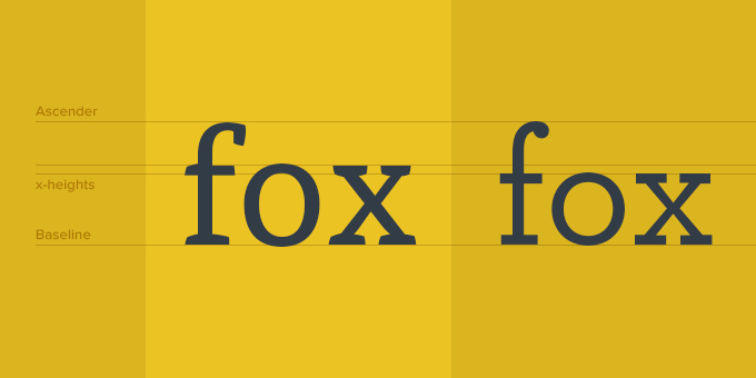
x-height
Another characteristic to note is x-height. This typically applies to using type at body text sizes. The x-height is, well, the measurement of the height of the lowercase “x” in a given font. It doesn’t take into account the height of the ascenders or descenders. You may be surprised to know how much difference there is in x-height from one face to another. When used small, typefaces with larger x-heights are typically more readable.
Readability
Readability is about arranging words and groups of words in a way that allows the readers eye to access the content easily and in a way that makes sense. It’s really an art form that is honed over time as successful combinations are found.
In my experience this tends to be one of the hardest concepts to grasp for beginning developers and designers alike. Even seasoned designers sometimes struggle with how to best arrange typography in a layout. Now that those two designations are starting to merge when it comes to web design, it’s important to begin to grasp the concept of readability. Here are a few things to keep in mind:
Spacing/Line Height
One of the most common typographic “mistakes” I see on the web today is improper type spacing. What I’m referring to here is instances where a block text isn’t given enough margin, subheads and correlated body text which aren’t visually grouped together, and so on. Proper spacing (combined with hierarchy) allows the reader to scan the text and access it at the desired points.
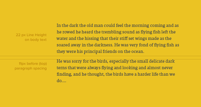
It’s not a hard-and-fast rule, but it seems to me that the relationship of paragraph spacing (additional spacing placed before or after a paragraph), the space around a block of type, and letter spacing can be related proportionally to the line height of a paragraph. Line height is defined as the vertical distance between lines of text. So for instance, if the line height of one paragraph is set to 2em and a paragraph with the same size text is set to 1.5em, the first paragraph will require more paragraph spacing and probably more margin around it.
Much of this is done by eye rather than an exact formula, but I do use a good rule of thumb when it comes to the relationship of paragraph spacing to line height. I typically make my paragraph spacing (which on the web translates to margin or padding placed at the top or bottom of a paragraph) around half of the line height. This tends to help passages of text “hold together” rather than using a full hard return between each paragraph, creating large amounts of space between paragraphs.
Size
Obviously, care should be taken to make sure that text is not presented too small. It’s also important to remember that the age of your audience may vary, hence the quality of their eyesight. Generally, it’s good to stay around 13px or .813em at smallest. Currently, with the wider implementation of responsive websites, there’s a trend moving toward larger body copy. In RWD, it’s also important to keep in mind that different text sizes for different devices may make sense. For instance, it may make sense to increase body copy size on a mobile phone width as opposed to a desktop width.
Measure
Another common practice that hinders type readability is allowing the horizontal lines of type on a page to become too wide. This distance is referred to as measure (also sometimes line length). If a line of type is too long it’s a tedious read and a stretch for the reader’s eye to return to the left edge of the text block for the next line. It’s also intimidating to see a block of text arranged this way and some readers may not even attempt to read it.
So what’s the maximum width a text block should be? Well, it all depends on the size of the text. The larger the text, the longer the line can be (that whole proportion thing again). In my opinion, generally around 70 characters is as long as you want to be. On average, for body copy sized text, I try to stay within 45ems.
Letter Spacing
Letter spacing (also referred to as tracking) is the consistent increase or decrease in distance between the letterforms in a word or block of text. It’s not to be confused with kerning, which refers to adjusting the distance between individual characters. Letter spacing can be used to adjust the density of a block of text or an individual headline or subhead.
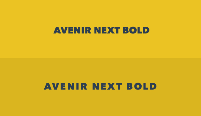
Obviously, letter spacing does affect the readability of text. Too much or too little and readability will be compromised. However, there are times when, in my opinion, letter spacing is needed. As you can see in the graphic below, I like to add generous letter spacing to subheads or phrases of uppercase text. I find it’s easier to read uppercase text when the characters have some additional space around them. Also, depending on the typeface used, I like to increase letter spacing slightly in body copy.
Contrast
It may sound obvious that good type contrast is essential for readability. The fact of the matter is designers (myself included) are always pushing the boundaries of contrast. It might be that we want a certain section of text to be less prominent, or to create “layers” of hierarchy in our design. Whatever the case, keep in mind that on screen contrast, especially when it comes to small, fine shapes like body text, vary greatly from screen to screen. It’s best to err on the side of a bit “too much” contrast.
Hierarchy
As we’ve already discussed in this series, hierarchy plays a big part in the readability of content. A successful hierarchy organizes the content into digestible parts and allows the reader to scan and access the text easily.
Start thinking about employing these legibility and readability concepts into your projects. The more you do it the better you’ll get.