
They say letters are boring. Unlike videos and music, text is static. It does not move or tickle other senses besides the eyes. Texts are usually placed as information-dissemination tools which convey the detailed message of the media being used. For example, if you upload a YouTube video tutorial, the video is the dynamic medium which will aid the viewer to achieve the goal. On the other hand, the text will provide all the details needed in case something is not clear.
This fact might give you an impression that texts are really boring. But what if they are really not? What if texts, which are used mainly to detail, are used for the design function? How is that possible? Of course, through typography.
Typography has existed for a long time. It originated from a time we all couldn’t remember. Basically, typography is the technique of putting texts or types in an orderly manner to make it visible, attractive and readable. Simply put, typography is the art of working with texts, graphically.
The tutorial is divided into five parts:
- Creating Typographies Using Photoshop
- Choosing the Perfect Fonts for Every Occasion
- Where to Download Fonts (Free and Premium)
- How to Consider the Perfect Colors Fit for Your Design
- Sample Finished Product on a Website
Type, Design, Publish!
Aside from Adobe Illustrator, Photoshop is also a good software that can help you render good typographies. This is easier and more advantageous to use if you are a web designer. In Photoshop, you could create typographies, render it as pictures, and even layout your own website!
So, what are the things we should know to create Photoshop typographies?
First, you should familiarize yourself with the Type tool. It’s a flexible tool in Photoshop where you could customize the types according to your preference. You can find it in the tool palette of your Photoshop software, or simply press the shortcut ‘T’.
The Type tool has three sub-tools. They are the:
- Horizontal Type Tool – this sub-tool will enable you to type text as you type normally, from left to write.

- Vertical Type Tool – this sub-tool will enable you to type text from to bottom.

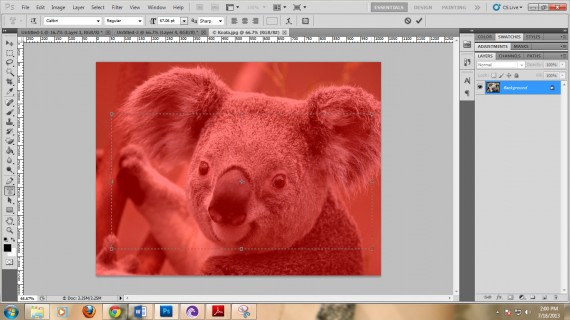
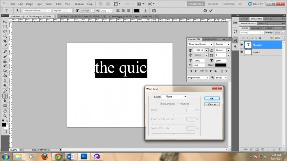
- Horizontal Type Mask Tool – this sub-tool will enable you to type horizontally in a mask. This can be used if you want to use your Type in picture backgrounds. For example,
Insert the desired picture:

Use the horizontal Type mask tool and type your chosen word.
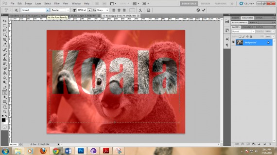
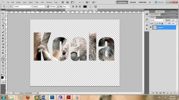
You will now have the text masked over the main picture (notice the “marching ants” forming the world Koala).

Now you can cut the photo and what will remain is the masked area.
- Vertical Mask Tool – basically the same as the horizontal mask tool. The only difference is the orientation of the type.
One of the things that you should know are the text panels. In Photoshop, there are two text panels that you can find: one is located on top of the window, just below the Menu bar, and the other one is located at the right side of the window.

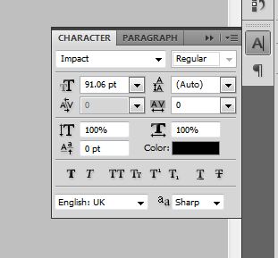
The top panel shows the font face, style, size, alignment, color and warping options. The side panel shows the options for font face, style, size, spacing, kerning, leading, horizontal and vertical size, color, and style options.
The font face shows options where you can select from the different installed fonts recognized by Photoshop. Here, you could choose from Impact, Arial, Times or any other installed fonts. The font style shows you customizations for text styles. You could choose from Bold, Italic, Black, Bold Italic or Regular.
The warping option allows you to choose between options and warp your text, Just simply press the button as shown.

Spacing shows you the distance between individual letters, kerning allows you to set the horizontal spaces between all selected letters. Leading, on the other hand, allows you to set the vertical spaces between each line.
Horizontal and vertical settings give you the liberty to decide whether your texts will blow up or shrink down horizontally or vertically. This option is different from the font size because the latter changes the size uniformly on both horizontal and vertical axes.
Aside from that, you can also choose whether to bold, italicize, large caps, small caps, subscript, superscript, underline or strike-through texts.
Familiarize yourself with the functions of these tools first before you move on to the next part.
Find the Fount of Fair Fonts!
Of course, as tools for design, typographies should be typed in attractive and suitable fonts. There are a lot of fonts available on the Web to download.
Fonts should be readable yet peculiarly attractive. It should suggest a feeling of belongingness in the typography that you are designing. Of course, using good fonts is as important as designing it. It creates a sense of identification for your site. Because of this, you need to familiarize yourself on its different kinds, forms and uses.
There are seven font categories. They are the most commonly used font types in designing. They are:
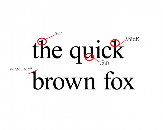
1. Old style – old style fonts are considered the parent fonts. They originated from the traditional methods of printing. These fonts are commonly identified through their serifs. Serifs are fonts which have flag-like endings. Also, the fonts in this category are commonly two-stroked, meaning, they are composed of thin and thick parts. They are often used in print output, like newspapers and books or in designs which require formality, credibility and simplicity.
Examples:
- Times New Roman
- Garamond
- Book Antiqua
- Baskerville Old Face
2. Modern – modern typefaces are commonly changing according to trends. One font can be modern depending on the pop culture. Commonly, modern fonts are digitally produced, meaning, they don’t have root traces on print fonts. These fonts are commonly used for movie posters, shows, and events.
Examples:
- Bauhaus 93
- Avengance
- CollegiateHeavyOutline
3. Script – script fonts are fonts that have curves and ornaments. They are calligraphic in nature and suggest a theme of elegance, formality or luxury. Commonly used in weddings and other formal and conservative occasions, the script fonts are more evidently elaborate than the design itself.
Examples:
- Script MT Bold
- ANGEL TEARS
- Before the Rain
- Brush Script Std
4. Decorative – these decorative fonts are very thematic in nature. They are used to imply a very particular occasion or event. Often used in brandings which require recognition and easy memory stamping, decorative fonts can used for designing purposes.
Examples:
- a dripping marker
- Confetti Stream Gretoon
5. Sans serif – literally meaning without serif (sans is a French word which means without), Sans serif fonts are fonts that have no flaglike endings. They are commonly plain. These fonts are commonly used in main texts for print output and web texts. They are easy to read but plain.
Examples:
- Calibri
- Arial
- Century Gothic
6. Ornaments – these are fonts that are based on symbols and pictures. They are best used for logos and secret messages.
Examples:
- Symbol
- Wingdings
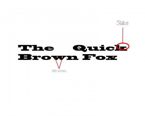
7. Slabs – slabs are wide fonts with slab serifs. Slab serifs are thick horizontal endings placed on letters.
Example:
- Blackoak Std
Fonts, fonts, fonts everywhere!
The Internet provides us a huge database of downloadable fonts. Websites offer a wide variety of fonts ranging from usage to font categories. The only challenge that remains for us, is to actually look for them.
- Font Space – this is one of the best sites as they claim to have 21, 043 fonts in their database. You can choose from the popular ones, or you can look for the newly uploaded ones. It’s up to you. Just click the font name or image and download.
- 1001fonts – this one’s also claiming a thousand fonts. The only difference of this site from fontspace is that you could actually buy premium fonts here.
Other sites: dafont, 1001freefonts, fonts.
Now you’re probably wondering why the hassle to buy premium fonts if there are free downloads? Well, the thing is, there are fonts that aren’t free. Some of them, which are sold by their authors, are originally made. It means that the designs are as exact as you would want them to be. For more info on this, just read ourarticle on fonts.
Are colors only for design?
Coloring can be fatal to a design. Failure to harmonize color to its target market could result into a decline of viewership for a website. Having a good color that is identified to your company or website, is as good as identifying it with the its logo. That is why a lot of websites have brainstormed on how to have the best logo color possible.
Think of Facebook, YouTube, Twitter, Google and Yahoo. Close your eyes and imagine a color when you hear their names. Of course, you would see exactly how they appear on your browser. That is the power of colors. They make you remember the site itself. With the eyes as the primary organ used in browsing the web, colors can help you earn a lot of money and viewers as well.
Think of your website typography. Will it have the same impact on your viewers? Will it stamp the same memory of your website to them? Or would they just forget it because some other website has a cooler way of using it?
According to Kissmetrics.com, 93 percent of people remember the company by their color. Meanwhile, the same research shows that 83 percent of buyers buy an item because of its branding color. Now think, are colors just for design? I guess not.
So, when will you use a certain color?
- Use yellow when you want to get attention. Yellow, a hot color, is also a neon. It grabs the eyes’ attention. If you want to make them focus on something, use yellow. It is optimistic and youthful. Likewise, when you create positive typographies, use this color.
- Use red for urgency. Red suggests alertness, energy and importance. Use red when highlighting warnings, emergency drills, or something that should be done ASAP.
- Use blue for trust. Often, banks use the color blue to ensure that your money is secure and safe. It suggests a stronghold of something that should not worry you. Use it to make your viewers calm and clear-minded.
- Use green for relaxation. The eye processes green very easily. It could also suggest wealth, nature, beauty and peace..
- Use orange for calls. A call to action. A call to move. Use it in advocacies, meetings, and other political matters.
- Use pink for romance and feminism. Pink suggests a touch of a woman to a design. Use this to attract female teen readers.
- Use black for luxury. Black is an elegant color. Use it for formal occasions, formal occasions and any design that would suggest luxury.
Typography Tutorial: Make a Cool Typography in 10 minutes
Okay. This one’s a good example of a typography with a simple message: It’s alright to commit mistakes. I made this using the concepts I have discussed in the previous parts of the blog. So how did I make it?
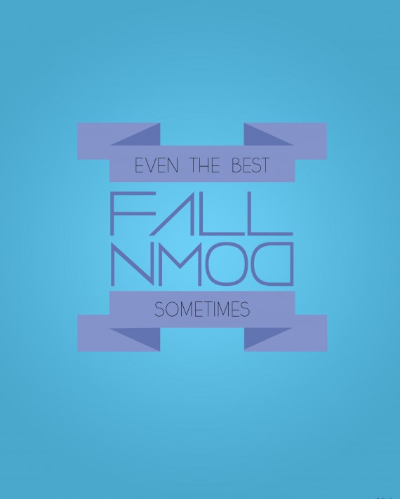
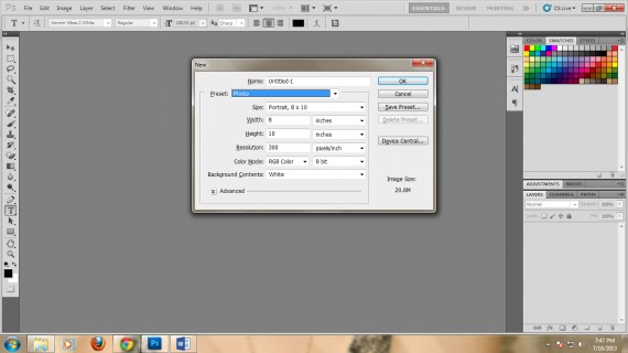
1. Open Photoshop. Create a new file. I used a preset size with a width of 8 inches and height of 10 inches, with 300dpi. You can, of course, change this one to any size you want.
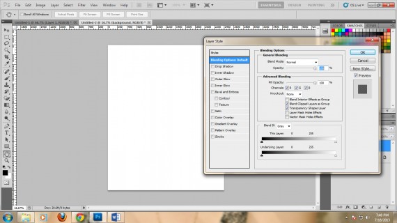
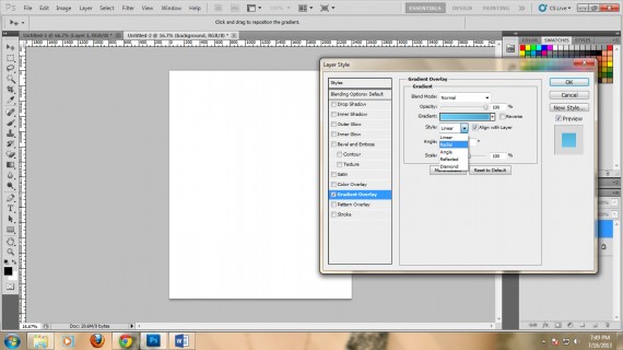
2. Next, add a new layer. Name it “background”. Double click it to show the LAYER STYLE window.
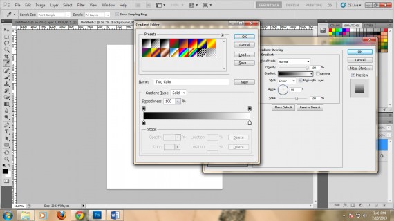
3. Go to Gradient Overlay and click on the gradient. A window will open that will let you select the colors you will use. Use the #6dd0f7 and #4aa8cd colors. Make the Style: Radial.
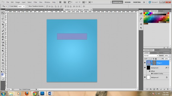
4. Now, we need to do the ribbon design. Go to the Rectangle tool and draw a rectangle. Color it #8393ca.
5. Now, create a triangle using the pen tool. You should be able to create a triangle that would look like a flap of the actual ribbon. Color it #6274b2.
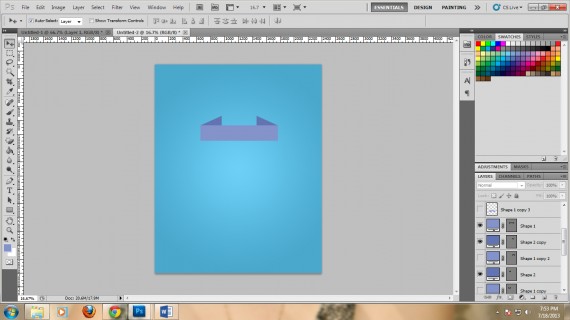
6. Copy the triangle and flip it. Now draw another rectangle using the rectangle tool. Color it #8393ca. Place the rectangles in a manner that they will overlap with the triangle flaps
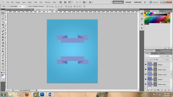
7. Duplicate the ribbons.
8. Now type the message on the ribbons. In this case I used the Yellow Peas Demo font. I colored it black. For the center message, I used the Vermin Vibes 2 White and colored it #6274b2.

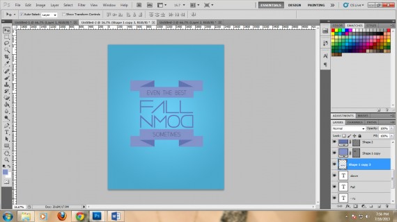
10. Save it as a JPEG file.