
Photoshop and Illustrator are great tools to help you create things that only exist in your imagination. In this tutorial, we will create words out of intertwining guitar strings. Let’s get started!
Tutorial Assets
The following assets were used during the production of this tutorial.
1. Create the Strings in Illustrator
Step 1
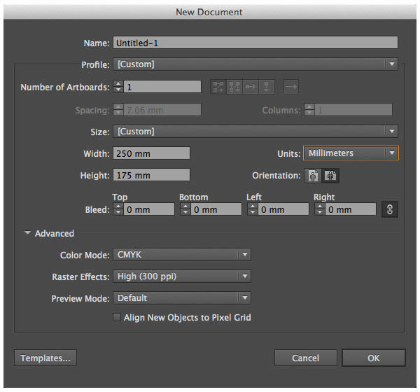
We will start out in Illustrator. Create a New Document by going to File > New (Command/Ctrl + N). I used the following document size:
- Width set to 250 mm
- Height set to 175 mm
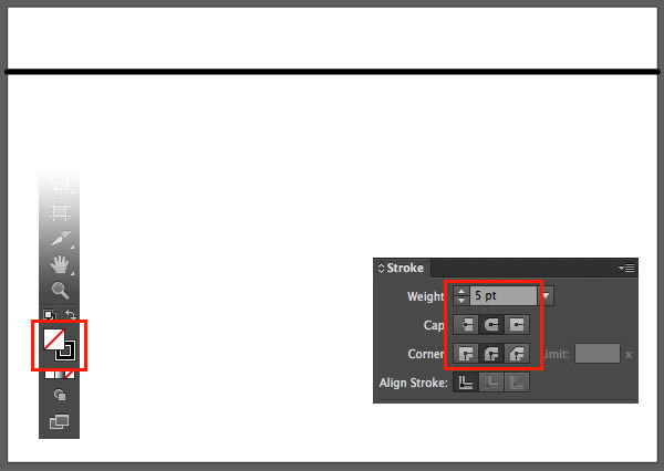
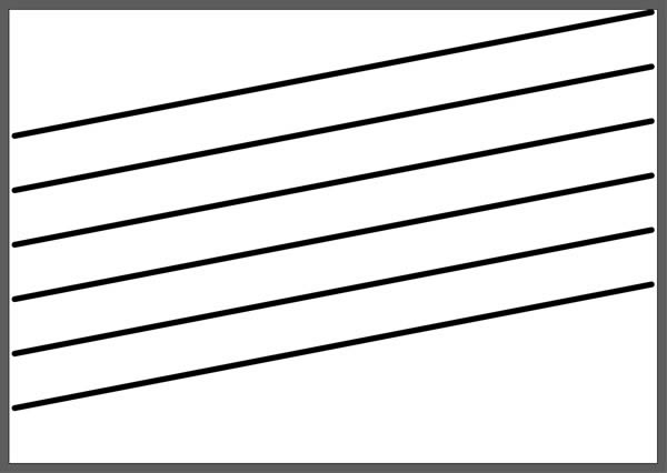
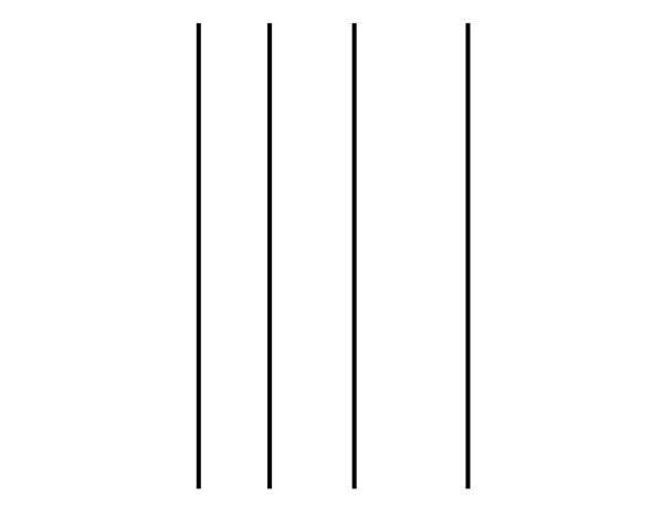
Select the Line Segment Tool (\), and while holding down Shift draw a horizontal line across the width of the document, somewhere in the top fourth of the page. Now set:
- Fill Color (X) to none
- Stroke Weight to 5 pt
- Cap to Round Cap
- and Corner to Round Join
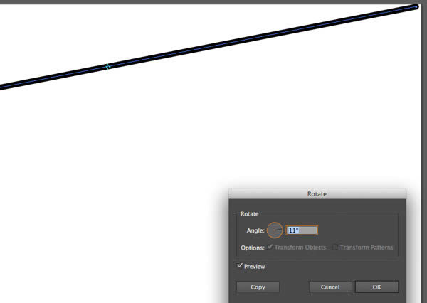
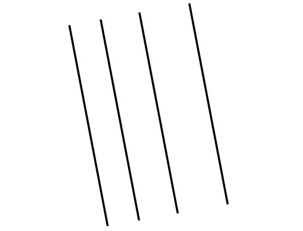
Using the Rotate Tool (R) rotate the horizontal line by 11°.
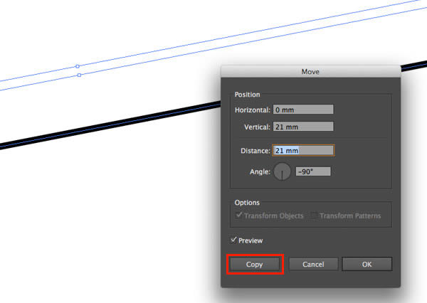
Using the Move Tool by going to Object > Transform > Move (Command/Ctrl + Shift + M) duplicate the line with the following values:
- Horizontal: 0 mm
- Vertical: 21 mm
Don’t forget to click Copy instead of OK.
Duplicate the new line 4 more times simply by going to Object > Transform > Transform Again (or Command/Ctrl +D), so you end up with 6 lines altogether.
Step 2
Now we will draw the letters.
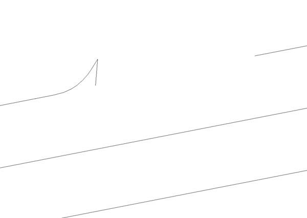
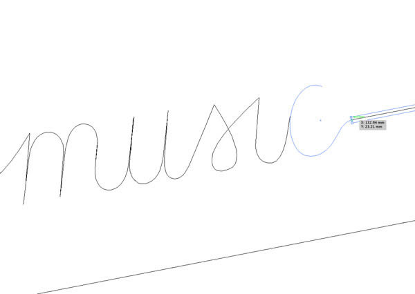
Use the Scissors Tool (C) to cut the top path at two points, in a distance which is approximately the length of the first word. Using the Direct Selection Tool (A) grab the path in the middle and delete it. (Don’t forget to press Delete twice, so you delete the endpoints of the unwanted path as well.)
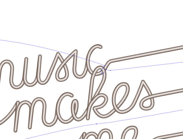
Using the Pen Tool (P) click on the right endpoint of the first path to continue the path, and start drawing the first letter. It’s a good idea to view the paths in Outline View (View > Outline, Command/Ctrl + Y) to be able to work more precisely.
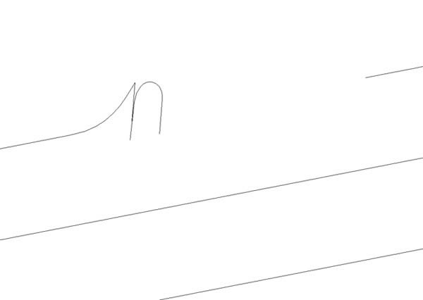
The letters can be made up of different paths for now, especially because some paths need to be duplicated (the two curves of the ‘m’ are similar, so is the curve of the ‘u’ etc., but they do need to be adjusted so are connected nicely with the next letter).
This phase of the tutorial will probably involve quite some work, tweaking and correcting the paths to make the curves look flawless, but this is the base of our artwork, so it needs to look perfect.
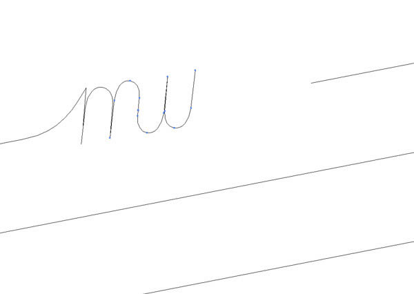
Add all the letters you need on one string, and adjust the left endpoint of the second line path so it starts where the endpoint of the last letter ends.
Step 3
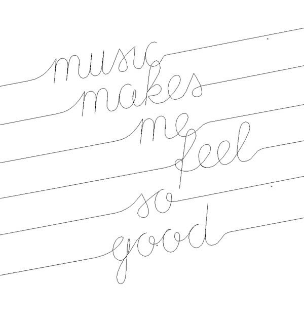
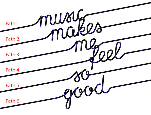
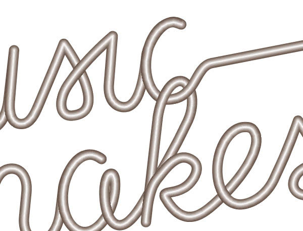
Let’s create all letters on all six strings. Same letters can be duplicated. After drawing all paths, this is how our artwork should look in Outline View.
Now we have to join all paths so we end up with each string being just one path. Make sure that the points that need joined are at the same position. If they are not, adjust their positions using the Direct Selection Tool (A).
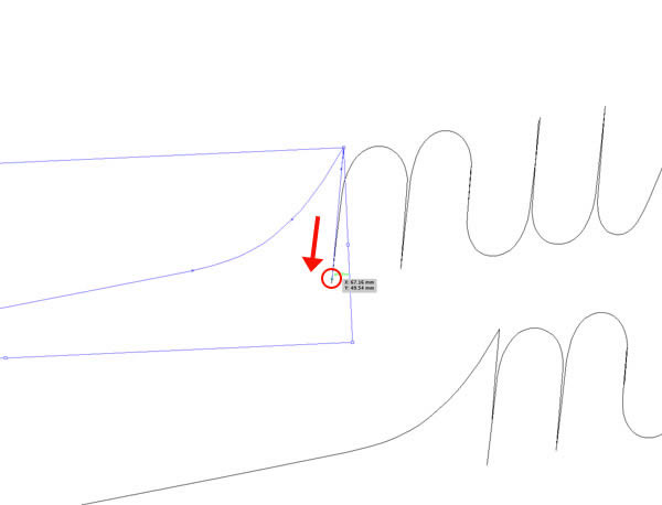
Once they’re in the right position, select both endpoints with the Direct Selection Tool (A), and Average them (Object > Path > Average, Command/Ctrl + Option + J). You can leave out this step if you are absolutely sure the paths are exactly on top of each other. Then Join them (Object > Path > Join, Command/Ctrl + J). Go through the entire document and join all neighboring paths, so you are only left with 6 paths.
Step 4
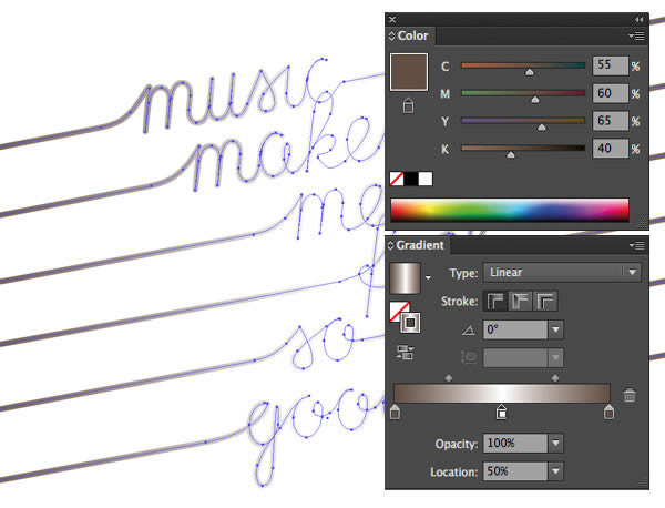
We’ll create the color of the strings next. Go to the Color Palette (Window > Color), and add the values.
- C: 55
- M: 60
- Y: 65
- K: 40
To create a brownish color. (I am using CMYK values because this artwork was created for printing.) Drag this color to Swatches, so we can easily use it next time we need it.
Next we define the sliders of the Gradient (Window > Gradient). Drag the brownish color to the first and last sliders of the gradient, and drag White to the middle of the gradient, thus creating a new slider. This middle slider should be at 50%. Drag this gradient to Swatches as well.
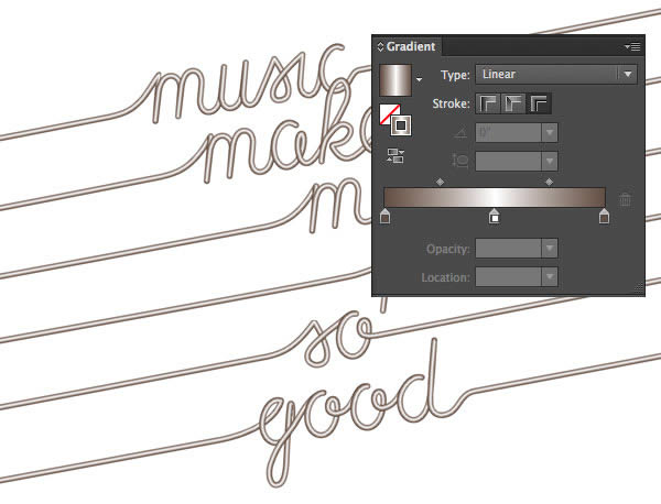
Now select all 6 paths, and set the stroke to the gradient we just created.
Click on Apply Gradient Across Stroke in the Gradient palette to achieve the string-like look.
The direction of each path should go from left to right, otherwise the letters won’t follow the direction of writing.
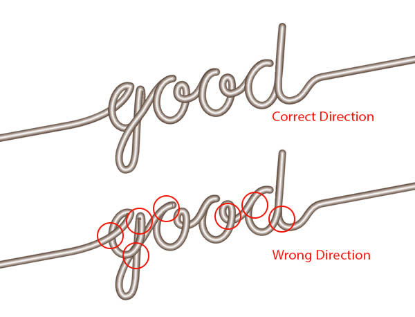
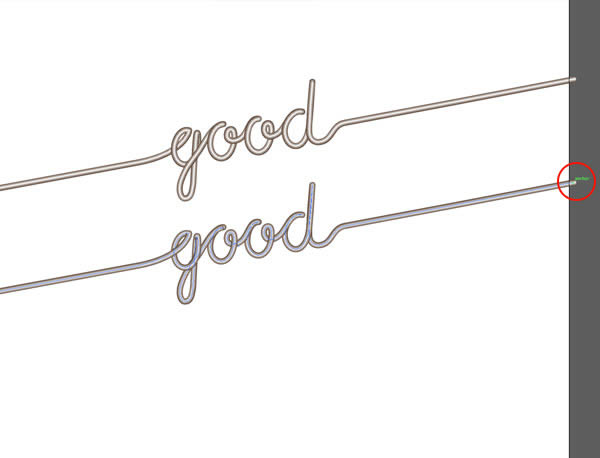
In case your path is not set to the right direction, use the Pen Tool to click on the right endpoint of your path to reverse the order of the path.
Step 5
There’s only one last thing left for us to do with the strings in Illustrator: to take care of the interlocking.
Using the Pen Tool draw a new path around the second string making sure you leave out the part which is to be hidden. This should be done very precisely. Ensure that you close the path.
Next make sure it is in front of the string path (Object > Arrange > Bring to Front), but most probably it will be, as it was created later. Select both paths (the new closed path and the string path), and make a Clipping Mask (Object > Clipping Mask > Make, Command/Ctrl + 7). Now part of the letter ‘k’ should have disappeared behind the lower part of the letter ‘c’.
Repeat this step at the fourth string for letter ‘f’.
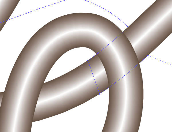
The lower part of ‘e’ in ‘me’ should now be overlaying on top of the ascender of ‘f’.

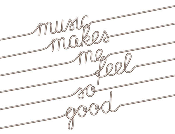
We are now done with the vector part of strings, it should look similar to the image below. Then, save the file as ‘strings’.
2. Create the Frets in Illustrator
Step 6
Still in Illustrator, create a new document (Size: 350 x 350 mm), otherwise same settings as last time. With the Line Segment Tool Shift-draw a vertical line, approximately 240 mm long. Set the Fill Color (X) to none, and Stroke Weight to 6.4 pt.
Press down the Option key and with the Selection Tool (V) Shift-drag the line to the right (approximately 35 mm). Repeat this step with the second line, but this time make the distance a little larger (about 45 mm). Repeat again, with even larger distance (55 mm). (You could also use the Move Tool for these steps.)
Select all four lines and use the Rotate Tool (R) to rotate them by 11°. Set the stroke color to white. Save the document as ‘frets’. It’s time to move on to Photoshop.
3. Set Up the Base of the Artwork in Photoshop
Step 7
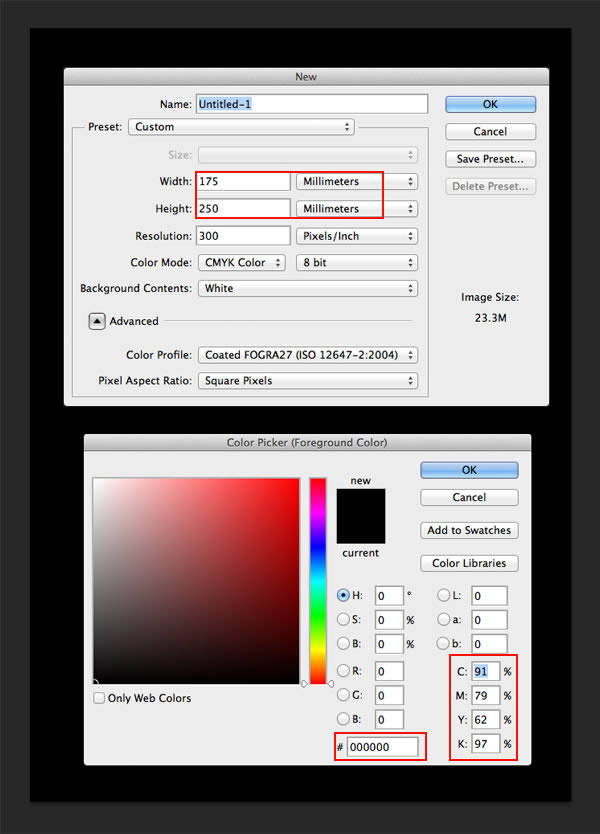
In Photoshop create a New Document (File > New, Command/Ctrl + N) with the following values:
- Width: 175 mm
- Height: 250 mm
- Resolution: 300 Pixels/Inch
- Color Mode: CMYK Color
Fill the background with Default black (C:91 M: 79 Y:62 K:97 or #000000).
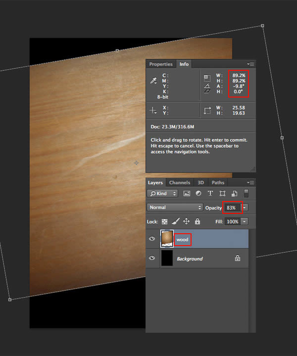
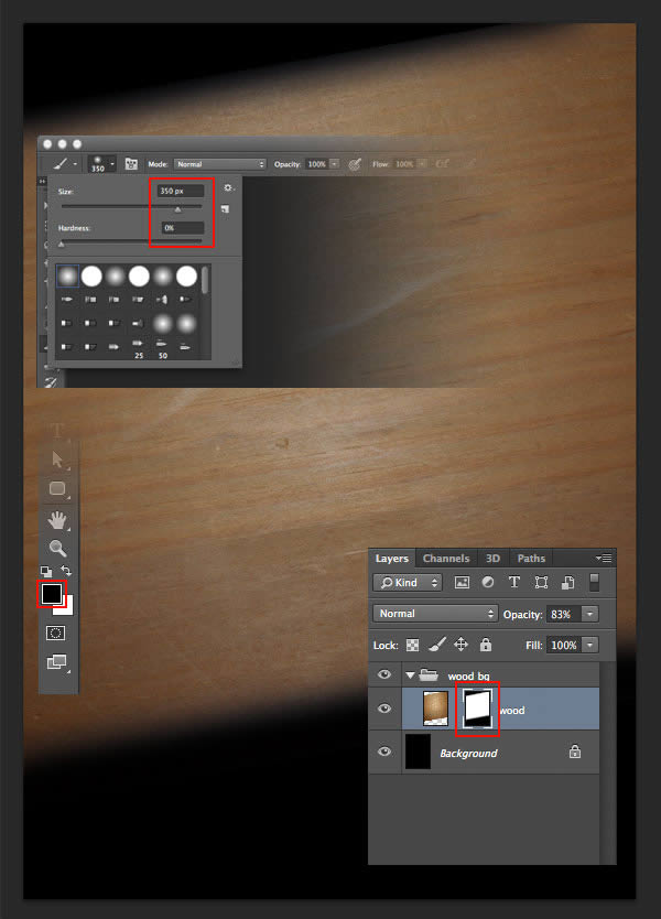
Open Wooden Texture from Assets and drag its layer thumbnail into your new document to create a new layer. Use the Free Transform Tool (Edit > Free Transform, Command/Ctrl + T) to rotate and Shift-reduce the size of the texture as shown on the Info palette. Double click the layer’s name to rename it ‘wood’. Set the opacity to 83%.
Now we’re going to Add a Layer Mask by clicking Layer > Layer Mask > Reveal All. Use a large, soft-edged Brush (B) (about 350 px, hardness 0%) to draw on the mask. Click on the left point of the top side of the wood image, then hold down Shift and click on the right point, to draw a straight line. Do the same at the bottom of the wood image.
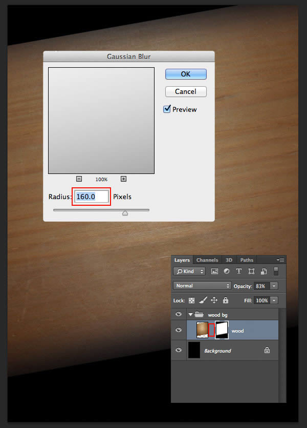
Unlink the mask, then Blur (Filter > Blur > Gaussian Blur) the mask with a radius of 160 px.
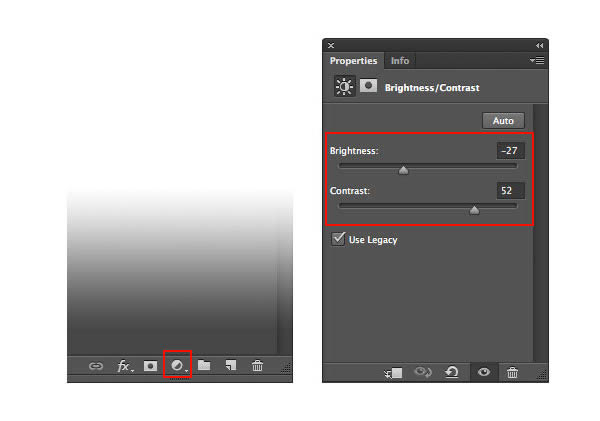
Command/Ctrl click on the mask to Load Selection, then Create a New Brightness/Contrast Adjustment Layer (icon is at the footer or the Layers tab) with the following values.
- Brightness set to -27
- and Contrast set to 52
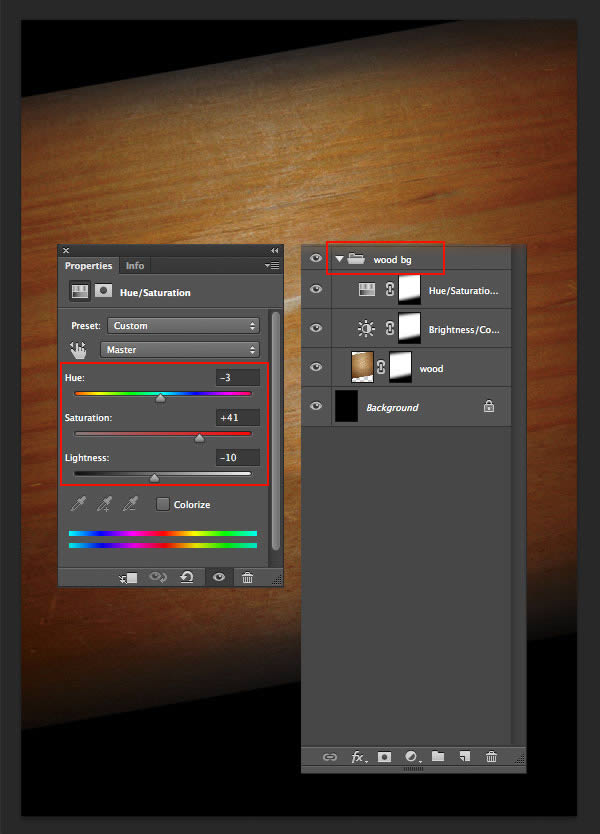
Command/Ctrl click on the mask to Load Selection again, and Create a New Hue/Saturation Adjustment Layer with:
- Hue set to -3
- Saturation set to +41
- and Lightness set to -10.
Select these 3 layers (‘wood’ layer and the 2 adjustment layers), and Group them (Command/Ctrl + G). Name the group wood bg.
4. Add Frets to the Artwork
Step 8
Switch back to Illustrator and Copy the four lines of Frets, then Paste into the Photoshop file (alternatively stay in Photoshop and Place (File > Place) the file ‘frets’). I usually paste vector data as Smart Objects to keep them editable for later use, but you can also paste as Pixels now. Make sure you paste/place the frets at 100% (check the Info Palette). Position the lines as shown below. Name the layer ‘frets’.
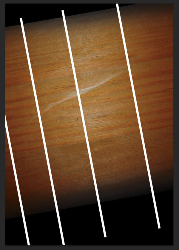
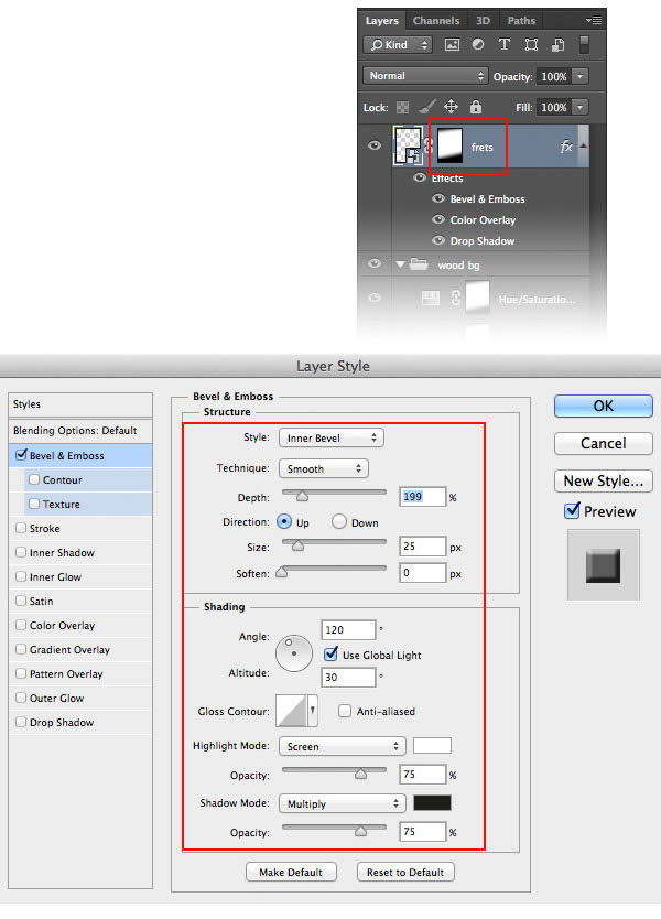
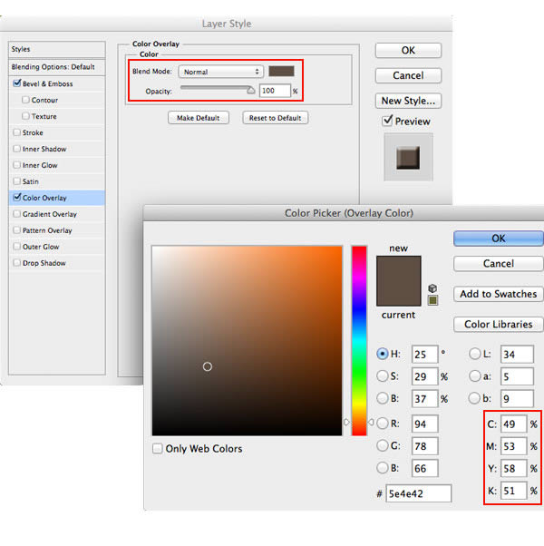
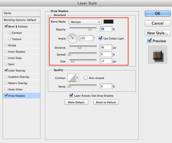
Command/Ctrl click on the mask of layer ‘wood’ to Load Selection, and Add a Layer Mask (Layer > Layer Mask > Reveal Selection) to the layer ‘fret’. We will now add the following three layer styles: Bevel and Emboss, Color Overlay and Drop Shadow, with values as seen below.
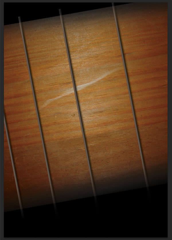
Our artwork should look something like this now.
Step 9
Okay, as we can see, the sides of the guitar still don’t blend nicely into the background.
Use the Ellipse Tool (U) to create an ellipse that extends over the width of our document.
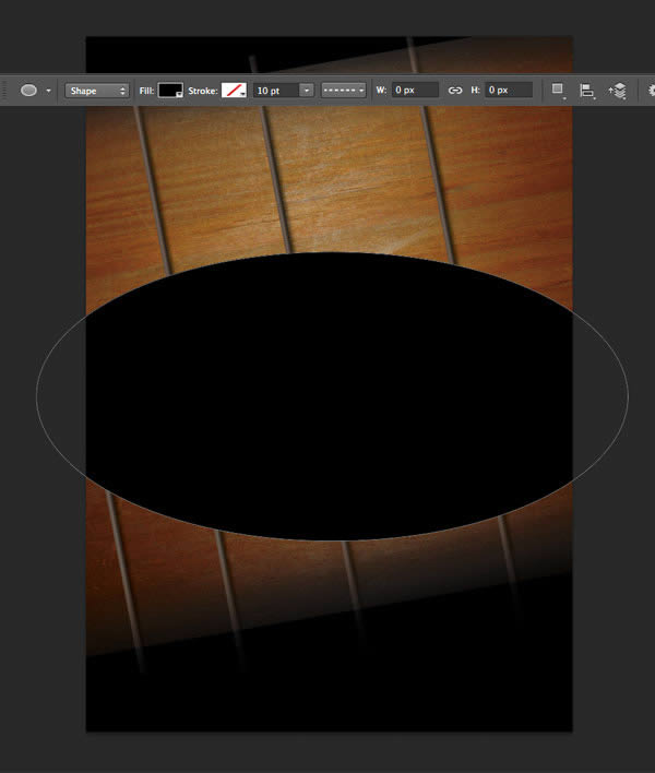
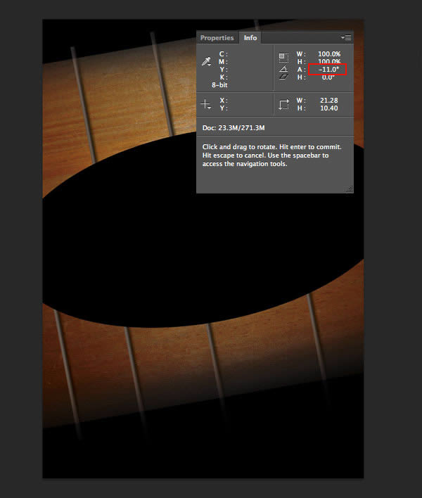
Using the Free Transform Tool (Command/Ctrl + T) rotate the ellipse by 11°, and move it up a little.
Load Selection (Command/Ctrl click on the ellipse layer) and turn off Visibility (click on the eye icon to the left of the layer thumbnail), but you can even delete this layer. Press Shift + F6 (Select > Modify > Feather) to Feather the selection, and set the Feather Radius to 250 pixels.
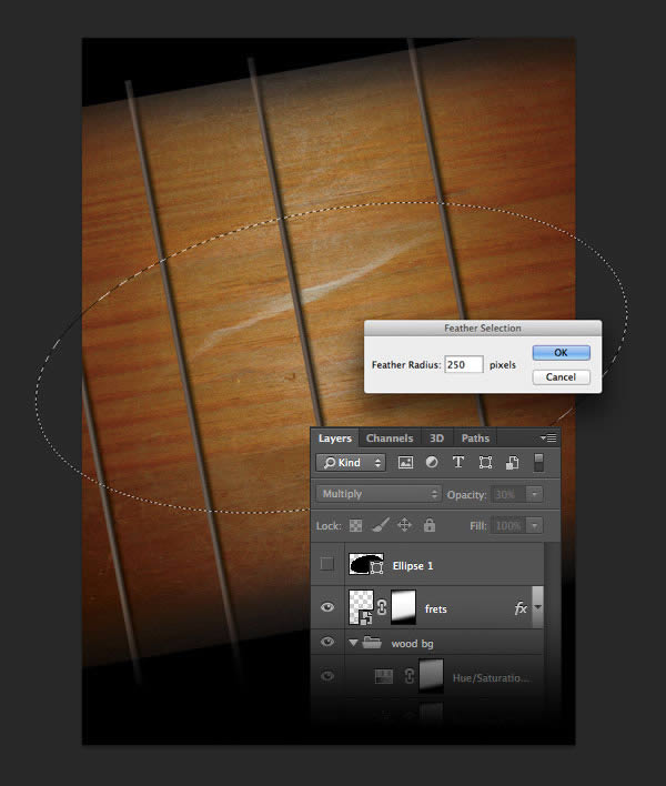
Press Command/Ctrl + Shift + I (Select > Inverse) to Invert Selection, press D to make sure your fill color is set to black, Create a New Layer (Layer > New Layer), and Fill the Selection by hitting Option/Alt + Backspace. Set the layer’s Blending Mode to Multiply, the layer’s Opacity to 30%. Press Option + D to deselect. Name the layer ‘darken’.
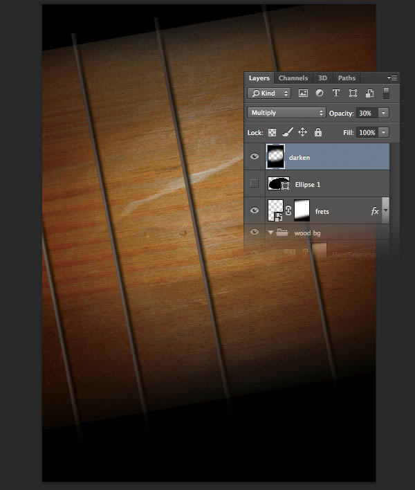
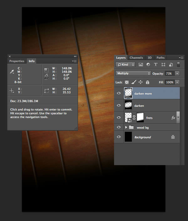
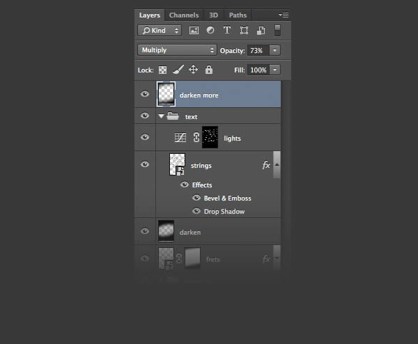
Duplicate this layer (by dragging it on the Create a New Layer Icon), set the Opacity to 73%, and enlarge it to about 148% (with the Free Transform Tool). Name this layer ‘darken more’.
5. Add Strings to the Artwork
Step 10
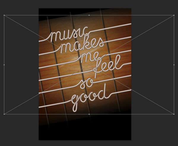
It is time now to Place our strings, the same way as we placed the frets (Copy–Paste or Place). We will need to enlarge it to about 120%. Name the layer ‘strings’.
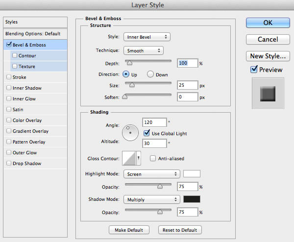
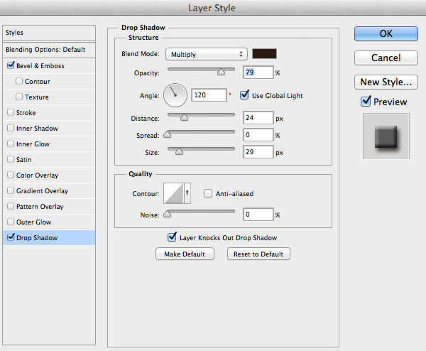
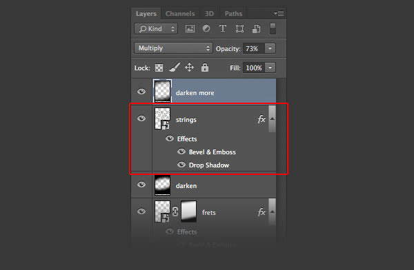
We will now Add two Layer Styles: Bevel and Emboss and Drop Shadow, as shown.
Modify the Layer Order, so that ‘strings’ goes below ‘darken more’.
Step 11
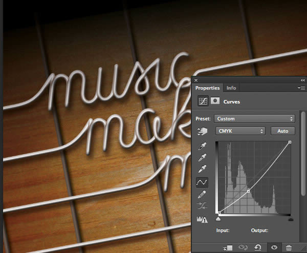
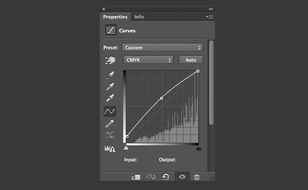
Next we will create a light effect to make our strings more 3 dimensional. Load selection of ‘strings’ (Command/Ctrl click on the layer) and Contract the Selection (Select > Modify > Contract) by 3 px. Press Command/Ctrl + Shift + I to Invert Selection, and click the Curves Adjustment Layer. Set is as shown.
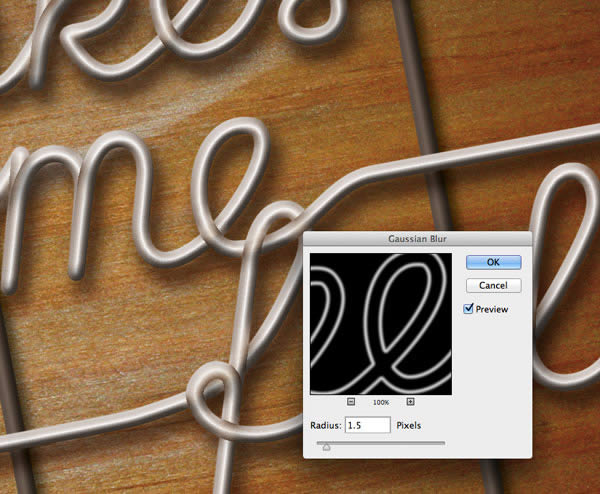
Load Selection of the ‘strings’ again (Command/Ctrl click on the layer), Invert Selection and fill the mask of the adjustment layer with black. Blur the mask with a radius of 1.5 pixels.
Set the layer’s Blending Mode to Color Dodge, the Opacity to 35%. Name the layer ‘lights’. Select the ‘strings layer’ and the Curves Adjustment Layer, Group them, and name the group ‘text’.
Step 12
Within the group, add another Curves Adjustment Layer to make the entire artwork even darker. Set the layer as shown.
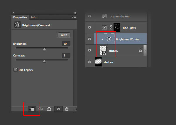
Click on the ‘strings’ layer, and add a Brightness/Contrast Adjustment Layer with the values as shown. Activate the Clipping Icon (or Create Clipping Mask from the Layers Palette, Command/Ctrl + Option/Alt + G) to limit the adjustment to the layer below (‘strings’ only).
Our artwork should look something like this now:

6. Create Wearing on the Wood
Step 13
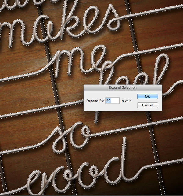
Let’s leave the strings for a while, and create the wearing of the wooden part. Load Selection of the strings (Command/Ctrl click on the layer), and Add the Selection of the layer ‘frets’ (Command/Ctrl + Shift click on the layer, but not the mask). Expand the Selection (Select > Modify > Expand) by 50 pixels.
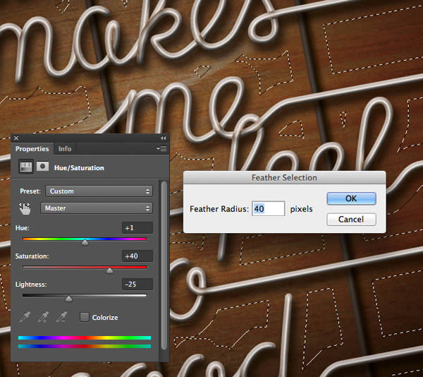
Now set the Feather Radius (Shift + F6) to 40 pixels, and add a Hue/Saturation Adjustment Layer with values set as shown.
Step 14
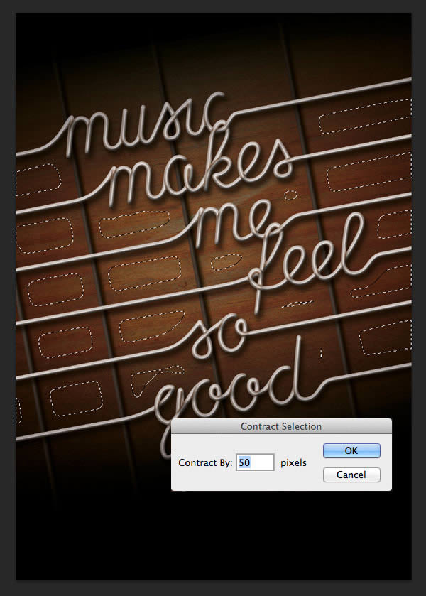
Load Selection of the last layer we created (Hue/Saturation Adjustment Layer), and Invert the Selection.
Using the Lasso Tool (L) subtract the top and bottom parts of the selection. Contract the selection that is left (Select > Modify > Contract) by 50 pixels.
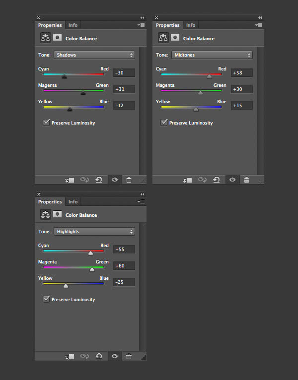
Add a Color Balance Adjustment Layer as shown.
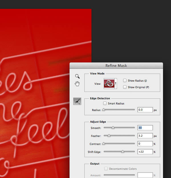
We can further refine the mask by clicking on Refine Mask Edge in the Properties palette. Make sure View Mode is on Overlay, this way it’s easy to see how your mask changes.
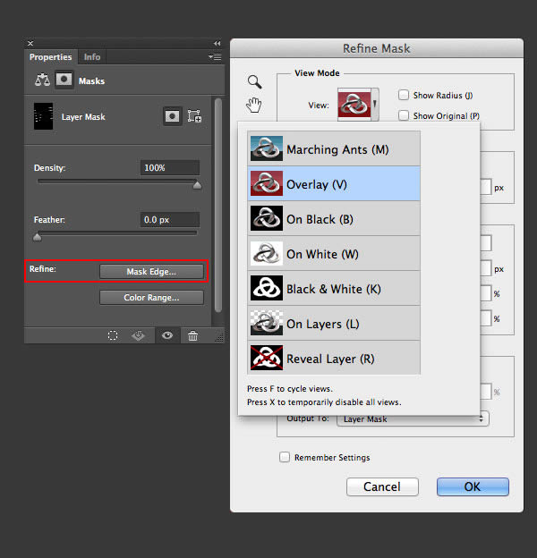
Set it as shown.
Now the wearing on the wood should look similar to this:

7. Create Inlays
Step 15
Let’s use the Elliptical Marquee Tool (M) to make a round selection (hold down Shift to make it a regular circle). Make the diameter about 0,8 mm (you can check the width/height in the Info Palette).

Set the Foreground Color to:
- C: 39
- M: 37
- Y: 36
- K: 16
and the Background Color to
- C: 51
- M: 51
- Y: 52
- K: 46
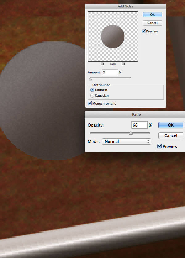
Set the Gradient Tool (G) to Foreground to Background and Linear Gradient in the Options Bar, Opacity should be 100%. Create a New Layer and fill it with the gradient. Name the layer ‘inlay dot’.
Add a little Noise (Filter > Noise > Add Noise) as shown, then Fade the noise (Edit > Fade Add Noise, Command/Ctrl + Shift + F) to 68%.
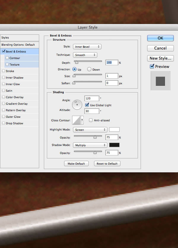
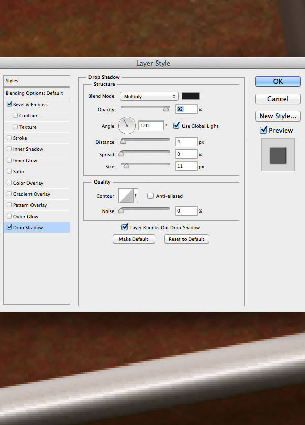
Let’s Add two Layer Styles: Bevel and Emboss and Drop Shadow, and apply the following settings.
Step 16
Duplicate the ‘inlay dot’ layer twice and position the new dots as shown.

Create a New Layer and Load the Selection of the three dots (Command/Ctrl click on the layer, then Command/Ctrl + Shift click on the other two layers). Set the Brush Tool (B) to 130 px, hardness to 0% in the Options Bar, the Foreground Color to white, and paint the upper right sides of all three dots to add highlights.
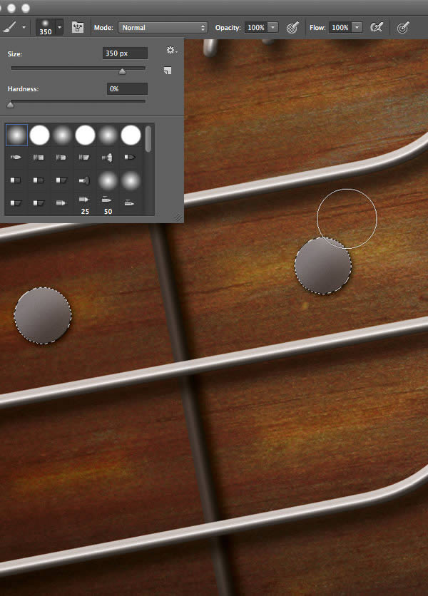
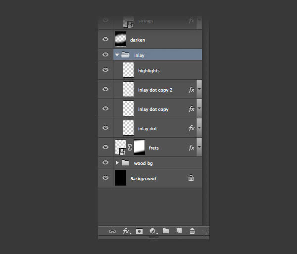
Name the layer ‘highlights’. Select the three ‘inlay dot’ layers plus the ‘highlights’ layer, group them and name the group ‘inlay’.
8. Improve Strings
Step 17
It is now time to go back to our strings to perfect them.
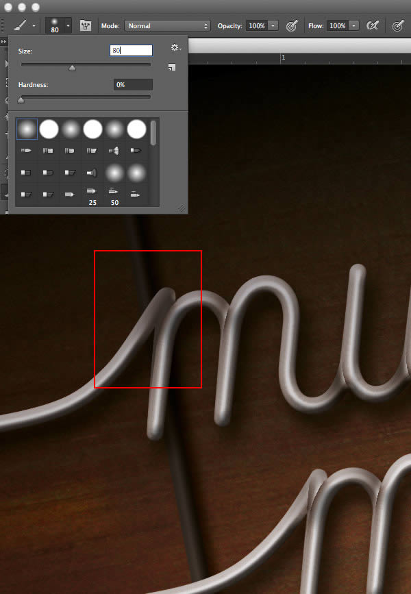
Let’s place shadows on the strings to add more depth to them. I did this manually by first Selecting areas (with the Lasso Tool) on which shadow is to be projected. Make sure the selection is precise where it divides the different areas (areas with and without shadow).

Next the Selection of strings needs to be Intersected with the current selection (either Command/Ctrl + Option/Alt + Shift click on ‘strings’ layer, or click on the ‘strings’ layer and go to Select > Load Selection, and click Intersect with Selection).

Set the Foreground Color to a brownish grey:
- C: 66
- M: 67
- Y: 69
- K: 58
Create a New Layer and using an approximately 80 px wide brush start painting the shadows. (You can Hide Selection to get rid of the disturbing ‘marching ants’ by pressing Command/Ctrl + H, or View > Extras).
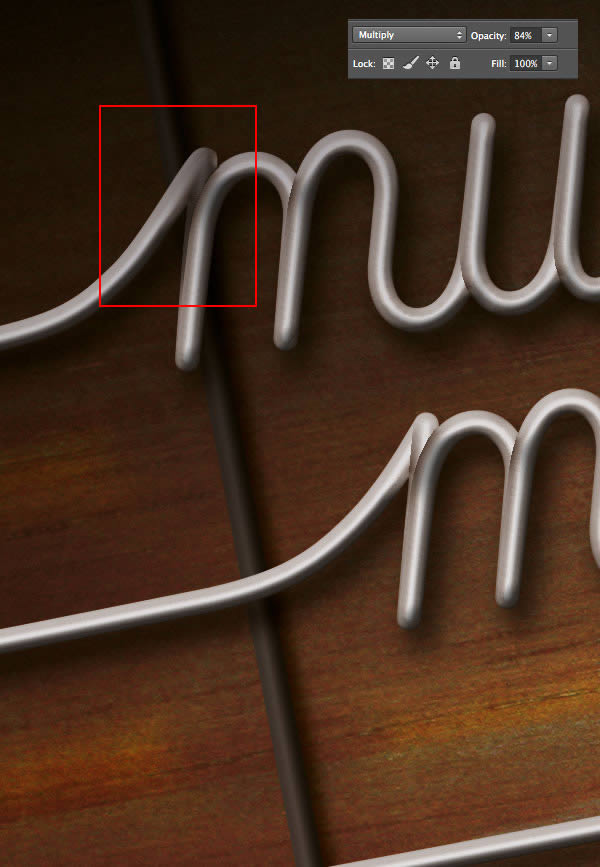
Set the layer’s Blending Mode to Multiply, Opacity to 84%. Name the layer ‘shadows’.
Step 18
Repeat Step 17 for every single area where the curves of the text meet or intersect. This is a time-consuming step, but it’s important to get it right as it really adds life to the artwork.
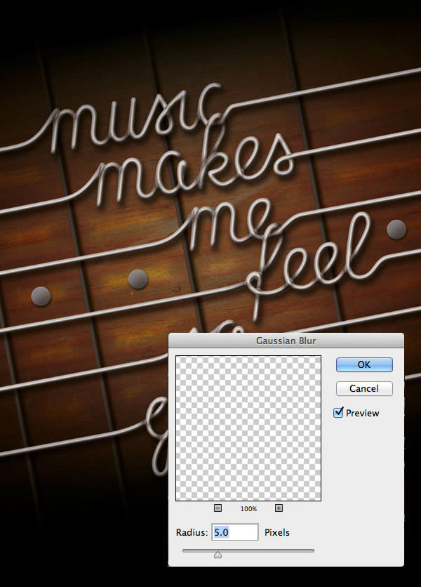
Once the shadows are done, Load Selection of strings once again, click on ‘shadows’ and Blur with a radius of 5.0 pixels.
Step 19
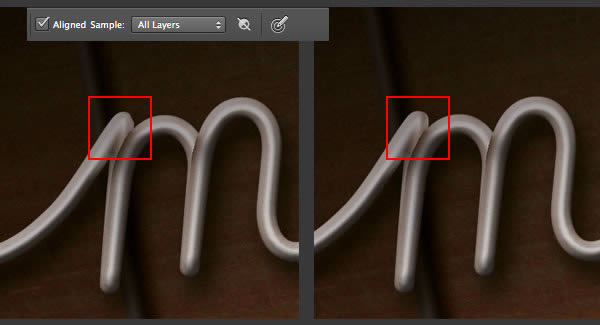
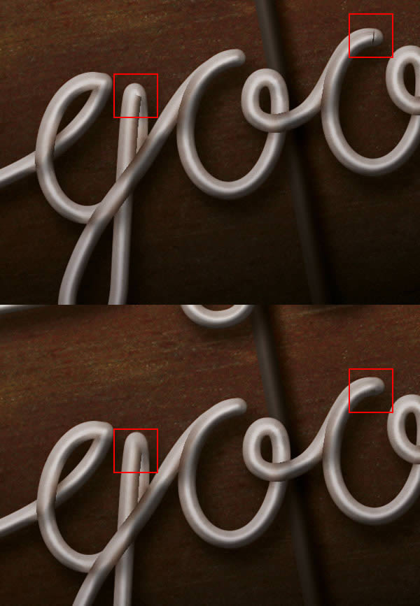
Make a New Layer within the group ‘text’ and call it ‘retouch’. Click on the Clone Stamp Tool (S), and set Aligned Sample to All Layers in the Options Bar. Now you can retouch the imperfections of the letters ‘m’, ‘g’ and ‘o’.
9. Finishing Touches
Step 20
I think we still need to make the sides or the artwork a bit darker, so let’s click on the Elliptical Marquee Tool (M) and place the cursor at the middle of the artwork (both horizontally and vertically). Hold down Option/Alt and make an ellipse similar to this.

Press Shift + F6 to Feather the selection by 200 pixels. Invert the selection, Create a New Layer, press D and Fill the layer with black. Press Command/Ctrl + D to Deselect. Set the layer’s Blending Mode to Multiply, Opacity to 21%. Name the layer ‘border’.

Step 21
There’s only one last thing left for us to do. Let’s add the horizontally centred credits at the bottom.
Click on the layer ‘Background’ and drag a guide from the left ruler to the middle. Set Paragraph to Center Alignment, click on the Horizontal Type Tool (T), click exactly on the guide, and Copy-Paste the following text:
Lyrics: Sleepy Brown | Music Makes Me Feel So Good
Use the font ‘Aller‘ at a size of 5 pt. Set ‘Sleepy Brown’ to Aller Bold.

Conclusion
Thank you for taking the time to complete this tutorial. Let’s quickly recap what we have learned.
- We created the vector based elements in Illustrator
- We created the base of the guitar in Photoshop
- We added the components of the guitar and used Photoshop tools to achieve a realistic look
I hope you found this tutorial understandable, interesting, and educational. Questions, comments and suggestions are welcome.