The more we communicate, the closer we become. Typography inspires us by reminding the world of a simpler time without connection. As designers and artists, we can carry that fascination into our work by studying the makeup of letters.
Let’s explore all about the parts of lettering by examining the anatomy of a letter. If you prefer video tutorials, you can start with the basics of typography anatomy with this quick video from the Tuts+ YouTube channel.

Common typography terms
What are some of the most common typography terms for letters? Familiarize yourself with these concepts to get a better handle on typography anatomy.
What is the baseline?
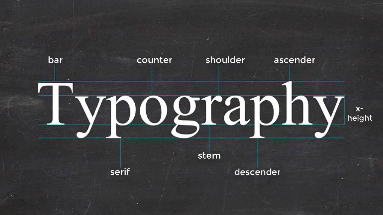
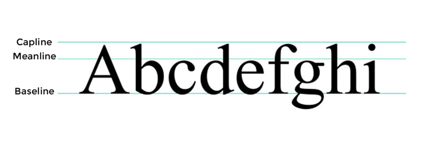
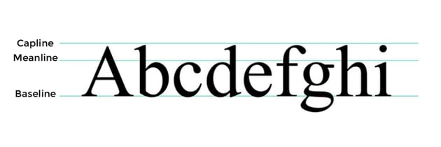
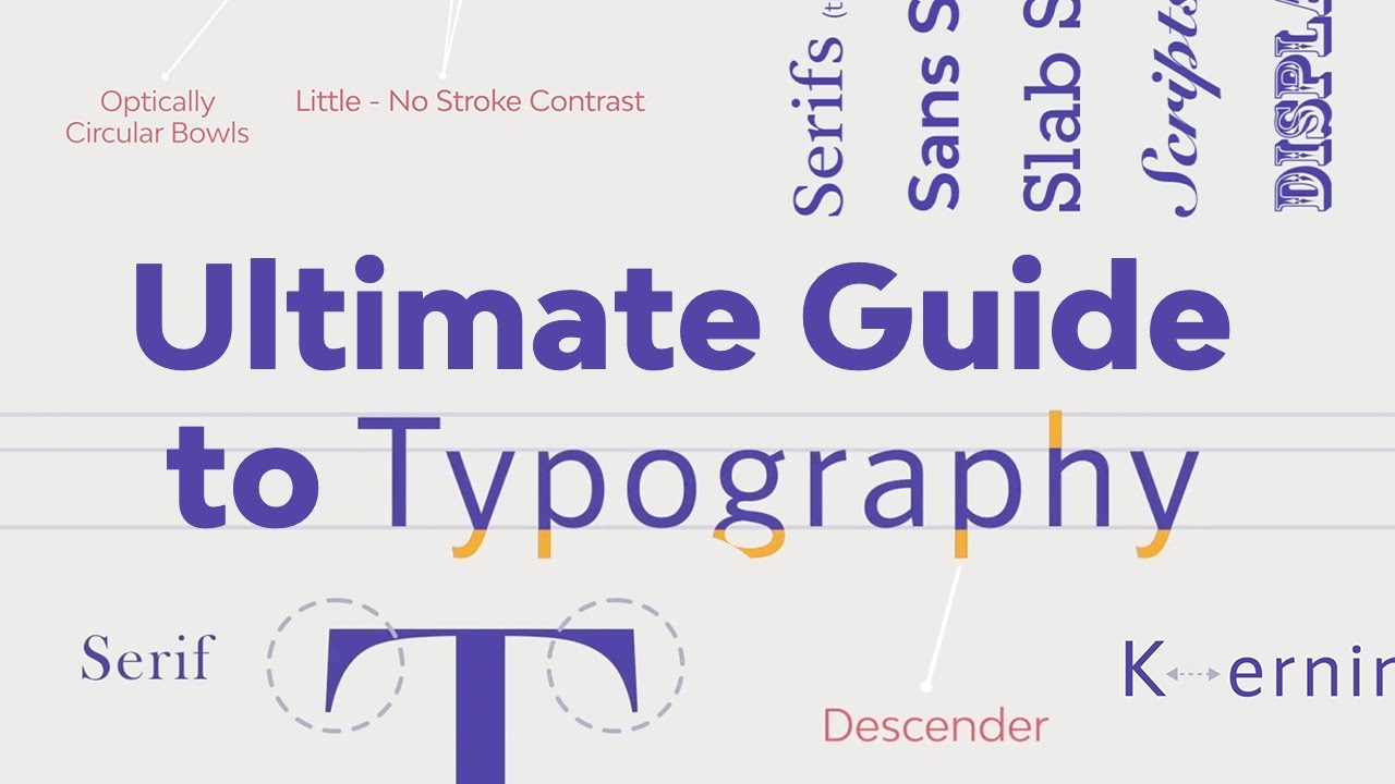
In short, the baseline is the invisible line letters rest on. It’s a key aspect of the aesthetics of text: it makes the letters look organized and easier to read. Other related letter anatomy concepts are:
- The meanline. The upper limit for the shorter lowercase letters like c, e, and o.
- The capline. The upper limit for uppercase letters and taller letters like b, d, and h.
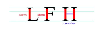
What is the stem?
The stem is one of the basic parts of any font. It consists of a single vertical stroke upwards used to create letters like L or F. Connect one stem to another using a crossbar detail, the horizontal line we find in the letter H.


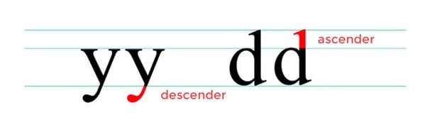
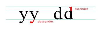
What are the ascender and descender?
Letters with downward strokes that extend past the baseline have Descender strokes. Alternatively, if the stroke moves upward and away from the main body of the letter, we call that the Ascender stroke. That’s what we mean when we talk about the ascender in typography anatomy.

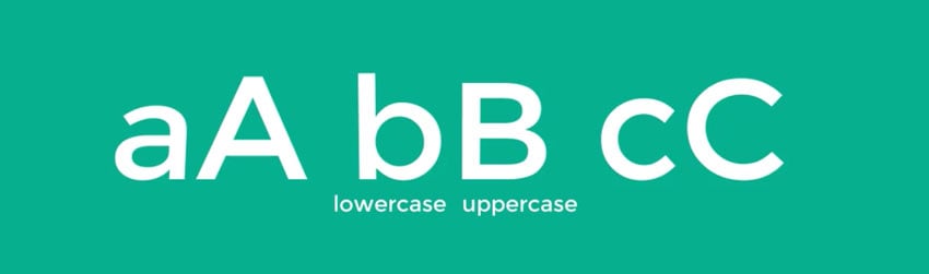
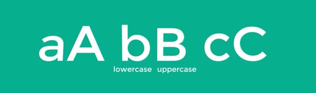
What are uppercase and lowercase letters?
These are some of the most common and well-known concepts from the font anatomy system. Uppercase letters are capital letters. Lowercase letters are smaller ones. We use uppercase letters for names and places, and lowercase letters for casual settings and improved readability.

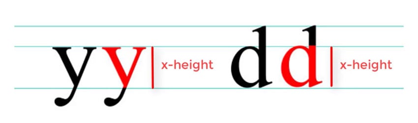
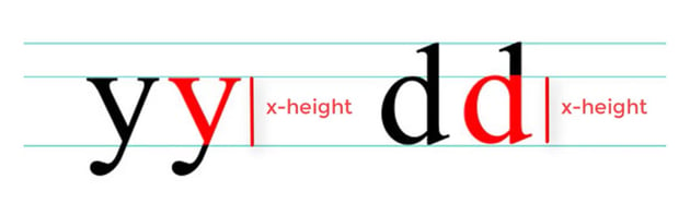
What is the X-height?
Let’s bring back two typeface anatomy concepts that we explored earlier: baseline and meanline. The space between these two lines is the X-height. For lowercase letters, the X-height is the main body of the letter.
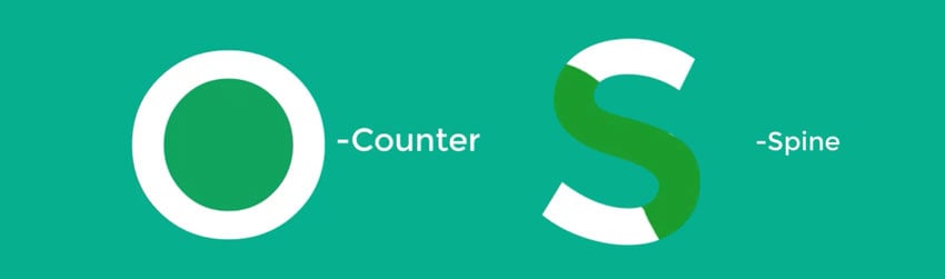
What are the counters and spine?
Think of the fully or partially closed spaces found in letters like O, A, and B. That’s the counter. If the letter isn’t fully closed, you guessed it: it’s an open counter.
On the other hand, the spine is a curved stroke. More specifically, it is the central stroke of the letter S.


What are the ear and the shoulder?
An ear is a decorative detail that pokes out from letters like g. A shoulder is a bumped curve seen in letters like m and n. These are features of typeface anatomy that vary widely from font to font.


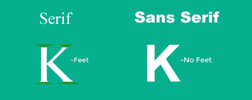
What is the difference between serif and sans serif?
Serif types feature extended stroke details also known as feet. These details are missing in sans serif styles.
There are many common fonts from both styles. Serifs tend to have a reputation for elegance and formality, while sans serif are considered to be simpler and cleaner.
Learn more about font trends for 2025 and what they’re used for.


Learn more about typography anatomy and terms
Typography is an art form every designer can admire. Continue exploring your interest in typography to build your skills over time. We’ve got some top videos for you from the Envato Tuts+ YouTube channel.
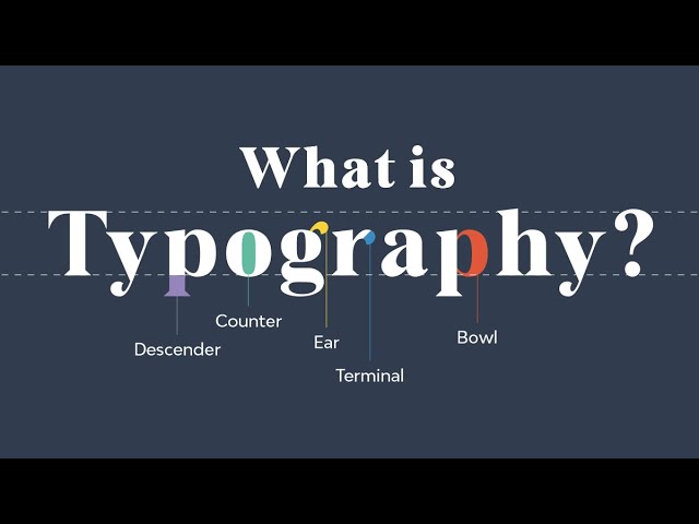
1. What is typography?
We covered typography anatomy and the parts of a font. But we haven’t discussed what typography is in more detail. Watch this video to learn all about it.
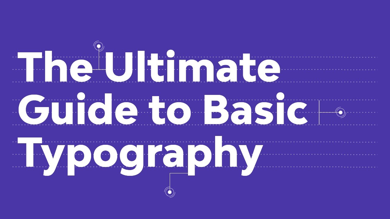
2. The ultimate guide to basic typography
If you enjoyed this quick letter anatomy tutorial, you’ll like this complete guide with typography terms and more. Beyond just the anatomy of typography, this video clarifies a few misused terms. It also touches on figures and symbols, and explains some indispensable typesetting terminology.
3. Free course: The ultimate guide to typography
Feel like taking a complete letter anatomy course? We’ve got the ultimate free guide for you. By the end of it, you’ll be able to confidently talk about typography and experiment with concepts and fonts as you hone your typography skills.
Get amazing design resources
Want to create videos like this? The resources used in this video are available in the Envato library:
Wish to continue learning or find more useful information? The anatomy of a font is only the beginning. Check out other amazing articles from the Envato Blog and Envato Tuts+:
How to make a font: 10+ typography and font tutorials for beginners