The more we communicate, the closer we become. Typography inspires us by reminding the world of a simpler time without connection. As designers and artists, we can carry that fascination into our work by studying the makeup of letters.
If you prefer video tutorials, you can start with the basics of typography anatomy with this quick video from the Tuts+ YouTube channel. Learn about the typography terms for letters and more!
Common Typography Terms
Next up, we’ll cover some of the most common typography terms for letters. Familiarize yourself with these terms to get a better handle on typography.
What Is the Baseline?
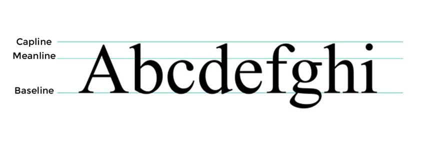
The invisible line letters rest on.
What Is the Stem?
A single vertical stroke upwards to create letters like L or F. Connect one stem to another using a crossbar detail, like the letter H.


What Are the Ascender and Descender?
Letters with downward strokes that extend past the baseline have Descender strokes. Alternatively, if the stroke moves upward and away from the main body of the letter, we call that the Ascender stroke. That’s what we mean when we talk about the ascender in typography.


What Are Uppercase and Lowercase Letters?
Uppercase letters are capital letters. Lowercase letters are smaller ones. Use uppercase letters for names and places, and lowercase letters for casual settings and more readability.


What Is the X-Height?
For lowercase letters, the X-height is the main body of the letter.


What Are the Counters and Spine?
Fully or partially closed spaces found in letters like O, A, and B. If the letter isn’t fully closed, then it’s an Open Counter.


What Are the Ear and the Shoulder?
An Ear is a decorative detail that pokes out from letters like g. A Shoulder is a bumped curve seen in letters like m and n.


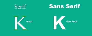
What Is the Difference Between Serif and Sans Serif?
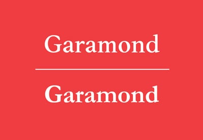
Serif types feature extended stroke details also known as feet. These details are missing in sans serif styles.


Learn More About Typography Anatomy and Terms
Typography is an art form every designer can admire. Continue exploring your interest in typography to build your skills over time. We’ve got some top videos for you from the Envato Tuts+ YouTube channel:
1. What Is Typography?
We covered typography anatomy and the parts of a font. But we haven’t discussed what exactly typography is. Watch this video to learn more.
2. The Ultimate Guide to Basic Typography
If you enjoyed this quick letter anatomy tutorial, you’ll like this complete guide with typography terms and more. The video clarifies a few misused terms, touches on figures and symbols, and explains some indispensable typesetting terminology.
3. Free Course: The Ultimate Guide to Typography
Feeling like taking a complete letter anatomy course? We’ve got the free course for you. By the end of this course, you’ll be able to confidently talk about typography and experiment with concepts and fonts as you hone your typography skills.
Get Amazing Design Resources
Want to create videos like this? Download the resources used in this video:
Check out these tutorials to learn more from our experts:


 TypographyWhat Is Typography?

 Typography5 Typography Secrets to Transform Your Designs

 TypographyReadability and Typesetting Basics: Kerning, Tracking, Leading, and More!

 TypographyHow to Design and Construct a Functional Cursive Font

 Font DesignThe Basics of Drawing Type & Creating Your Own Handwritten Font

 FontsThe Must-Have Fonts for Graphic Designers and Font Lovers

 FontsHow to Identify a Font

 Fonts16 Fonts Similar to Georgia

 Fonts17 Fonts Similar to Impact and Impact Font History

 Fonts15 Fonts Similar to Garamond and What to Pair It With

 Fonts14 Fonts Similar to Helvetica

 Typography16 Fonts Similar to Arial

 Fonts16 Fonts Similar to Copperplate

 FontsThe Different Types of Serif Fonts With Serif Font Examples
Editorial Note: This post has been updated with contributions from Maria Villanueva. Maria is the Associate Editor of the Tuts+ Design channel.


