In this article, we’ll take a brief look at neo-brutalist graphic design, its origin, its use in web design, and some awesome neo-brutalist fonts for your designs.
After the great Y2K experimental revival of the early 2020s, designers were craving less and more. Neo-brutalist graphic design entered the chat, first appearing in website design and later in other digital forms, and now we have our own typographic style. In this article, we’ll take a look at the origin of neo-brutalist graphic design and end with an awesome selection of neo-brutalist fonts from Envato Elements. Let’s dive in!
What Is Neo-Brutalist Graphic Design?
To define neo-brutalist graphic design, we have to first define what came before it, brutalist design. The name of this 1950s movement originated from the French béton brut, which means raw concrete. The style was just like it, pure and blunt. The field of architecture first saw the dawn of the brutalist style, which celebrated exposed raw materials and shied away from any type of decoration.
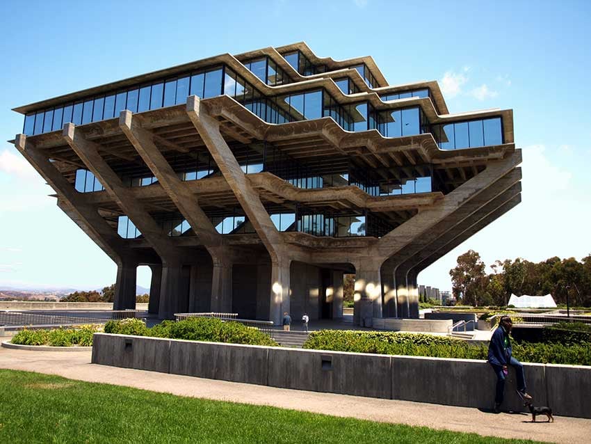


We’ve experienced the revival of brutalism in the last few years. Now it’s called neobrutalism, and it’s influencing the world of graphic design even more. In comparison to brutalism, neobrutalism has a visually modern approach while maintaining a few key aspects. Neo-brutalism emphasizes rawness and authenticity. There are more organic elements, natural patterns, and round shapes. Brutalism loved concrete, but now it’s translated into monochrome designs and oversized typography. Both of these styles are linked to rebellion, counterculture, and directness. They’re a reaction against oversaturated and highly decorated designs.
Neobrutalism vs. Brutalism vs. Minimalism
Design trends blend into one another, and I know it can get confusing using different terms with slightly different meanings. These overlapping trends had the same ethos in mind: to include only the necessary elements of order and precision. Let’s identify the main differences between these three trends.
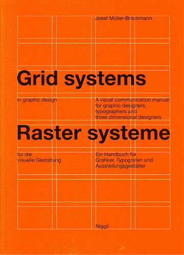
Minimalism can be considered a design language that uses the simplest and most essential elements in a design. Each element has a purpose and is carefully placed based on an organized grid. Josef Muller-Brockmann is the most renowned designer who mastered minimalism. The Swiss style of design was also a representation of minimalist design in the 40s and 50s. Minimalism takes the details into consideration, and there’s always a strong hierarchy and a sense of space.


Brutalism, on the other hand, conveys a different level of rawness. Taste is often left out of the picture, and the content comes first. Brutalist designs tend to be more in your face: think of the giant concrete buildings of the 50s and 60s.
Neobrutalism is the contemporary version of the 50s trend. It has influenced different design disciplines and not only architecture. The original brutalist trend from the 50s didn’t feature any colour. Neobrutalism comes with a twist, exploring different splashy colours and taking more consideration of the user (that’s in web design) to have a better experience. Neobrutalism is playful and often experimental, while still keeping that raw energy from the 50s trend.

Neo-Brutalism in Web Design
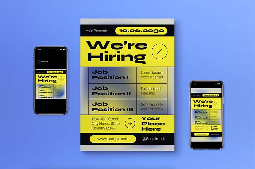
The neo-brutalism trend has also become a current trend in web design. Many eCommerce websites have adopted this trend as a new way to approach design, tired of the usual UI rules when it came to colors and element organization. Many of these web designs feature extreme contrast between bold typography and other graphical elements. The layouts can often be inconsistent, with unusual color backgrounds.

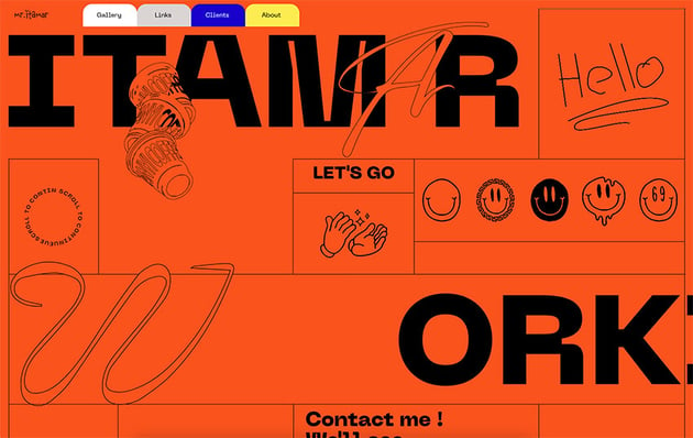

This website features a saturated background and a strong contrast between the main typography and the other elements. It’s extremely experimental but still displays the important elements clearly.
Characteristics of Neobrutalism in Graphic Design
There are key characteristics that define and separate this neo-brutalist graphic design trend from others. Let’s take a look at some of the features this trendy style has:
- Unrefined, unstyled elements: many designs include eye-catching geometric shapes, with playful and experimental layouts. Expect to see more than just geometric shapes and a few curves.
- Bold typography: neobrutalism is characterized by using raw fonts, ones that have a little more personality than those used in the minimalist movement. Sometimes they’re even quirky.
- Neo-brutalist color palette: this trend doesn’t shy away from bold colours. The original brutalist trend might have loved concrete, but this new version loves color, especially neon.
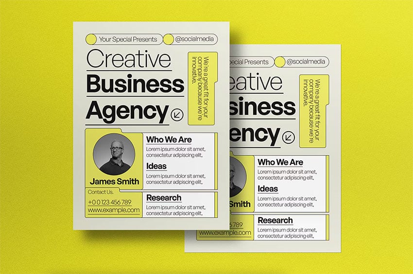
- Unconventional layouts: designs tend to be asymmetrical and sometimes even lack a sense of cohesiveness, especially when designing websites.

Neo-Brutalist Fonts
Typography is one of the most important tools for communicating in design. Minimalist typography aimed to have as little decoration as possible and to be highly legible, while often lacking personality.
Neo-brutalist fonts tend to be unique, unpolished, raw, and sometimes even quirky. Display fonts are meant to be used only for short-form content, so be sure to pick a legible font for longer text. Neobrutalist fonts tend to be graphical and experimental. Let’s take a look at some awesome examples from Envato Elements:
1. Borneo
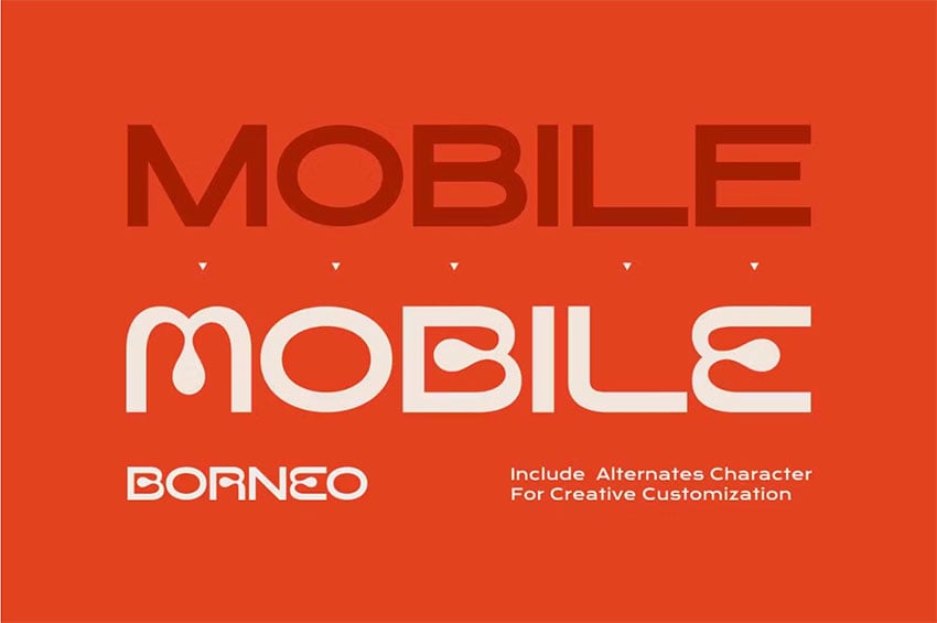


Neo-brutalist fonts tend to have a hint of futuristic flair. That’s certainly the case in this example; the sans serif version of Borneo is based on geometric shapes, while the second version looks unusual but with more personality.
2. Mono Rogient

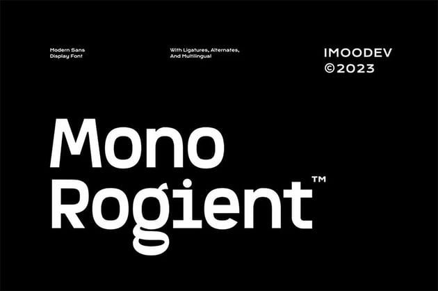
This modern sans serif font is a great example of neo-brutalism in fonts. It has smooth curves, and the monospace aspect of it enforces the computerized look.
3. Cozy Gelato Sans
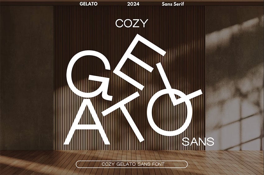

Small details added to a regular sans serif font are what set a normal font apart from a neobrutalist font. The small curve on the capital G and on a few other characters help create an architecture-like detail.
4. Brutalisme
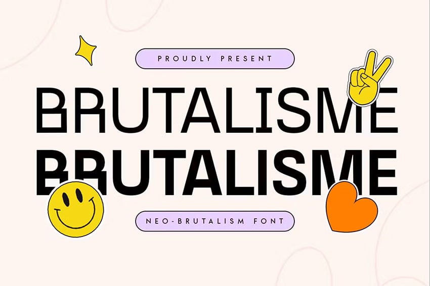

This could be the next iconic sans serif font. While it’s not your typical minimalist sans serif, it still looks polished and interesting at the same time. The bold version adds great contrast to any design.
5. Neuething Sans Serif Font
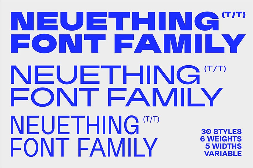

If you want to explore something more extreme, this neo-brutalist font is perfect. It has a contemporary, futuristic approach, and it’s perfect for exploring different extremes of typographic families.
6. Brutal Milk No 3
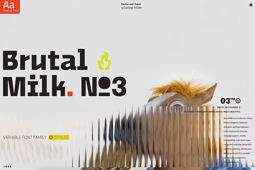

This neo-brutalist font is great if you want something very different from the typical fonts. It’s a mix of nostalgia with a Y2K flair—think of the websites and album covers of the early 2000s.
7. Baguede
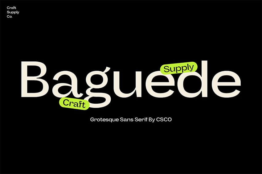
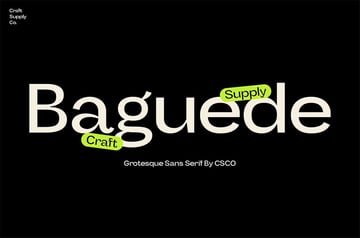
If you’re looking for something more sophisticated and legible, Baguede is perfect. The strokes aren’t exactly perfect or even, and that’s what helps make this font more human rather than being completely computerised.
8. Nebulica
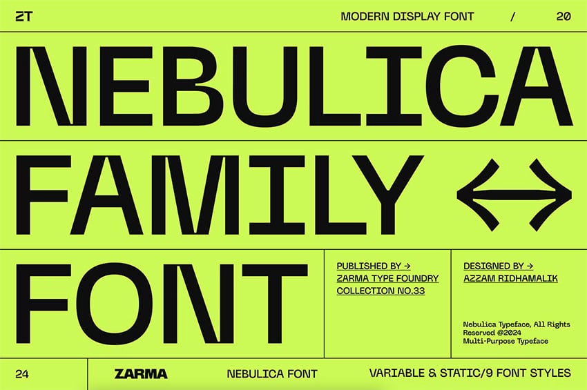

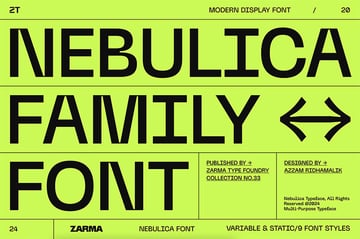
This modern sans serif is unique and legible. It mixes monospaced characteristics with geometric elements, making it look modern and sleek.
9. Gutón

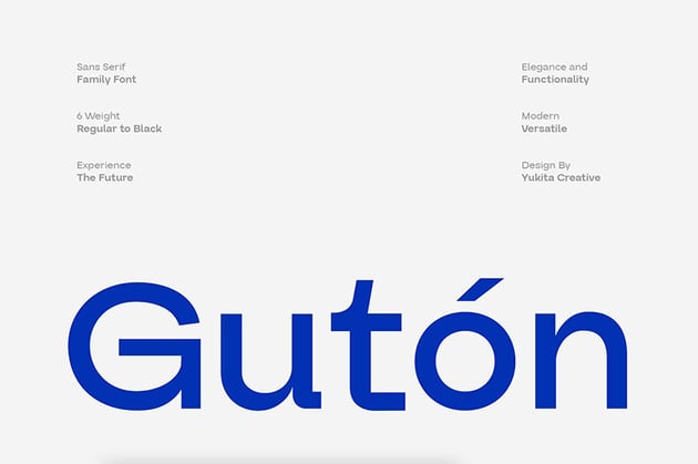

If you want something more versatile, this font is a perfect mix of sans serif font and an almost serif style. The small curves and 90-degree details make this font more architectural. You can appreciate each character as a graphic element rather than just another letter.
10. Brulia Modern
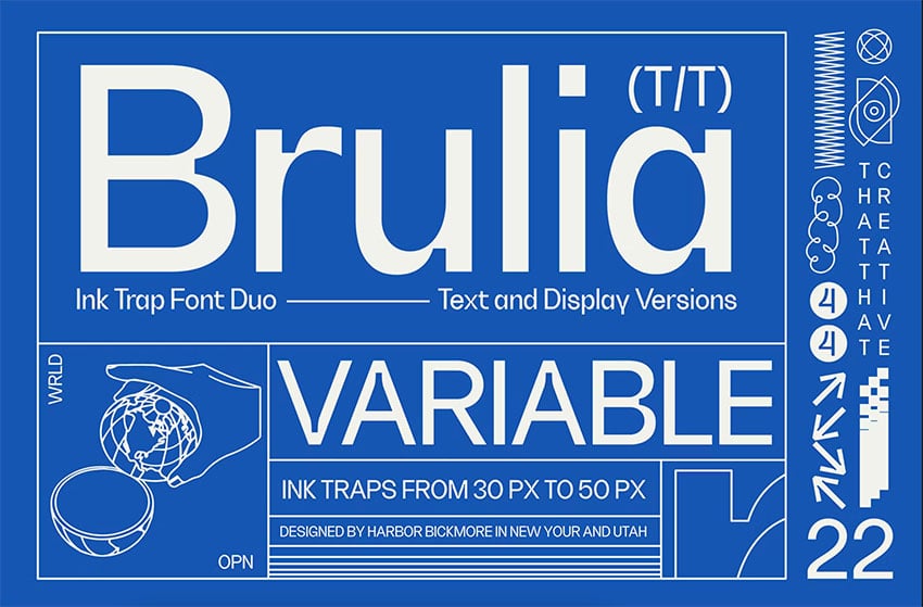


This font is directly inspired by brutalist architecture. To make it less common, there are small details added to each character. This is the perfect font if you’re looking for sophistication and strong personality.
Conclusion
In this article, we took a look at the history of neo-brutalist graphic design. We talked about neo-brutalism in web design, identified the characteristics of this famous trend, and looked at some edgy neo-brutalist fonts.
The brutalist trend has existed for many decades in architecture. In the last few years, after the Y2K revival, designers craved something a little different, and neo-brutalism was born. This trend can often be mistaken for minimalism, but neo-brutalism is definitely its own thing. It’s loud, expressive, and experimental. Have you adopted this trend yet?