
When it comes to creating a responsive design for mobile the most challenging aspect we face is creating a navigation menu that works well on any mobile device screen. Especially, when your website navigation menu has several items, squeezing all those items into a mobile device with small screen resolution, is a tricky problem to solve.
Through this post, I’ll be covering some design solution to mobile navigation problems. But before diving further into looking at the solutions to navigational layout issues of mobile, let’s first look at the most common problem you might encounter when accessing a website on your mobile device.
The Problem
If your website navigation has just 3 or 4 buttons, you won’t face any problem such as the navigation getting wrapped in two lines. But, in case your navigation contains more than 6 buttons, the buttons will pile up on top each other (as shown in the screenshot below).

Solutions to Mobile Navigation
1. Converting to a Dropdown Menu
The most preferred and widely used solution to the navigational layout problem of mobile (as we had discussed previously) is to turn your navigation to a dropdown for mobile devices having small resolution. For this purpose, you can write an HTML markup that uses the <select> and <option> elements. However, these elements cannot be styled using CSS, thereby leading to an inconsistent user experience. Moreover, not all of us can tinker with the code. A viable alternative to this problem is to make use of the jQuey plugin: Chosen. This plugin helps in making long and cumbersome select boxes user-friendly.
Example of Dropdown Menu:

2. Display Navigation Menu Items as Block Elements
The second solution is to the make each of the navigation menu item as block elements so that they are displayed vertically. However, there is a problem with this approach: it takes plenty of header space. And so, you should avoid using this approach if your navigation menu contains a lot of buttons, as it will make the users to scroll down the vast list of navigation items before they can actually see your content.
Example of Display Block:

3. Using a Menu Icon
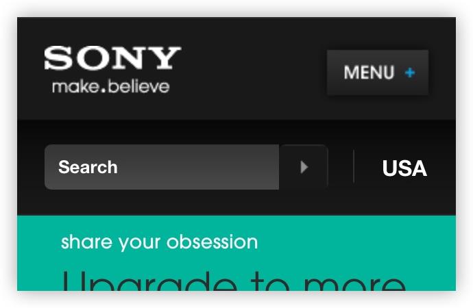
Another great way to resolve the mobile navigation issue is to use an icon to represent the navigation menu items – that can toggled on the click of the icon/button. The best thing about this solution is that it takes relatively less space compared to the above two solutions, and give you complete control over styling your menu via CSS. In fact, you can choose to style your menu icon to match it up according to your overall design.
Example of Menu Icon: Sony uses the “+” icon clicking on which opens up the hidden menu items.
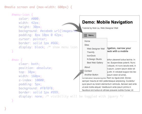
Using jQuery to Create a Mobile Navigation With Menu Icon
You can use jQuery to create a mobile navigation with a menu icon and toggle the navigation. The best part about using this approach is that doesn’t require using additional or non-semantic HTML tags.
HTML:
Here’s a simple HTML markup to create a navigation:
<nav id=”nav-wrap”>
<ul id=”nav”>
<li><a href=”#”>Button</a></li>
<li><a href=”#”>Button</a></li>
</ul>
</nav>
jQuery Code:
Now in order to add menu icon in the navigation, you will need to add the following jQuery script along with the function in between the <head> tag.
<script type=”text/javascript” src=”http://ajax.googleapis.com/ajax/libs/jquery/1.7/jquery.min.js”></script>
<script type=”text/javascript”>
jQuery(document).ready(function($ ){
/* prepend menu icon */
$ (‘#nav-wrap’).prepend(‘<div id=”menu-icon”>Menu</div>’);
/* toggle nav */
$ (“#menu-icon”).on(“click”, function(){
$ (“#nav”).slideToggle();
$ (this).toggleClass(“active”);
});
});
</script>
The above function will prepend the menu-icon. And on the click on #menu-icon element, it will toggle the navigation.
The above jQuery script will render the HTML code as follows:
<nav id=”nav-wrap”>
<div id=”menu-icon”>Menu</div>
<ul id=”nav”>
<li><a href=”#”>Button</a></li>
<li><a href=”#”>Button</a></li>
</ul>
</nav>
Working With the CSS:
I won’t be diving too deep and explaining every detail of the code that you need to include in your stylesheet. However, let’s jump onto the main part. In case the width of the viewport is less than 600px, then make sure to set #menu-icon attribute to display:block.
Conclusion
So, that’s it for now. Here’s hoping that reading the post will help you learn about the most commonly used solutions to fix the problem of mobile navigation.