The beginning of each year is marked by intense discussions about future web design trends: everyone shares its assumptions. It has become a tradition, so the time has come to put our 2 cents in.
We have compiled a list of 10 predictions that in our opinion will turn out to be correct to a varying degree. We have excluded flat style and responsiveness because of their obviousness. The first one has got an enormous stimulus from material design, and the second one, well, it is hard to name a trend actually, nowadays it is a must-have requirement. Also, we do not include ghost buttons since they are literally everywhere. So let’s get acquainted with our prognoses.
Web Design Trends for the Future
1. Integration with Mobile Web
Navicons, hamburger icons, slide out menus, hidden menus – and this is not the whole list of solutions successfully taken from mobile app interfaces that charge the website layouts and enhance user experience. Designers intend to unify various versions, making them look alike across various devices through interplay between these 2 types of interfaces.
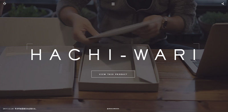
Hachi-Wari is an excellent example of that. The landing page with a great emphasis on the image backdrop looks the same on desktop, tablet and mobile. There is no inconsistency or confusion; everything is in its initial and rightful place. As a result, users naturally scan the website and won’t feel lost if coming to the project from another device.
2. Custom Photography
Designers try to step away from the stock, extremely overused images in favor of unique, visually appealing and custom photography. If earlier only a few could afford to have spectacular, uncommon shots, then today numerous designers go for this type of visual in order to not only enrich the design but also add a uniqueness and originality, bolstering the brand visually.
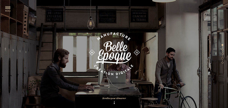
Belle Epoque produces a truly memorable and distinct impression. Of course, typography and seal-styled logotype play an important role here, finishing the appearance off; however, without a perfectly matched, outstanding image backdrop, the home page wouldn’t ooze so much charm and charisma.
3. Parallax is Going Nowhere
Long scrolling websites, one-page websites preferring scrolling over clicking, modular parallax, mind-blowing storytelling experiences, history-themed websites, informative web infographics and other matchless projects, where parallax rules the roost. Do you think with such a scope of utilization, it will lose its position and influence? Obviously, not, and this year the situation is unlikely to be changed drastically.
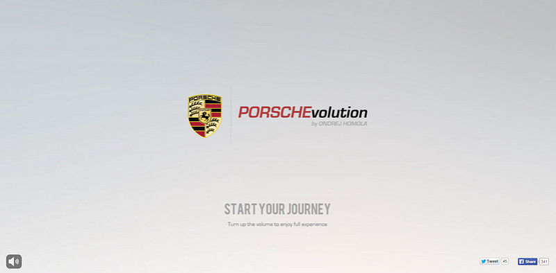
PorschEvolution takes you on a short but unforgettable emotional journey through the history of Porsche that has been skillfully brought to life with the help of the parallax effect.
4. Interactive Websites
Google Chrome Experiments, small browser games, dynamic analytics/stats based projects: interactivity gaining more and more popularity. With a significant boost from HTML5 that in tandem with JavaScript is capable of doing wonders, developers bless us with incredible, pioneering websites, clearly demonstrating the hidden power of sophisticated hypertext language.
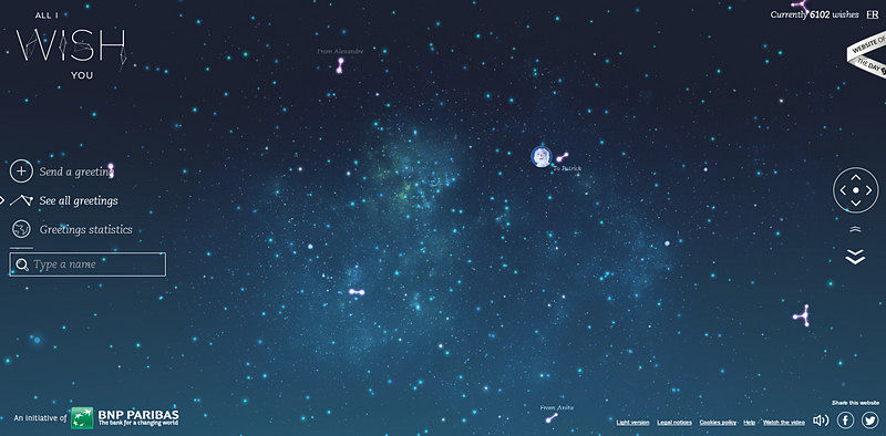
All I Wish You is a flawlessly executed universe of greetings, where interactivity calls the shots, offering an exciting way of passing time.
5. Personal Portfolios
The rise of first-rate personal portfolios with a zest has been observed during the last year. Creative/Art directors, artists, developers and designers who were ready to “sail alone” tried to make their presence felt in the web through creating unique, trendy and stylish portfolios. This year, they will please us with more amusing, intriguing, provocative and impressive websites.
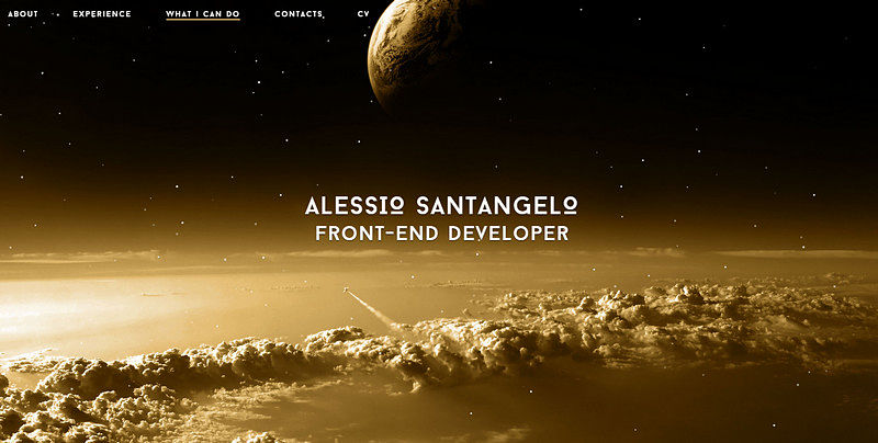
Alessio Santangelo is one of those who is not afraid to pursue his goals solo and work alone. He has capably stamped his sparkling personality on his online portfolio, expressing his sphere of expertise and professionalism in the best light.
6. Motion
Motion is a driving force for cinemagraphs, animated gifs, slow reveals and dynamic objects that diversify and reinforce website designs. This year it becomes more sophisticated and sought-after thanks to its subtlety and straightforward implementation.
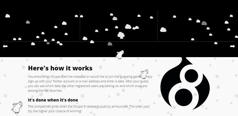
Although Drupal8 Release, with an enigmatic and a slightly strange design, at first sight evokes quite mixed feelings, animated characters in collaboration with dynamic elements bring about a startling effect.
7. Full-Screen Videos
We have already seen entertaining videos that reveal agencies’ workflows, company walkthroughs, short looped videos, professional video backdrops, and intriguing intros.
Full-screen videos that mark the front pages will undoubtedly continue to arouse the curiosity of online readers, drawing the whole attention to them.
The Pixel Age features a series of short delightful videos that are playing without pauses. They add an extra vibrancy and make the home page look extremely appealing.
8. Focus on UX: More Splash Screens, Unique Loading Bars, etc.
For a long time UX has been a “dark horse” that was taken into account only by chosen ones, yet the time has changed and UX-oriented designs are about to steal the show.
Last year, we saw a bunch of websites enhanced by primitive and creative loading bars, ingenious splash screens, fancy transition effects, accompanying animations and others, and this year the number of such projects will steadily increase.
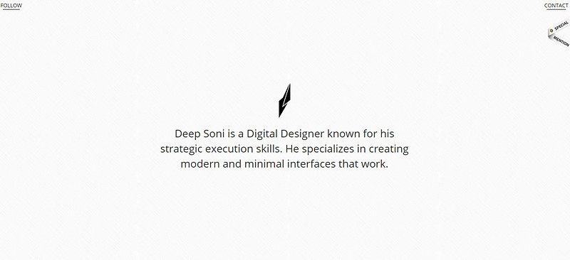
Deep Soni is a high-end personal portfolio that welcomes its readers with a short yet elegant opening intro. Here, well-thought-out minimalism in tandem with carefully executed UX makes the whole website.
9. Centered Site Layouts
This sounds to me more like a fad rather than a trend. However, one cannot help but mention that websites with evident centered layouts appear on the web here and there, slightly reminding us of the old days of fixed interfaces.
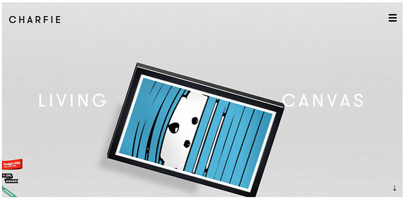
Charfie is such a site that pulls everything to the heart of the screen. Such a solution does not distract attention, saving you from zealously seeking necessary controls such as navicon or home button.
10. Last but not least, Microinteractions
Websites created with an excellent eye for detail and primarily focused on obtaining a high degree of comfort for users have become a quite popular. Microinteractions are everywhere, and although everyone agrees that content is king, these tiny pleasant features became a focal point last year and certainly won’t lose their position this year.
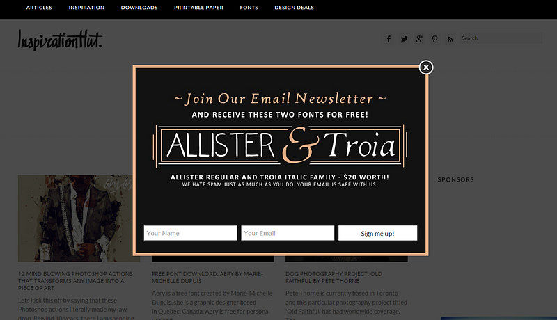
The home page of Inspiration Hut is marked by a glamorous pop-up window that unobtrusively suggests readers to subscribe to the newsletter, offering them extra fonts as gifts. This is a beautiful mousetrap.
Conclusion
Although the majority of trends come and go, not staying more than a year or even several months; they are significant factors that should be taken into account by those who want their projects to look cool and stylish.

