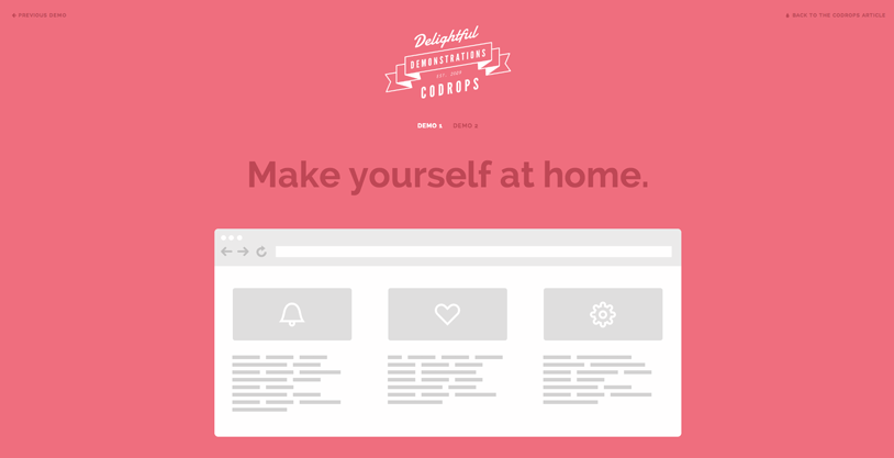
Today we want to show you how to create a very simple page preloading effect with CSS animations, SVG and JavaScript. For websites, where it’s crucial to load all or part of the assets, these kind of preloader screens can be a creative way to make waiting a bit less boring for the visitor. The idea for this tutorial is based on the beautiful preloading effect seen on the website of Fontface Ninja. Initially, the logo and a circular progress element slide up and when the loader finishes its progress animation, i.e. the page assets are loaded, the whole “header” moves up while the page elements are revealed with yet another animation. The sliding logo with its color change makes the icing on the cake.
In this tutorial we will re-create the effect seen on Fontface Ninja with some adjustments and a second demo with slightly different effects. For the logo and the circular progress element we will use inline SVGs, so that we can style their paths in our CSS. We’ll create a little script for the stroke animation of the SVG loading element and then we’ll control the page animations with classes that we add to the main container.
Please note that we’ll be using CSS animations and CSS 3D transforms, so this will only work as intended in browsers that support them.
So, let’s get started!
The Markup
Let’s wrap a header and the main content division into a container. We have to keep in mind that we want to control anything that happens to the initial view and the content with classes. So we will use the main container as our control element. We give it the class and ID ip-container.
The initial view consists of a header that contains the logo and the loading element. They are both SVGs and our logo is a bit more complex than the loader, so we’ll leave out the path coordinates in the snippet below because its really long. As you can see, we are defining some SVG attributes like the width and height, the viewBox and the preserveAspectRatio. The value for the preserveAspectRatio is xMidYMin meet which means that we force uniform scaling where the graphic fits completely into its container while its centered on the X axis and aligned at the top. In order to make the logo accessible, we add a title, description and the necessary ARIA attribute, aria-labelledby.
The main content has the class ip-main and later on we’ll apply animations to its children, the headline, the division and the inner boxes:
<div id="ip-container" class="ip-container">

 	<!-- initial header -->
 	<header class="ip-header">

 		<h1 class="ip-logo">
 			<svg class="ip-inner" width="100%" height="100%" viewBox="0 0 300 160" preserveAspectRatio="xMidYMin meet" aria-labelledby="logo_title">
 				<title id="logo_title">Delightful Demonstrations by Codrops</title>
 				<path d="...our super-long path..." />
 			</svg>
 		</h1>

 		<div class="ip-loader">
 			<svg class="ip-inner" width="60px" height="60px" viewBox="0 0 80 80">
 				<path class="ip-loader-circlebg" d="M40,10C57.351,10,71,23.649,71,40.5S57.351,71,40.5,71 S10,57.351,10,40.5S23.649,10,40.5,10z"/>
 				<path id="ip-loader-circle" class="ip-loader-circle" d="M40,10C57.351,10,71,23.649,71,40.5S57.351,71,40.5,71 S10,57.351,10,40.5S23.649,10,40.5,10z"/>
 			</svg>
 		</div>

 	</header>

 	<!-- main content -->
 	<div class="ip-main">

 		<h2>Make yourself at home.</h2>

 		<div class="browser clearfix">
 			<div class="box">
 				<span class="icon-bell"></span>
 				<p>...</p>
 			</div>
 			<div class="box">
 				<span class="icon-heart"></span>
 				<p>...</p>
 			</div>
 			<div class="box">
 				<span class="icon-cog"></span>
 				<p>...</p>
 			</div>
 		</div>

 	</div>
 </div><!-- /container -->
Let’s go on and style this.
The CSS
Note that the CSS will not contain any vendor prefixes, but you will find them in the files.
Initially, we’ll include some fonts that we’ll need for the dummy text and the icons in the boxes. The icons used in the demos are from the Feather icon set and we’ve created the icon font with the Icomoon App. The dummy font is Blokk, a really great fonts when creating wireframes and mockups.
 @font-face {
 	font-weight: normal;
 	font-style: normal;
 	font-family: 'Blokk';
 	src: url('../fonts/blokk/BLOKKRegular.eot');
 	src: url('../fonts/blokk/BLOKKRegular.eot?#iefix') format('embedded-opentype'),
 		 url('../fonts/blokk/BLOKKRegular.woff') format('woff'),
 		 url('../fonts/blokk/BLOKKRegular.svg#BLOKKRegular') format('svg');
 }

 @font-face {
 	font-weight: normal;
 	font-style: normal;
 	font-family: 'feather';
 	src:url('../fonts/feather/feather.eot?-9jv4cc');
 	src:url('../fonts/feather/feather.eot?#iefix-9jv4cc') format('embedded-opentype'),
 		url('../fonts/feather/feather.woff?-9jv4cc') format('woff'),
 		url('../fonts/feather/feather.ttf?-9jv4cc') format('truetype'),
 		url('../fonts/feather/feather.svg?-9jv4cc#feather') format('svg');
 }
We want the header to fill all the viewport initially, so let’s give it a 100% in width and height and set its position to fixed:
 .ip-header {
 	position: fixed;
 	top: 0;
 	z-index: 100;
 	min-height: 480px;
 	width: 100%;
 	height: 100%;
 	background: #f1f1f1;
 }
Let’s remove any margins from the logo headline:
 .ip-header h1 {
 	margin: 0;
 }
Both, the logo and the loader will be positioned absolutely and we’ll stretch them over the viewport:
 .ip-logo,
 .ip-loader {
 	position: absolute;
 	left: 0;
 	width: 100%;
 	opacity: 0;
 	cursor: default;
 	pointer-events: none;
 }
Instead of simply taking the logo element and positioning it in the center of the header, we need to keep the following in mind: we want the logo SVG itself to be responsive, meaning that we might not have knowledge about its dimension, and we want to move it to the top of the main content using 3D transforms, once the loading is done. Mainly, because we don’t know the size of our logo, we don’t know how much we have to actually translate it in order to be at the top of the content (percentage translations take the element as reference and not the parent). But we do know and can work with one particular value: the viewport height. So let’s just set the logo to 100% height and translate it 25% so that the logo SVG stays in the middle of the page:
 .ip-logo {
 	top: 0;
 	height: 100%;
 	transform: translate3d(0,25%,0);
 }
We position the logo element at the bottom of the viewport:
 .ip-loader {
 	bottom: 20%;
 }
The SVGs, which we gave the class ip-inner, will be displayed as block element and we center it horizontally with the auto margin:
 .ip-header .ip-inner {
 	display: block;
 	margin: 0 auto;
 }
The logo SVG should be responsive but not become too big or too small. So, beside a percentage value as the width, we also set a max and min width:
 .ip-header .ip-logo svg {
 	min-width: 320px;
 	max-width: 480px;
 	width: 25%;
 }
Since we’ve added the logo SVG inline, we can directly style the color of the path:
 .ip-header .ip-logo svg path {
 	fill: #ef6e7e;
 }
And the same holds for the loader:
 .ip-header .ip-loader svg path {
 	fill: none;
 	stroke-width: 6;
 }
The first path has a gray fill:
 .ip-header .ip-loader svg path.ip-loader-circlebg {
 	stroke: #ddd;
 }
And the second path will have the progress transition that we will control in our JS. But here, we’ll define the transition of the stroke-dashoffset:
 .ip-header .ip-loader svg path.ip-loader-circle {
 	transition: stroke-dashoffset 0.2s;
 	stroke: #ef6e7e;
 }

And now, we’l style the content of the page, which is all wrapped in the ip-main division:
 .ip-main {
 	overflow: hidden;
 	margin: 0 auto;
 	padding: 160px 0 10em 0;
 	max-width: 1100px;
 	width: 90%;
 }
The headline will be sized with vw which will make it responsive:
 .ip-main h2 {
 	margin: 0;
 	padding: 0.5em 0 1em;
 	color: #be4856;
 	text-align: center;
 	font-size: 4.25em;
 	font-size: 4vw;
 	line-height: 1;
 }
Let’s add a browser image:
 .browser {
 	margin: 0 auto;
 	padding-top: 8%;
 	min-height: 400px;
 	max-width: 1000px;
 	width: 100%;
 	border-radius: 8px;
 	background: #fff url(../img/browser.png) no-repeat 50% 0;
 	background-size: 100%;
 	color: #d3d3d3;
 }
And some dummy boxes:
 .box {
 	float: left;
 	padding: 3.5em;
 	width: 33.3%;
 	font-size: 0.7em;
 	line-height: 1.5;
 }

 .box p {
 	font-family: 'Blokk', Arial, sans-serif;
 }
The boxes will each have an icon:
 [class^="icon-"]::before,
 [class*=" icon-"]::before {
 	display: block;
 	margin-bottom: 0.5em;
 	padding: 0.5em;
 	border-radius: 5px;
 	background: #dfdfdf;
 	color: #fff;
 	text-align: center;
 	text-transform: none;
 	font-weight: normal;
 	font-style: normal;
 	font-variant: normal;
 	font-size: 5em;
 	font-family: 'feather';
 	line-height: 1;
 	speak: none;
 	-webkit-font-smoothing: antialiased;
 	-moz-osx-font-smoothing: grayscale;
 }

 .icon-bell:before {
 	content: "\e006";
 }

 .icon-cog:before {
 	content: "\e023";
 }

 .icon-heart:before {
 	content: "\e024";
 }
Now we have to define the animations that should take place. As we mentioned earlier, we will control the firing of animations by adding classes to the main container.
The initial animation of the header elements will make them move in from the bottom:
 .loading .ip-logo,
 .loading .ip-loader {
 	opacity: 1;
 	animation: animInitialHeader 1s cubic-bezier(0.7,0,0.3,1) both;
 }

 .loading .ip-loader {
 	animation-delay: 0.2s;
 }

 @keyframes animInitialHeader {
 	from {
 		opacity: 0;
 		transform: translate3d(0,800px,0);
 	}
 }
We only need to define the from keyframe since we want to move the elements to their original position.
The custom cubic-bezier timing function, will add a nice smoothness to the effect. The loading element needs to have a slight delay before it slides in.
At this point, let’s keep in mind, that we will animate the circular progress with JS. So we need another “state” which will be switched to, once that progress animation is done. We will give the class loaded to the container and apply the following animations:
 .loaded .ip-logo,
 .loaded .ip-loader {
 	opacity: 1;
 }

 .loaded .ip-logo {
 	transform-origin: 50% 0;
 	animation: animLoadedLogo 1s cubic-bezier(0.7,0,0.3,1) forwards;
 }

 @keyframes animLoadedLogo {
 	to {
 		transform: translate3d(0,100%,0) translate3d(0,50px,0) scale3d(0.65,0.65,1);
 	}
 }

 .loaded .ip-logo svg path {
 	transition: all 0.5s ease 0.3s;
 	fill: #fff;
 }

 .loaded .ip-loader {
 	animation: animLoadedLoader 0.5s cubic-bezier(0.7,0,0.3,1) forwards;
 }

 @keyframes animLoadedLoader {
 	to {
 		opacity: 0;
 		transform: translate3d(0,-100%,0) scale3d(0.3,0.3,1);
 	}
 }
The logo moves down 100% (remember, our logo is 100% of the viewport height, so this will make it move the entire screen height) plus a bit more for some spacing, and then we also scale it down a bit. The color of the SVG path will change with a transition.
The loader element moves up, scales down and fades out.
The fixed header itself needs to move up as well:
 .loaded .ip-header {
 	animation: animLoadedHeader 1s cubic-bezier(0.7,0,0.3,1) forwards;
 }

 @keyframes animLoadedHeader {
 	to { transform: translate3d(0,-100%,0); }
 }
Let’s take care of the content elements. Here, you can do a lot of creative effects. This of course, all depends on what content you have on the page. In our case, we want to fade the elements in while moving them up from below:
 /* Content animations */
 .loaded .ip-main h2,
 .loaded .ip-main .browser,
 .loaded .ip-main .browser .box,
 .loaded .codrops-demos {
 	animation: animLoadedContent 1s cubic-bezier(0.7,0,0.3,1) both;
 }

 .loaded .ip-main .browser,
 .loaded .ip-main .browser .box:first-child {
 	animation-delay: 0.1s;
 }

 .loaded .ip-main .browser .box:nth-child(2) {
 	animation-delay: 0.15s;
 }

 .loaded .ip-main .browser .box:nth-child(3) {
 	animation-delay: 0.2s;
 }

 @keyframes animLoadedContent {
 	from {
 		opacity: 0;
 		transform: translate3d(0,200px,0);
 	}
 }
The slight delay for the boxes in the browser division, will create a nifty extra effect.
In order to avoid problems with scrolling and gaps at the bottom of the page, we need to switch the positioning of the header from fixed to absolute. This, we can control by adding a class to the body (or any parent) once all the animations are done. With the help of that class, we switch the positioning:
 .layout-switch .ip-header {
 	position: absolute;
 }
If we don’t have JavaScript, we show the state after all animations. This we can do by setting the header to relative positioning and sizing the logo accordingly:
 .no-js .ip-header {
 	position: relative;
 	min-height: 0px;
 }

 .no-js .ip-header .ip-logo {
 	margin-top: 20px;
 	height: 180px;
 	opacity: 1;
 	transform: none;
 }

 .no-js .ip-header .ip-logo svg path {
 	fill: #fff;
 }
Last, but not least, we have to take care of the large headline and the boxes for smaller screens:
 @media screen and (max-width: 45em) {

 	.ip-main h2 {
 		font-size: 2.25em;
 		font-size: 10vw;
 	}

 	.box {
 		width: 100%%;
 	}

 }

And that’s all the style.
The JavaScript
The JavaScript consists of two parts. We will separate the general progress element’s loading functionality from the rest. Let’s call that script pathLoader.js since it is the path element that animates.
We want to be able to set the stroke-dashoffset in order to animate the filling the path. Initially, this and the stroke-dasharray are set to the length of the path (getTotalLength()). We draw the path by setting the dash offset to a lower value up until zero where the path is totally drawn. This is done by calling the setProgress function with a parameter for the value. The optional callback parameter might be useful if we want to execute some code once the value is set and the transition is finished.
 function PathLoader( el ) {
 	this.el = el;
 	// clear stroke
 	this.el.style.strokeDasharray = this.el.style.strokeDashoffset = this.el.getTotalLength();
 }

 PathLoader.prototype._draw = function( val ) {
 	this.el.style.strokeDashoffset = this.el.getTotalLength() * ( 1 - val );
 }

 PathLoader.prototype.setProgress = function( val, callback ) {
 	this._draw(val);
 	if( callback && typeof callback === 'function' ) {
 		// give it a time (ideally the same like the transition time) so that the last progress increment animation is still visible.
 		setTimeout( callback, 200 );
 	}
 }

 PathLoader.prototype.setProgressFn = function( fn ) {
 	if( typeof fn === 'function' ) { fn( this ); }
 }
The setProgressFn method is used here to define a possible way to interact with the loader. For instance, for our demo we are not preloading anything but instead we simulate a loading animation by setting a random value between 0 and 1 throughout a set of time intervals:
 var simulationFn = function(instance) {
 	var progress = 0,
 		interval = setInterval( function() {
 			progress = Math.min( progress + Math.random() * 0.1, 1 );
 			instance.setProgress( progress );
 			// reached the end
 			if( progress === 1 ) {
 				clearInterval( interval );
 			}
 		}, 100 );
 };

 var loader = new PathLoader([pathselector]);
 loader.setProgressFn(simulationFn);
Next, let’s create our resting script in main.js. First we initialize and cache some variables:
 var support = { animations : Modernizr.cssanimations },
 	container = document.getElementById( 'ip-container' ),
 	header = container.querySelector( 'header.ip-header' ),
 	loader = new PathLoader( document.getElementById( 'ip-loader-circle' ) ),
 	animEndEventNames = { 'WebkitAnimation' : 'webkitAnimationEnd', 'OAnimation' : 'oAnimationEnd', 'msAnimation' : 'MSAnimationEnd', 'animation' : 'animationend' },
 	// animation end event name
 	animEndEventName = animEndEventNames[ Modernizr.prefixed( 'animation' ) ];
We start the initial animation (both logo and loader slide up) by adding the loading class to the main container. After the animation ends we start the “fake” loading animation on the SVG loader element like explained before. Note that while these animations are taking place we don’t allow the page to be scrolled.
 function init() {
 	var onEndInitialAnimation = function() {
 		if( support.animations ) {
 			this.removeEventListener( animEndEventName, onEndInitialAnimation );
 		}

 		startLoading();
 	};

 	// disable scrolling
 	window.addEventListener( 'scroll', noscroll );

 	// initial animation
 	classie.add( container, 'loading' );

 	if( support.animations ) {
 		container.addEventListener( animEndEventName, onEndInitialAnimation );
 	}
 	else {
 		onEndInitialAnimation();
 	}
 }

 // no scroll
 function noscroll() {
 	window.scrollTo( 0, 0 );
 }
Again, we will simulate that something is being loaded by passing a custom function to the setProgressFn. Once the animation is finished we replace the loading class with the loaded class which will initiate the main animations for the header and the content. After that’s done, we add the layout-switch class to the body and allow scrolling:
 function startLoading() {
 	// simulate loading something..
 	var simulationFn = function(instance) {
 		var progress = 0,
 			interval = setInterval( function() {
 				progress = Math.min( progress + Math.random() * 0.1, 1 );

 				instance.setProgress( progress );

 				// reached the end
 				if( progress === 1 ) {
 					classie.remove( container, 'loading' );
 					classie.add( container, 'loaded' );
 					clearInterval( interval );

 					var onEndHeaderAnimation = function(ev) {
 						if( support.animations ) {
 							if( ev.target !== header ) return;
 							this.removeEventListener( animEndEventName, onEndHeaderAnimation );
 						}

 						classie.add( document.body, 'layout-switch' );
 						window.removeEventListener( 'scroll', noscroll );
 					};

 					if( support.animations ) {
 						header.addEventListener( animEndEventName, onEndHeaderAnimation );
 					}
 					else {
 						onEndHeaderAnimation();
 					}
 				}
 			}, 80 );
 	};

 	loader.setProgressFn( simulationFn );
 }
And that’s it, all done!
We hope you enjoyed this tutorial and find it useful and inspiring!
Resource credits: Browser by Keyners, logo made from GraphicBurger template: 5 Vintage Labels / Insignias Vol.1

