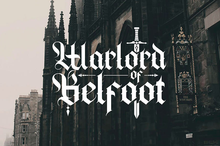
In this “Mastering Calligraphy” lesson, we’ll be learning what is by far the hardest font but also the most impressive: Gothic Script.
This font is a bit different than the others because it’s made up of so many small strokes. However, the letters are very similar in construction so once you have a few down, you can do the rest easily!
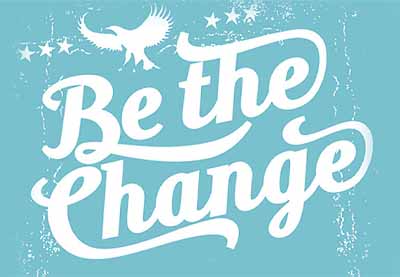
But if you’re looking for Gothic calligraphy fonts for your digital projects, we’ve got some of the best for you.

Scroll down after this Gothic calligraphy tutorial. We’ve got a selection of premium Gothic calligraphy fonts from Envato Elements.
What You Will Learn In This Gothic Calligraphy Tutorial
- How to write in Gothic style
- Gothic calligraphy strokes
- Lowercase Gothic calligraphy alphabet
- Uppercase Gothic calligraphy alphabet
What You’ll Need
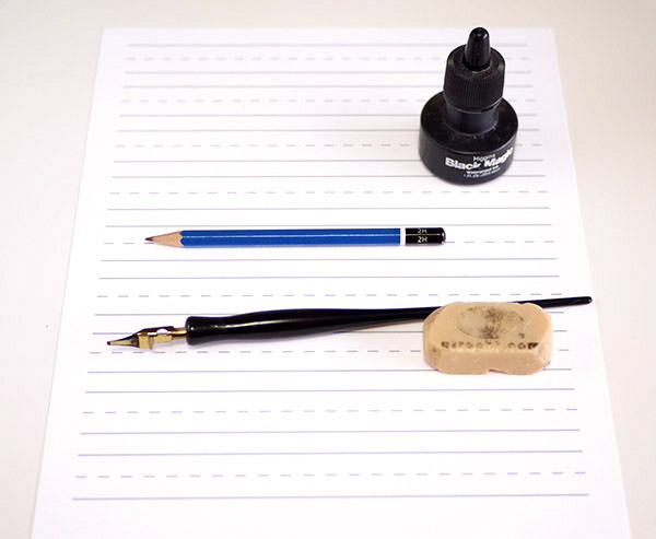
- Pencil
- Eraser
- Black ink (preferably Speedball or Higgins waterproof ink)
- Practice sheet
- Pen holder (the black part of the pen above)
- Flat-tipped pen nib (the shiny gold part of the pen above)
1. Review the Introduction Lesson
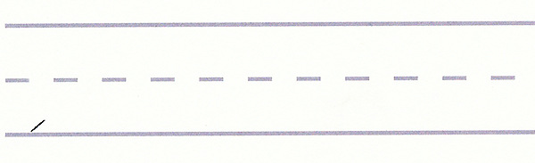
Before we dive into Gothic Script, let’s warm up our hands. We’re going to go back to the basics and add a few strokes unique to this type of calligraphy.
Step 1
Print out four or five of the practice sheets on a nice cardstock or Bristol paper.
Step 2
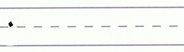
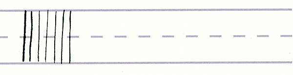
Practice the basic downward serif/connecting strokes for one or two lines to warm up.
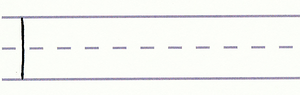
For the downward serif stroke, place your pen nib at a 45-degree angle above the dashed line. (For now, we’re making the stroke above the dashed line, but it can be made anywhere, as you’ll soon see.) Then drag your pen downward at a diagonal to the right. You should have a wide pen stroke on the paper.
Step 3
Practice making the downward serif stroke a few times.
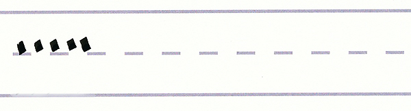
Step 4
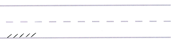
Let’s learn the upward serif/connecting stroke. Place your pen tip again at a 45-degree angle (this time on the bottom line) and drag your pen upward and to the right. You should have a very thin pen stroke on the paper.
Step 5
Practice making the upward serif stroke a few times.
Now we’re ready to start. In this lesson on mastering calligraphy, we’re going to learn the extremely fancy alphabet called Gothic Script.
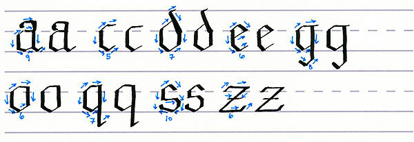
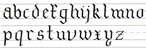
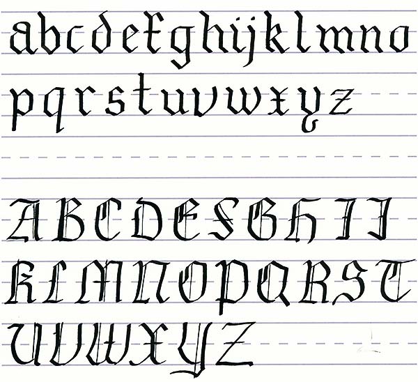
2. Gothic Script Lowercase Alphabet
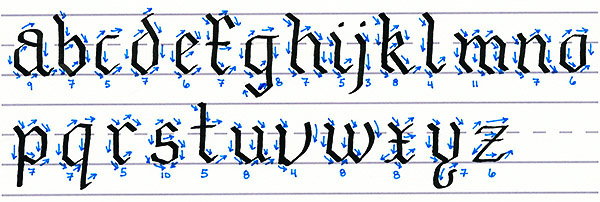
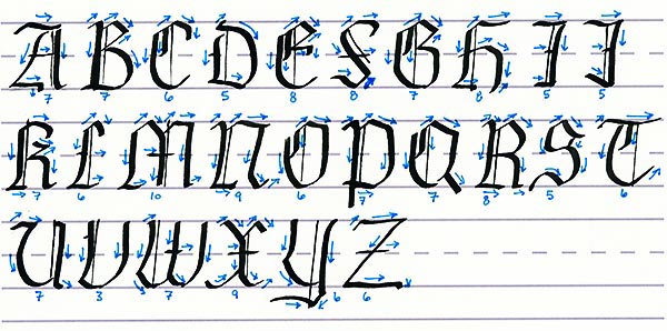
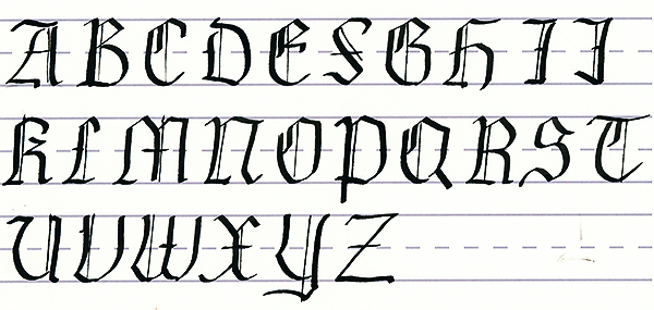
Let’s take a look at the Gothic Script alphabet. As you can see, it’s an extremely fancy and intricate alphabet. Each of the Gothic calligraphy letters is made up of many small strokes. I’ve learned this alphabet from several instructors, and each does it differently. So the best thing to do is to look at the way the strokes go and, as you practice each letter, decide which order you prefer to draw the strokes. The blue arrows above show the directions of the pen strokes, and the numbers below tell you how many strokes make up each letter.
We’re going to start with the lowercase alphabet and break it up into two sections: those that start with a downward serif and those that start with an upward serif.
Print out a copy of the Gothic calligraphy alphabet above so that you have it handy for reference.
3. Downward Serif Lowercase Letters
Step 1
The Gothic calligraphy letters b, f, h, i, j, k, l, m, n, p, r, t, u, v, x, and y all begin with the downward serif/connecting stroke. I would recommend sketching out the letters using your pencil first to feel more comfortable. Then you can simply follow the pencil lines with your pen.
Step 2
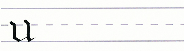
Let’s start with the “u” since it’s easiest. Place your pen tip just above the dashed line at a 45-degree angle. Drag your pen downward at an angle to the dashed line.
Now make a normal downward stroke to just above the bottom line. Lift your pen tip and put it down again at the end of your last line but at a 45-degree angle.
Make another downward serif stroke to the bottom line. This one will be slightly longer than the first one. Now lift your pen tip again and place it above the dashed line to the right of where you last ended.
Make a small downward serif stroke to the dashed line. Then draw a normal downward stroke to just above the bottom line. Make another small downward serif stroke to the bottom line. Placing your pen tip at a 45-degree angle at the bottom of your first series of lines, draw an upward/connecting serif to the second set.
This is the bottom of your “u”. Make another upward serif at the end of the “u”. Take a deep breath because you just made your first Gothic Script “u”.
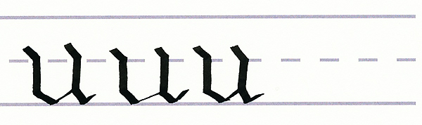
Step 3
Repeat the process of making the letter “u” two or three times so that you get the feel of it. You can see how it’s made of many basic strokes. Many letters, such as the m, n, v, w, and y are very similar to the “u”. Once you have the “u” down, it’s easy to see how other letters are made. After all, it’s just a lot of connecting strokes and straight lines.
Step 4
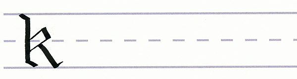
Let’s try a harder letter: k. The “k” starts the same as the “u” but at the top line. This time, your downward stroke goes all the way to just above the bottom line, where you finish it off with a downward serif stroke.
Lift your pen and place it at a 45-degree angle on the dashed line. Make a long upward serif stroke. This is the top of your “k”. Now make a downward serif stroke that meets the dashed line.
Lifting your pen, place it again at a 45-degree angle on the main downward stroke of the “k”, a bit below where your last upward stroke started. Make another upward serif stroke to connect with the bottom of your last stroke.
Now place your pen at a 45-degree angle in the middle of that last line, and draw a downward stroke at an angle to just above the bottom line.
Finish off this fancy “k” with one last upward serif at the end of the leg you were drawing. A bit superfluous, I know, but look how fancy that letter “k” is.
Step 5
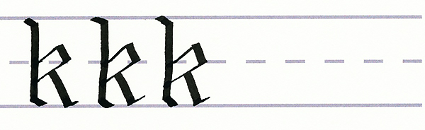
Repeat the process of making the letter “k” two or three times so that you get the feel of it.
Step 6
Slowly make your way through the rest of the downward serif stroke lowercase letters, using the guide of the strokes as a reference.
4. Serif Stroke Lowercase Letters
Step 1
The Gothic calligraphy letters a, c, d, e, g, o, q, s, and z all begin with the upward serif/connecting stroke. I would recommend sketching out the letters using your pencil first to feel more comfortable. Then you can simply follow the pencil lines with your pen.
Step 2
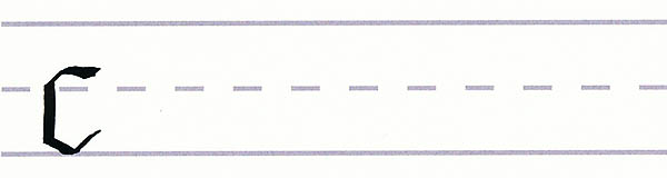
Let’s start with the letter “c” since it’s easiest. Put your pen tip down just above the dashed line at a 45-degree angle, and make an upward serif stroke.
Put your pen back down horizontally on the dashed line, and make a regular downward stroke to just above the bottom line. Then make a downward serif stroke to the bottom line.
Let’s top this “c” off with some fancy ends. So keeping your pen where it was, turn it to 45 degrees and make an upward serif stroke to finish off the bottom of the “c”. Now we just need to top off the “c”. Place your pen at a 45-degree angle at the end of your very first upward serif stroke, and draw a horizontal line to the right. Woohoo! You have a “c”.
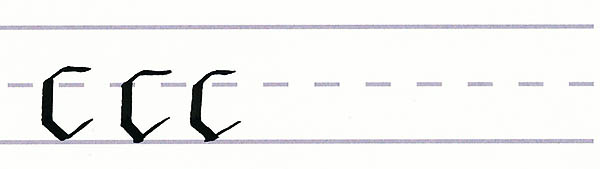
Step 3
Repeat the process of making the letter “c” two or three times so that you get the feel of it.
Step 4
Now we’re going to expand on that “c” and make a “g”. Start by making a “c”, but this time draw the last horizontal line a bit longer. Then, place your pen tip horizontally on the line that you’ve just drawn, a little to the left of the end of it, and make a downward stroke that goes past the bottom line. This is the tail of the “g”. Now we’re just going to make it a little fancier with a downward serif stroke and an upward serif stroke to make the hook on the end of the tail of the “g”. Not too hard, right?
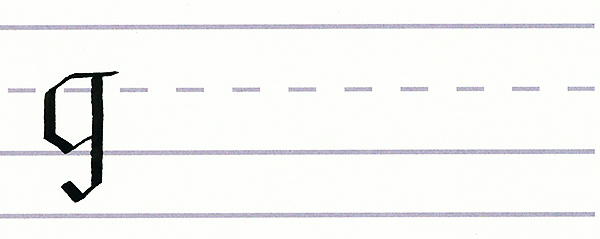
Step 5
Practice making a few more Gothic “g” letters until you feel comfortable making them. Many letters like the “o” and “q” are very similar to the “g” and “c”, so once you know how to make these, the rest are simple.

Step 6
Slowly make your way through the rest of the downward serif stroke lowercase letters, using the guide of the strokes as a reference.
5. Write the Lowercase Alphabet
Now that you’ve written each letter multiple times, it’s time to put it all together and write out the alphabet.
6. Looking at the Gothic Script Uppercase Alphabet
The uppercase alphabet always plays by different rules and is generally much more elaborate. The curved strokes are much bigger, and the downward strokes have a bit more flair. Besides that, the Gothic Script uppercase letters have a special stroke: the skinny downward stroke. I highly recommend sketching out the letters using your pencil first to feel more comfortable. Then you can simply follow the pencil lines with your pen.
Step 1
Let’s start by learning the skinny downward stroke. Instead of putting your pen tip down horizontally or at a 45-degree angle, turn it so that the flat of it runs vertically. Then draw the pen down the page. You should get a very skinny straight line.
Step 2
Practice making this new stroke a few times.
7. Write the Uppercase Letters
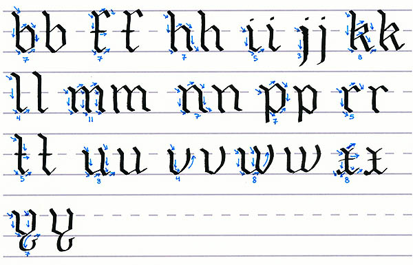
Since most of the letters begin with the upward serif stroke, I didn’t divide the alphabet into groups. Instead, we’ll simply work our way through it, using the guide above to see how many strokes each letter is made of and what direction the strokes go.
Step 1
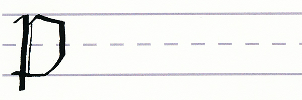
So let’s start with an easy letter. We’ll start with the letter “p”. Place your pen tip just below the top line and draw an upward serif stroke to meet the top line. Now make a downward stroke past the bottom line.
Lift your pen and place it on the last stroke just below the top line at a 45-degree angle, and make another upward serif stroke to the top line. Drag your pen out and to the right.
Then make a downward stroke, curving it to the left once you pass the dashed line to connect and then go past the first big downward stroke. We’re nearly done! Now we just need to make it even fancier with a skinny downward stroke near our first downward stroke. Not too hard, was it?
Step 2
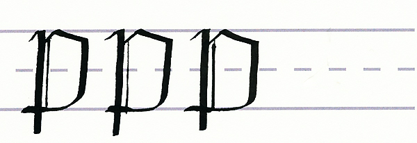
Practice making a few more Gothic uppercase “p” letters until you feel comfortable making them. Most of the capital letters start with a small upward serif stroke so once you have this one down, the rest are much easier. Letters like the “p” include “b”, “l”, “n”, “r”, “t”, “u”, “x”, and “z”.
Step 3
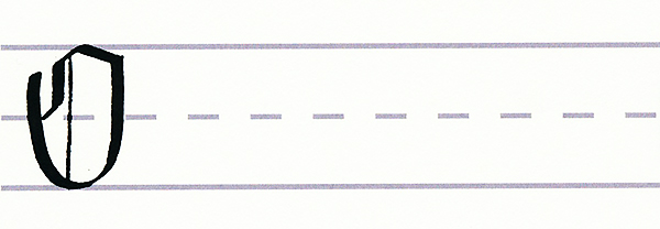
Okay, now the other type of uppercase letters are those which start with a longer upward serif stroke. These letters include the “c”, “e”, “f”, “g”, “h”, “m”, “o”, “q”, and “s”. So we’re going to start with an easy one: the “o”. Start with a longer upward serif stroke that reaches the top line. Then make a mostly horizontal stroke to the right. You just made the top of the “o”.
Now put your pen tip horizontally at the end of the stroke you just made, and make a downward stroke. Stop just before you reach the bottom line.
Now lift up your pen and put it again horizontally down below and slightly to the left of your first upward serif stroke. Make a curved downward stroke that goes down to the bottom line and then curves up slightly to meet the end of your last line. You’ve now made the bottom of the “o”. It’s nearly complete!
Okay, now lift up your pen and put it at the start of your first upward serif stroke. Make a downward stroke that reaches the dashed line, curving it just at the end toward the left side of the “o”. Now all you have to do is make a skinny downward stroke just left of the middle of the “o”. Woohoo! The “o” is complete!
Step 4
Practice making a few more Gothic uppercase “o” letters. Now that you have the “o” and the “p” under your belt, you can handle the rest!

Step 5
Slowly make your way through the rest of the uppercase letters, using the guide of the strokes as a reference.
8. Write the Uppercase Gothic Script
Now that you’ve written each letter multiple times, it’s time to put it all together and write out the alphabet.
9. Putting It All Together
Let’s write something a bit more exciting! Since Gothic Script is quite fancy and old-fashioned, let’s write something that you’d see at a Renaissance Faire!
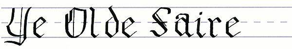
You’ve Just Mastered the Gothic Script!
This font is by far the hardest one to learn, but it’s definitely the fanciest and most impressive. Each letter is made up of lots of tiny strokes that come together to make very angular letters. However, once you make each letter a few times, you can start to see the patterns that connect the “c” to the “d” to the “g”. Gothic Script is great for invitations and very formal events.
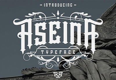
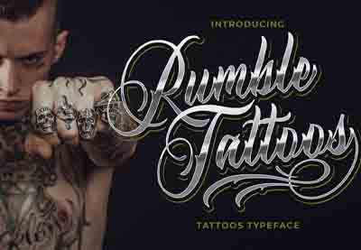
5 Top Gothic Calligraphy Fonts From Envato Elements
Now you know how to do the Gothic calligraphy alphabet. Next up, let’s see some cool Gothic calligraphy fonts from Envato Elements.
If you’re a digital creator or graphic designer, you’ll love our subscription-based marketplace. For a low monthly fee, enjoy unlimited downloads of the best Gothic calligraphy fonts. You can also get unlimited premium fonts, graphic templates, actions and presets, and more.
Let’s see some Gothic and blackletter fonts from Envato Elements:
1. Cattedrale: Gothic Blackletter Font (OTF, TTF)

Cattedrale is a popular Gothic blackletter font. If you want Gothic calligraphy fonts for digital projects, definitely check this out. This Gothic font includes four different styles plus ornaments, symbols, and multilingual support.
2. Acude: Victorian Gothic Font (OTF, TTF, WOFF)

Are you looking for a modern Victorian Gothic font? Check out Acude. This decorative blackletter font is perfect for creative projects. It includes tons of glyphs, alternates, ligatures, and PUA encoded characters.
3. Rozex: Bold Decorative Gothic Font (OTF, TTF, WOFF)

Rozex is a blackletter font that combines a bold look and a medieval Gothic style. These Gothic calligraphy letters also include web fonts and vector fonts. You’ll get alternate characters and ligatures in this cool Gothic font.
4. Cambridge: Bold Decorative Gothic Font (OTF, TTF, WOFF)
If you’re looking for Gothic calligraphy fonts with bold styles, this is for you. Cambridge features web fonts and alternate characters. Try this cool Gothic blackletter font for your next project.
5. Blackey: Bold Decorative Gothic Blackletter Font (OTF, TTF, WOFF)

Blackey is a classic Gothic blackletter font that combines modern and classic calligraphy with nice alternates. This blackletter font includes web fonts, ligatures, and multilingual support.
Discover More Gothic Calligraphy Fonts and Resources
I hope you’ve enjoyed this Gothic calligraphy tutorial. Following the cool Gothic calligraphy fonts from Envato Elements, I’m sure you’d like to discover more awesome calligraphy fonts and resources:
 Fonts40 Best Blackletter and Gothic Fonts for Designers
-
Fonts25+ Best Free Gothic Fonts for Fantasy Lettering Art Designs
-
Fonts20 Best Art Nouveau Fonts (Stylish Fonts to Download)
-
Fonts30 Inspiring Old English Fonts
-
Fonts40+ Best Swash Fonts and Fonts With Tails (Download Now!)
-
Tattoo Design49 Epic Tattoo Fonts
-
Fonts30+ Free Tattoo Fonts (Download Now to Use)
-
Fonts40 Most Popular Fonts of 2020


Get Your Gothic Calligraphy Fonts Today!
This has been a selection of premium resources perfect for the avid designer. For more Gothic fonts, visit Envato Elements and let us know your favorites in the comments below! Happy creating!
