What You’ll Need
We’ll be using simple built-in InDesign templates for this tutorial. These are the other assets I used to customize them, so download them if you want to follow along:
How to Elevate Print Design Templates
Print design templates are a great way to save time; they’re cost-effective and most of the time easy to customize. These premade templates help ensure your design looks professional from the get-go. Most of the time they already have the right print settings, and the design is already decided, especially where certain elements are placed.
While InDesign layout templates offer a wide variety of designs, you still want to stand out from the rest. Using a template means other designers are using them as well, and customizing it can make it look less template-y. Let’s take a look at some InDesign templates, go through some tips specific to those mediums, and see how simple steps can transform them into something less ordinary.

Business Card Template
Let’s start with a business card. First impressions are important, and this essential design piece is the gateway to knowing someone. There are a few things to consider when designing a business card, like size, shape, and including only the necessary information.
Start by choosing a template that already reflects your brand personality. In this case, I’ll be using a very minimalist template from InDesign. You might be wondering if using an image would be good here, but it can get tricky because of the amount of space we’re working with.
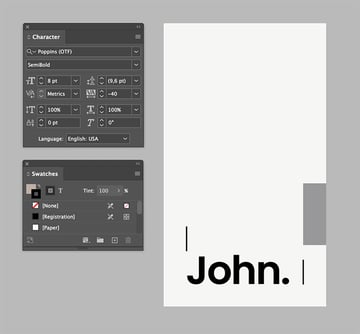
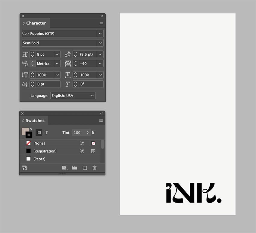
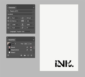
For this template, I want to create a tattoo shop business card. Let’s take advantage of the real estate to create impact, while keeping it minimalist and highly contrasting by using only black and white. Let’s create emphasis by using a different font for the business name—we can use the same font on the front of the card later. Highlighting these two is important as we want people to remember our shop and name, so let’s choose something that goes more with a tattoo artist.
I want to play with the white space to create something memorable. White space doesn’t mean only white space but also a play with the negative and positive space. I eliminated the other graphic elements so they’re not distracting from the typeface element. In this case, let’s move the name of the business all the way to the bottom-right corner. It’s simple, impactful, and clean.

For the front of the card, the template already has text boxes in place, which is a big help since we don’t need to figure out where they can go or think about what kind of information we could include. It’s already there.
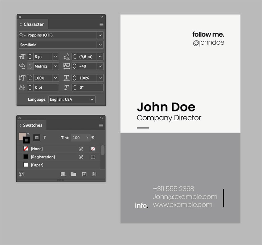
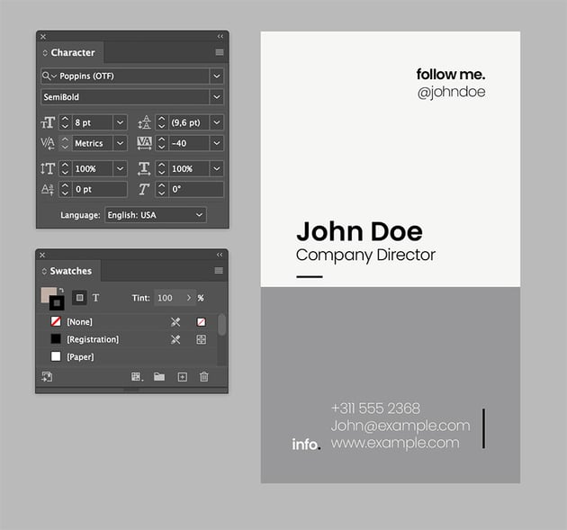
To create contrast, I made the background black. This will also have an impact when someone turns the card around. This is a tattoo shop, so let’s not be afraid of an all-black look. The two pieces of supporting text, at the top and bottom right, create balance against the name on the left. I lowered the point size by 1 pt on the supporting text to create more contrast with the name.
The main name is in the same font used on the back of the card. I left the title in the sans serif font so it doesn’t compete with the name.
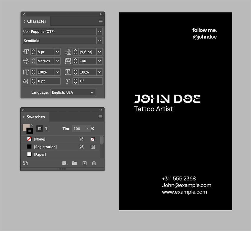


This whole process, when we go and finesse the type treatment on a design, is called typesetting. Typesetting is important because it means attention to detail, and that level of attention elevates the design. A business card doesn’t have much space to include lots of information, but it’s enough to showcase attention to detail.
Flyer Design Template
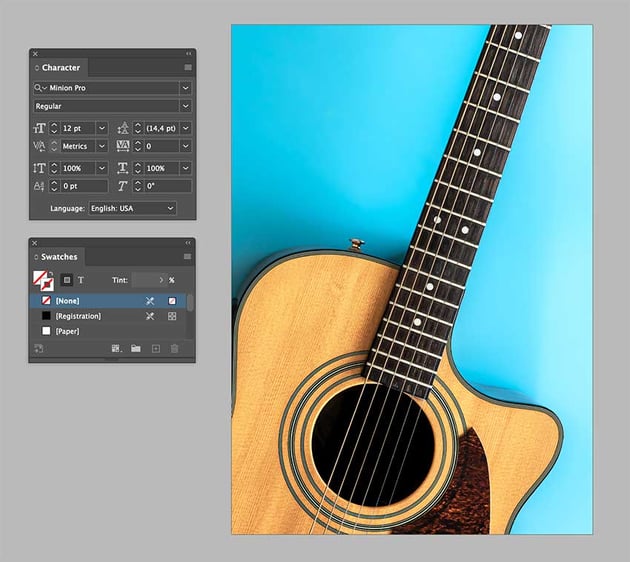
Flyers are a great way of letting people know about an event. Using high-quality images is essential if we want to elevate the design and create impact. Here we’ll create an Acoustic Festival featuring a guitar image, one that fits the theme and that is also in high resolution. For that, we can head to Elements and browse their library. Start off with a template that has information text boxes already in place.


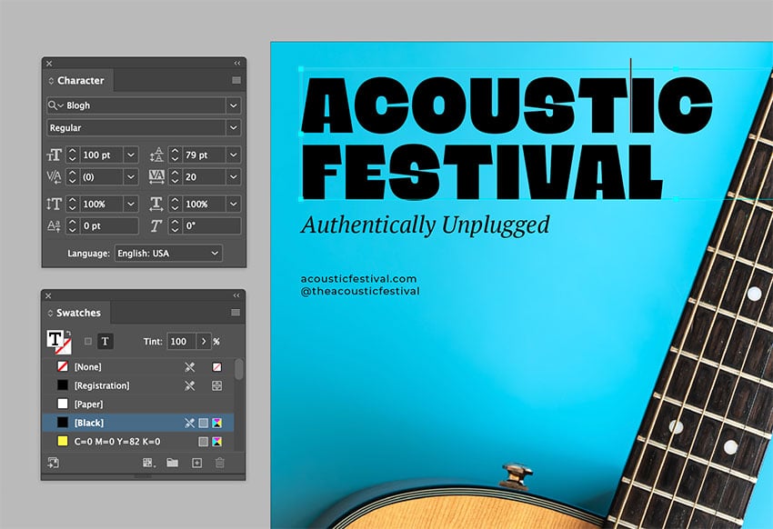
I found an image at Envato Elements and placed it in the flyer template. In a flyer design, hierarchy is important to let the audience know what information is most important. In this case, I will leave the top left for the main information and use the right side of the flyer for dates.


Hierarchy is achieved through contrasting elements, size, color, and placement. In this case, we want the name of the festival to pop, so we can choose a different font and a larger point size.

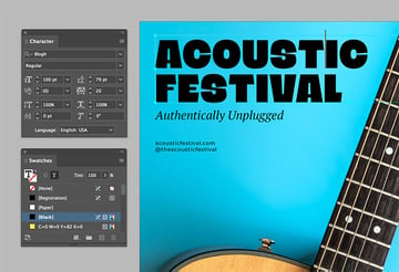
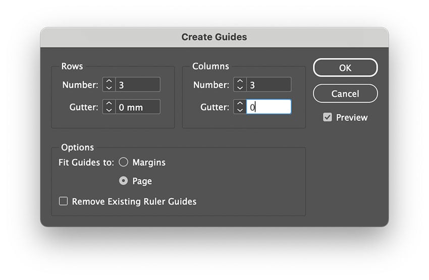
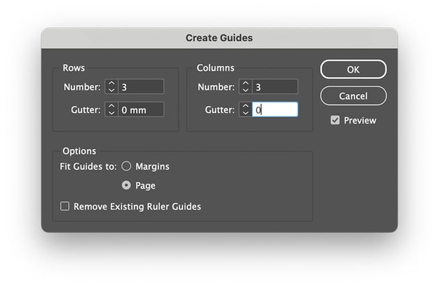
By using the rule of thirds in any design, we can achieve a sense of organization. Let’s bring up the guides. In this case, the elements are already placed within the rule of thirds, but now we have an image that we need to work around. Let’s move some of the elements, keeping in mind the rule of thirds and the image. The elements at the bottom need to be moved higher—let’s place the website and social media handle under the title so it’s more like one unit.
And let’s place the date and time on the lower third of the flyer, right at the last guide. The template helped us figure out the text boxes on the flyer.
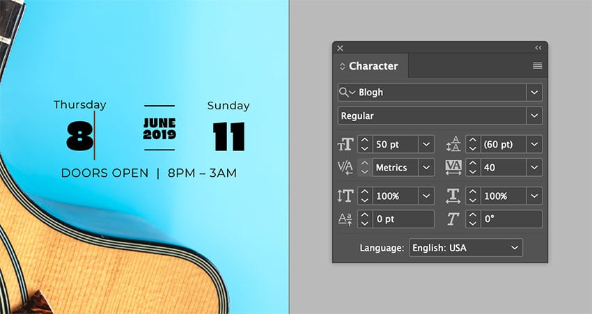


To elevate this flyer design, I added the image and adjusted the text boxes and font. Using a grid is useful to group information and place it where it’s more natural. The result is a clean and effective music flyer with an eye-catching, high-quality image.
Brochure (Rhythm, Variety, Movement)
What happens when we have more than one or two pages/panels to work with, like in a trifold brochure? Here, things can get more interesting because we need to consider rhythm, variety, and movement. We also need to consider how the user will interact with the design piece.
Rhythm dictates how our eyes move across a page and consume content. We can then emphasize specific information. Variety is important as not every panel has to be exactly the same. Movement will help the user’s eye move from element to element. Keep in mind that these three principles need to be cohesive in the overall design.
In this case, we have to consider rhythm and variety for each individual panel and the trifold brochure as a whole. Make sure that as people interact with the brochure, they don’t feel overwhelmed by the amount of information displayed on each panel. At the same time, we want to repeat some elements with variety.
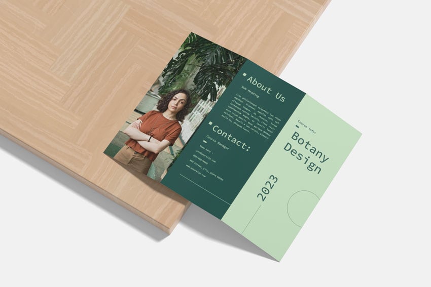
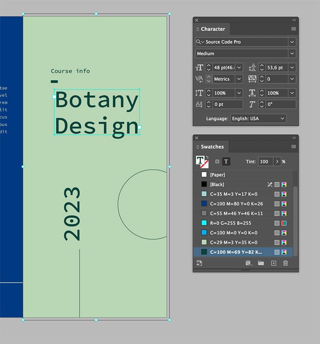
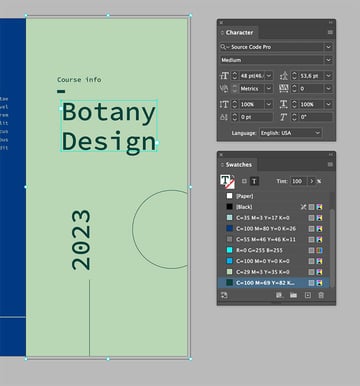
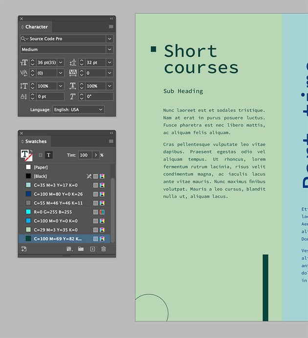
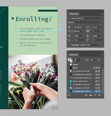
We’re starting off with a simple design that contains elements which are repeated on the interior pages. I’ll use the same font, but I want to change the content to describe a botany design course and switch the color to something more natural.

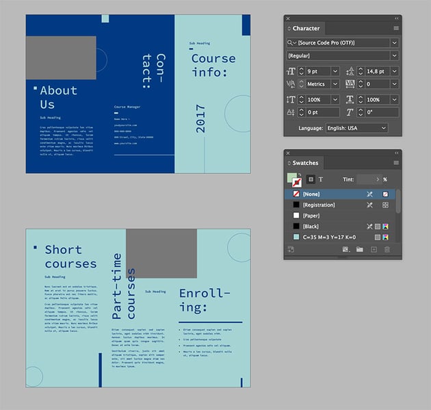
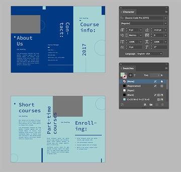
When using templates, you can use the same font or change it to something more suitable. In this case, I chose to keep the same font as I wanted to bring something edgier to the design.
InDesign templates are so easy to edit. You can also delete some elements that you might not think are adding balance to the design.

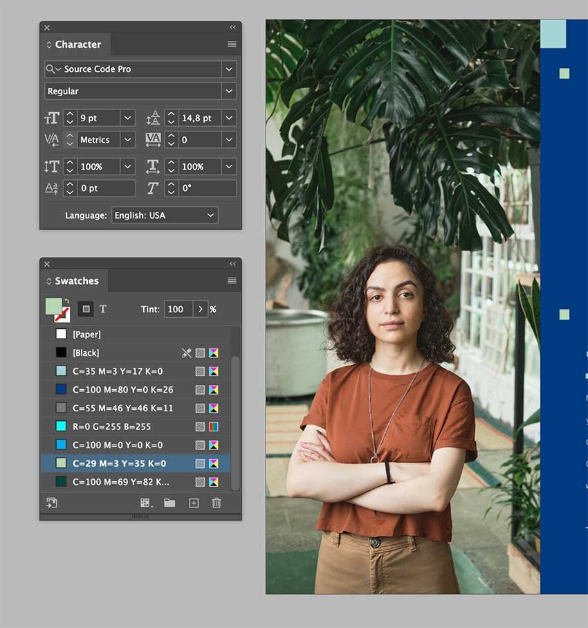
As we open the cover, the next panel we see is one of the exterior. I want to give readers a visual break and surprise them with something powerful. I decided to use a high-quality image from Elements that goes with the theme.


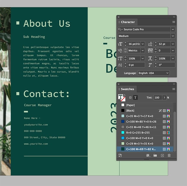
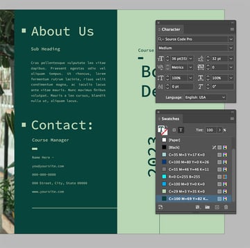
The next panel the reader will be drawn to is the left side of the interior or the back of the cover panel. Here we can leave the template as is with the visual elements that also appear on the cover. The second and third panels of the interior are similar but different. That’s the goal for this brochure, to make it all look as if it belongs together.


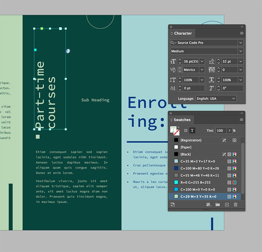
The middle panel repeats the vertical text box and the circle element at the back. We still want to make this panel slightly different to differentiate it from the other two. I changed the background to a darker color and repeated the square element that goes with the head.

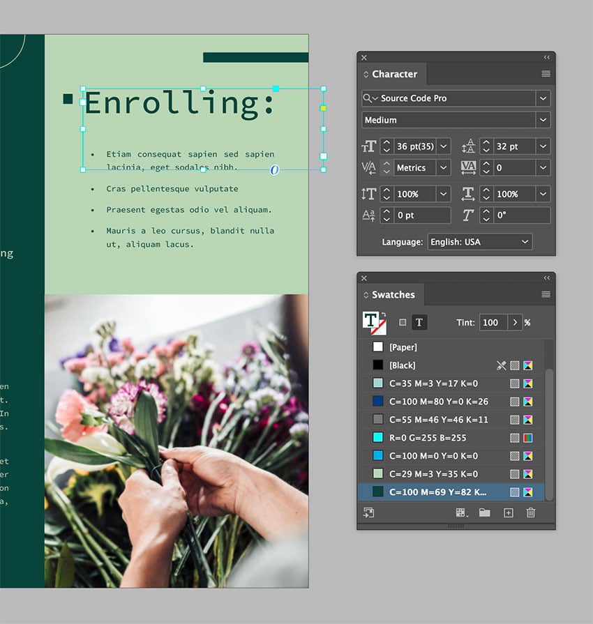
The third panel includes a couple of the visual elements used in the other panels to create movement. I added an image from Elements to fill up the space and create visual interest. As you open the whole trifold brochure, be sure that there’s a sense of balance across the page.

Last but not least, readers will look at the middle panel from the exterior. To achieve cohesiveness, we can repeat the dark background from the panel on the inside and adjust the information to what is needed.

We took a simple template and customized it with a high-quality image. By moving text boxes and graphic elements, adding high-quality images, and most importantly, applying essential design principles, we created an extraordinary trifold brochure.
Conclusion
In this article, I showed you how I edited three different print design items using similar tips and others that are more specific to those mediums. Let’s round up the tips we learned:
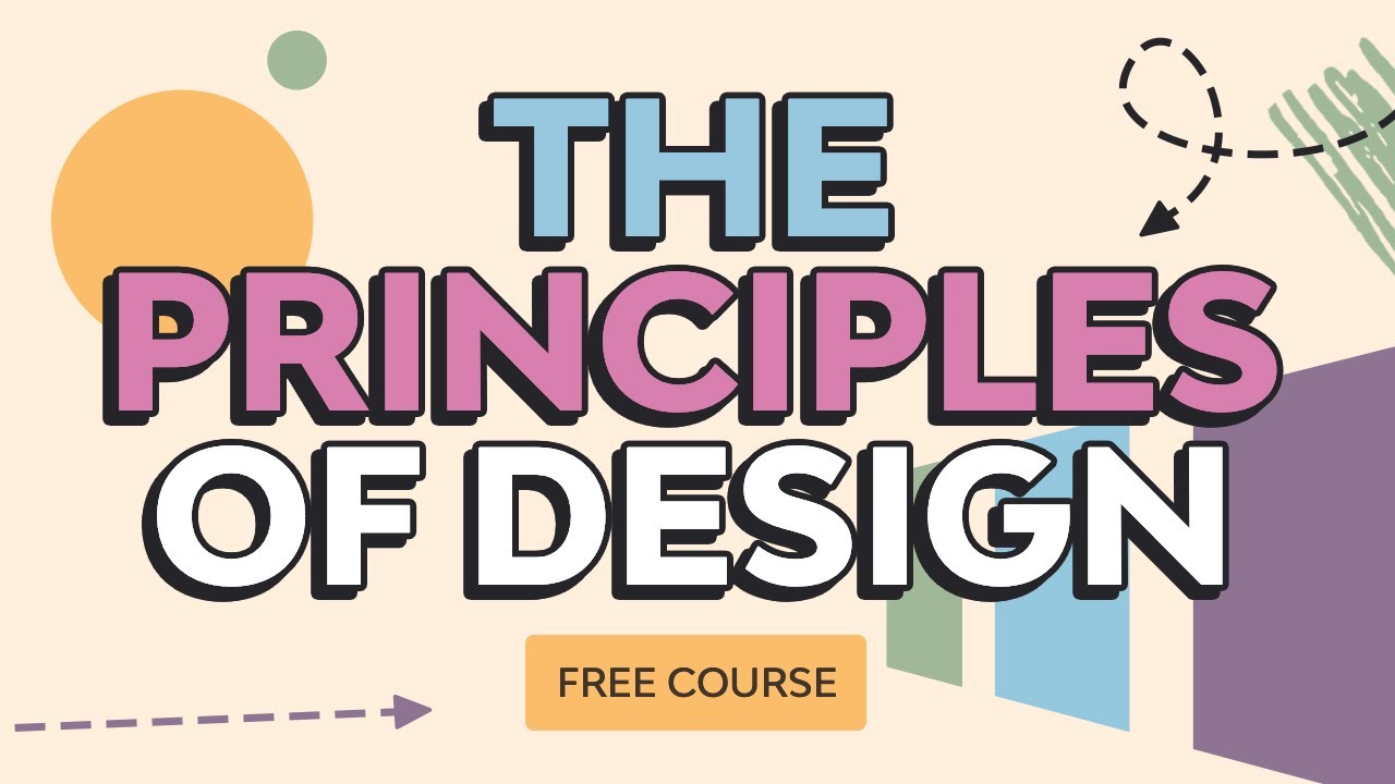
- Use design principles to elevate your design. This is a basic tip but so important. The design depends on key principles like the rule of thirds, positive/negative space, emphasis, rhythm, etc. Check out the Principles of Design course to learn more about these essential concepts.
- Use high-quality images as they can truly make a design piece feel premium. If you’re looking for high-resolution images, be sure to check out Envato Elements, which offers an extensive library with millions of assets.
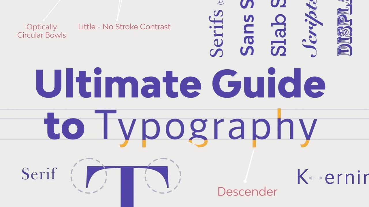
- Practice typesetting, which shows attention to detail. This includes choosing a font that’s suitable, unique, and legible. Fonts can also show personality and reinforce a message. If you want to learn more about the nitty-gritty of typesetting, be sure to check out the Ultimate Guide to Typography course on our YouTube channel.
- And last but not least, adjust to your own brand colors. Nothing is more evident in a brand than the brand language, and color is important. This is the fastest emotional connection you’ll make with the audience. Be sure to use it to your advantage.
Using these essential tips will take your InDesign layout templates from ordinary to extraordinary. There’s nothing wrong with using a template design, but I believe it’s important to tweak it to help you stand out from others using the same template. So take the time to add your own flair and elevate your designs.
If you’re looking for more trifold brochure templates, flyer templates, or business card templates, be sure to check out Envato Elements. There are millions of assets ready for you to explore.