An efficient Figma file organization is key for maintaining productivity and collaboration. Not sure how to organize Figma files? This tutorial is here to help!
Have you ever created a file titled “App-layout-v1-final-final-final“? There’s no shame in it, we’ve all been there! That said, having well organized Figma files could be a game changer for you.
According to Figma, the way you structure and present your work can be key for everyone involved to stay on the same page as the project evolves.
This tutorial is created especially (but not exclusively) for freelance designers working alone. So we’ll focus on the bottom rows of this organizational flow chart: Projects and Files.
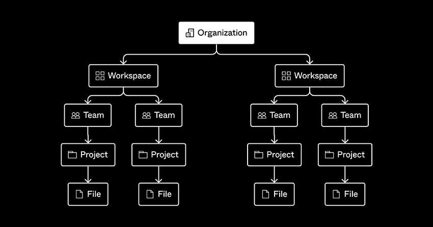
Let’s go over five tips and tricks you can easily apply in your projects. The aim is to make your life easier by organizing each project and keeping track of every specific aspect of it.
Keep in mind Figma file organization should work for you and your design process.
5 Tips and Tricks for Organizing Your Figma Projects Like a Pro
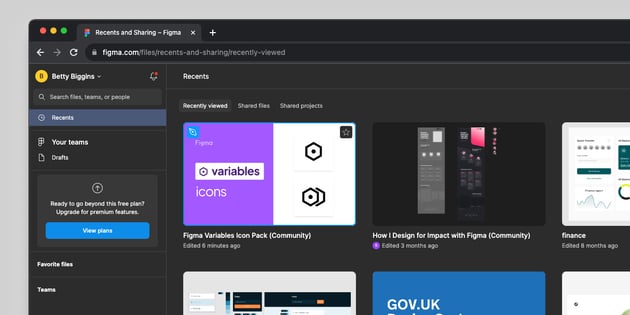
We’ll start from the general view on Recents page in Figma. Then we’ll move all the way into tips for the internal structure recommended inside each individual project.
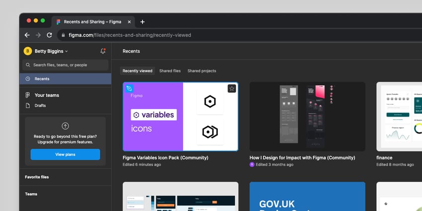
These tips are merely suggestions. There a thousand versions of Figma file organization. But for guidance, here are three organization approaches shared by Figma:
- By product surface: this is suggested for web apps or products. For example, if you’re building an e-commerce website, you’ll have Projects like Account, Cart, Homepage, and Product listings.
- By feature or production state: this approach is great for teams to see what’s “live” and what isn’t.
- By stage of design process: this is best for teams like agencies so everyone is aligned on the process stage. This can include Projects for WIP, Review, Development and Shipped.
Some of this features vary with the Figma version you’re working with (free or paid).
This tutorial is focused on what’s available when you work with Figma in the basic and free version.
1. Create Clean File Names
Creating clean and effective file names can save you and your team hours. When naming your files, try to be as descriptive as possible including the file’s content and purpose.
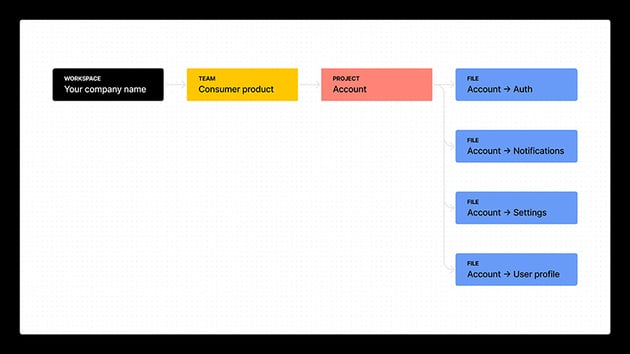
It is also recommended to create a naming format to be used consistently. For example, it can be “ProjectName_Section”. Make this a repeatable and stablished agreement between you and your collaborators.
Here’s a chart that shows the hierarchy and structure that a Figma file name can follow:


2. Add a File Cover for Each Project
A File Cover in Figma is pretty much a visual summary of what’s inside a Figma file. It’s perfect for visual scanning through your projects. You can quickly tell the project, stage and who’s working on it.



It’s a great trick to quickly identify and differentiate Figma files. And the best part: it’s really easy to create. I’ll show you how.
Start by creating a Page titled Cover and press F.
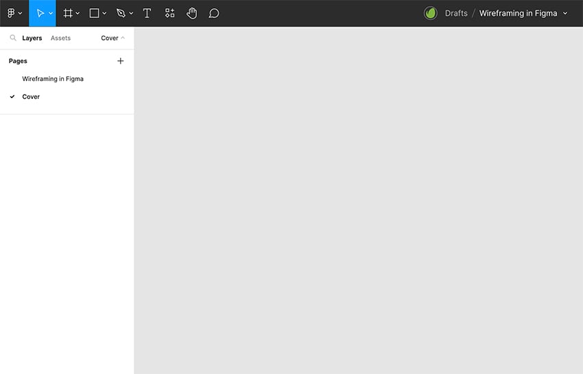
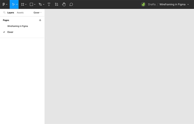
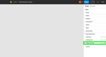
Then click on the right side panel on Figma Community and then click on Plugin / file cover.


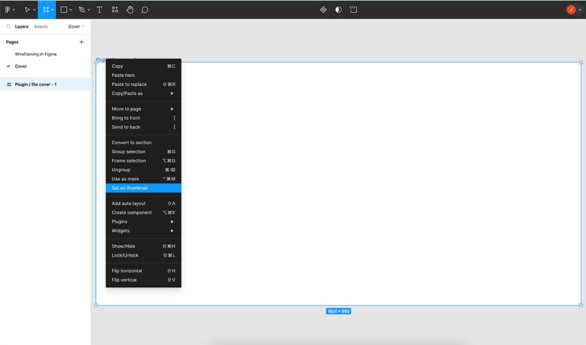
You’ll get a 1920 x 960 frame. You’re going to right-click on it and select Set as thumbnail.
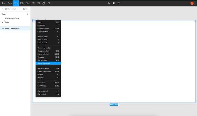
Here’s the main information your file cover must feature:
- Status
- File name
- Project description
- Team
- Visual elements
Not sure how to design yours? Find loads of Figma file cover designs in Figma Community for inspiration. Mine looks something like this:

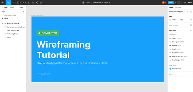

And you’re all set! Do this with all your Figma files and find things faster!
3. Think About Page Structure
Now let’s go inside Figma files. Thinking about page structure can totally save your life as each project evolves and more projects come along. Your page structure for efficient Figma file organization could include:
- Figma files cover (like the one I just showed you how to create)
- Visual research: add all the screenshots and ideas you find in one place
- User research: you could test out and keep track of user flows without messing up your design
- Design system: this is like your treasure box where you keep all your design elements
- Ready for review: here’s the design ready to show your client before moving on
- Ready for development: here’s where everything approved by the client rests and it’s ready for your development team to work on
For example, it can be a basic two-page structure like the one featured on this Grocery E-Commerce Website Template:

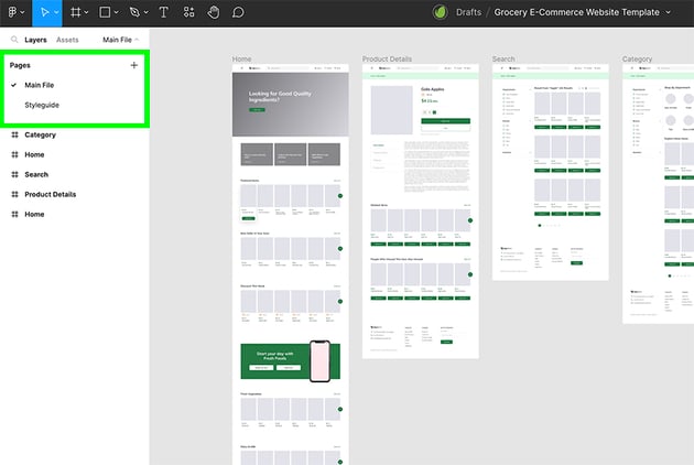
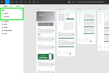
Or it can be more specific if the project is more complex or considers more aspects. You can even add emojis for visual guidance.
Create dividing lines to visually separate pages.
Here’s a more specific page structure suggested by Figma:
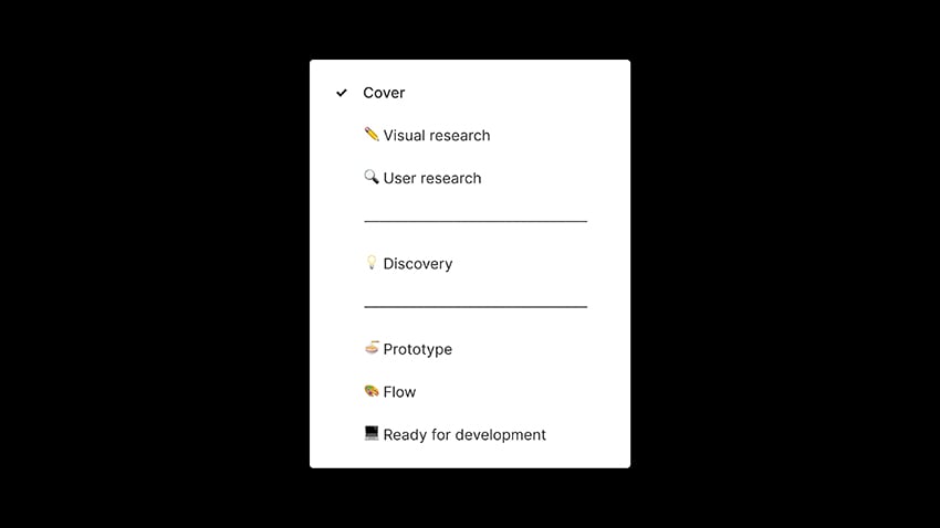

As mentioned at the very beginning, Figma file organization should work for your and your team. Create the pages you need based on the requirements of each project..
4. Devote Some Time to Naming Layers
As designers, I think this is a practice most of us have ignored since Photoshop times. Naming your layers in a consistent and easy-to-understand way can save you (and others) time (and maybe tears) in the future.
Don’t go, keep reading. I promise you this just takes a few seconds! Here’s a good diagram example created by Figma to give you an idea:
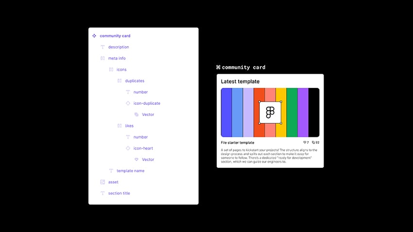
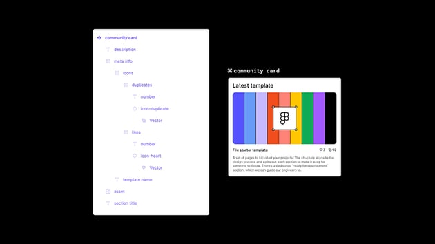
Instead of having a generic Frame 25, vector, image layers, give them some love. Make them a bit more specific.
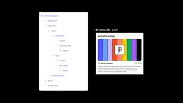
As you can see in this example, the Community Card follows a basic layer hierarchy. Each layer simply named after its function.
5. The Ideal Frame Organization
This step is saved for the very last, since it’s useful once the project is ready for development.
This Figma file organization for frames can create middle ground for you and your developing team.
It can ensure your design ideas are effectively translated into code. So use this Figma file organization tip for your “Ready for development” page.
The best approach is to think of this structure by flow and by platform. For example, I created a basic Login mobile flow using the E-commerce Mobile App template as a base. Following an organized frame structure can look like this:

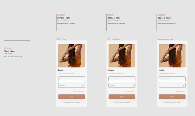

Don’t stress out. Thankfully there’s a good soul in the Figma community who created a file structure guide for us.
In this example, each frame shows a different stage of the Login flow. The first frame will show Login screen. Then Password filled and last Email filled.
This is just and example of how you can prepare for the perfect handoff process for your development team.
The Best Figma Templates to Optimize Your Design Work
Now you have some actionable tips and tricks on how to organize Figma files. To make your life even easier, you can start working with Figma templates.
Envato Elements offers a broad selection of Figma templates including flowcharts, wireframes, mobile app templates, web templates, and more to help enhance your design projects.

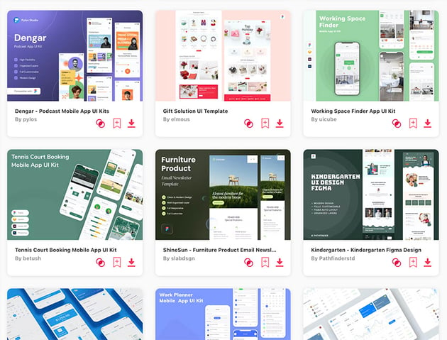
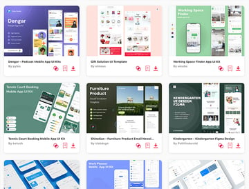
Start applying all this Figma file organization tips and tricks with Figma templates from Envato Elements!
More Figma Resources and Tutorials
Want to learn more about Figma? Dive into one (or more) of the Figma tutorials and resources available on Envato Tuts+: