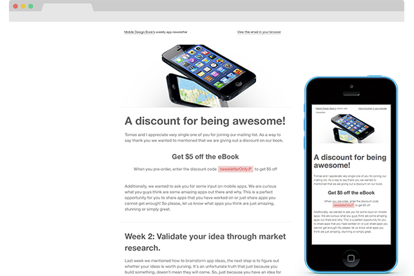
If you are looking to familiarize yourself with responsive emails this is a perfect place for you. In this quick tutorial I will be going over how to code a simple and minimal typography based responsive email. It will provide you a fundamental understanding how responsive emails work.

Responsive Design
Because this is a typography based design, the email won’t require much visual differentiation between its desktop and mobile states. For the purpose of this tutorial it will be perfect; all I want to make sure is that you are familiar with the concept of responsive emails. As you can see the email design is very simple, clean and minimal. This is an email redesign I did of an email that I have used for Mobile Design Book weekly newsletter. You can check out the Dribbble shot of the redesign. And you can checkout what the Mobile Design Book as well; its’ a book I’m currently writing :)
Progressive enhancement, for the win!
If you want to do anything responsive the right way you will need to embrace the progressive enhancement approach. It means building the email for mobile devices first, as they are the least advance technology and then elaborating on the email for more capable technologies like desktop applications. To do this, we’d use media queries. Not all mobile devices’ browsers or email apps support media queries; it makes more sense to create the email design to fit mobile devices first. Then, though the use of media queries, you’d embellish the design to look good on desktop devices as most of them in fact support media queries. It’s that simple. If you have any experience with responsive web design, the idea is exactly the same!
Email Set Up
First thing first, we need a basic HTML page set up. Below you can see the HTML skeleton of the email. It’s a typical HTML5 mark up with a two cell table in it.
<!DOCTYPE html> <html lang="en"> <head> <meta charset="utf-8"> <title>Mobile Design Book: A simple responsive email tutorail</title> <style type="text/css"> </style> </head> <body> <table border="0" cellpadding="0" cellspacing="0" > <tr> <td> </td> <td> </td> </tr> </table> </body> </html>
Emails are notorious for being hard to work with, it’s one of the reason why we will be using inline CSS styles and embed the remaining CSS in the header of the page. To start off, let’s style the body tag and the overall table. First, you want to add a width measurement to the table and add a class called content.
<table width="100%" class="content" bgcolor="#fff" border="0" cellpadding="0" cellspacing="0" >
Next, in the header’s style tag you want to define the body style and .content as well. There are a couple important styles to note here. In the content class we are setting max-width to 480px, as well as setting the width to be 100%. This means that the table will always be 100% as long as it is less then 480px; past 480px it will stay 480px.
body { margin: 0; padding: 0; min-width: 100% !important; line-height: 20px; font-family: "HelveticaNeue-Light", "Helvetica Neue Light", "Helvetica Neue", Helvetica, Arial, "Lucida Grande", sans-serif; color: #7d7d7d; font-size: 14px; } .content { width: 100%; max-width: 480px; margin: 0 auto; }
Styling the Text
Before moving forward we should style the text some. First, let’s define the links. Then, let’s just specify the style of the headers, h1-h3.
a:link{color:#ed4545; text-decoration: none;}a:hover{color:#ee7474;} h1{font-size: 38px; line-height: 40px; font-weight: bold; color: #636363;} h2{font-size: 28px; line-height: 40px; font-weight: bold; color: #636363;} h3{font-size: 24px; line-height: 20px; font-weight: bold; color: #636363;}
Adding the first set of content
It’s time to add the content of the email. Within the table we currently have two columns. This is the only two-column design in the whole email.
<tr> <td style="width:47.5%; padding: 20px 0 20px 2.5%;font-size:11px;" class="margin"> <a href="#" class="dark">Mobile Design Book’s</a> weekly newsletter </td> <td style="width:47.5%; padding: 20px 2.5% 20px 0;font-size:11px;text-align:right;"> <a href="#" class="dark">View this email in your browser</a> </td> </tr>

Take note of the line CSS. You could include it in the header but for example sake I wanted to show you some inline CSS. What it does is specify the font size of this row as well as adjust the width and padding of the columns. There is also some padding around the content; it’s purely aesthetical.
In the header, you can add the CSS that defines the dark link style.
a.dark{color: #636363; text-decoration: underline;}
Adding the Header image
Next, we want to add the header image. Underneath the last tr, create a new one. Please note that from now on, each tr wil have a single td that will have colspan=”2” in it. That’s because we need the column to span across two columns now. This is the beautiful magic of tables; it doesn’t make your life easier.
<tr> <td colspan="2"> <img src="header.jpg" width="100%"/> </td> </tr>
Also, don’t forget to add the width="100%" to the image. This will make sure it is fluid so that it fits the container it is in no matter the width of the container.

Adding the Main Body Content
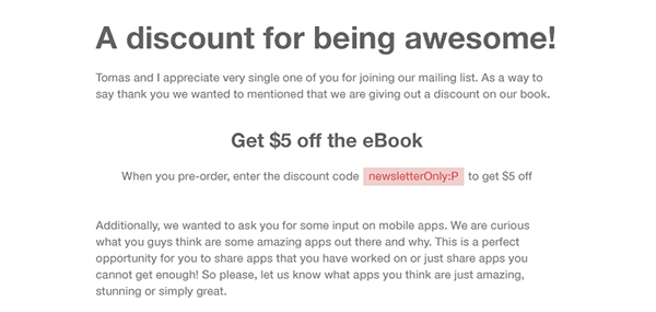
The next thing in the email design is the content area talking about a discount. There are a few things going on there like h1, h3 and some centered text. There is some inline CSS present, that’s the pink colour for the discount code.
<tr> <td colspan="2" class="withPadding"> <h1>A discount for being awesome!</h1> <p>Tomas and I appreciate very single one of you for joining our mailing list. As a way to say thank you we wanted to mentioned that we are giving out a discount on our book.</p> <h3 class="centered">Get $ 5 off the eBook</h3> <p class="centered">When you pre-order, enter the discount code <a href="#" style="padding:5px; background:#f6cdcd">newsletterOnly:P</a> to get $ 5 off </p> <p>Additionally, we wanted to ask you for some input on mobile apps. We are curious what you guys think are some amazing apps out there and why. This is a perfect opportunity for you to share apps that you have worked on or just share apps you cannot get enough! So please, let us know what apps you think are just amazing, stunning or simply great.</p> </td> </tr>
First, define the centered class. Those usually come in handy with an email. Additionally, let’s define the withPadding class. It’s the onethat gives a bit of padding to the content per the visual design.
.centered{text-align: center;} .withPadding{width:95%; padding:20px 2.5%;}

Adding in an Break
The design calls for two horizontal breaks. First, it’s present in the middle of the content as it devides the two sections that talk about the discount code and the week two resources. Second, it’s between the body content and the footer. For now, add another row with a column and a good old hr.
<tr> <td colspan="2"> <hr/> </td> </tr>
The CSS for the hr is pretty straightforward’ it sets it to be a single pixel vertical, gray line.
hr{ width: 100%; height: 1px; background: #eeeeee; border: 0;}

Some More Content
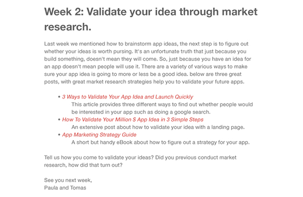
The second content section is more interesting – there is a list! There is too much repetitive things in this section to bother with inline CSS. We have to define a quick hack for styling the indented text.
<tr> <td colspan="2" class="withPadding"> <h2>Week 2: Validate your idea through market research.</h2> <p>Last week we mentioned how to brainstorm app ideas, the next step is to figure out whether your ideas is worth pursing. It's an unfortunate truth that just because you build something, doesn't mean they will come. So, just because you have an idea for an app doesn't mean people will use it. There are a variety of various ways to make sure your app idea is going to more or less be a good idea. below are three great posts, with great market research strategies help you to validate your future apps.</p> <ul> <li><a href="#"><i>3 Ways to Validate Your App Idea and Launch Quickly</i></a></li> <li class="indented">This article provides three different ways to find out whether people would be intedested in your app such as doing a google search.</li> <li><a href="#"><i>How To Validate Your Million $ App Idea in 3 Simple Steps</i></a></li> <li class="indented">An extensive post about how to validate your idea with a landing page.</li> <li><a href="#"><i>App Marketing Strategy Guide</i></a></li> <li class="indented">A short but handy eBook about how to figure out a strategy for your app.</li> </ul> <p>Tell us how you come to validate your ideas? Did you previous conduct market research, how did that turn out?</p> <br/> <p>See you next week, <br/> Paula and Tomas</p> </td> </tr>
Below is the CSS class for indenting the list item and gets rid of the styling.
.indented{ padding-left: 25px; list-style: none; }

And The Footer
Before we actually inset the footer mark up we need one more hr.
<tr> <td colspan="2"> <hr/> </td> </tr>
Now, insert the footer content. As you can see it has it’s own class in addition to the withPadding class.
<tr> <td colspan="2" class="withPadding footer"> <p>You're receiving this email because you signed up to receive email updates about our book, Mobile Design Book. Thank you for that :)</p> <p>If you need a refresher about what this book is check out our <a href="http://wwwmobiledesignbook.com">Mobile Design Book</a> website. If you are curious about the authors you can find more information about us on our Twitter pages; <a href="http://twitter.com/paulaborowska">@paulaborowska</a> and <a href="http://twitter.com/tomaslau">@tomaslau.</a></p> <p>You can also get in touch by replying to this email. <a href="#">Unsubscribe from this list.</a></p> </td> </tr>
The footer class isn’t that special. It just makes the font size smaller, the font’s weight bolder and resets line height.
.footer{ font-size: 11px; font-weight: bold; line-height:15px; }

Media Queries
The email for mobile devices I now done! It’s not much different than the desktop version. The biggest difference is the fact that mobile devices were capped at 480px width. Typical emails have a width of 600px. Media queries are used to redefine the width.
@media screen and (min-width: 480px){}
What we want to do is create a new CSS rule when a browser window is bigger the 480px. To do this, we need to set a media query for all browsers whose minimum width is 480, like in the above snippet.
Now that the media query is defined, it’s time to over ride some code. By default the media query will take form the original CSS code and it will override only the things that are in fact overridden. So, there is no need to duplicate code any code. All you need to do is specify which code you want to be different. In our case, we want the max-width of the content class to be now 600px – not 100%. Additionally, for aesthetic purposes we want the padding to be a big bigger around the main content.
@media screen and (min-width: 480px){ .content {max-width: 600px;} .withPadding{width: 90%; padding: 20px 5%;} }
And that is it!
For the sake of seeing some obvious results trying inputting the code below within the media query and then resize your browser. This will show you the changes without a doubt!
body{background: #ff0;font-size: 16px; color: #f0f;} .content{background: #000} a.dark, a:link {color: #0ff;}
Conclusion
I hope this was a very simple and clear example of how to create responsive emails. Don’t forget that there can be much more variance in the email design styl; it’s okay to have various media queries. Just make sure you use the progressive enhancement approach and you’ll be golden!
