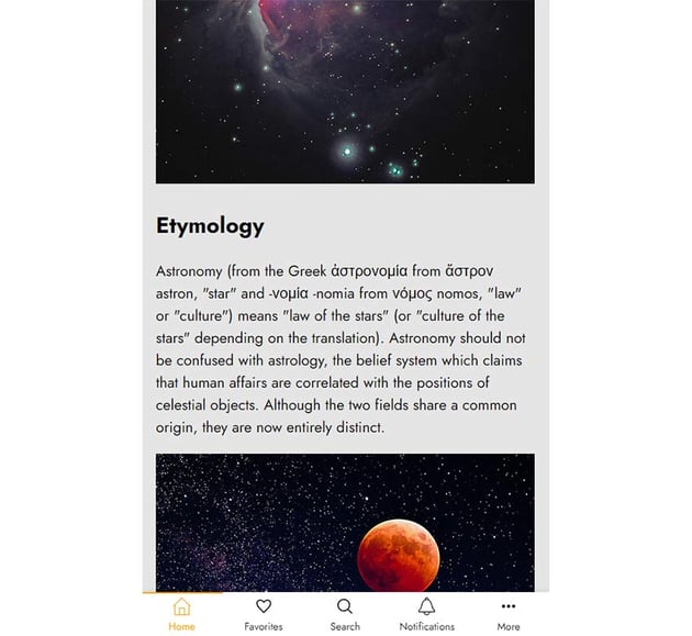
If you’ve ever used LinkedIn’s mobile app, you’ve probably noticed the sticky bottom navigation bar. By default, it appears, then as you scroll down disappears, and appears again as you scroll up.


Fixed/sticky navigation bars are the primary layout pattern on mobile apps.


But nothing stops us from following this pattern for structuring navigation bars on sites in mobile view, either for the primary or the secondary navigation.
In the past, we’ve built something similar to LinkedIn’s app navigation bar—a page header that disappears when scrolling down the page and reveals when scrolling up.
Let’s rely on the core principles of this tutorial and create an app-like bottom navigation bar whose visibility will depend on the scrolling direction, just like the LinkedIn app.
What We’re Building
A picture (demo) is worth a thousand words, so take a look at what we’re going to create (scroll to test the behavior):
For a better experience, be sure to examine it from a mobile device. In a real scenario, there will be two different navigation menus: one for the desktop that will probably sit on the page top and one for the mobile like we have here.
1. Begin With the Page Markup
The markup will consist of the nav element and the main element where we’ll put the page content. Inside the nav, we’ll place our menu which will include five items. Each of them will have an SVG taken from the popular iconmonstr library. To indicate the active page, we’ll add to the associated item the active class. By default, the first item will have this class. Finally, we’ll add a heading that will be visible only on screen readers.
Here’s the page markup:
1 |
<nav class="nav-mobile"> |
2 |
<h2 class="screen-reader-text">Mobile Menu Navigation Bar</h2> |
3 |
<ul>
|
4 |
<li class="active"> |
5 |
<a href=""> |
6 |
<svg width="24" height="24" xmlns="https://www.w3.org/2000/svg" fill-rule="evenodd" clip-rule="evenodd"> |
7 |
<path d="M22 11.414v12.586h-20v-12.586l-1.293 1.293-.707-.707 12-12 12 12-.707.707-1.293-1.293zm-6 11.586h5v-12.586l-9-9-9 9v12.586h5v-9h8v9zm-1-7.889h-6v7.778h6v-7.778z" /> |
8 |
</svg>
|
9 |
Home |
10 |
</a>
|
11 |
</li>
|
12 |
<li>
|
13 |
<a href=""> |
14 |
<svg width="24" height="24" clip-rule="evenodd" fill-rule="evenodd" stroke-linejoin="round" stroke-miterlimit="2" viewBox="0 0 24 24" xmlns="http://www.w3.org/2000/svg"> |
15 |
<path d="m7.234 3.004c-2.652 0-5.234 1.829-5.234 5.177 0 3.725 4.345 7.727 9.303 12.54.194.189.446.283.697.283s.503-.094.697-.283c4.977-4.831 9.303-8.814 9.303-12.54 0-3.353-2.58-5.168-5.229-5.168-1.836 0-3.646.866-4.771 2.554-1.13-1.696-2.935-2.563-4.766-2.563zm0 1.5c1.99.001 3.202 1.353 4.155 2.7.14.198.368.316.611.317.243 0 .471-.117.612-.314.955-1.339 2.19-2.694 4.159-2.694 1.796 0 3.729 1.148 3.729 3.668 0 2.671-2.881 5.673-8.5 11.127-5.454-5.285-8.5-8.389-8.5-11.127 0-1.125.389-2.069 1.124-2.727.673-.604 1.625-.95 2.61-.95z" fill-rule="nonzero" /> |
16 |
</svg>
|
17 |
Favorites |
18 |
</a>
|
19 |
</li>
|
20 |
<!-- three more items here -->
|
21 |
</ul>
|
22 |
</nav>
|
23 |
|
24 |
<main>
|
25 |
<div class="container">...</div> |
26 |
</main>
|
2. Add the Sticky Nav CSS
Let’s now focus only on the core styles—you can always look at all by clicking on the CSS tab of the demo project.
- The
navwill be a fixed-positioned element sitting at the page bottom. - All items will be flex items and occupy the same amount of space across the menu. To ensure this, we’ll manipulate the links’ font size depending on the screen size.
- To distinguish the active item, we’ll change its color to orange and give it a top border with the same color. Plus, we’ll add the same styling to the hovered items.


Here are the related styles:
1 |
.nav-mobile { |
2 |
position: fixed; |
3 |
bottom: 0; |
4 |
left: 0; |
5 |
width: 100%; |
6 |
background: var(--white); |
7 |
transition: transform 0.3s; |
8 |
z-index: 1; |
9 |
box-shadow: 0 -3px 6px 0 rgba(0, 0, 0, 0.05); |
10 |
}
|
11 |
|
12 |
.nav-mobile ul { |
13 |
display: flex; |
14 |
list-style: none; |
15 |
padding: 0; |
16 |
margin: 0; |
17 |
}
|
18 |
|
19 |
.nav-mobile li { |
20 |
flex: 1; |
21 |
}
|
22 |
|
23 |
.nav-mobile a { |
24 |
display: flex; |
25 |
flex-direction: column; |
26 |
align-items: center; |
27 |
gap: 5px; |
28 |
padding: 10px; |
29 |
border-top: 2px solid transparent; |
30 |
font-size: 16px; |
31 |
text-decoration: none; |
32 |
transition: all 0.3s; |
33 |
}
|
34 |
|
35 |
.nav-mobile a svg { |
36 |
transition: fill 0.3s; |
37 |
}
|
38 |
|
39 |
.nav-mobile li.active a, |
40 |
.nav-mobile a:hover { |
41 |
color: var(--orange); |
42 |
border-color: currentColor; |
43 |
}
|
44 |
|
45 |
.nav-mobile li.active svg, |
46 |
.nav-mobile a:hover svg { |
47 |
fill: var(--orange); |
48 |
}
|
49 |
|
50 |
@media (max-width: 600px) { |
51 |
.nav-mobile a { |
52 |
font-size: 14px; |
53 |
padding: 5px; |
54 |
}
|
55 |
}
|
56 |
|
57 |
@media (max-width: 450px) { |
58 |
.nav-mobile a { |
59 |
font-size: 12px; |
60 |
}
|
61 |
}
|
3. Add the JavaScript
As we start scrolling the page, we‘ll check the scrolling direction and implement this functionality:
- If we scroll down, the
bodywill receive thescroll-downclass. At that point, the navigation will smoothly disappear with a slide-out animation. - If we scroll up, it’ll receive the
scroll-upclass. At that point, the navigation will smoothly appear with a slide-in animation. - If we scroll to the top of the page, it’ll lose its
scroll-upclass.
Here’s the required JavaScript code which as we discussed earlier will come from a previous tutorial:
1 |
const body = document.body; |
2 |
const scrollUp = "scroll-up"; |
3 |
const scrollDown = "scroll-down"; |
4 |
let lastScroll = 0; |
5 |
|
6 |
window.addEventListener("scroll", () => { |
7 |
const currentScroll = window.pageYOffset; |
8 |
if (currentScroll <= 0) { |
9 |
body.classList.remove(scrollUp); |
10 |
return; |
11 |
}
|
12 |
|
13 |
if (currentScroll > lastScroll && !body.classList.contains(scrollDown)) { |
14 |
// down
|
15 |
body.classList.remove(scrollUp); |
16 |
body.classList.add(scrollDown); |
17 |
} else if ( |
18 |
currentScroll < lastScroll && |
19 |
body.classList.contains(scrollDown) |
20 |
) { |
21 |
// up
|
22 |
body.classList.remove(scrollDown); |
23 |
body.classList.add(scrollUp); |
24 |
}
|
25 |
lastScroll = currentScroll; |
26 |
});
|
And the associated styles:
1 |
.nav-mobile { |
2 |
transition: transform 0.3s; |
3 |
}
|
4 |
|
5 |
.scroll-down .nav-mobile { |
6 |
transform: translate3d(0, 100%, 0); |
7 |
}
|
8 |
|
9 |
.scroll-up .nav-mobile { |
10 |
transform: none; |
11 |
}
|
Conclusion
Another scrolling tutorial came to an end, folks! During this exercise, we created an app-like sticky mobile navigation bar and slid it based on the scrolling direction. I hope you enjoyed it as much as I did and found it inspiring!
Once more, here’s our creation:
Lastly, if you need some inspiration for creative header effects on scroll, consider this tutorial.
As always, thanks a lot for reading!