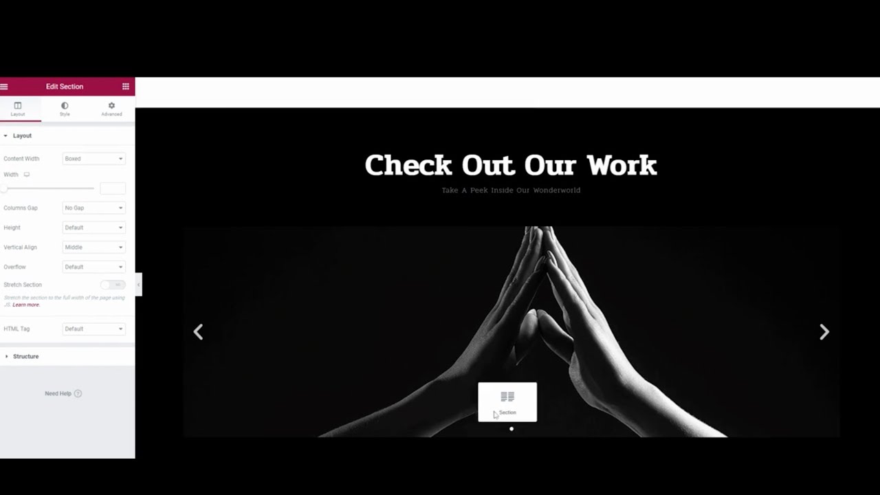
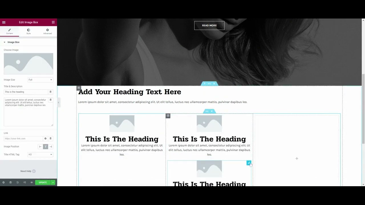
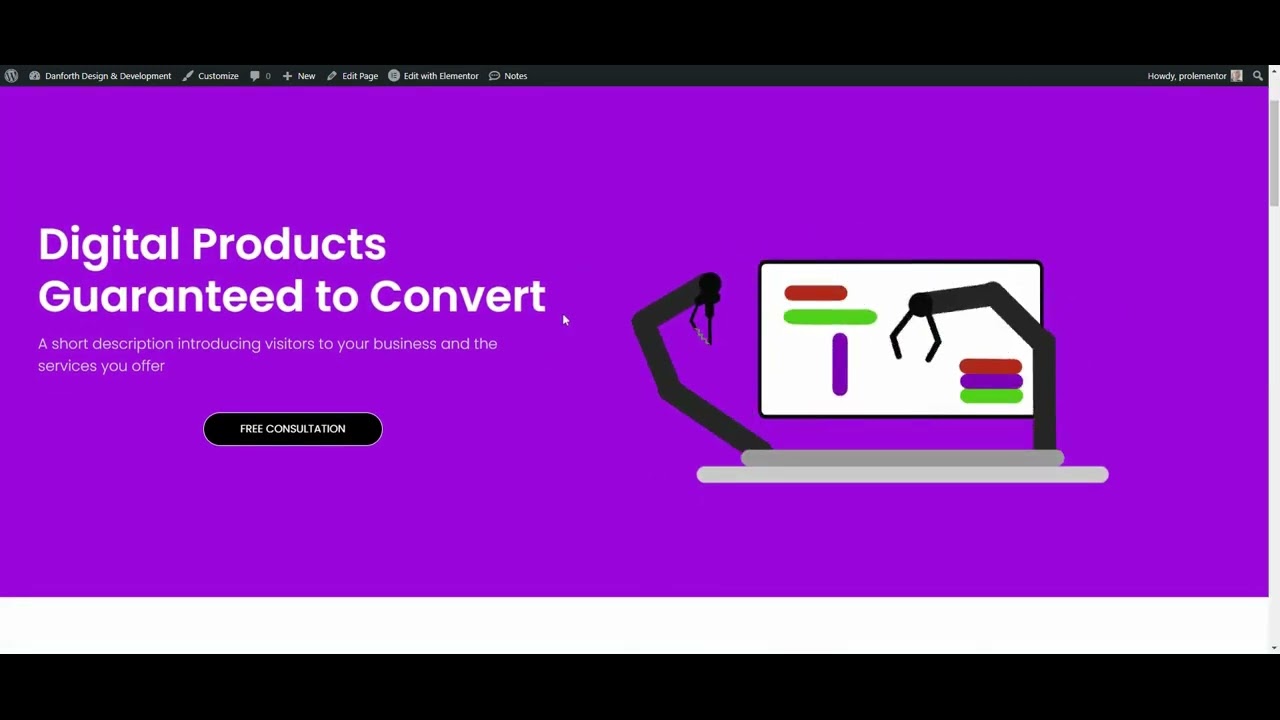
In this tutorial, we’re going to walk through the various ways you can create a homepage with Elementor. Then, we’ll take a look at some tips to help you get better results—with visitors and search engines—from your homepage.
The homepage is arguably the most important page on a website. Even if visitors don’t initially land on the homepage, they’re likely to end up there at some point.
That’s because, as consumers, we know that the homepage gives us the best bird’s-eye view of what a website and the company behind it have to offer. That’s why it’s critical to design a homepage that looks attractive, is easy to engage with, and motivates visitors to take the next step.
Elementor Template Kits on Envato Elements
You can download unlimited Template Kits for Elementor with your Envato Elements subscription, to use with your WordPress website. Envato Elements also gives you access to thousands of other creative assets, like icons, graphics, video templates, email templates, HTML templates, Photoshop actions, you name it!

Now let’s dive into all the ways you can create your Elementor homepage!
6 Ways to Create the Homepage with Elementor
The great thing about using Elementor is that it’s flexible. Whether you want to use it as a total website building solution or only need it to streamline how you edit pages, there’s a way to make it work for your personal approach.
In terms of how you create a homepage with Elementor, there are six ways to do it:
Option 1: Customize a Premium WordPress Theme Demo
ThemeForest has over 3,500 Elementor-compatible WordPress themes:
Depending on the one you use, it will either include a single template or various demos for the homepage.
To use a premium theme with Elementor, go to Appearance and Themes. Click the Add New button and you’ll be taken to a page where you can upload your theme files:
To import the homepage template or demo, look for a new area of WordPress named after the theme. There should be an area in there called Import Demo.
After you’ve completed the process to import it, you’ll find a new page called Home that you can customize with Elementor.
Option 2: Start with an Envato Elements Template Kit
Envato Elements has more than 2,400 website template kits that are compatible with Elementor:
These kits come with templates for the most common web pages, including the homepage. What’s nice about this option is that you don’t need to import every page template into your website. You can pick and choose which ones you need.
To import one of these kits, install the Template Kit — Import plugin. Open up Tools and Template Kit:
From here, you can either find a kit you like and import it or upload the kit file you got directly from Envato Elements. When importing is done, you’ll have a new homepage ready to go under Pages.
Option 3: Install an Elementor Kit
Elementor has its own website template kits, which you’ll find under Templates > Kit Library.
There are over 100 to choose from, though some require you to have a Pro or Expert membership to gain access. The nice thing about this option is that you’re able to choose from fully designed templates as well as basic wireframes.
Find the kit you want to use, click on it, and then click on the green Apply Kit button in the top-right corner:
When the kit finishes loading, you’ll be able to hop inside to edit your new homepage.
Option 4: Use an Elementor Homepage Template
In addition to full website demos, Elementor also offers a great collection of page templates for the most common web pages. Open up the templates folder inside the Elementor editor and do a search for “Home” to see what’s available:
The vast majority of page templates are only available to Pro users, so that’s something to keep in mind if this is the route you want to go.
When choosing a homepage template, don’t stress about the exact content that’s in them. All of that has to be edited. What you want to do is find one with a general style and layout that you like. This will minimize how much you need to edit the homepage in Elementor.
When you find a homepage template you like, select it and click on the green Insert button to add it to the page:
The template is now yours to customize.
info
If you go with Options 4, 5, or 6, you’ll need to manually configure the homepage to render as the homepage.
After you’ve published your homepage, go to Settings > Reading:
By default, WordPress will set the homepage to Your latest posts. If you use a theme’s demo content or a premade website kit, they almost always take care of switching that setting to A static page as well as the newly created Home page.
If you’re not leveraging premade page designs, you’ll have to configure this by hand from the Settings panel.
Option 5: Compile the Homepage using Elementor Block Templates
If you can’t find a homepage template that contains the kind of content or structures you want to include in yours, Elementor block templates are a good workaround:
Many of these block templates look more like wireframes than complete designs, which is nice as you won’t have to strip out or edit as much content that way. These blocks are also helpful if you want to add new sections to premade templates or themes.
The process to add block templates is the same as adding a full-page template. You’ll just have to add them one at a time.

It’s okay if you don’t add them in the right order. Elementor makes it easy to drag-and-drop them into place. You can also use the Navigator tool to quickly make composition changes.
Option 6: Build the Homepage with Elementor, From Scratch
If you have a very specific vision for your homepage, you might decide it’s better to build it by hand using the Elementor visual editor:
With a Pro subscription, you’ll have dozens of Elementor widgets to build with—in addition to section editing capabilities. You can also switch it up by building some sections by hand and then utilizing block templates to fill in the rest.

It may take longer to go this route, but the end result will be 100% your creation.
Tips for Designing a Homepage with Elementor
The six options above outline the first steps you’ll take to create your homepage. Here are some things to keep in mind as you edit your homepage in Elementor.
1. Spend Extra Time on the Hero Section
Aside from the website header, the hero section will be the first thing that people see on your homepage. So you need to make it count.
While WordPress themes and Elementor templates do a good job of mixing high-impact typography, eye-catching multimedia, and creative layouts, think about how many people are using these premade designs. This is why so many websites look the same.
In order to make your hero section stand out, use your template as a place to jump off from. For instance, this is one of Elementor’s wireframe homepage templates:
Elementor not only gives users full control over every detail, but Pro users also have access to advanced features like Lottie:

With a bright pop of color, some creative manipulation of a Lottie file, and typography motion effects, this is just one way to transform an uninspired hero section design.
2. Be Careful About How Much Content You Add
Elementor WordPress themes and page templates are great because they’ll usually get you about 75% of the way there. However, every website is different.
For example, let’s say you’re building a website for a brand new consulting agency. The homepage template you used includes a section for testimonials. However, the agency has yet to get any clients. So, you delete the testimonials section.
Be careful about thinking you have to add something into the homepage for anything you remove. A longer homepage isn’t always better, especially when it comes to the mobile experience.
To keep an eye on the length of your homepage, open the Navigator tool. You’ll find it in the bottom-left toolbar — it’s the second icon from the left.
With the Navigator tool open, you can see the entirety of your homepage all at once. If you have more than eight or nine sections, then you probably have too much content.
Look for duplicate sections or ones that cover something secondary to the primary purpose of the website. Delete them and keep your homepage long enough to be informative but short enough so that it’s easy to digest.
3. Use Elementor’s Site Settings Tools to Ensure Consistency
When it comes to editing the homepage in Elementor, it becomes more difficult to track the design choices you made previously.
One thing you can do to ensure you consistently use color and typography throughout the homepage and website is to create a style guide. If you don’t want to build a formal style guide for your brand, you can use Elementor’s global styling tools to create one inside of WordPress.
When you’re inside the Elementor editor, click on the hamburger menu icon in the top-left corner. Then select Site Settings. From here, you can set your Global Fonts and Global Colors:
In addition, you can configure:
- Typography styles for different types of text
- Global button designs
- Image settings related to borders, opacity, shadows, and CSS filters
- Form field design settings
- Default website backgrounds, layouts, transitions, and more
Not only do these Elementor settings help you keep consistent when designing, but they’ll save you from having to program in the same styles over and over again.
4. Always Include a Call-to-Action As the Last Section
There’s a UX Law called the Serial Position Effect. What it says is that people tend to remember the first and last items better than everything else in between.
This theory is super relevant to the way you structure your homepage. While visitors will peruse the sections in between, it’s the first (i.e. the hero section) and last one that will leave the strongest impression.
As such, the last section on the homepage should always be a call-to-action.
Your WordPress theme or Elementor template should already have one built in. You’ll have to customize what it says and how it looks regardless. However, you might also want to change the call-to-action itself.
If that’s the case, you have a couple of ways to do this. One option is to use an Elementor block template. You’ll find ones designed specifically for the Call To Action category. However, also check out the ones under Contact, Subscribe, and Footer:
You may find something closer to what you need there. You can also build it from scratch using Elementor widgets. All the building blocks you’d need—like buttons, forms, and maps—are there.
5. Optimize for Search
You don’t need to be a professional SEO specialist in order to optimize a homepage to rank better in search results pages.
Here are some general tips to help you edit the homepage in Elementor for the purposes of SEO:
Tip #1: Make the First Headline on the Page an H1
Set this up under the HTML Tag setting:
Also, include your main keyword in the H1.
Tip #2: Make the Subsequent Section Headlines H2
They should be clear, jargon-free, and tell a linear story about the website.
Any boxes placed within an H2 section should be set to H3.
Tip #3: Add alt Text to Descriptive Images
This is a field that appears when you upload a file to the Media Library:
You only need to write a description of what’s visible in the image if it’s important. If the image is just there for decorative purposes or if it’s a generic stock photo, no alt text is needed.
Tip #4: Test all of the Links
Click on the eyeball icon in the bottom-left toolbar to open up the preview of the homepage. Scroll through the page and engage with it as a visitor would.
Confirm that the user-triggered effects work, including text, button, and image links. Also make sure that all links direct them to the correct pages.
Tip #5: Review Your Work in Responsive Mode
This is the second icon from the right in the bottom toolbar.
When responsive mode is activated, a small bar will appear at the top of the page. Click on the tablet and mobile icons and preview your website on smaller screens:
A fully responsive website is critical to the user experience and is something that gets factored into every website’s ranking. Ensure that your homepage looks great and everything works as it should when it’s viewed from smaller devices.
Conclusion
The homepage is the most important page on a website. For some visitors, it’s the gateway to the rest of the website. For others, it’s where they go to get a high-level overview of the site’s offering.
This is why you need a powerful page building solution like Elementor to create the homepage with.
One of the biggest benefits of using this page builder plugin is that it’s flexible. You can design your homepage using any method you prefer. What’s more, Elementor comes with a comprehensive collection of tools and templates that simplify the design process. As a bonus, most WordPress themes are compatible with Elementor, so you can leverage external resources and templates without fear of them not working with your page builder.
Learn More About Elementor With Tuts+
We have new Elementor tutorials being published all the time; periodically check the Elementor category page to make sure you don’t miss any!