In a digital world, colors are represented as coordinates in one of the color models: RGB, HSL, HCL, etc… Some are made for machines (RGB literally represents the way displays work) while others (HSL, HCL) try to be more designer-friendly by providing a more natural way to navigate the color space.
For designers colors are visual. They have certain look and name and could be selected by moving sliders on a color picker or using a familiar “eyedropper” tool. For developers, colors are abstract entities represented with references in the code.
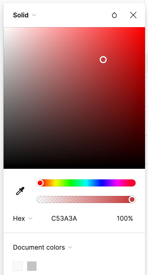
At the end of the day they are just sets of numbers in different formats.
These numbers could be manipulated visually with tools like Photoshop or indirectly by writing code. In the first case, we can get instant results that cannot be easily modified and in the second one, we’ll have to deal with a steep ladder of abstraction.
As a result, most digital designers use tools like Figma, which are quite limited for tasks beyond assembling mockups or countless one-trick small apps. No wonder some of the world’s leading design teams started building their own custom tools for dealing with colors. These tools can be handy, but you may unlikely get much value from them if your goals are slightly different from the ones of the creators.
So we are left with lots of great, but disconnected products, quite limited functionality of core design tools, and an urge to learn coding to be able to use chroma.js or something similar. Tough choice.
What if there was a more flexible way to work with colors without all the complexity of programming? I helped my friend Alex create a simple tool that tries to take the best of two worlds: allow designers to modify colors manually or parametrically while providing an instant preview of the end result.
Generator is a Figma plugin that helps designers better understand colors and work with them parametrically using a node-based interface.
Let me show you a few examples of how the plugin works…
First, we’ll add a color node and type a color value.
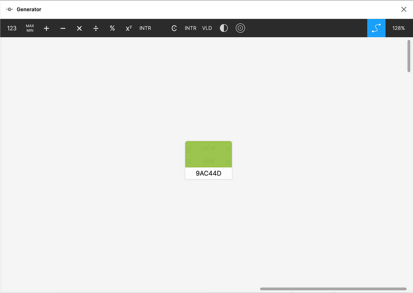
Now we have our initial color in a HEX format. Perfect for sharing with the developers or copy-pasting into design tools, despite being rather useless for everything else.
Fortunately, the very same color may be presented in different formats depending on your needs.
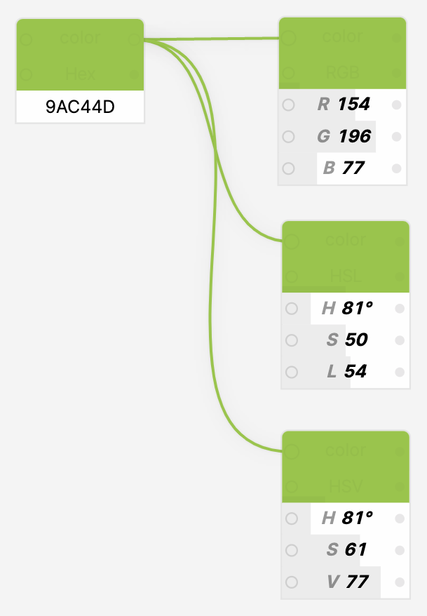
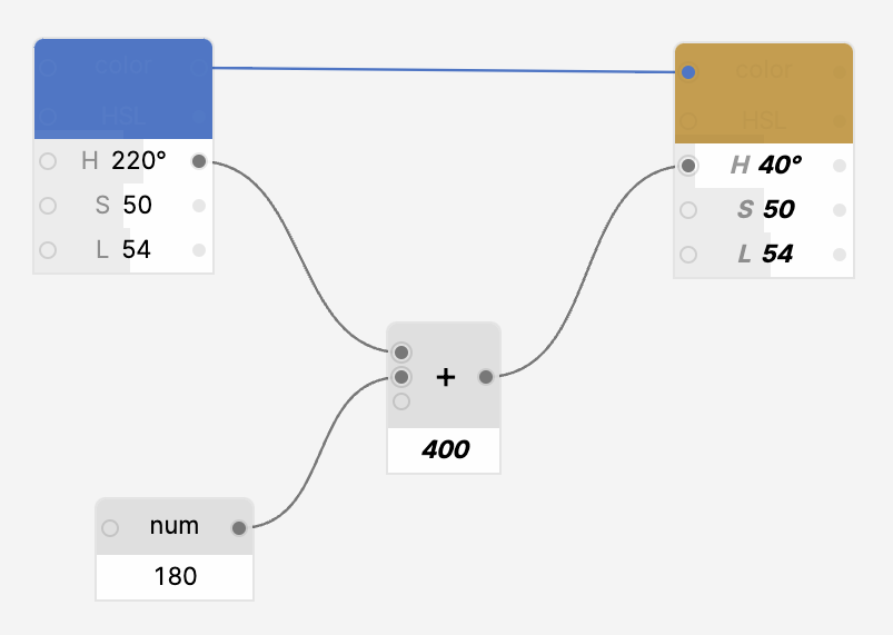
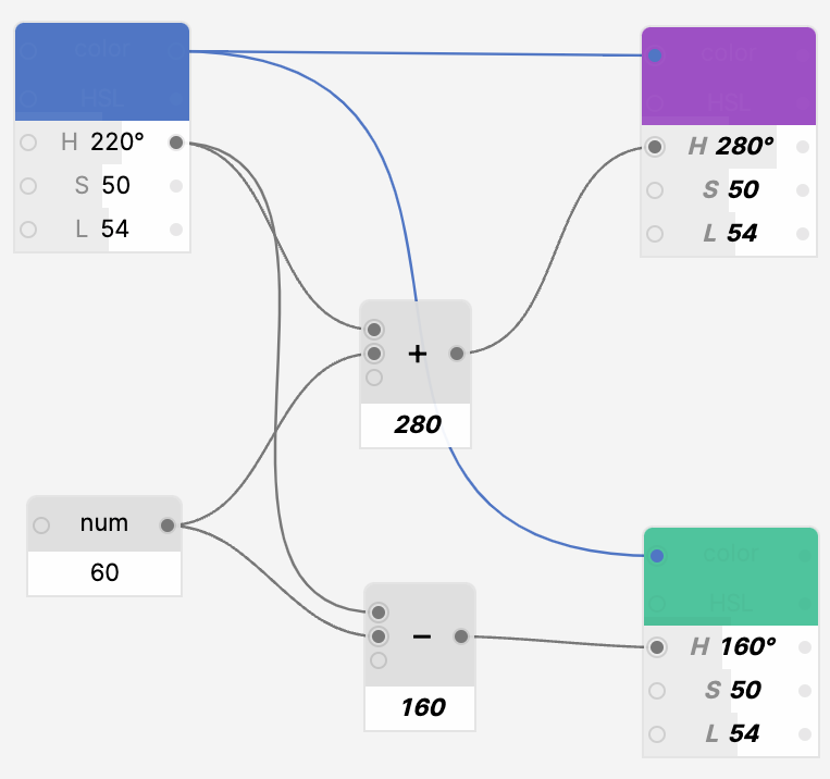
Let’s take our primary color in HSL and create a complementary one by rotating the hue by 180º on the color wheel.

We can do it manually by calculating a sum of 81º and 180º and then typing the hue value on the new node while copy-pasting the original saturation and lightness. But why not let the computer do this monkey work instead?

So we’ll create a second color node connected to the original, connect the initial hue to the sum of it and 180º and map the result to the output color node. You’ll spend more time reading the paragraph than it actually took to create this example.
Now no matter what the initial, seed color is, we get a perfect complementary one automagically.
Let’s modify this scheme to support triadic color combination by offsetting the original hue in two directions by a certain angle.
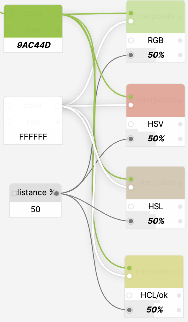
Extra colors could be calculated by interpolating a seed color and, say, white. Switching color models yields different results, so feel free to experiment and see what works the best.
When needed, we may instantly calculate WCAG contrast for two colors without leaving the tool.
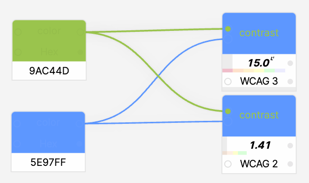
Just keep in mind that the contrast calculation algorithm used in WCAG 2 is rather unreliable and one should not mindlessly optimize for the numbers. When possible, use WCAG 3 APCA instead.
Another practical example, deciding if we should use dark or light text against a certain background.
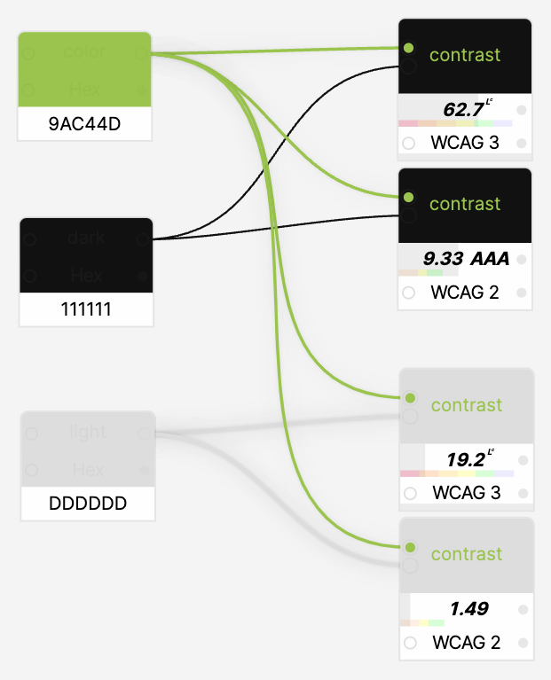
The contrast for the dark one is much higher, so it’s a clear winner.
And what if we need a saturated or a desaturated version of the color?
Adjust the saturation with a number node and it’s done.
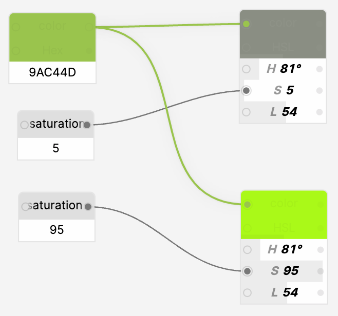
This trick could be handy if we need to normalize the color to make sure it’s not totally desaturated or dark.
We may play with the colors manually or connect our nodes into rather complex chains to receive instant results by adjusting a few values.

Now let’s try something a little bit more complex, like designing a basic color system: 3 hues, 2 grades for each hue.
We’ll use a seed color and create two additional ones by splitting the color wheel into three equal segments.
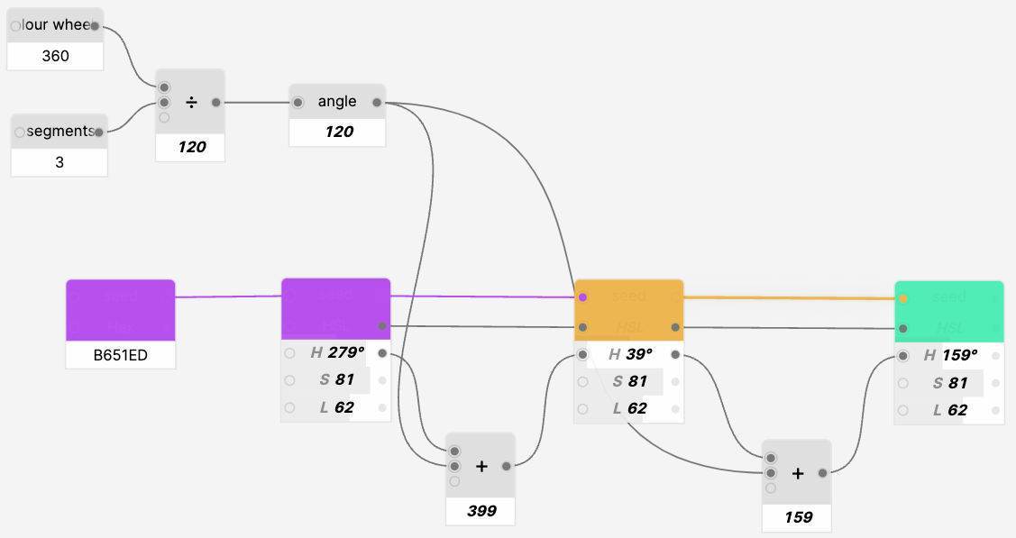
Unfortunately, HSL color space is not visually uniform. Our math is right, yet some of the colors are clearly standing out.
Let’s try switching the color format to HCL. HCL is one of the most popular perceptually uniform color spaces that’s handy for creating complex color systems and data visualizations.
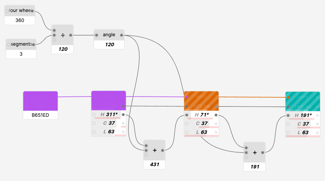
Wait, what’s happening?
Like every great invention, HCL is not flawless. The main downside is that the color space is rather tricky to navigate as, unlike HSL, it’s not a simple cylinder where we always get a valid color.
This color picker clearly indicates that we have to balance on a really narrow bridge while choosing the colors.

Generator addresses this issue by finding a fallback color by modifying hue, chroma, and luminance within a certain range to find the closest available fallback color.
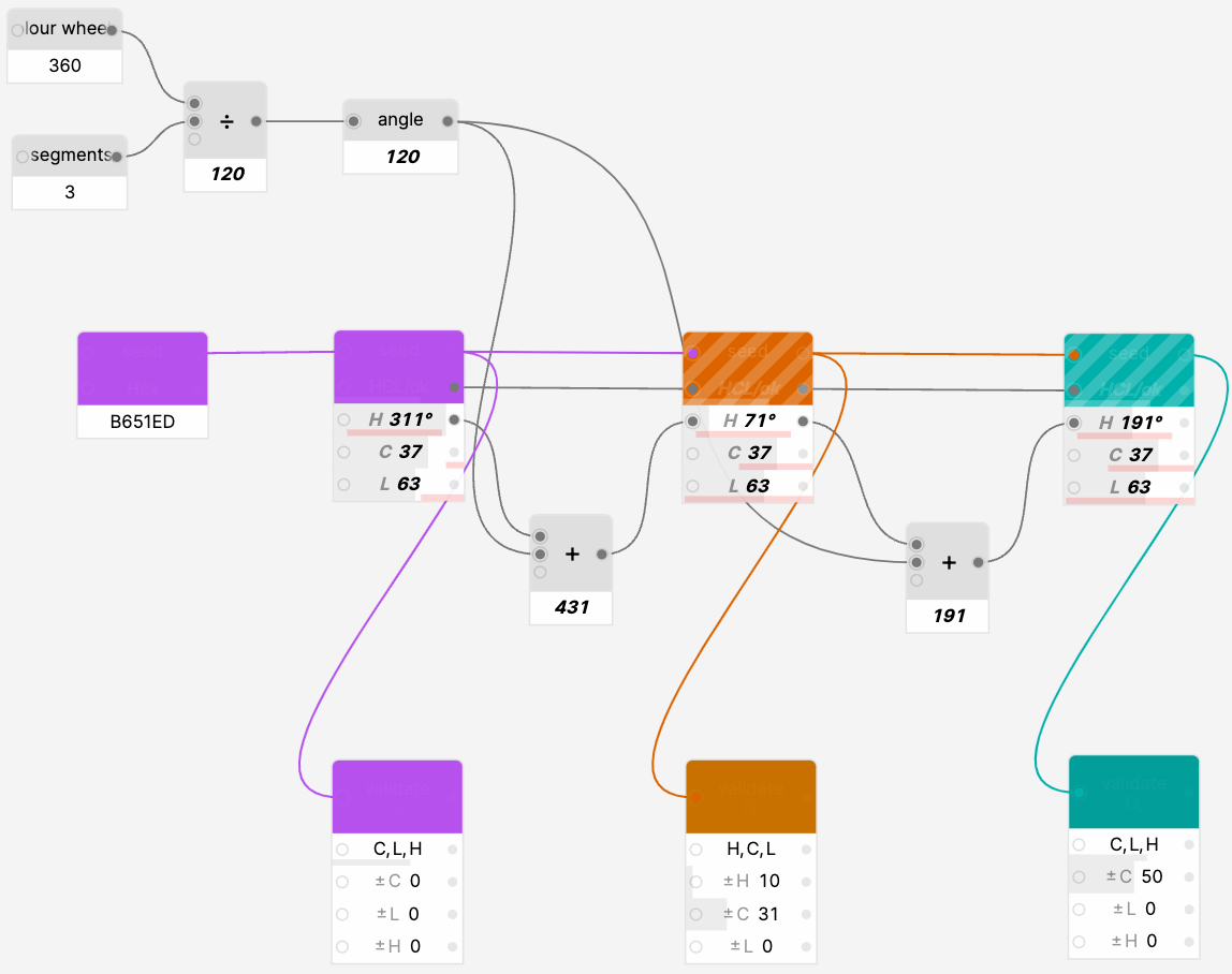
So, to use HCL in a fully parametric color system we’ll have to rely on a combination of color nodes and validators. C’est la vie…
Let’s add color grades by shifting luminance up and down by a certain number.
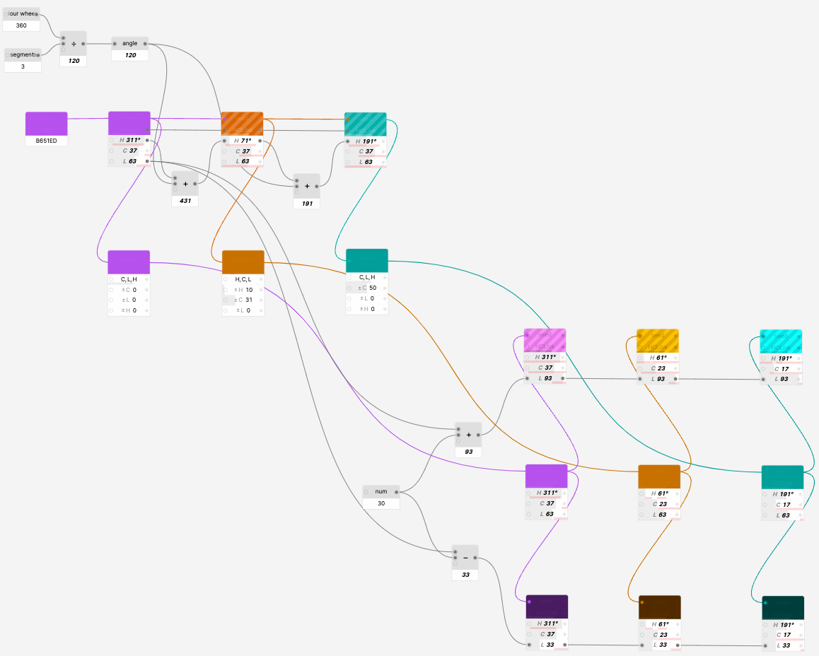
Certain colors are still non-valid, but we already know how to deal with them, right? Add validators for each HCL color and a contrast checker to ensure that the grade offset is large enough to provide us with an accessible color set.
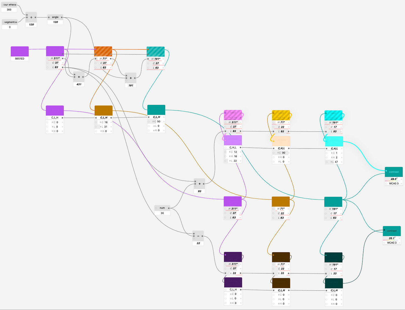
The graph may look really complex at first glance, especially with seemingly redundant validation nodes, but the real magic starts once we complete the model and understand that it is reusable.
Wait a second…
Change the seed color to pale green? Check.
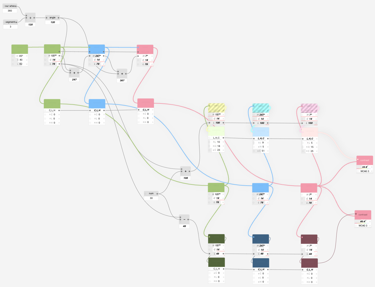
Change angle between hues? Check.
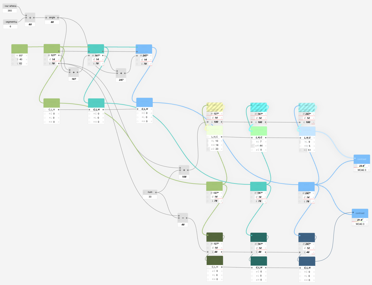
Reduce the difference between light and dark grades? Check.
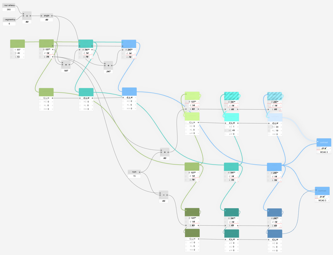
We could even convert the seed color to HSL and fix saturation and lightness so that the model only relies on the hue value of the initial color. Now the model literally works with anything you connect to the seed, be it green, magenta, or even black or white.

At this point our simple model is complete and we can adjust different parameters and instantly preview the results instead of having to spend hours with a calculator and a bunch of tools.
Generator is not a silver bullet: it won’t let you create an infinitely flexible color system within a second or make your designs nice and pretty with a click of a mouse button.
Just like any early-stage prototype, Generator is not perfect. There is no conditional logic, groups are missing, no way to create cycles, and scaling the model beyond a few dozens of nodes makes debugging rather complex.
But even in its early days, the plugin can be handy for explaining and exploring color spaces or creating parametric color systems and models which are hard to create with the majority of existing tools.
We do believe that the potential of node-based design tools is still to be revealed and they can go beyond complex professional systems.
In the meanwhile, you may download the plugin and see how it can change the way you work with colors.