Let’s get creative using Figma. In this tutorial we’ll focus on the style elements needed to start building a functional design system.
How to Create a Design System in Figma
Let’s get started! In this easy-to-follow tutorial we’ll learn how to create the basic structure and style elements for a design system in Figma.
1. Define The Structure of Your Design System
A design system can be as simple or as complex as your brand needs it to be. It can include a set of style elements, documentation, tone of voice, and best practices.
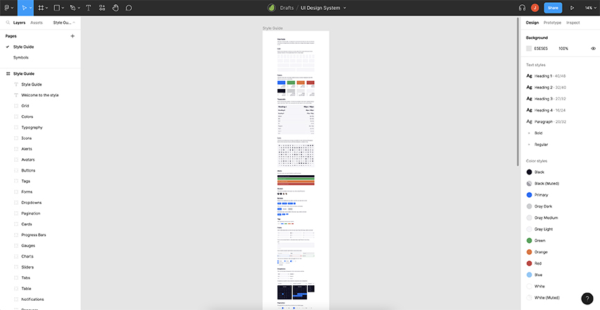
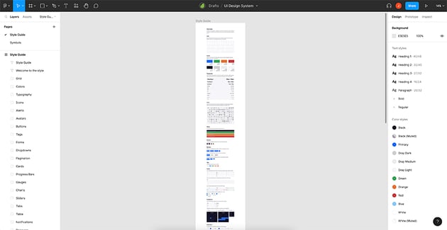
The basic structure of a design system includes (but is not limited to) style elements such as:
- Colors
- Grid and spacing
- Typography
- Shapes and patterns
- Buttons
- Cards
- Icons
- Tags
- Forms
- Charts and progress bars
It can also feature technical and communication elements such as:
- Help documentation
- Brand philosophy
- Tone of voice
- Vocabulary
- Best practices
- Visual guidelines
Remember, a design system is like a live library that is developed over time.
For this tutorial we’ll be covering the three style elements highlighted in bold on the list above. Don’t worry if you don’t tackle all elements at first, you can update and include them as your brand evolves.
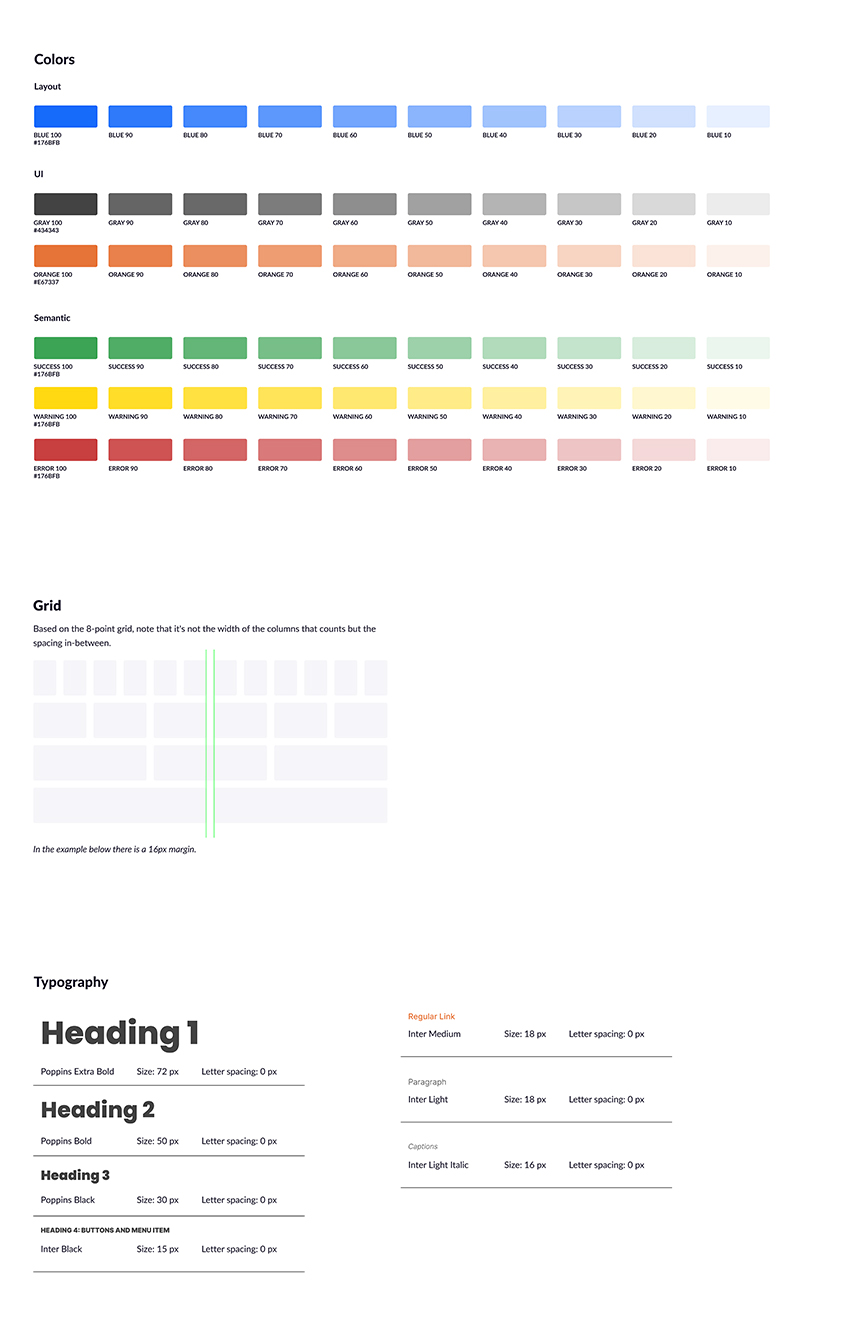
2. Define Colors
Color might be the main visual language of your brand. Given its huge relevance, defining your colors is a good place to start.
Step 1: Split Your Colors into Categories
Create a new file in Figma. Add a Frame into the workspace, mine started at 1920 x 1080 px. The length will expand as I add new elements to my design system.
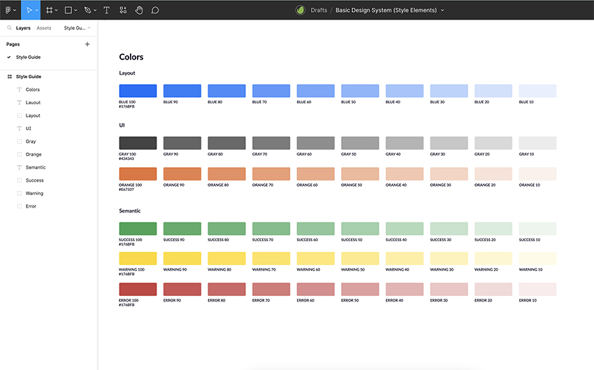
Following the guidelines shared by Adi Purdila in his Introduction to Design Systems, we’ll split colors into three main categories:
- Layout: borders, headers, footers, etc.
- UI: text, buttons and forms
- Semantic: success, error, information
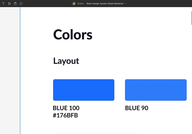
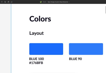
Include these three categories in your Frame and add your primary color. In this case BLUE will be my main Layout color.
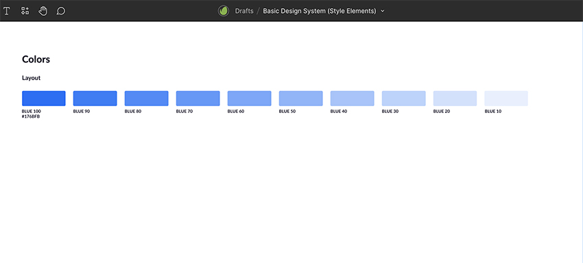
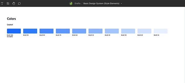
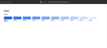
I’ll repeat the shape ten times and reduce opacity by 10% so I have a range of contrast. This will give a visual guide of what each tint of a specific color looks like.
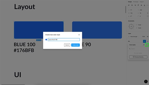
Step 2: Name Your Colors
Make sure you add specific names to each color so they’re easy to identify. In this case, each tint of my Layout color will be named “BLUE” + the percentage of opacity it shows.

Step 3: Sample Your Colors
Sampling makes it easy to assign each tint a color throughout your design system and even in your actual web design.
Select your color, click on the plus sign on the right side menu.


Repeat the same with all your colors and you’ll have your own project color library.
Step 4: Duplicate Layout Section for UI and Semantic Colors
Let’s define UI and Semantic colors. To do this we can use what we did for our Layout colors as a base. Just duplicate the section and replace the HEX values to represent UI and Semantic colors for visual elements such as:
- Text
- Links
- Buttons
- States (active/inactive)
- Success
- Warning
- Error
Once you’ve done that, your Frame should look something like this:

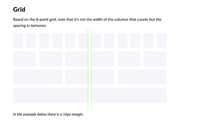
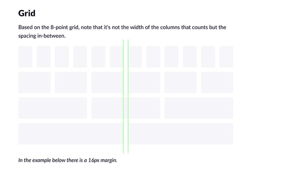
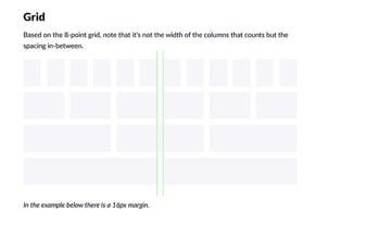
3. Define Grid and Spacing
For this step I’ll be using the grid and spacing that comes with the UI Design System. This 8-point grid is based on multiples of 8.
4. Define Typography
Look the perfect pairing of fonts that will land your brand’s message. Keep your brand cohesive and clean by working with no more than three fonts: one for headlines, one for body of text and another one for buttons.
Step 1: Choose Your Fonts
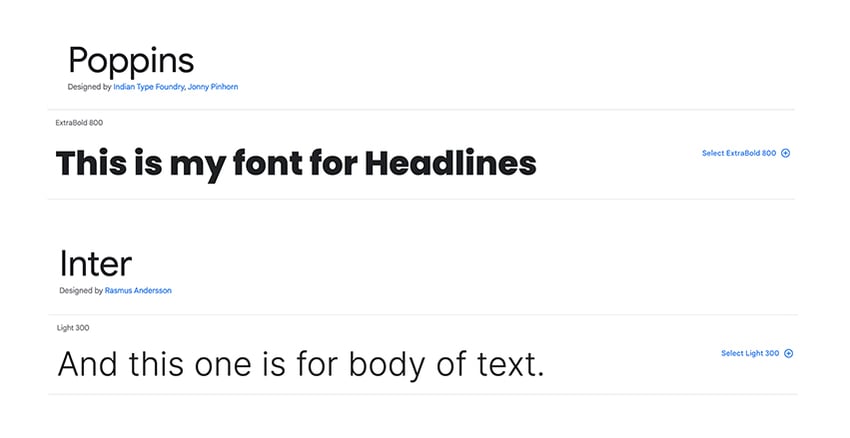
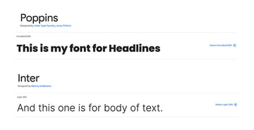
I’ll be working with two options from Google Fonts: Poppins for Headlines and Inter for body of text and buttons.
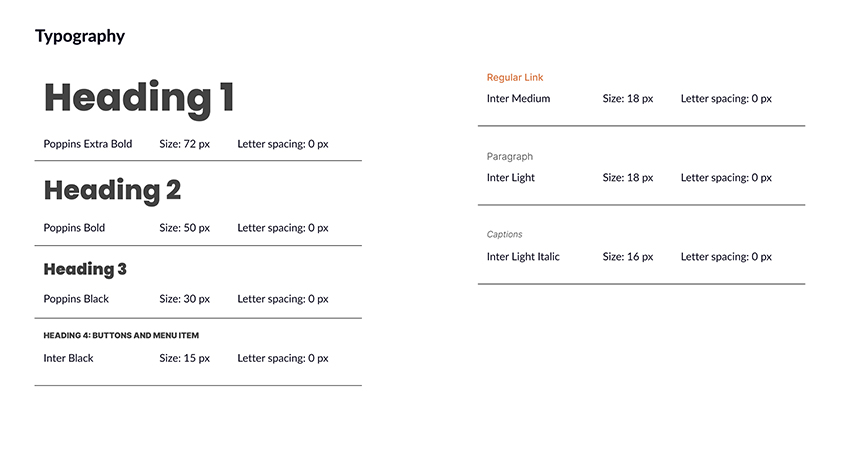
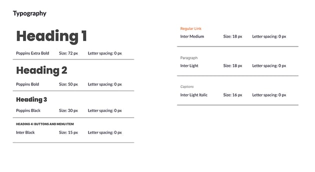
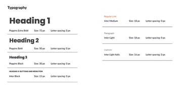
Step 2: Define Font Size and Scale
You should consider the following:
- Heading 1: main titles
- Heading 2: subtitles
- Heading 3: highlights
- Heading 4: buttons
- Regular link
- Paragraph or body text
- Captions
5. Start Planning Future Updates to Your Design System
We now have the very basic structure and style elements of your design system.
This is a great place to start. But you might want to come back periodically to add new styles and technical elements.

Consider working on specific icons, cards and buttons for your brand as a next step. Also think about animations and button behaviors.
Look for Figma design system examples to apply new styles to your own. Keep making improvements to your design system so all your design updates look cohesive and consistent!
Get More Figma Resources and Inspiration
One of the best part of working with Figma is how easy it is to use and understand. Discover new skills and tricks to create better UI/UX design with Figma. Check out some of the tutorials and resources featured in the list bellow:
You’re Already a Better Web Designer!
I hope you enjoyed this quick Figma tutorial and use these new tricks on your next design project. The more Figma design system examples you look at, the better your own design systems will be.
Find all the inspiration and creative resources you need on Envato Elements.