In this article, we’ll learn all about what brutalism is in graphic design and how 90s graphic design trends are influencing a new hybrid.
The word “rebellious” is closely related to graphic design that breaks the rules—often as part of a response to a current design trend. In this article, you’ll learn about what brutalism is in design, how 90s graphic design trends are creating a mix of new styles, and how to break the rules of graphic design with brutalism.
Rebellious Design

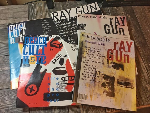

Throughout history, we have witnessed many art and design trends that were responses to other current styles. Sometimes because of a clash of philosophies, societal movements and protests influenced graphic design and communication. In history, we can see how posters and zines have been used as pieces of activism to rebel.
Rebellion isn’t unheard of when it comes to design. Most trends in art and design have emerged from a response to another trend. In the past, we’ve seen how the Bauhaus was a response to Art Nouveau, punk graphics to minimalism, and so on. Trends tend to come back every few decades but with a new twist. That’s the case with the neo-brutalist style that mixes with 90s graphic design. Here are a few trends that have helped put graphic design where it is now and have influenced the brutalist revival:
How Punk Influenced Graphic Design
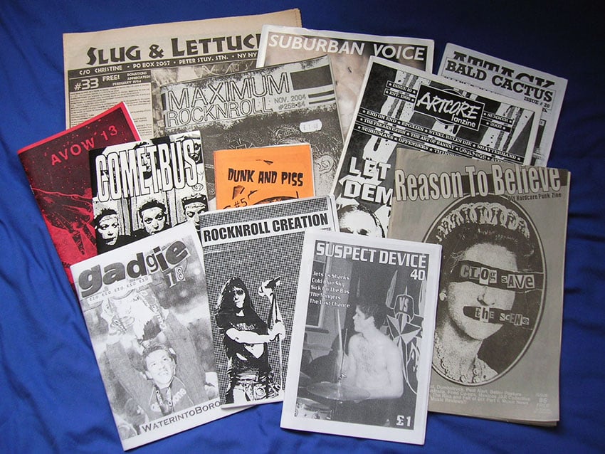
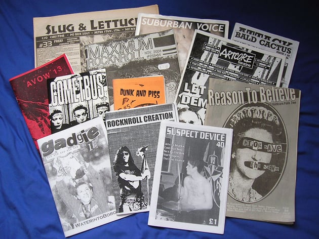
The punk design style was one of the first trends that relied heavily on music, and the style emerged as a response to modernist design. The inclusion of music in the underground press and counter-culture graphic design in the 1960s and 1970s paved the way for exploration in graphics.
The punk aesthetic of designers like David Carson and Stefan Sagmeister, in a way, helped deconstruct and understand visual language, not only for designers but also for users. The punk influence helped bring into question the importance of design elements, rules, and the functionality of design pieces. Punk also influenced the rave-culture graphic design of the 90s and other 90s graphic design trends by encouraging these styles to break the rules of graphic design.
Rave Culture and Graphic Design
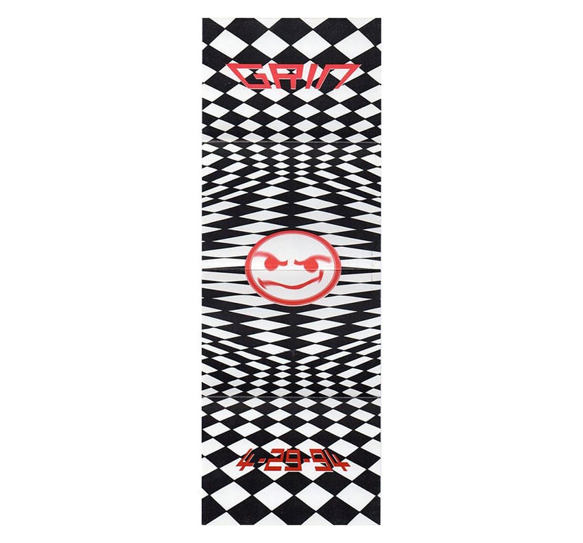
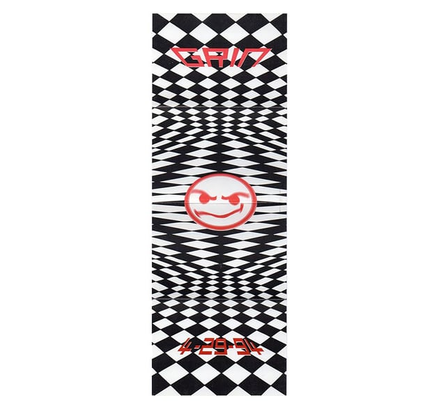
This is another 90s graphic design trend that became famous through flyers. Rave culture started in the late 1980s. The rave aesthetic included explorative images with energetic feeling. There were no rules, similar to punk. Original designs featured bold colors, typography was bold, and graphic elements were inspired by psychedelia. The rave culture set design up for the freedom to explore colors, shapes, and composition. We can see how it influenced the brutalist revival designs.
The Beginning of Brutalism
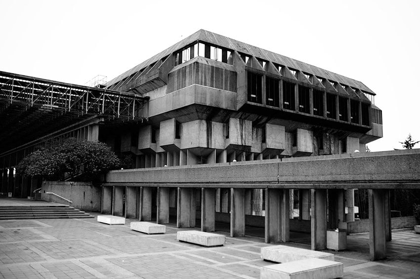

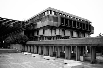
The name “brutalist” comes from the French “beton brut”, meaning raw concrete. The main philosophy of brutalism is to create simple and functional buildings with purpose. The movement has been criticized for being cold because of the use of concrete and its modern design approach.
The origin of the brutalist movement can be seen at different periods starting from early modernism, a movement that focused on urbanization, and how modern civilization viewed life. Art movements that were part of modernism included cubists and futurists. These two art movements already featured artworks and performances with landscapes that used geometric shapes and dreamlike industrial scenes.
As new technological advancements followed, a new type of modernist movement emerged. Constructivism from the 1920s was influenced by the Bauhaus school and the early work of Le Corbusier. His main proposal was to destroy historical buildings to make room to create modern cities. His vision changed the European urban planning and landscape forever in order to create functional housing for people displaced by war. This utilitarian approach inspired many architects, but the buildings were not the most aesthetically pleasing things to see. The value was in its usefulness rather than its beauty.
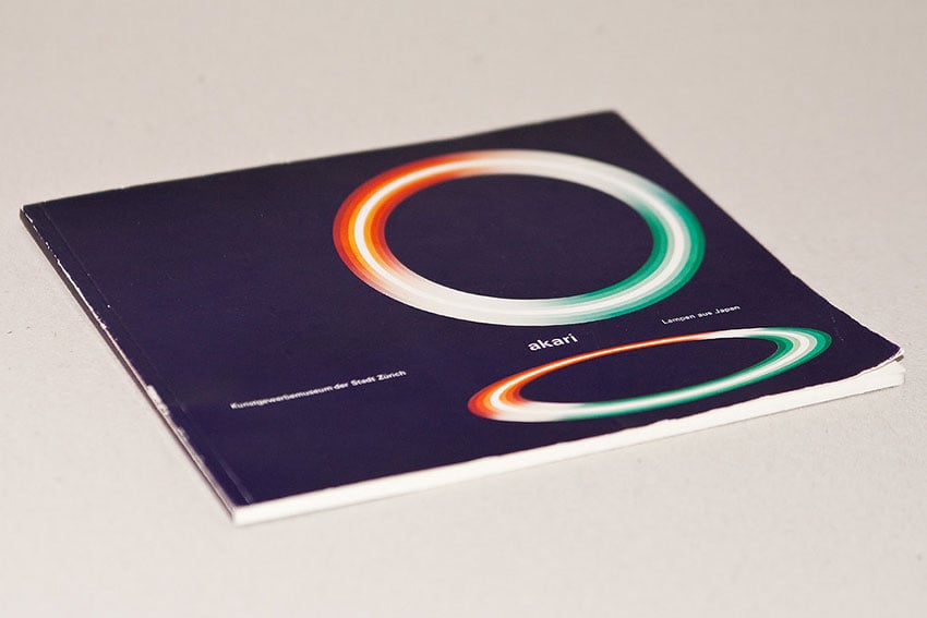

Parallel to architecture, minimalist design was taking off in the graphic design discipline. Brutalism is related to minimalism in general ideals. There are key differences, however. For example, minimalism doesn’t go as far in terms of stripping design down to rawness. Minimalism still pays consideration to key design elements, whereas brutalism can be contradictory: visually extravagant while extremely minimalist.
What Is Brutalism in Graphic Design?

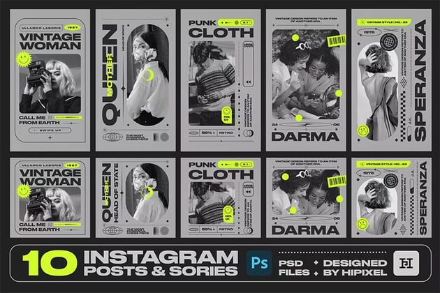
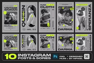
Taking the philosophy from the 1950s and the architecture field, brutalist design attempts to look raw and bare. The brutalist revival style of today is a beautiful hybrid of the 1960s and 1990s aesthetics. The 1990s was a big time for pop culture and a playful aesthetic, especially following on from the 80s Memphis style. Many other styles, like punk and rave, are influencing the new brutalist revival. These styles were characterized by the destruction of form: typography was pushed to its limits, and graphics were distorted.
So how can we see this translated into graphics? Since the 1960s, brutalism has been characterized by the words “bare bones” because it exposes the wireframe of designs. The style has nothing to hide, and we can often see the grid of the design come alive. The 90s graphic design style comes in with some of the grungy-looking images, the colors of the rave culture, and sometimes the inclusion of futuristic elements like chrome from Y2K or grids from the rave posters.


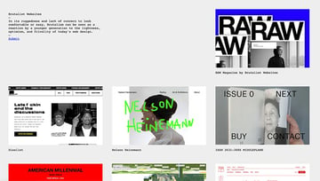
Brutalism can also be applied to web design. As in architecture, where the main idea is to use raw materials and efficiency in construction, this easily translates to websites. Functional websites like Craigslist, where you can see the essential elements, are unpretentious and useful. New websites that feature a brutalist approach in their design are not concerned with looking corporate. Instead, big typography, bright color choices, and mostly a personal interpretation of brutalism are key.
Characteristic Elements of the Brutalist Design Revival
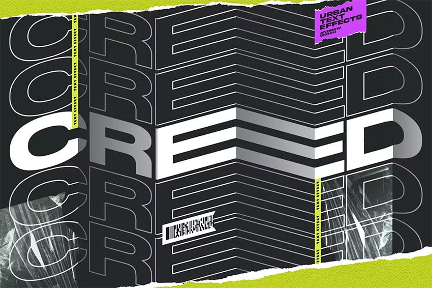


Brutalist design characteristics can be a little difficult to nail down since they vary from designer to designer. Nothing ever fits in a single box anymore. One of the key characteristics of the new resurgence of brutalism is that it looks easy but it’s far from. Brutalist design celebrates rawness and simplicity, and most times, that’s hard to recreate. A few of the key elements are:
- Composition: A clear hierarchy between all the elements, while attempting to look messy. Adventurous and explorative designs featuring multiple layers and repetitive elements arranged in different directions.
- Colors: Monochromatic color schemes in black, white, and grey, often with a single pop of color.
- Typography: Bold and clean typography, a mix of contemporary and classic fonts.
- Other graphic elements like heavy lines, tape designs comped with plastic wrappers, rugged posters, and aluminium foil.
Brutalist Graphic Design Pieces
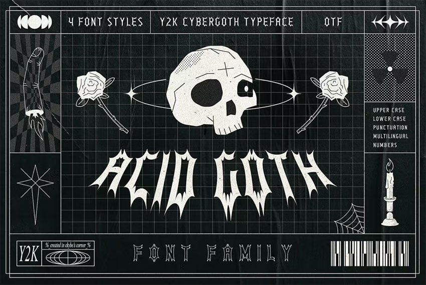
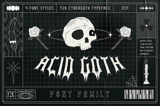
We often see brutalist design in design pieces from brands that are open to exploration. Since the style can look artsy, highly experimental, and conceptual, it’s difficult for it to work for corporate brands.
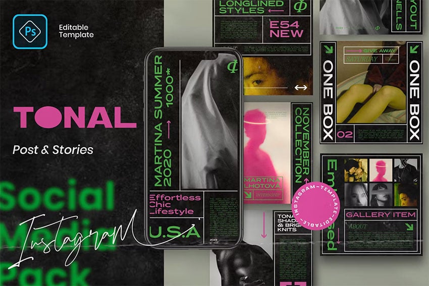
Nevertheless, fashion brands like Nike and print materials for the music industry also make use of this style. Social media has been a huge part of this brutalist revival as many brands now interact directly with customers. Social media graphics have evolved greatly, and the brutalist style creates impact, especially when seen on a small device.
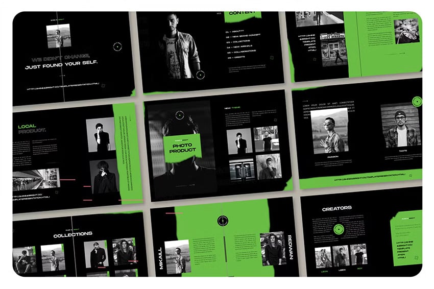

The style has also been translated into editorial design, where readers can have a special reading experience. Designs have become more expressive, and typography is louder, with colorful palettes.
In poster design, the use of shaped photographs has become very popular, with repetition of elements multiple times, bright or contrasting colors, and outlined typography.
As you can see, brutalism doesn’t really have specifics—it varies from designer to designer, but it goes back to basic principles from brutalist architecture and art:
- strong concepts that stay away from popular trends
- repetition of elements
- high contrast between elements in size and texture
- rough and unfinished look
- an underlying rave/punk aesthetic
Brutalism Is In
While the main trend was born over 50 years ago, brutalism has enjoyed a major resurgence and turned into a hybrid of retro styles. This beautiful mix is very different from what we’ve witnessed in the last few years in the design industry. The explorative nature of the trend allows designers to expand and try out typefaces and compositions outside of the norm.
So have you wondered how to break the rules of graphic design? Take a close look at brutalism and explore, explore, explore! If you liked this tutorial, you might like: