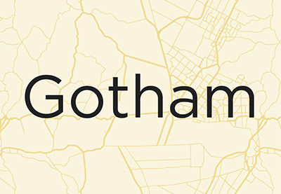
Have you ever wondered what font Obama uses? In this article, we uncover the story of the Gotham font, the most used typeface of the 21st Century.
If typefaces could represent one specific person, that would be Gotham as the Obama font. In the 2008 American election, you’ll notice that Barack Obama used typography as a powerful tool. Some might even say it won him the election. The Gotham font has been used in branding, editorial design, posters, and political campaigns. In this article, we’ll talk about the Gotham typeface history, designer, and uses. Ready to jump in?
Interested in finding an affordable version of the Gotham font? Be sure to check out Envato Elements and GraphicRiver. If you’re interested in other font collections, we have some amazing articles here at Tuts+.
What Is Gotham?
Gotham is one of the most well-known typefaces of our time. It was designed by Tobias Frere-Jones and based on lettering found around New York. The urban landscape inspiration and the perfect basic engineering of each character have made Gotham one of the most used typefaces of the early 21st century. Gotham is one of the latest geometric sans serif fonts to take on the world.
Gotham: Quick Facts
- Inspired by mid-20th century signage found in New York.
- GQ commissioned Tobias Frere-Jones to design a masculine font.
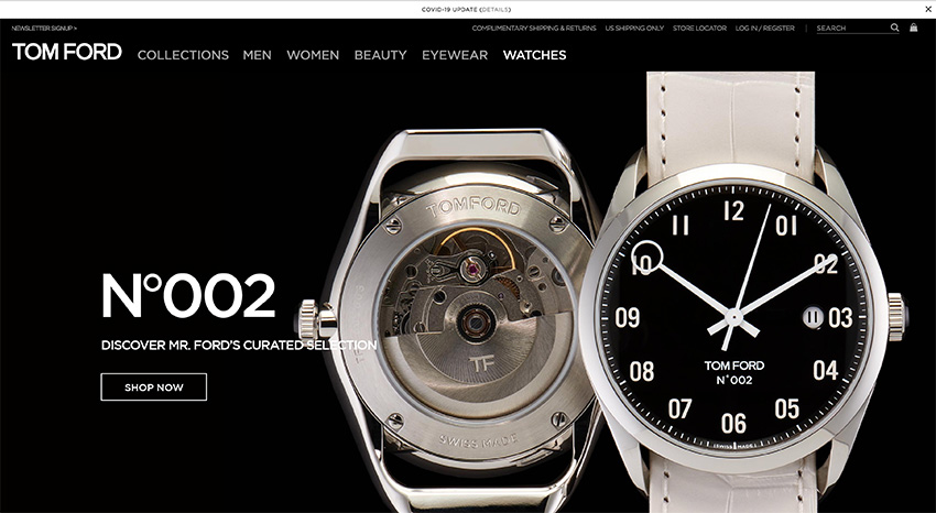
- The Gotham font family has been used in many rebranding efforts like Cartoon Network, Twitter, Tom Ford, and Chanel.
- Featuring a tall x-height and wide apertures, the Gotham font is highly legible.
- Besides branding, the Gotham typeface has been used in the Obama Presidential Campaign of 2008 and the One World Trade Center tower.
Who Designed Gotham?
Gotham was initially commissioned by GQ magazine. Gotham font designer Tobias Frere-Jones describes the font as masculine and fresh and absolutely straightforward. Frere-Jones wanted to preserve the New York charm and designed a modern typeface that would meet the needs of designers for years to come. The main inspiration came from the Port Authority Bus Terminal, and he found a geometric character—as if designed by an engineer.
Another inspiration for Gotham was the all-time iconic geometric Futura: a font that eliminated any decorative elements and left its characters with the bare minimum. Completely engineered with basic shapes, it was a typeface that followed the Bauhaus ideology of function over form.
While the font was mainly designed with mathematical logic, the Gotham font designer allowed some characters to break the rule whenever necessary. While there have been other fonts that mix humanist and geometric styles, Frere-Jones came up with a new solution.
Gotham Anatomy and Variations
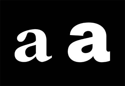
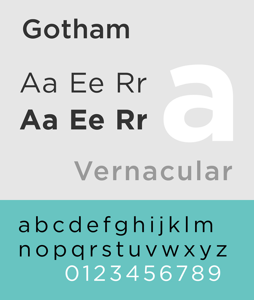
The Gotham font is fresh and masculine, and it has a very geometric structure. It’s a workhorse all around; its design doesn’t feature any unnecessary lines. There’s little contrast between the thick and thin strokes. The characters feature near-perfect circular curves. It has a particularly large x-height, which comes up to halfway between the ascenders and descenders. Characters like “e” or “a” are a little larger than usual.
The Gotham font family comes in 66 styles, is supported in 60 languages, and is very versatile. You can find Gotham in the following weights and widths:
- Weights: Gotham thin font, Gotham Extra Light, Gotham Light font, Gotham book, Gotham Medium font, Gotham bold, Gotham Black font, and Gotham Ultra font.
- Widths: You can also find Gotham Narrow fonts, Extra Narrow, and Condensed.
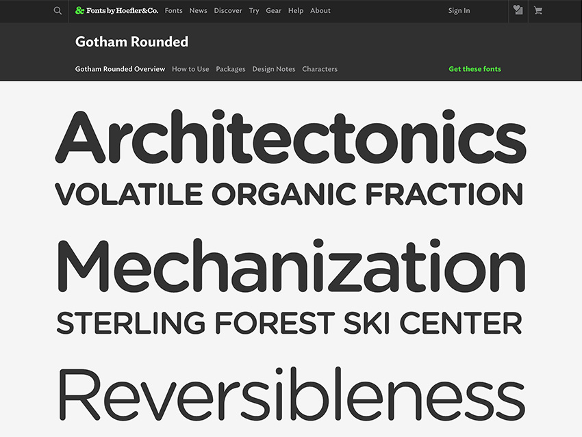
If you’re wondering how you can use such an extensive library, here are a few examples: Use the Gotham bold font to highlight certain text alongside the Gotham book font. For all these styles, you can also find Gotham web font versions.
Gotham in Use
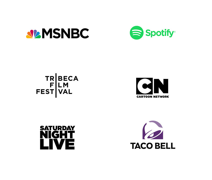
While it was developed for a specific use, GQ’s exclusive license expired in 2002, and Gotham was later released for public use. It has been used everywhere by brands like Tom Ford, Chanel, Taco Bell, Netflix, Starbucks, Spotify, and Twitter—and even on the campaign trail. On TV, it’s been used in shows like Saturday Night Live and Conan, and it’s the branding typeface for the Tribeca Film Festival.
The iconic One World Trade Center uses it on the Freedom Tower cornerstone to remember the lives lost on 9/11. The 20-ton cornerstone features an inscription that was chiseled in Gotham, the perfect timeless font that represents America. The Gotham typeface was also used for the National September 11 Memorial & Museum logo in combination with Verlag, another font by H & FJ typeface.
A modernist vision, the logo emphasizes the word ‘ONE’ to convey the message about the building’s best features and its role in the Lower Manhattan area. The emphasis also represents that the OWTC is the tallest building in the Western Hemisphere and an iconic part of the New York City skyline.

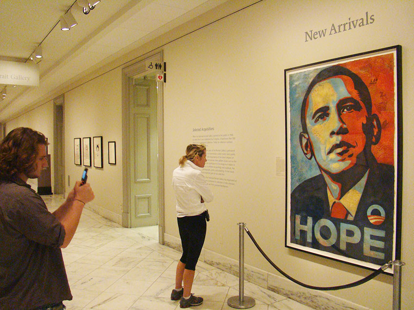
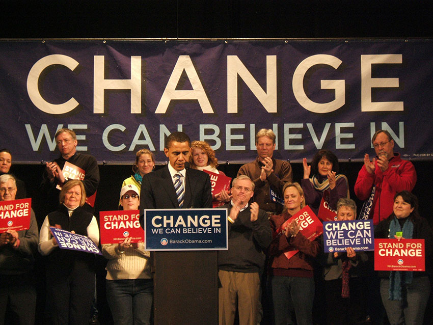
If you saw the 2008 American election and wondered “What font does Obama use?”, the answer is Gotham. The Obama campaign had initially used Gill Sans, but new designers on the team took the visuals in a different direction.
Gotham worked perfectly to bring a sense of modernism and authority to the campaign. This can be seen when the slogan “CHANGE WE CAN BELIEVE IN” is set in the font. Many designers praised the consistency of the message in the campaign, and many referred to Gotham as the Obama font. Since then, the font has been praised as the font that won the election.
To support the campaign, street artist Shepard Fairey designed the “HOPE” poster. It was a statement in the campaign trail including the word set in Gotham bold—striking.
In the same election, Hillary Clinton’s campaign designers chose to go with New Baskerville Bold. To most of the audience, the choice felt safe and regressive in comparison. Many designers agree that this single choice might have contributed to her loss.
After the 2008 American election, the Gotham typeface and similar fonts were used in many government projects. In 2020, campaigns are even more aware that their typography sets the tone for their ideals and message.
Gotham is extremely versatile and can be used in many, many ways, as we’ve seen in the examples above. While usually seen in logos, the font is the number one choice for brands looking for a contemporary sans serif. Even though the font is based on the perfect character engineering, it’s a little humanistic as well, and that gives it personality. In a way, it makes it neutral, adaptable, and a breath of fresh air to font design.
Conclusion
The Gotham font’s popularity made it the most used typeface of the 21st Century and probably the most recognizable too. From being the number one choice for rebranding to becoming the Obama font in the 2008 presidential elections, the Gotham font came in strong. Over the last few years, it has been the inspiration for new fonts like Montserrat and Raleway, clean and no-nonsense fonts that keep the minimalist movement going. Do you have a favorite sans serif font? Let us know in the comments below!
High-quality sans serifs like the Gotham typeface are hard to come by. Envato Elements and GraphicRiver have an extensive library that can help you find what you’re looking for. Be sure to check them out!
If you liked this Gotham typeface history article, you might like:
 FontsThe Rise of the Sans Serif
-
Typography10 Typefaces That Changed the World
-
FontsA Brief History of Display Fonts
-
Graphic Design60 Design Terms You Should Know
-
FontsEverything You Wanted to Know About Helvetica
-
FontsVintage Trend: Best Mid-Century Fonts