

For filmmakers and photographers, choosing the right aspect ratio can affect how a story is perceived by the audience. For web and graphic designers, it impacts how content is laid out on different screens and devices, ensuring that it looks good no matter where it’s viewed. For consumers, understanding aspect ratios can enhance the viewing experience by aligning the content with the most suitable display settings.
In this article, we’ll break down what is aspect ratio, how to determine aspect ratio, the history, and why they’re important in our daily digital experiences.
1. Understanding Aspect Ratio
Aspect ratio is a simple yet crucial concept in the world of visual media. It describes the shape of images and screens by comparing their width to their height. This section introduces what aspect ratios are and explains their importance.
What is Aspect Ratio?


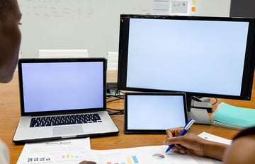
An aspect ratio tells us the relationship between the width and height of an image or screen. It’s usually written as two numbers separated by a colon (e.g. 16:9). This means the width of the image is 16 units for every 9 units of height. Aspect ratios are found everywhere, from TV screens and computer monitors to mobile phones and tablet devices.
Common Aspect Ratios
Now that we understand what is aspect ration, let’s take a look at some of the most common aspect ratios found in everyday devices and media.
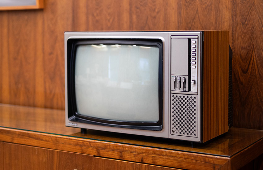
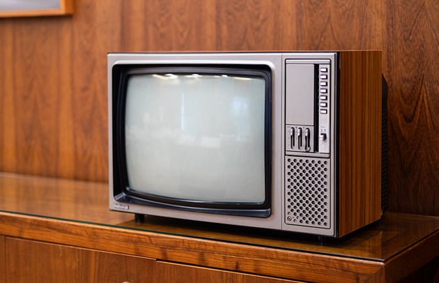
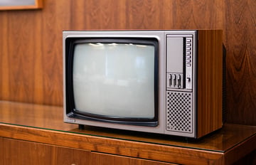
4:3 – Often seen in:
- Older television sets.
- Standard-definition TVs.
- Classic films.
- Some tablets like the iPad.
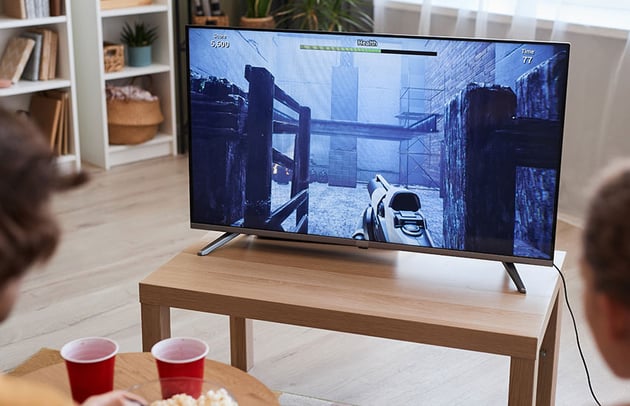
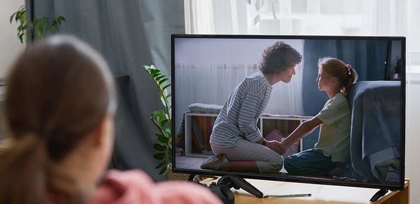
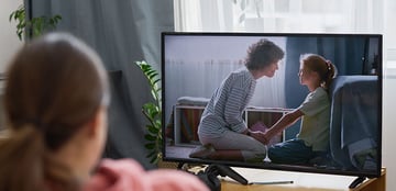
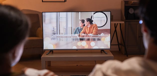
16:9 – Commonly used in:
- Modern high-definition televisions (HDTV).
- Computer monitors.
- Laptops.
- Smartphones (although many newer models are moving to taller aspect ratios).


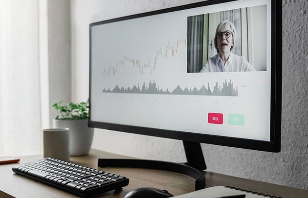
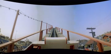
21:9 – Typically found in:
- Ultrawide computer monitors.
- Cinematic content intended for a very immersive viewing experience.

Why Aspect Ratios Matter
Now that we understand what is aspect ratio, let’s take a look at why it matters. Aspect ratios affect how we view and enjoy images and videos. They help filmmakers and photographers tell their stories more effectively. For designers, choosing the right aspect ratio means making sure websites and graphics look good on all devices. For everyone else, understanding aspect ratios can make watching movies, playing video games or using apps a better experience.
2. A Brief History of Aspect Ratios
The history of aspect ratios is deeply intertwined with the evolution of film and television technology, reflecting changing aesthetic preferences and technological advancements over time.
Early Cinema

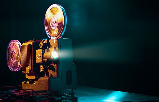

In the early days of cinema, the aspect ratio was primarily dictated by the physical size of the film used by filmmakers. The first motion picture cameras and projectors used a 4:3 aspect ratio, derived from Thomas Edison’s Kinetoscope format, which was 35mm wide. This ratio, also known as the Academy ratio, became the standard because it closely resembled the field of human vision while being economical with film.
The Advent of Widescreen

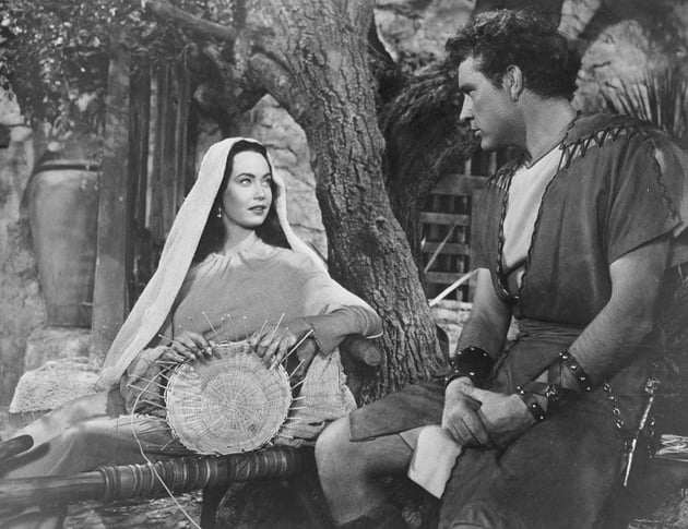

As the film industry grew, directors and cinematographers sought more visually engaging ways to tell stories and compete with the burgeoning popularity of television in the 1950s. This competition led to the introduction of various widescreen formats. One of the first widescreen movies was “The Robe” (1953), presented in CinemaScope, which boasted an aspect ratio of 2.35:1. This wider format offered audiences a more immersive experience, simulating a broader field of view.
Cinerama


Another significant development was Cinerama, which used three synchronized 35mm cameras and projectors to create a massive panoramic image with an aspect ratio of approximately 2.59:1. While cumbersome, this format brought epic landscapes and sweeping action sequences to life in a way that had never been seen before. Although not widely adopted due to its complexity, Cinerama paved the way for other multi-projector formats and influenced single-strip widescreen methods that were easier to manage.
Television and Home Video

Television initially adopted the 4:3 aspect ratio, mirroring early cinema. However, as movies transitioned to widescreen formats, TV content and screens eventually followed to enhance the home viewing experience. The shift to a 16:9 aspect ratio in televisions during the late 1990s and early 2000s marked a significant change, aligning TV broadcasts and home media more closely with the cinematic experience. This ratio then became the standard for high-definition television (HDTV).
Digital and Mobile Media

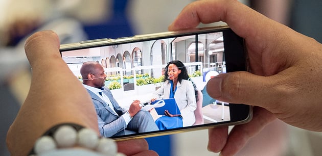

The digital age brought with it a new wave of aspect ratios, especially as mobile devices became prevalent. Smartphones and tablets introduced aspect ratios like 18:9 (or 2:1), providing more vertical space for users to scroll through content. These newer ratios reflect the dynamic ways we consume media today, optimizing for both landscape and portrait orientations depending on the user’s device and preferences.
3. Choosing the Right Aspect Ratio
Selecting the appropriate aspect ratio is crucial for optimizing your viewing or creation experience. Whether you’re buying a new device, setting up a home theater, or creating visual content, understanding which aspect ratio best suits your needs can greatly enhance the outcome. Here’s a guide how to determine aspect ratio based on different use cases:
For Media Consumption


If you primarily use your device for watching movies and TV shows, a wider aspect ratio like 16:9 or even 21:9 (for ultrawide monitors) is ideal. These ratios closely match the formats commonly used in film production, offering a cinematic viewing experience without the black bars that appear when playing widescreen content on devices with more square-shaped screens.
- 16:9: Perfect for standard high-definition and ultra-high-definition content.
- 21:9: Best for cinematic content and expansive gaming setups.
For Photography and Video Production


Photographers and videographers need to consider the end use of their images or videos when choosing an aspect ratio. If you’re creating content for standard TVs or online streaming platforms, stick with 16:9. However, if you’re aiming for a more dramatic effect or cinematic feel, wider ratios might be preferable.
- 4:3: Good for traditional photography styles and when targeting platforms or print formats that favour this ratio.
- 16:9: Ideal for videos intended for most modern digital platforms.
For Productivity


Devices used for productivity tasks like writing, designing, or coding benefit from aspect ratios that offer more vertical space. Ratios like 3:2 or 4:3 are excellent choices as they provide more screen real estate, reducing the need to scroll and making it easier to view multiple windows side by side.
- 3:2: Offers a balanced workspace, suitable for both media consumption and productivity.
- 4:3: Provides a more square-like space, useful for reading and professional design work.
For Mobile and Handheld Devices
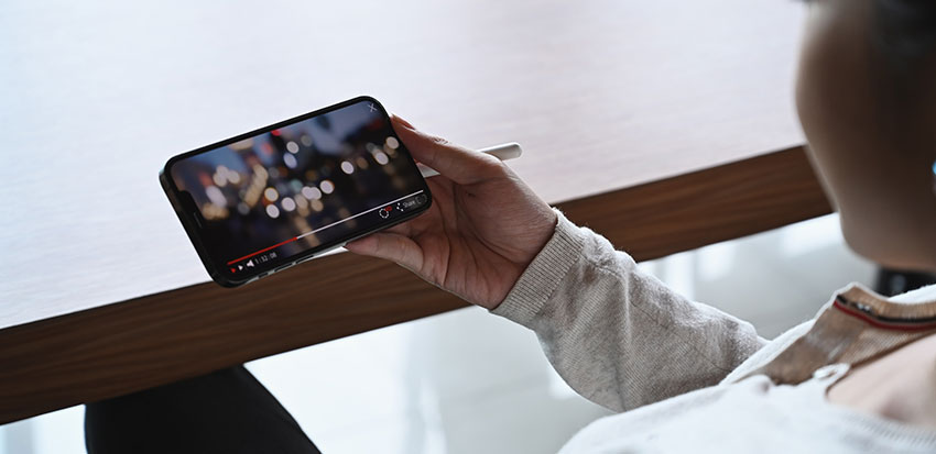
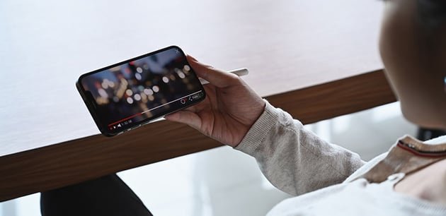

How we determine aspect ratio for mobile phones and tablets, involves considering the ergonomics of the device. Mobile devices, particularly smartphones and tablets, typically use a variety of aspect ratios to optimize display for different uses like media consumption, web browsing, and ergonomic handling. Here are some of the most common aspect ratios for mobile devices:
-
16:9 – This was the standard for many years, particularly favoured for its compatibility with most video content and television formats. It’s perfect for watching videos without any black bars on the screen.
-
18:9 (or 2:1) – This ratio became popular as device manufacturers sought to increase screen size without making the phone wider and harder to hold. It provides more vertical space, making it ideal for scrolling through feeds and using apps.
-
19.5:9 – Slightly taller than 18:9, this aspect ratio is common in newer smartphones. It allows for an even larger screen real estate, useful for split-screen multitasking and immersive gaming experiences.
-
20:9 – This is a newer trend in aspect ratios, offering an elongated form factor that enhances the viewing area further while maintaining a comfortable grip. It’s increasingly found in gaming phones and devices intended for media streaming.
-
21:9 – Known as “ultrawide,” this aspect ratio is found in some high-end phones designed for an enhanced cinematic video experience and superior gaming performance.
4. Aspect Ratio Calculators


Aspect ratio calculators are incredibly useful tools that help you determine aspect ratio and easily convert one aspect ratio to another or find the correct dimensions for your content or screen without compromising the original quality or proportion. Whether you’re resizing images, videos, or planning the dimensions of a new display setup, understanding how to use an aspect ratio calculator can save time and enhance your results.
Choosing an Aspect Ratio Calculator


There are many free aspect ratio calculators available online that offer these functionalities. When choosing a calculator, look for one that is user-friendly and provides additional features like multiple unit conversions or the ability to handle complex calculations for professional use. Here are some examples of the typical uses of an aspect ratio calculator:
- Film and Video Production: Adjust video dimensions to fit different formats, such as converting a video from a phone’s aspect ratio to fit a standard TV screen.
- Graphic Design: Resize images without distorting key elements, ensuring that graphics look professional across all media.
- Digital Signage and Displays: Plan and design digital signage content that fits perfectly on various screen sizes and shapes.
5. Future Trends in Aspect Ratios
As technology evolves, so do the aspect ratios that define our screens and displays. In this section, we explore how emerging technologies, especially in virtual reality (VR) and augmented reality (AR), are influencing aspect ratios, and we speculate on future developments that could further transform the way we view our media.

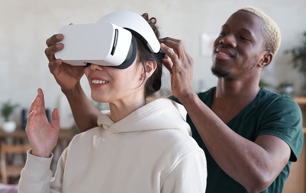

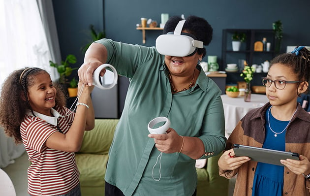
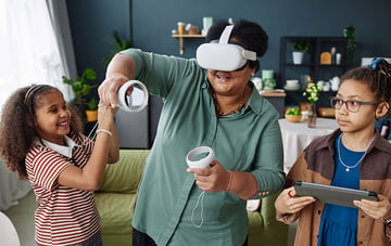
Aspect Ratios in Virtual Reality and Augmented Reality
Virtual and augmented reality technologies are redefining the traditional concept of aspect ratios. Unlike flat screens, VR and AR use immersive, 360-degree environments, which don’t conform to standard aspect ratios. Instead, these technologies require new approaches to visual dimensions that can accommodate a full spherical view without distortion.

-
Virtual Reality: VR headsets use two screens (one for each eye) or a single screen divided into two parts, employing very wide aspect ratios to create a panoramic view that encompasses the user’s entire field of vision. The aspect ratios in VR are designed to match the human eye’s natural viewing range, which is closer to a circle than a rectangle, leading to ultra-wide ratios not typically seen in traditional media.
-
Augmented Reality: AR overlays digital information on the real world and uses aspect ratios that vary significantly depending on the device. For example, AR applications on smartphones might still use the device’s native aspect ratio, but head-mounted displays (HMDs) could use unique, custom ratios to blend digital images seamlessly with the user’s environment.
Future Developments in Aspect Ratios

-
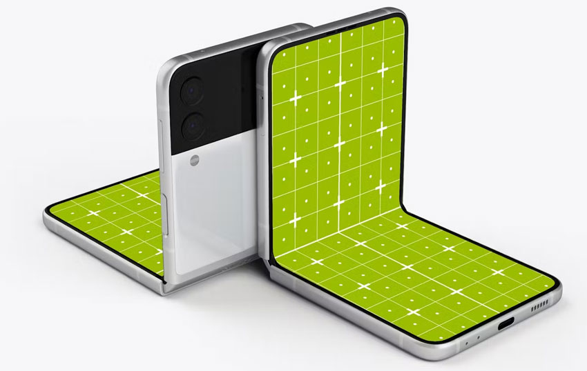
Flexible and Foldable Screens: As flexible and foldable screen technologies mature, we may see aspect ratios that can dynamically change based on how a device is used. For instance, a foldable phone could switch from a conventional 18:9 aspect ratio when closed to a more square 1:1 ratio when opened into a tablet form.
Conclusion
Aspect ratios are a fundamental component of our visual media, impacting everything from the smallest smartphone screen to the largest cinema display. Understanding how to determine aspect ratios for different use cases is not only crucial for enhancing our media consumption but also for creating content that is visually appealing and correctly formatted across various devices.
So whether you’re a filmmaker, a graphic designer, a developer, or simply a consumer of digital media, having a solid understanding of aspect ratios will allow you to navigate the future of visual media with confidence. As aspect ratios evolve, so too will our methods of storytelling and information sharing, continually transforming how we connect with the world and each other through screens.