With Expo, developers can create React Native apps without going through the hassle of installing and configuring software dependencies such as Android Studio, Xcode, or all the other tools which are needed to develop and run a React Native app.
In this tutorial, I’m going to show you how to create a simple memory game using Expo. Along the way, you’ll also learn the following:
- How to use the tools provided by Expo. This includes the CLI, the SDK, and the Expo client app.
- How to create a React Native app using Expo.
What Is Expo?
Expo is a framework for quickly developing React Native apps. It’s like Laravel or Symfony for PHP developers, or Ruby on Rails for Ruby developers. Expo provides a layer on top of the React Native APIs to make them easier to use and manage. It also provides tools that make it easier to bootstrap and test React Native apps. Lastly, it provides UI components and services that are commonly only available when you install a third-party React Native component. All of those are made available via the Expo SDK.
Limitations of Expo
Before you proceed further, it’s important to be aware of some of the limitations of Expo:
- Expos apps are limited to the native APIs that the Expo SDK supports. This means that if your app has a very specific use-case such as communicating with a Bluetooth peripheral, the only option to implement such functionality is with plain React Native, or by writing native code.
- Expo locks you into their toolset. This means you cannot simply install and use most of the great tools available for React Native development such as command-line tools, scaffolders, and UI frameworks. But the good thing is that the Expo SDK is compatible with plain React Native apps, so you won’t have any problem when you eject your app from Expo.
Even with these limitations, it’s important to keep in mind that Expo is a fully functional framework with lots of support for commonly used Android or iOS APIs. This means that it has got you covered for most of the functionalities that apps commonly need. So there’s often no need to look outside of Expo to implement the native functionality.
App Overview
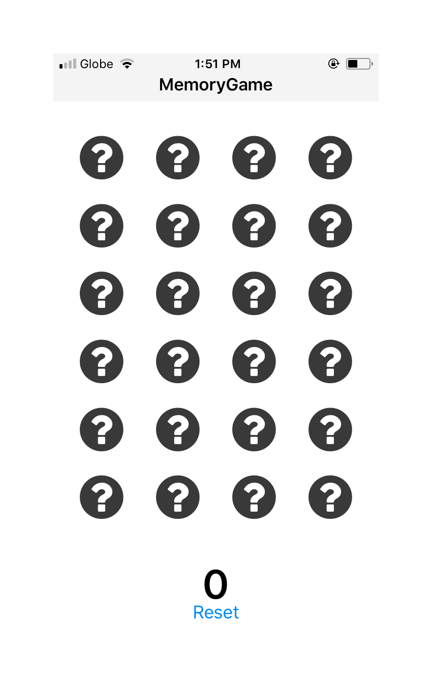
The app that we’re going to create is a memory game. You may be familiar with this type of game—the user has to find matching pairs by turning over cards two at a time. Here’s what the default screen looks like:


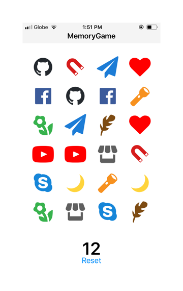
And here’s how it looks like once all the pairs have been opened:


Once they’ve solved the game, the user can tap on the Reset button to reset the items to their initial state. This allows them to start the game all over again.
Installing Expo
Unlike with plain React Native, where you have to install and configure Android Studio or Xcode and other dependencies, with Expo there are only a few steps to follow in order to start developing apps:
-
Download and Install Node.js and npm. Expo depends on the Node.js platform for its command-line tools and dependency management. Node.js includes a package manager called npm. Ensure that your npm version is 5.2 or higher; you can check it with the
npm -vcommand. If not, upgrade it or download the latest version of Node.js. This is in order to be able to run npm executables using npx. - Install the Expo Client on your iOS or Android device. This is used to preview the app while you’re developing it.
- Install the command-line tool. This allows you to generate a new Expo project, initiate a build process, and more. Execute the following command to install it globally:
npm install -g expo-cli
Or if you prefer yarn:
yarn global add expo-cli
Generating a New Expo App
Once you’ve installed all the dependencies, you can now generate a new Expo app:
npx create-expo-app MemoryGame
Once that’s done, it will create a new folder called MemoryGame. Navigate inside it and start running the development server:
cd MemoryGame
expo start
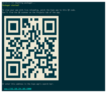
Once the development server is running, you should now be able to see something like this:


That’s the QR code which points to the live preview of the project. Open the Expo client app on your phone and scan the code using the QR scanner. At this point, you should now be able to view the default screen. Every time you hit Control-S on any of the project files, the preview should automatically reload to reflect the changes.
You can find the full source code of the project on its GitHub repo. Or if you want to give the app a try, you can check out the demo. Just select QR Code, and scan it on your phone using the Expo client app.
Coding the App
Now we’re ready to code the app. Let’s begin with some UI components before we go back and implement the main component.
Header Component
The header is used to display the title of the app. Create a components folder. Inside it, create a Header.js file and add the following:
import * as React from 'react';
import { Text, View, StyleSheet} from 'react-native';

export default function Header() {
  return (
      <View style={styles.header}>
        <Text style={styles.header_text}>MemoryGame</Text>
      </View>
  );
}

const styles = StyleSheet.create({
  header: {
    flex: 1,
    flexDirection: 'column',
    alignSelf: 'stretch',
    paddingTop: 20,
    paddingBottom: 5,
    backgroundColor: '#f3f3f3'
  },
  header_text: {
    fontWeight: 'bold',
    fontSize: 17,
    textAlign: 'center'
  }
});
This is just a basic React Native component, with some styling to match the UI of our app.
Score Component
Next is the component for displaying the score (components/Score.js):
import * as React from 'react';
import { Text, View, StyleSheet} from 'react-native';

export default function Score() {
  return (
      <View style={styles.score_container}>
        <Text style={styles.score}>{this.props.score}</Text>
      </View>
  );
}

const styles = StyleSheet.create({
  score_container: {
    flex: 1,
    alignItems: 'center',
    padding: 10
  },
  score: {
    fontSize: 40,
    fontWeight: 'bold'
  }
});
Again, just a simple display component with a text view and some basic styling.
Card Component
The card component (components/Card.js) will display the cards. These cards use icons from the Expo vector icon set. This is one of the features that come right out of the box when you use Expo: it includes icons from icon sets like FontAwesome, Entypo, and Ionicons.
In the code below, you can see that we’re only using FontAwesome. It has the icon that we want for displaying the card’s default state: a question mark. As you’ll see later in the main app component, we’ll also be using icons from Entypo and Ionicons. The reference to those icon sources will be passed to this component, so there’s no need to specify them here:
import React from 'react';
import { StyleSheet, Text, View, TouchableHighlight } from 'react-native';
import { FontAwesome } from '@expo/vector-icons'; // use FontAwesome from the expo vector icons
Inside the render() method, we only use the source and icon passed as props if the card is opened. By default, it will only display the question mark icon from FontAwesome. But if the card is open, it will use the icon source, icon, and color that were passed as props.
Each of the cards can be tapped. When tapped, the clickCard() function will be run, which is also passed via the props. Later on you’ll see what the function does, but for now, just know that it updates the state to reveal the icon on the card:
export default function Card(props) {
    let CardSource = FontAwesome; // set FontAwesome as the default icon source
    let icon_name = 'question-circle';
    let icon_color = '#393939';

    if(props.is_open){
      CardSource = props.src;
      icon_name = props.name;
      icon_color = props.color;
    }

  return (
      <View style={styles.card}>
        <TouchableHighlight onPress={props.clickCard} activeOpacity={0.75} underlayColor={"#f1f1f1"}>
          <CardSource
            name={icon_name}
            size={50}
            color={icon_color}
          />
        </TouchableHighlight>
      </View>
  );
}
Don’t forget to add the styles:
const styles = StyleSheet.create({
  card: {
    flex: 1,
    alignItems: 'center'
  },
  card_text: {
    fontSize: 50,
    fontWeight: 'bold'
  }
});
Helpers
We’ll also be using a helper function called shuffle(). This allows us to sort the array of cards in random order so that their order will be different every time the game is reset:
Array.prototype.shuffle = function() {
  var i = this.length, j, temp;
  if(i == 0) return this;
  while(--i){
   j = Math.floor(Math.random() * (i + 1));
   temp = this[i];
   this[i] = this[j];
   this[j] = temp;
  }
  return this;
}
Main Component
The main component (App.js) contains the main app logic and brings everything together. Start by including the React and Expo packages that we will be using. This time we’re using all of the icon sources from Expo vector icons:
import React from 'react';
import { StyleSheet, View, Button } from 'react-native';
import { Ionicons, FontAwesome, Entypo } from '@expo/vector-icons';
Next, include the components and the helper that we created earlier:
import Header from './components/Header';
import Score from './components/Score';
import Card from './components/Card';

import helpers from './helpers';
Inside the constructor, we first create the array which represents the unique cards. src is the icon source, name is the name of the icon (you can find the names of other icons if you want to use them), and color is, naturally, the color of the icon:
export default class App extends React.Component {

  constructor(props) {
    super(props);
    // bind the functions to the class
    this.renderCards = this.renderCards.bind(this);
    this.resetCards = this.resetCards.bind(this);

    // icon sources
    let sources = {
      'fontawesome': FontAwesome,
      'entypo': Entypo,
      'ionicons': Ionicons
    };

    // the unique icons to be used
    let cards = [
      {
        src: 'fontawesome',
        name: 'heart',
        color: 'red'
      },
      {
        src: 'entypo',
        name: 'feather',
        color: '#7d4b12'
      },
      {
        src: 'entypo',
        name: 'flashlight',
        color: '#f7911f'
      },
      {
        src: 'entypo',
        name: 'flower',
        color: '#37b24d'
      },
      {
        src: 'entypo',
        name: 'moon',
        color: '#ffd43b'
      },
      {
        src: 'entypo',
        name: 'youtube',
        color: '#FF0000'
      },
      {
        src: 'entypo',
        name: 'shop',
        color: '#5f5f5f'
      },
      {
        src: 'fontawesome',
        name: 'github',
        color: '#24292e'
      },
      {
        src: 'fontawesome',
        name: 'skype',
        color: '#1686D9'
      },
      {
        src: 'fontawesome',
        name: 'send',
        color: '#1c7cd6'
      },
      {
        src: 'ionicons',
        name: 'ios-magnet',
        color: '#d61c1c'
      },
      {
        src: 'ionicons',
        name: 'logo-facebook',
        color: '#3C5B9B'
      }
    ];

    // next: add code creating the clone and setting the cards in the state
  }

}
Note that instead of directly specifying the src as FontAwesome, Entypo or Ionicons for each of the objects, we’re using the property names used in the sources object. This is because we will need to create a copy of the array of cards in order for each card to have a pair. Creating a copy using array methods such as slice() will create a copy of the array, but the problem is that once the individual objects are modified in either the copy or the original, both arrays are also modified.
This brings us to the solution below which is to create a completely new object by converting the cards array into a string and then parsing it to convert it back to an array. This is the reason why we’re using strings since functions can’t be converted into strings. We then combine the two to come up with the array, which contains all the cards that we need:
let clone = JSON.parse(JSON.stringify(cards)); // create a completely new array from the array of cards

this.cards = cards.concat(clone); // combine the original and the clone
Next, go through that array and generate a unique ID for each one, set the icon source, and then set it to a closed state by default:
// add the ID, source and set default state for each card
this.cards.map((obj) => {
  let id = Math.random().toString(36).substring(7);
  obj.id = id;
  obj.src = sources[obj.src];
  obj.is_open = false;
});
Sort the cards randomly and set the default state:
this.cards = this.cards.shuffle(); // sort the cards randomly

// set the default state
this.state = {
  current_selection: [], // this array will contain an array of card objects which are currently selected by the user. This will only contain two objects at a time.
  selected_pairs: [], // the names of the icons. This array is used for excluding them from further selection
  score: 0, // default user score
  cards: this.cards // the shuffled cards
}
The render() method renders the header, cards, score, and the button for resetting the current game. It’s using the renderRows() function to render the individual card rows. The screen will have six rows containing four cards each:
render() {
  return (
    <View style={styles.container}>
      <Header />
      <View style={styles.body}>
        {
          this.renderRows.call(this)
        }
      </View>
      <Score score={this.state.score} />
      <Button
        onPress={this.resetCards}
        title="Reset"
        color="#008CFA"
      />
    </View>
  );
}
Here’s the code for the renderRows() function. This uses the getRowContents() function, which is responsible for creating an array of arrays with four items each. This allows us to render each row, and then use another function for rendering cards for each iteration of the map() function:
renderRows() {

  let contents = this.getRowContents(this.state.cards);
  return contents.map((cards, index) => {
    return (
      <View key={index} style={styles.row}>
        { this.renderCards(cards) }
      </View>
    );
  });

}
Here’s the getRowContents() function:
getRowContents(cards) {
  let contents_r = [];
  let contents = [];
  let count = 0;
  cards.forEach((item) => {
    count += 1;
    contents.push(item);
    if(count == 4){
      contents_r.push(contents)
      count = 0;
      contents = [];
    }
  });

  return contents_r;
}
Next is the renderCards() function. This accepts the array of card objects and renders them via the Card component. All we need to do here is to pass the individual properties of each card object as props. This is then used to render the correct icon, as you’ve seen in the code for the Card component. The clickCard() function is also passed as a prop. The card ID is passed to that function so that the unique card can be identified and updated:
renderCards(cards) {
  return cards.map((card, index) => {
    return (
      <Card
        key={index}
        src={card.src}
        name={card.name}
        color={card.color}
        is_open={card.is_open}
        clickCard={this.clickCard.bind(this, card.id)}
      />
    );
  });
}
Inside the clickCard() function, we get the details of the selected card and check if it should be processed any further:
clickCard(id) {
  let selected_pairs = this.state.selected_pairs;
  let current_selection = this.state.current_selection;
  let score = this.state.score;

  // get the index of the currently selected card
  let index = this.state.cards.findIndex((card) => {
    return card.id == id;
  });

  let cards = this.state.cards;

  // the card shouldn't already be opened and is not on the array of cards whose pairs are already selected
  if(cards[index].is_open == false && selected_pairs.indexOf(cards[index].name) === -1){

    // next: add code for processing the selected card

  }

}
Now let’s fill in the code for handling a selected card.
First, we open the card and add it to the array of currently selected cards:
cards[index].is_open = true;

current_selection.push({
  index: index,
  name: cards[index].name
});

// next: add code for determining whether the user has selected the correct pair or not
Once there are two items in the array of currently selected cards, we check if the icon names are the same. If they are then it means that the user has selected the correct pair. If they are not the same then it’s an incorrect pair. In that case, we close the first card that was selected and then add a bit of delay before closing the second card. (This way the user can see the card icon before it reverts to the closed state.)
if(current_selection.length == 2){
  if(current_selection[0].name == current_selection[1].name){
    score += 1; // increment the score
    selected_pairs.push(cards[index].name);
  }else{
    cards[current_selection[0].index].is_open = false; // close the first

    // delay closing the currently selected card by half a second.
    setTimeout(() => {
      cards[index].is_open = false;
      this.setState({
        cards: cards
      });
    }, 500);
  }

  current_selection = [];
}

// next: add code for updating the state
The last thing we need to do in the click event handler is to update the state to reflect the changes in the UI:
this.setState({
  score: score,
  cards: cards,
  current_selection: current_selection
});
A related function is the reset event handler. When the reset button is tapped, we simply restore the default state by closing all the cards and shuffling.
resetCards() {
  // close all cards
  let cards = this.cards.map((obj) => {
    obj.is_open = false;
    return obj;
  });

  cards = cards.shuffle(); // re-shuffle the cards

  // update to default state
  this.setState({
    current_selection: [],
    selected_pairs: [],
    cards: cards,
    score: 0
  });
}
Finally, we’ll add a few basic styles to make our app look good.
const styles = StyleSheet.create({
  container: {
    flex: 1,
    alignSelf: 'stretch',
    backgroundColor: '#fff'
  },
  row: {
    flex: 1,
    flexDirection: 'row'
  },
  body: {
    flex: 18,
    justifyContent: 'space-between',
    padding: 10,
    marginTop: 20
  }
});
Test the App
Since your Expo development server has been running this whole time, every change should be pushed to your mobile device with live reloading. Try the app out and make sure it works as it’s supposed to.
Conclusion
That’s it! In this tutorial you’ve learned how to use the Expo XDE to quickly wire up a React Native app. Expo is a really good way to start developing React Native apps because it removes the need to install a lot of software which is often a cause of frustration, especially for beginners. It also provides tools that make it really easy to preview the app while it’s being developed. Be sure to check out the resources mentioned on the Expo website if you want to learn more.
This post has been updated with contributions from Kingsley Ubah. Kingsley is passionate about creating content that educates and inspires readers. Hobbies include reading, football and cycling.