
The process of creating a website should always start with general ideas. These turn into wireframes or low-fidelity mockups to give the designer a sense of direction. It’s fairly straightforward, but the creative process requires a large visual library of existing layouts to understand which interfaces are usable and well-designed. Navigation is a huge part of web design and deserves a lot more coverage.
Responsive web design has slightly changed this creative process over recent years. Now designers are much more focused on grids and fluidity. Accessible responsive layouts should be flexible and naturally update to any screen size. Nav menus can be tricky because shortening a collection of links will often require completely revamping the UI.
In this post I’d like to cover some general tips and guidelines to help designers work with their own ideas for responsive navigation. The brainstorming stage is pivotal to every other stage which comes afterwards. Once you have a workable concept, it becomes easier to envision the full design and composition of a responsive website.
See Also: 10 Helpful Resources for Testing Responsive Web Design
Design by Example
Firstly it’s important to understand how other websites are using responsive navigation. I’d suggest looking through some of your favorite sites and pinpointing the best responsive traits. Which layouts seemed more natural than others? Can you apply similar ideas to your own navigation?
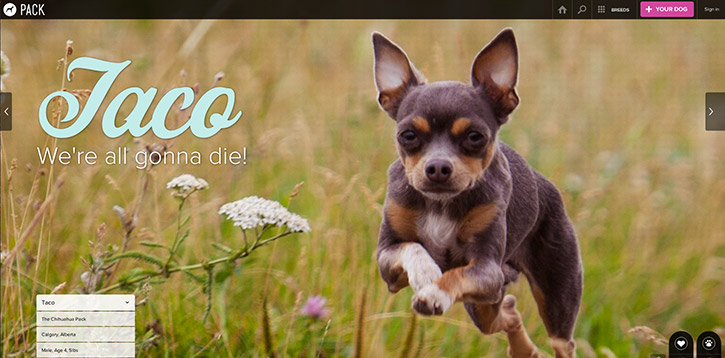
The online gallery Media Queries is full of terrific responsive website layouts. There are just a few primary methods for handling responsive navigation, so how you go about it will depend on your website–specifically how many pages are needed and if the menu requires sub-categories for internal links.
It helps to understand what others are doing so you can build on top of that. Web design isn’t easy, but it shouldn’t be an excruciatingly difficult task either. Learn from the success of others, and use those ideas in conjunction with your own to create brilliant navigation.
Sketching & Taking Notes
One of the first steps I always recommend is to take down some ideas on a piece of paper. The web is a digital medium, but a computer isn’t always the best tool for brainstorming ideas. Typing letters on a keyboard doesn’t produce the same cognitive function as writing each individual letter by hand. The same goes for drawing or sketching ideas as opposed to creating them in a wireframe program.
This step will feel clunky and unnecessary at first, especially if you’re not accustomed to writing or drawing in daily life. But I find that it helps to disconnect from the computer for a while because ideas can flow quicker and more naturally.
A fun exercise is to write down a few central themes on a piece of paper. Make a flow chart of words drawing arrows to connect different ideas together. The goal is to map your ideas down quickly and see what feels right. This tends to help more with writing, but it’s also helpful when just starting a new creative project.
Otherwise, it can help to just take sketches of existing navigation menus from well-designed responsive websites. Draw both the full version and responsive version next to each other. Wireframe the concept to demonstrate how each link will be displayed on the page. Depending whether you’re a visual or contextual thinker, I’d suggest one of these two brainstorming methods to get started.
Create a User Experience
Always think about the people who will be using a website before you design an interface. Navigation menus are one of the most interactive sections of a webpage. And without a navigation I wouldn’t have any reason to write this article! But we aren’t creating good navigation for my sake or your sake – it’s for the users.
During the wireframing stage, keep in mind that the average user is your primary target. Think about the best solution from a user experience perspective – not the best-designed solution or the most creative solution. Keep your mind open to possibilities for improving performance.
It definitely helps to check out what other designers have created, because you’ll see from a user’s perspective, what makes a navigation feel like a sturdy bridge vs. rickety old boards unsafe for travel.
For example, the drop-down navigation is a big part of larger websites such as e-commerce shops and big businesses. How should you handle sub-menus or sub-sub-menus which still need visibility on mobile devices? There is no single correct answer, but the best answers would focus solely on the user experience.
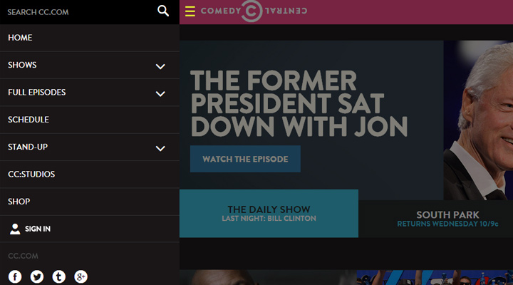
If my project needed drop-down navigation, I’d suggest a hidden sliding drawer menu or expandable links in a responsive layout. The navigation on Comedy Central’s website is a perfect working example of these two methods. Removing extra links is another alternative if every page is still somehow accessible.
Building & Testing
If you can design a beautiful navigation in Photoshop, that’s all well-and-good for the initial stages. But to actually build the design into a live website requires logic and persistence. If you’re even somewhat familiar with web development, don’t take this step lightly.
One great exercise is to construct rapid prototypes for navigation menus from scratch. This requires a cursory understanding of HTML/CSS and possibly jQuery if needed. You should end up with a low-fidelity working concept, and then immediately construct the navigation into an HTML page. Make it fully responsive and test the interface in all browsers.
This way, you can see how the navigation should behave in its final iteration. You’ll always have the option to spice up a color scheme with gradients and textures at a later date. Instead of jumping right into extra features, solely focus on the user experience first – animation style, link density, legibility, and of course responsive tendencies.
To get started without a code IDE (Integrated development environment), use an online cloud editor such as CodePen. It’s free to use, and it renders the code in real time.
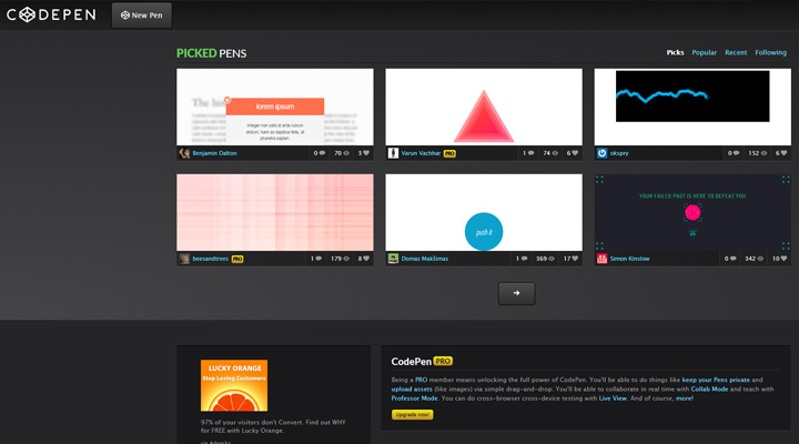
By default CodePen and similar websites create public code repositories which are freely available to other developers. If you want to create an account for testing projects, just set each repo to private. Then you’ll have access to your code from any computer with all changes updated automatically.
If It Ain’t Broke…
…then don’t fix it you fool! This phrase can be applied to almost anything, and in most situations, it’s hauntingly truthful.
When planning your own responsive navigation, don’t try to be overly creative with your solutions. There is a place for innovation and other cool buzzwords, and that place is located within the realm of possibility. Try to stay grounded, and don’t get lost in grandiose ideas. Creative ideas typically arise from a chaotic swirl of thought patterns, so it’s easy to get sidetracked.
Visitors won’t really care if your navigation has been seen a thousand times dating back to the Triassic period. As long as it’s functional and blends into the layout, it should work. Making a responsive navigation that works is about 70% of the struggle. Afterwards, you get to design all the pretty frills without any concern for the structural foundation.
Throughout the entire creative process, try to envision each goal as simple and achievable. When we set goals that seem impossible, it leads to procrastination and second-guessing. A better strategy is to brainstorm dozens of unique ideas to see if any of them work. I hope these tips can help you reframe the design process with a heavy focus on user-oriented navigation.