
As one of the top social media networks in the world, Twitter’s design has to appeal to millions of users from multiple cultures, languages, and regions. So far, its design has worked well, especially its infinite scrolling feed with super convenient tweaks. For instance, Twitter allows users to view other users or a tweet in more detail and then exit back to the feed in the same exact spot in the list that they left off. This makes getting through a ton of tweets very quick and easy.
However, there are other areas of the design that are a bit more confusing. For instance, the arrangement of links to other pages and features simply is not intuitive. Plus, there are too many buttons, such as the Me button when you can already access your profile by clicking on your name in the left column. And, some may agree with me here, the look is a bit outdated. Twitter could really use some additional UX changes.
Many designers have had quite a bit of fun re-imagining the Twitter design. Some aren’t so great, while others are definitely worth a look. The following are 23 of the top twitter redesign concepts found across the web. Just be sure to click on your favorites to take a look at the designs more in-depth (as I wasn’t able to fit all of the screen shots for each redesign in this article). If you are really impressed with a redesign, be sure to give the designer some love by leaving a positive comment or sharing on your social media pages. Most of all, enjoy the inspiration that you will gain by browsing through the following very impressive redesign concepts for Twitter.
Twitter Redesign by Fred Nerby
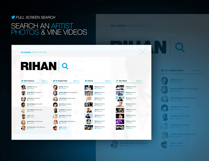
Nerby probably has the most complete and unique Twitter redesign out right now. With the focus on artists and magazines, this redesign includes a very artistic and modern look and feel. A search can be done by categories, such as “most popular” or “vine videos.”
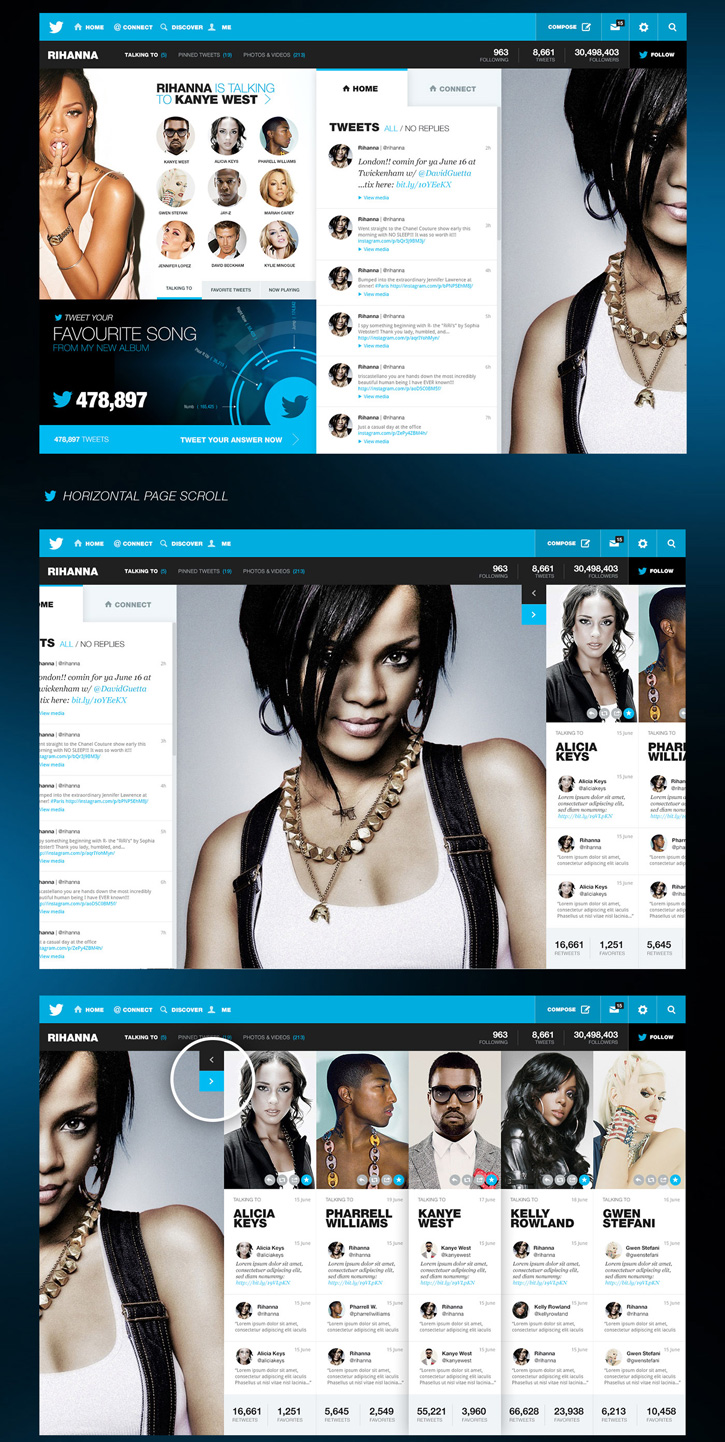
The artist’s main page includes a snap shot of other artists they are currently talking to, favorite tweets, or now playing (for songs in your album by this artist). The profile page also includes an awesome infographic-like section showing trending statistics.
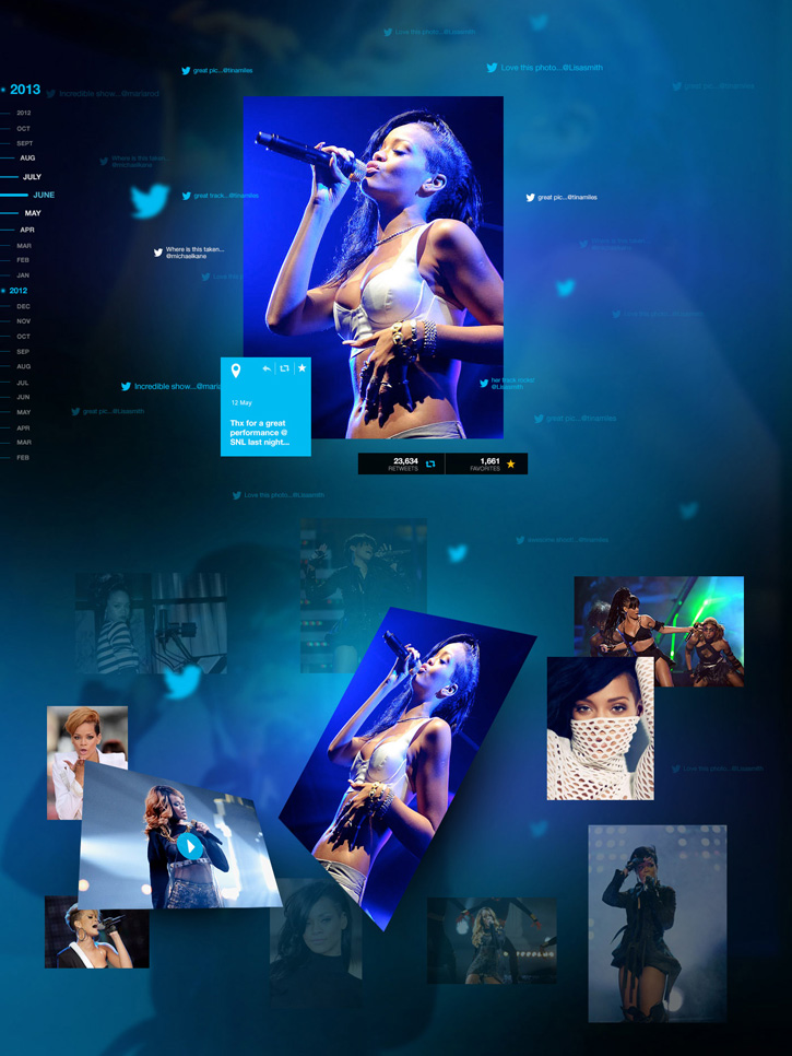
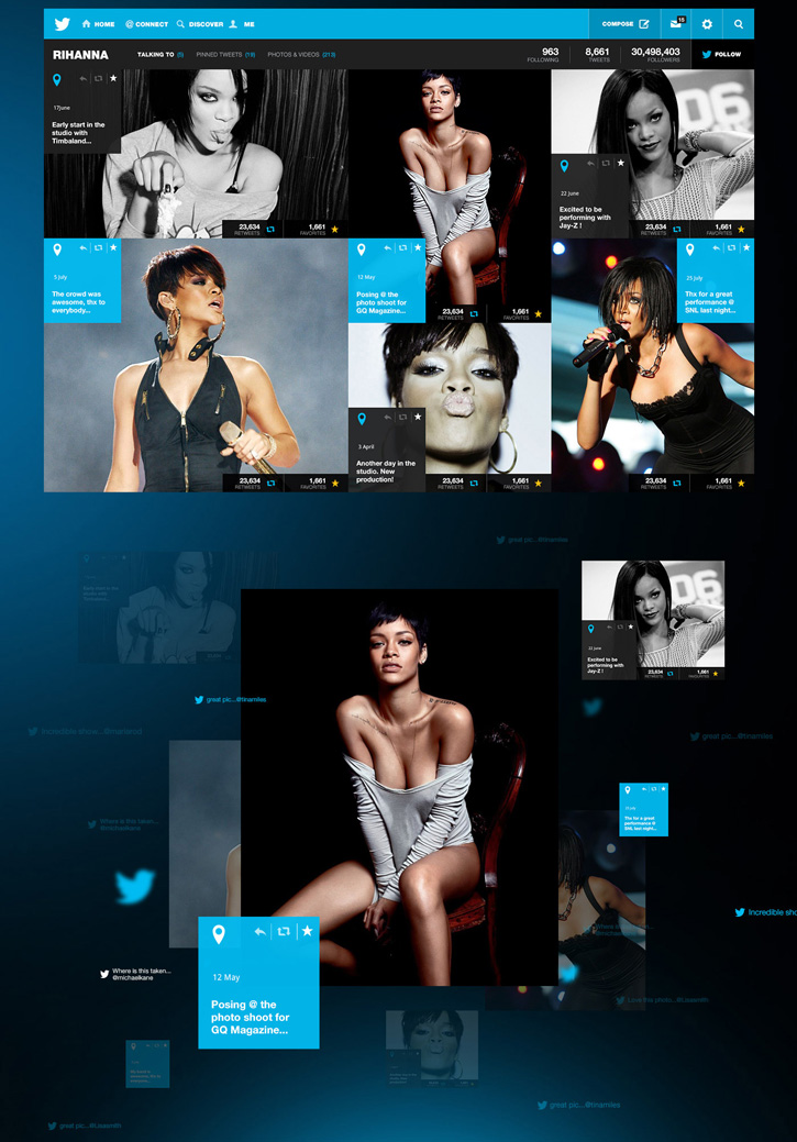
The photo gallery is incredible with a design that “floats” photos over the background. Once you click on a photo to view, live tweets of the photo float around the image.
So much more – including pin/board options, a cool “talking to” full page slider, and customization options – are all on Nerby’s page. Be sure to check it out as well as watch his video preview of this very impressive redesign!
Twitter. Redesign Concept by Maxim Eriomov
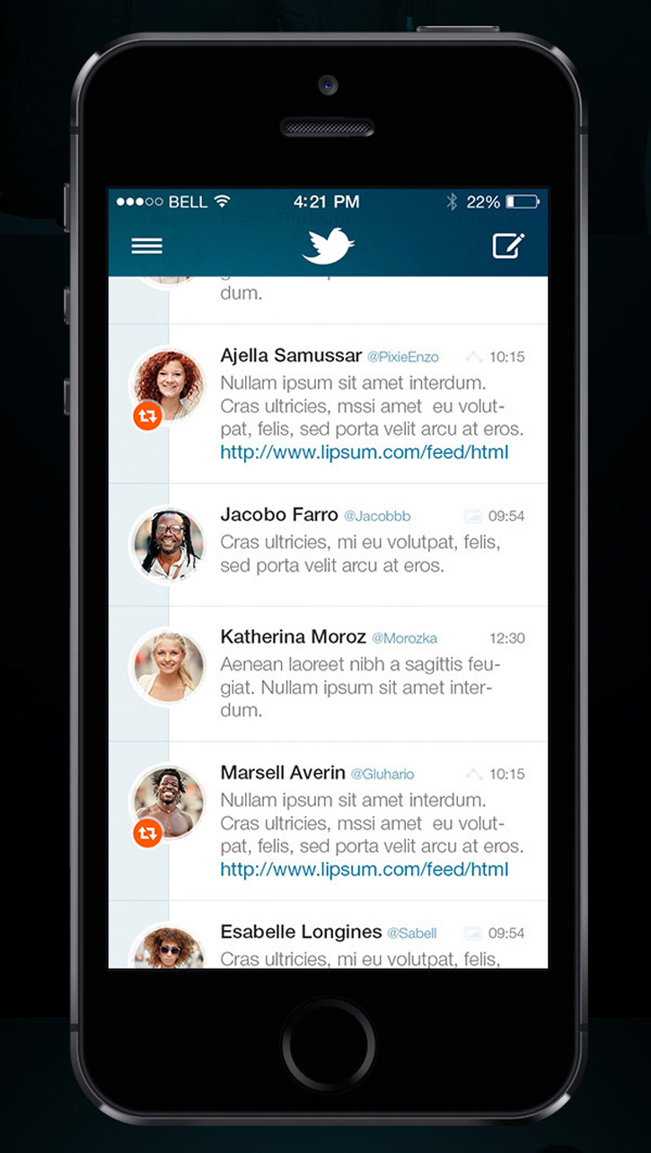
This Twitter app redesign looks incredibly slick with new icons and a new layout. The Twitter feed is a bit simpler and looks great with circular profile pics and the icons for shares and replies placed over the profile pic.
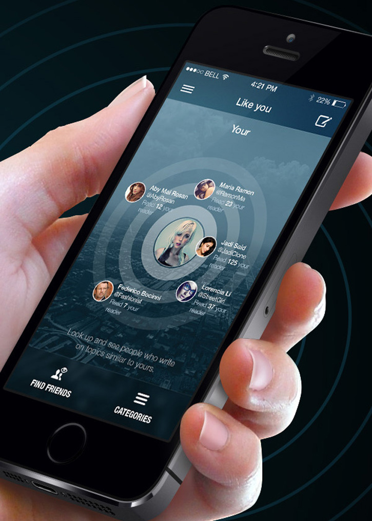
A new “like you” screen has been added that shows users who write similar tweets as you. Clicking on one of the shown users brings up a preview window so that you can quickly glance at their information without opening their entire page.
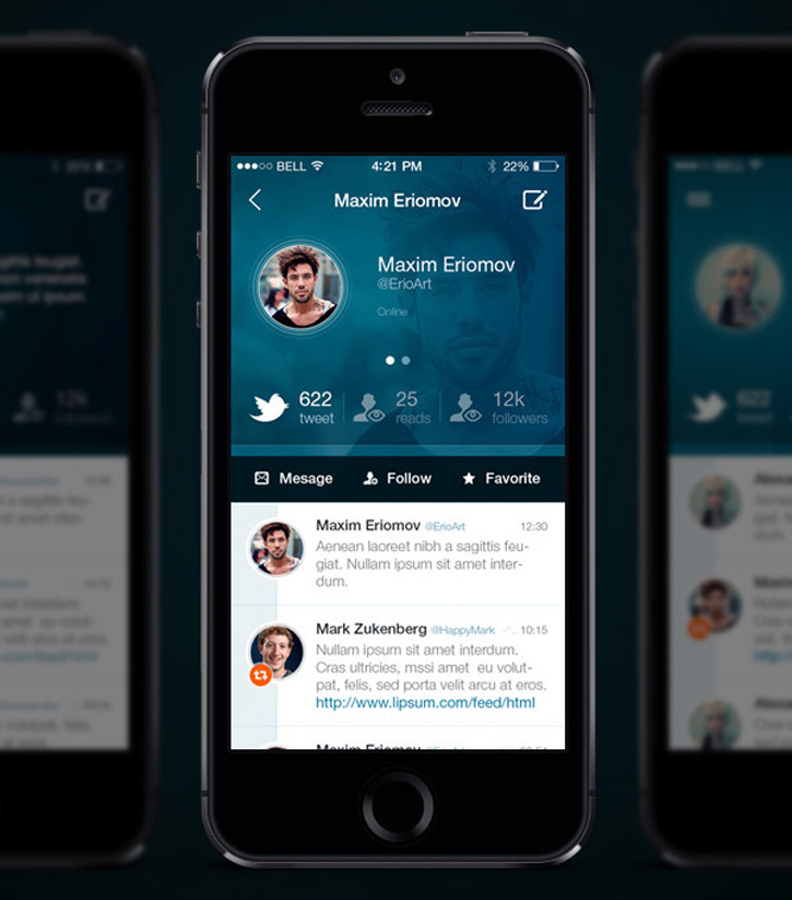
And the profile page just looks cleaner and much more organized.
Twitter – Redesign of UI Details by Grégoire Vella
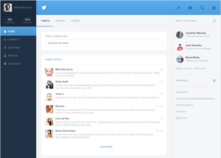
A much simpler layout focuses this redesign on the main feed. Vella rearranged many of the menu items, making navigation easier to do. Keeping the different page links in the left menu really helps them be more visible.
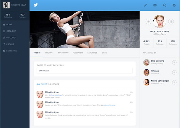
The profile page remains similar in look and feel to the homepage in Vella’s redesign. Be sure to also check out his other redesigned pages for more awesome Twitter improvements.
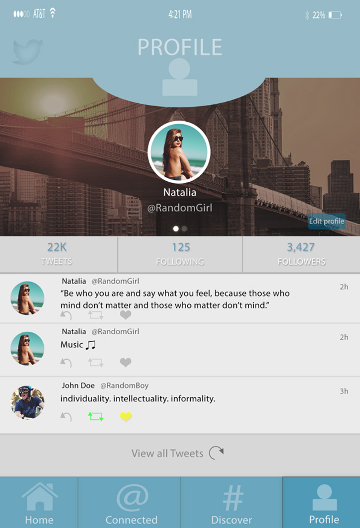
Twitter Layout Redesign by Estie Carrillo
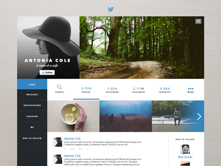
This may be one of my favorite redesigns, as it makes Twitter seem more like a blog than a crowded social media page. The focus in this profile page redesign allows users to view by photos, if desired, and the focus is certainly on images – with the separation of profile image and hero image at the top of the screen. The left side bar is simple yet very stunning and in excellent contrast with the rest of the page.
Twitter Redesign Concept by Dawid Dapszus
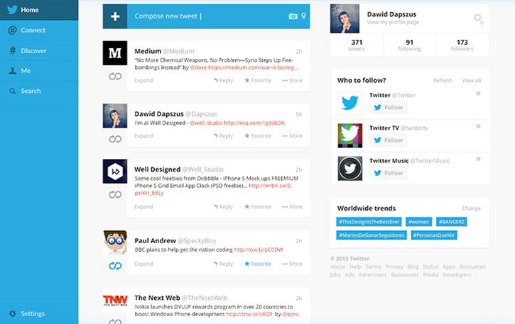
This is another Twitter redesign concept that rearranges the menu items, except that the header menu is completely removed. Compose a New Tweet is at the top of the feed, making it much more visible.
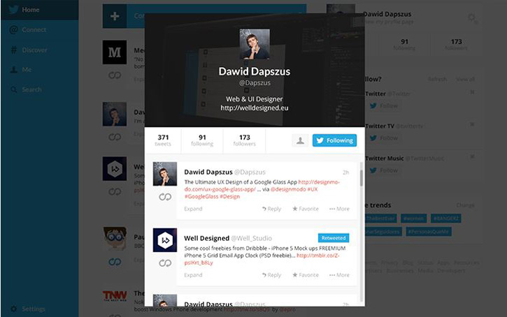
The user preview window is arranged nicely too, with the profile pic in the center of the header pic and the navigation buttons arranged in neat menu just below the header.
Twitter Redesign by James Littler
This redesign keeps the profile and news feed completely the center of attention by making buttons visible only with a slide out menu. The extra navigation links are placed in a footer menu, keeping them accessible, yet less in the way of the feed.
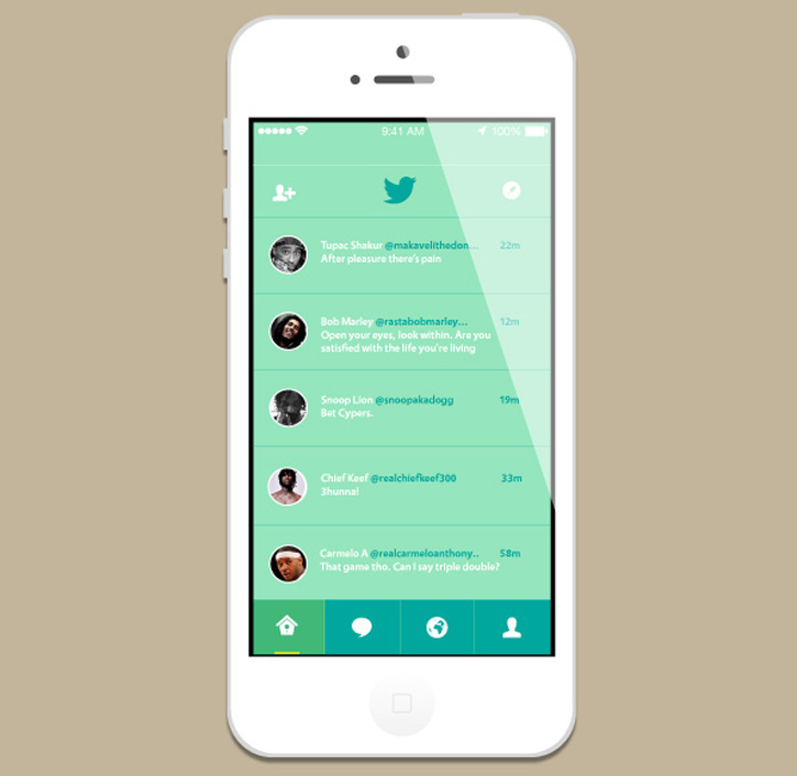
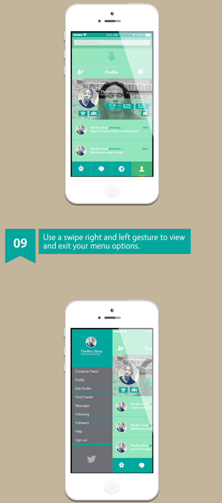
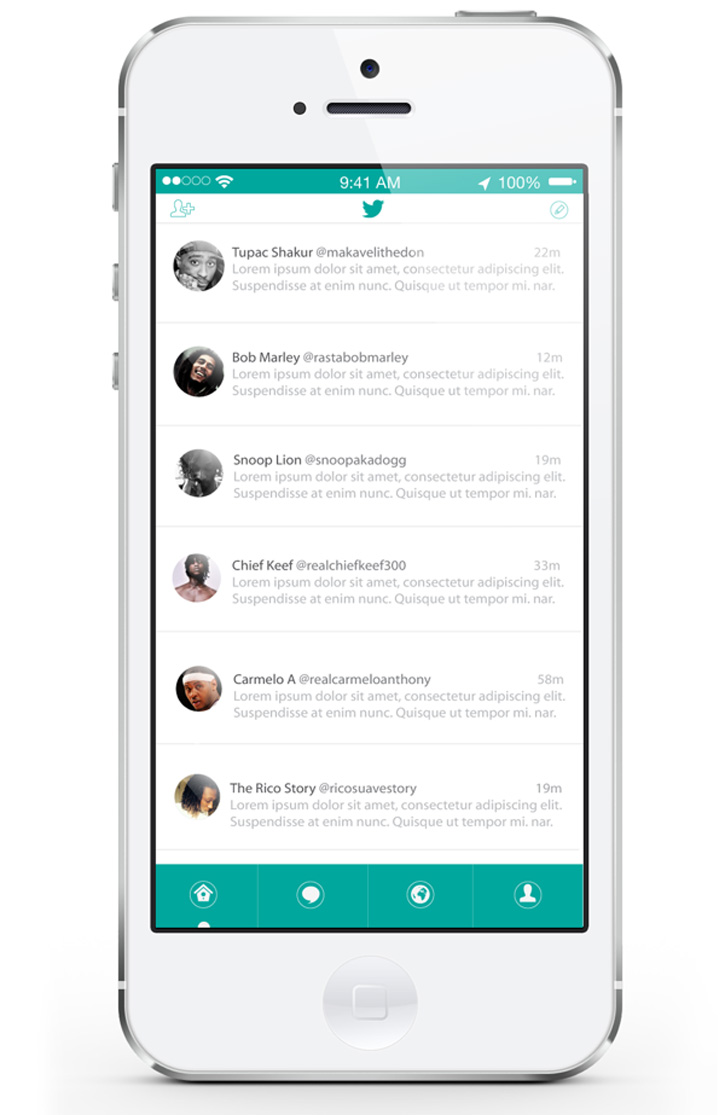
Twitter iOS7 Redesign by Rick Karens
This redesign is very clean and functional in its layout, but it keeps many of the same elements that users will immediately identify with Twitter. The profile page is also a nice design with the profile pic centered over the header pic.
iOS 7 Twitter Concept by Antonio Madera
Madera changed up both the icons and the color scheme in addition to the layout in his Twitter redesign concept. All of the pages have a similar look with a few design elements unique to that page.
This concept also requires users to swipe down for the search bar and swipe left to view the menu.
In his second redesign, Madera removed the colored background and made the top navigation menu much smaller to keep the focus on the content. The profile page has a beautiful slightly transparent look to the hero section.
Twitter Concept by Mohamed Yahia
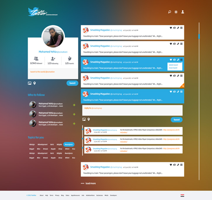
This interesting Twitter redesign concept completely changed up the title of the logo with a new font. It also has a new gradient background over which content is grouped into boxes.
Twitter Redesign Project by Pierre H.
With this redesign of Twitter by Pierre, comes excellent simplicity mixed with great aesthetics to make a Twitter app experience more enjoyable. The new font is a nice touch as well.
Twitter Redesign Concept by zsolt hutvagner
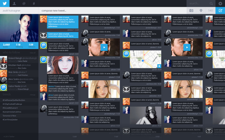
A full page layout makes more tweets viewable on the screen at once. Although this layout could slow down the ability to view tweets quickly and easily, it is an interesting idea. The dark theme adds more of a posh look to the page.
iOS 7 Twitter Redesign by Shi Liang Lim
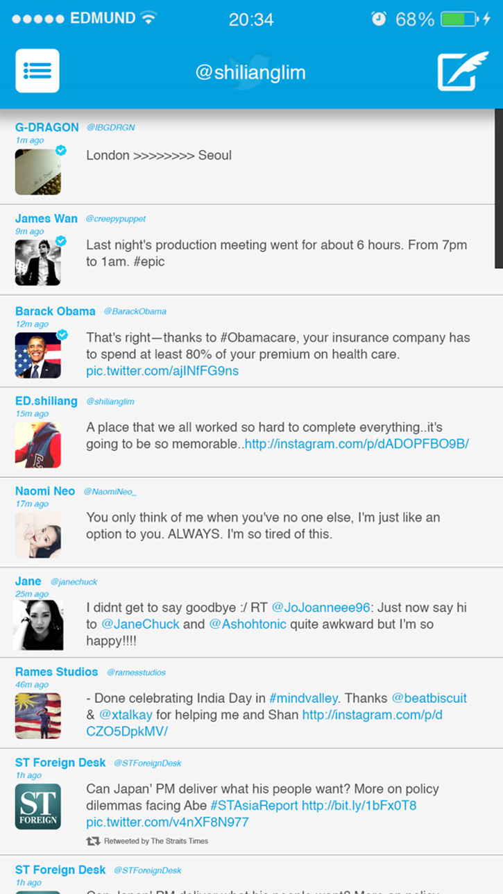
Lim’s redesign of the Twitter app for iOS 7 keeps the focus entirely on the content, removing even the search bar to the slide out menu. With a small screen, utilizing as much of the space as possible is important, and Lim does this very well.
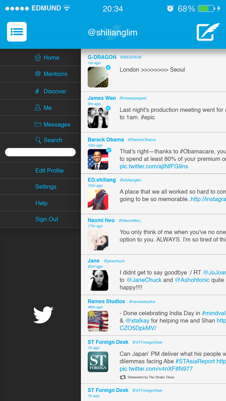
Even when the menu slides out, much of the content from the feed is still very visible.
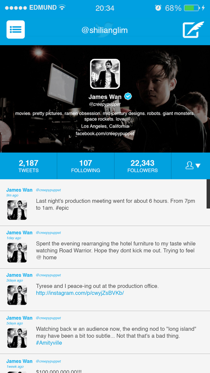
The profile page centers all of the profile information in the hero section, which helps it stand out from the tweet feed section.
Twitter Flat Redesign by Jack Cohn
Cohn redesigned Twitter for the XP recruitment challenge and did an excellent job! This flat concept looks incredibly clean, modern, and eye-catching. The black side bar keeps the middle section free for content, keeping only the search and tweet buttons in the top menu.
Twitter App Redesign by Curtis K. Moore
This Twitter redesign concept includes snazzy touches that add a much more appealing look to the app. The profile page may have too large of a header, but it does create a new look, as does the new font.
The news feed interestingly moves the tweet section to the bottom of the screen, but keeps the search and notification buttons at the top.
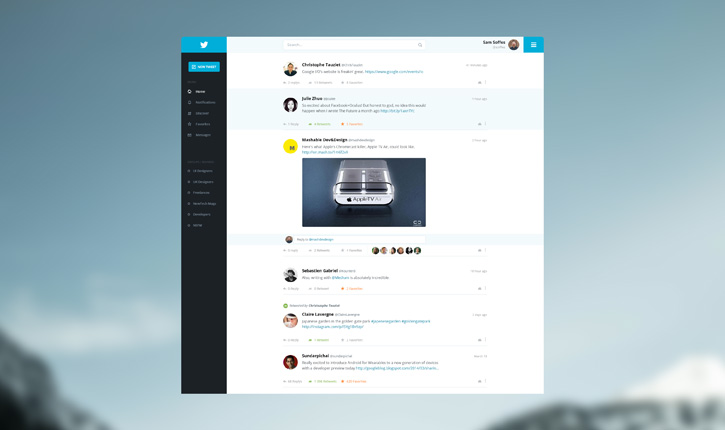
Twitter Web/App Redesign by Lewis Morgan
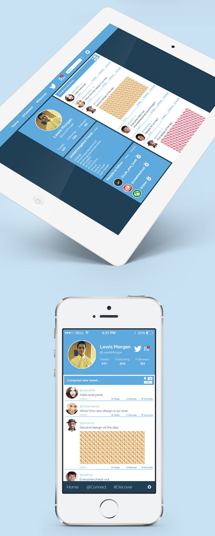
With a web look that easily translates to the app, this redesign does an excellent job of keeping the same look for Twitter, no matter the device used to view it. Morgan keeps things nice and simple, yet modern and aesthetic, in his Twitter redesign.
Twitter Redesigned by Vinfotech
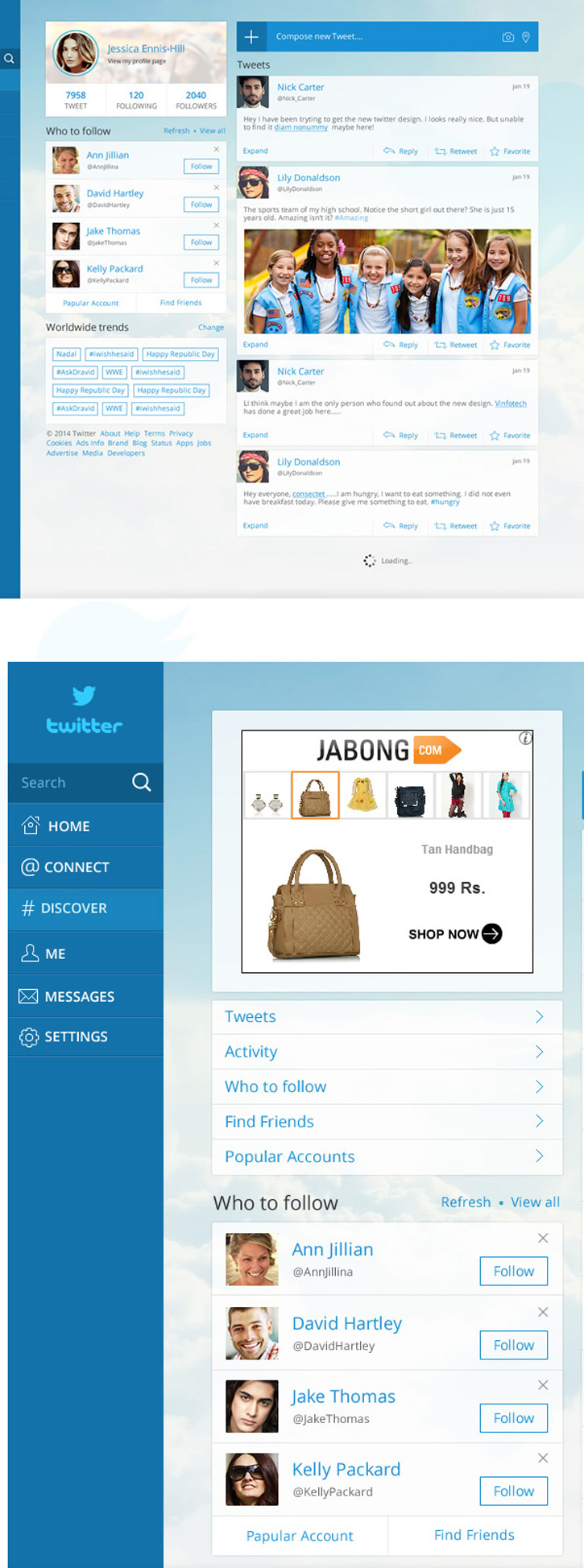
What is so appealing about this Twitter redesign concept is the clean organization of items across the screen. Plus, the fonts and color scheme are really eye-catching.
Twitter App Redesign by Matt Jessell

Jessell’s redesign of the Twitter app looks snappy and clean with well-organized header and feeder menus. The light colored action buttons for each tweet keep the focus on the content and the page easy to browse through.
Twitter Profile by Ramil (Bluroon)
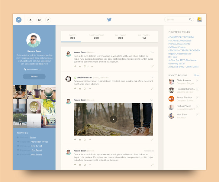
This Twitter profile redesign concept keeps the “about” information in the left side bar, allowing more room for the tweet feed in the center of the screen. “Who to Follow” and “Trends” remain in the right side bar and out of the way.
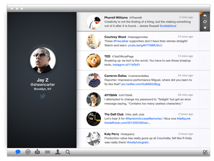
Twitter for Mac Redesign by Kubilay Sapayer
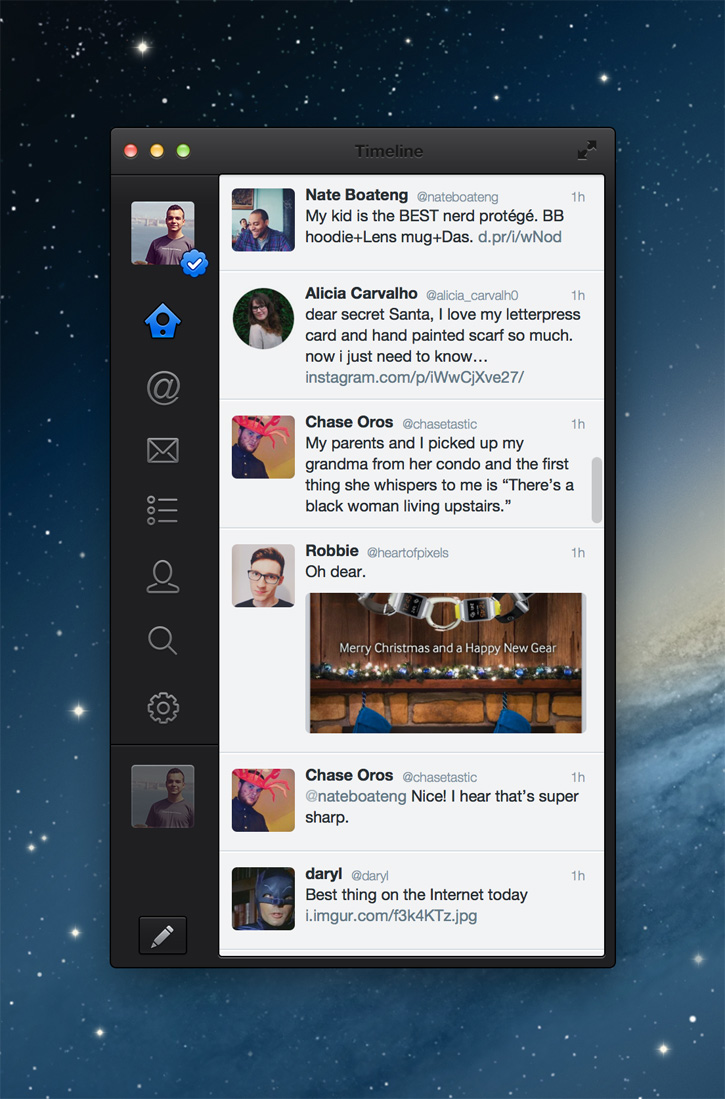
This Twitter redesign concept for Mac stands out nicely. While the focus is on the news feed due to a bold font, the icons are simple yet eye-catching with an almost 3D look.
Twitter Redesign – Cleaner Version by Adrien THOMAS
Certainly a cleaner version of the current Twitter design, Adrien cleans up the look by re-organizing the menus and removing the trending and other boxes on the screen.
Twitter Redesign by Dmitri Litvinov
The two column layout in this Twitter redesign concept makes browsing through the feed and finding information much easier. The grey accents also help the profile section and top menu stand out more.
Twitter iPhone 5s Redesign by Sam Girling
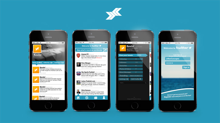
Girling created this iPhone app redesign for the KevConcepts Entry, and came up with quite a fresh and modern look. The slide out menu is an interesting design with boxes that highlight and turn into a tab when clicked on. The home page news feed is very clean, and the profile page again uses tabs to show which feed is being viewed.
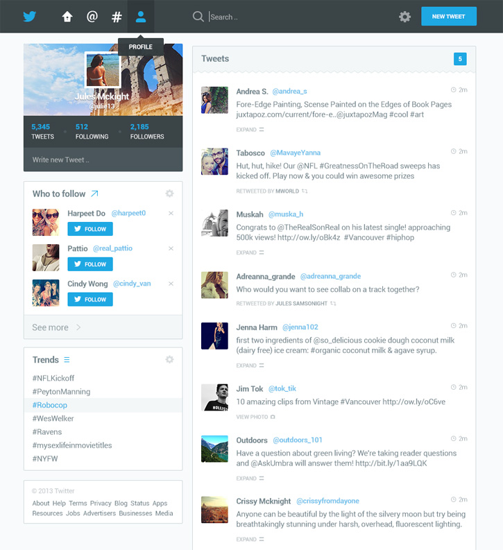
Twitter Redesign Concept by Lucas Reif

This redesign by Reif keeps the page clean and fairly similar in look and feel to the current design. However, this one is much more organized and much easier to browse through.
Final Thoughts
When I began this article, I wasn’t so sure how I felt about a Twitter redesign. After all, even though the organization is a bit faulty, I’ve finally learned how to navigate the platform (mostly). After I found the redesigns above, though, I’m really hoping that Twitter will come up with a new design soon. These designers know their stuff when it comes to both UI and UX.
As such, which of the above redesigns are your favorite? Any that you think should not have been included, or are there any redesigns I left out? Feel free to let us know your opinion in the comments below!