What do you think customers are seeking when they look for designers, photographers or other creative experts and agencies? Indeed, the first thing they are interested in is the experience and skills of the specialist.
Wether if you are a freelance logo designer or a representative of a prestigious creative studio, one thing is obvious: you need an outstanding portfolio to help your future customers evaluate your professionalism and the quality of your work and finally make them choose you over the others.
Although a physical portfolio is a good idea, portfolio websites usually are a better way to easily and quickly showcase your work to the world. Besides, with an enhanced online portfolio you can reach a larger audience. So take your time and get down to laying out your portfolio website! My collection of top tips for amazing portfolio websites may help you along the way!
What to show?
Go for quality not quantity. Better showcase 20 ideal works, that 200 works that are so-so. It will not only save your customers’ time and nerves, but also make an unforgettable impression. Large portfolio doesn’t say anything about the level of your professionalism, but a couple of super works, says much.
How to Show?
Choose minimalist design for your website, so that visitors can concentrate mostly on your works. However, you can afford a fancier website, if its design is also your work.
Keep it Well-Organized!
Always use tags and categories for your works, especially if you have a big portfolio, so that users can find whatever they want easily. You don’t want your customers to get lost trying to find the information they need, do you? Remember, the more time and efforts are spent on finding something, the less interesting it becomes. So, organize your works into similar categories and “tag” them if possible to make customers’ lives easier. It’s simple and it works!

Greatly organized portfolio, featuring catchy category headlines for each group on North Landscapes.
Let Them Find you!
Your super-duper works will worth nothing, if they can’t be found. That is why uploading the screenshots and writing descriptions, keep SEO in mind! Make sure the screenshots of your works are optimized for search engines. It’s easier than you think! Ideally your images should have:
– a descriptive file-name
– an alternative text
– a caption
Also keep in mind submitting your website or links to your showcased works to relevant digital workplaces and job markets. It will took you just a few minutes and will increase the traffic. Check it out yourself!
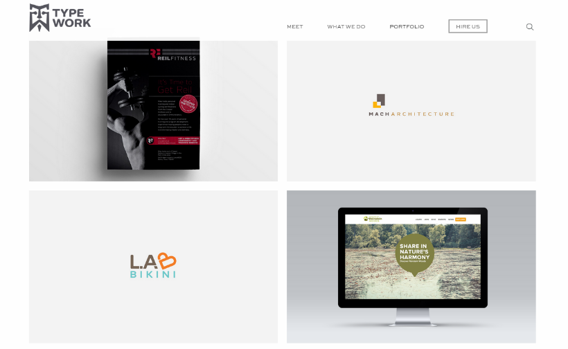
Type Work’s portfolio is great for both users and search bots: the all screenshots feature captions, descriptive file names and alt tags. Check the page source for more details!
Bonus Tip: People usually search for specific services, they are more likely to look for “ logo and brand design” rather than “design agency”. To take advantage of good SEO fully, create and optimize a page per each service you provide: it will help you show up in search results for specific searches as well.
Tell The Story Behind Your Works
Besides showcasing the final results, try telling a bit about the process of. Show your customer how you solved different problems, found creative solutions and overcame challenges. The results are important, but the way how you got there tells more about your abilities as a professional.
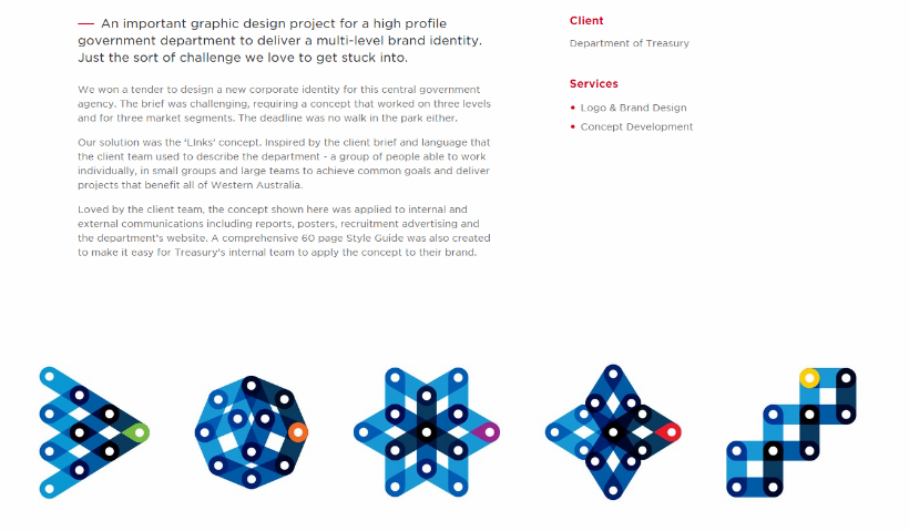
The Cut not only showcases its work in an appealing way, but also tells in a few words about the process of solution.
Motivate Visitors!
What is the reason of showcasing your works? Right, beat the competitors and get customers choose you. So why not try to motivate them a little? Here’s when “call-to-actions” will help you magically turn visitors to customers. Put something that compels visitor to click and convert: Do you want to get such a cool logo? Then contact me immediately at [email protected]!
Make It Easy to Browse and Contact!
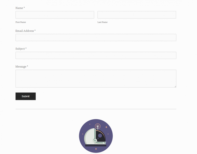
Make sure your website has a straightforward navigation. Don’t make users use browser’s features to navigate. If they need to go “Back”, to see your other works, let them do it with using the option on the website, not on browser. Not only your works, but also your contact details and personal info should be absolutely easy to access. The main reason people leave websites is bad usability, try to avoid it by any means. Don’t forget about a well-designed and attention-grabbing contact page, with a nice and simple contact form, so that users enjoy communicating with you.
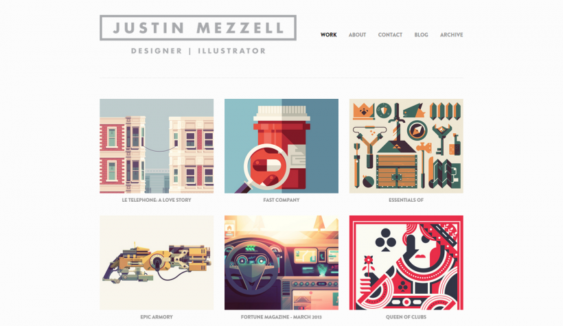
Justin Mezzell’s portfolio is built according to best practice: simple menu, easy navigation with “back to work”, ”prev/next” buttons, social icons and very nice contact form.
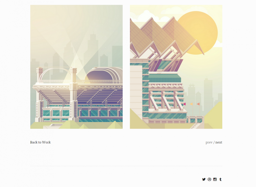
Easy navigation with “back to work”, ”prev/next” buttons and social icons on Justin Mezzell’s portfolio.
Now let’s go through some more quick tips as a bonus!
– Go social and let people share your content easily including social media icons.
– Make your web-site visually-driven, minimizing texts and focusing on images. You can also replace text navigation with icons, enhancing the look of the site and improving usability.
– Showcase the logos of the most acknowledged partners you deal with.
– You can also include a map of customers, if they are spread worldwide, that is a proven way to attract customers who need offshore outsourcing.
– Add a touch of personality, let your customers get to know not only your works but you as a person as well.
Just like one wise man said, the difference between something good and something great is attention to details. If you want to create a great portfolio, pay attention to each and every detail. And always remember, that for any creative work, there are no one-size-fits-all rules and maybe the most “working” rule for you will be the breaking off all rules and using your own intuition and imagination!

