Graphic designers use fonts on a daily basis. We have our favorites but we also run away from others. Some fonts have very little recall or have no commercial value, while others have become so popular, they should no longer be used in brand identity. These are some of the fonts that brands should avoid using in their identities and marketing collateral.
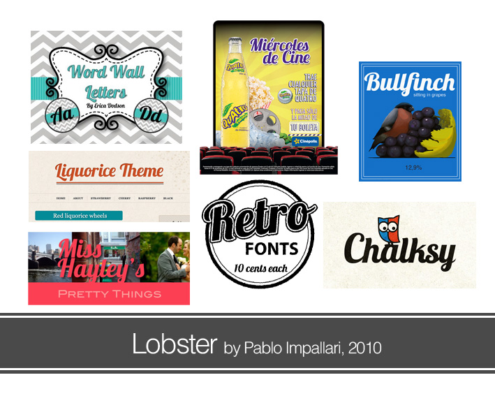
1.) Lobster
More and more people are starting to get hooked with the Lobster font because of its fancy appeal and ability to adapt to many industries such as food, design, and retail. It’s sad to see this new script font get abused in different ways because of its versatility.
Why we love it: It’s classy. It’s relatable. Best of all, it’s free for commercial use.
Why avoid it: In spite of its youth in the font industry, it has become a favorite of both designers and non-designers worldwide making it generic.
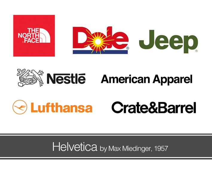
2.) Helvetica
Ranking first in the Top 100 Best Typefaces, it is understandable why “the best font of all time” is seen almost everywhere we look. It even has its own movie! New designers are taught that Helvetica is the go-to font of all graphic designers. Avoid this font not because it doesn’t work; rather, because it has worked for many others before.
Why brands love it: It’s neutral. It’s simple. All of its weights are easy to read.
Why avoid it: If you don’t plan on modifying the type, the line for logo look-alike goes around the block.
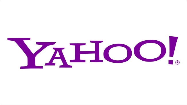
3.) Yahoo
Yahoo! used an original font of their own in their old logo but copies of it were released before 2005. In 2013, Yahoo!’s CEO led a re-branding compromising their logo using a less captivating font, Optima. Although the Yahoo font is free for personal use, brands should avoid using this because it is automatically associated with Yahoo!.
Why brands love it: It’s neutral. It’s simple. All of its weights are easy to read.
Why avoid it: If you don’t plan on modifying the type, the line for logo look-alike goes around the block.
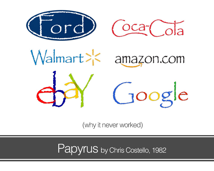
4.) Papyrus
Compiled logos from Steve Lovelace
Dubbed as one of the worst fonts in the world, Papyrus is a staple in all worst fonts list seen on the internet. People say that Papyrus is not entirely a bad font, but it has very limited usage and close to none. If Moses were alive, this would be his favorite font.
Why brands love it: They don’t.
Why avoid it: It only reminds the audience of Egyptian times.
5.) Futura
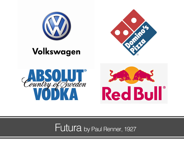
Futura is elegant, understated, and full of personality in spite of its simple form. Its different weights makes it a classic font that reflects efficiency and forwardness. It’s used in retail, food, and even in movie credits and posters.
Why brands love it: Futura looks good– no one can say no to that.
Why avoid it: If you don’t plan on modifying the type, the line for logo look-alike goes around the block.
6.) Arial
While designers have declared Helvetica their font of choice, the Microsoft office world begs to differ. Microsoft Office comes with a free font called Arial, the best alternative to Helvetica. In earlier versions of MS Office, Arial was the default font but sadly, it has become a joke in the designer circle.
Why brands love it: It’s generic and time-tested. It has potential when used properly.
Why avoid it: It has no recall.
7.) Jenna Sue
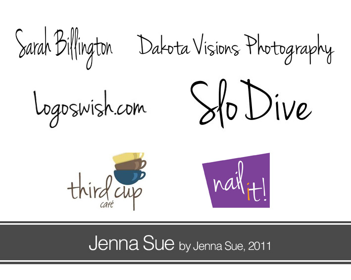
Named after its creator, the Jenna Sue font is preferred in many casual, relaxed, and feminine brands because of its script-like form without having to worry about the ligature. It’s oftentimes used as is and no longer modified. It has a successor called Nella Sue, a handwritten script font that has the same girly feel.
Why brands love it: It’s friendly and homey.
Why avoid it: It’s free that’s why it’s everywhere. It’s easy to forget. It shouldn’t be used by established brands.
8.) Gill Sans
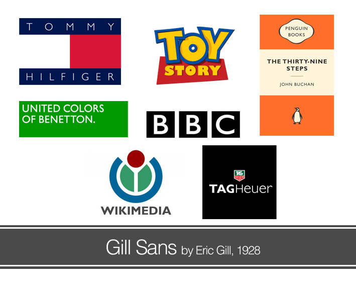
Gill Sans is a wonderful font commonly used in presentations because of its warm and friendly feel. It was originally created as a fool-proof font that can be easily understood by many and was once the standard typeface of London and North Eastern Railway (LNER).
Why brands love it: It’s England’s Helvetica.
Why avoid it: It comes with the Mac OS X and MS Office making it easily available to all
9.) Comic Sans
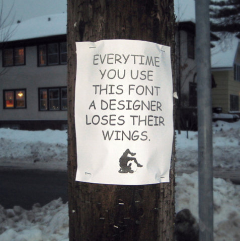
There are fonts that we hate and there are fonts that we love to hate. Comic Sans is not the worst font in the world. In fact, it was once very popular in printing serious information on posters, signs, and newsletters. There is a website dedicated to Comic Sans haters that will help shed a light on the global Comic Sans banishment.
Why brands love it: They don’t, because graphic designers won’t use this font.
Why avoid it: It’s comical. It’s strange. And it’s intended for children below 11 and some dyslexic people.

