In order to design a scalable website or app, you need an effective and efficient way to manage it without introducing errors, inconsistencies, or friction-filled experiences. This is what a UI design system is for.
In this introduction to design systems, we’ll look at real examples of design systems that leading organizations use today. We’ll also examine the reasons why you need a design system, times when you don’t need one, and what to include when building yours out.
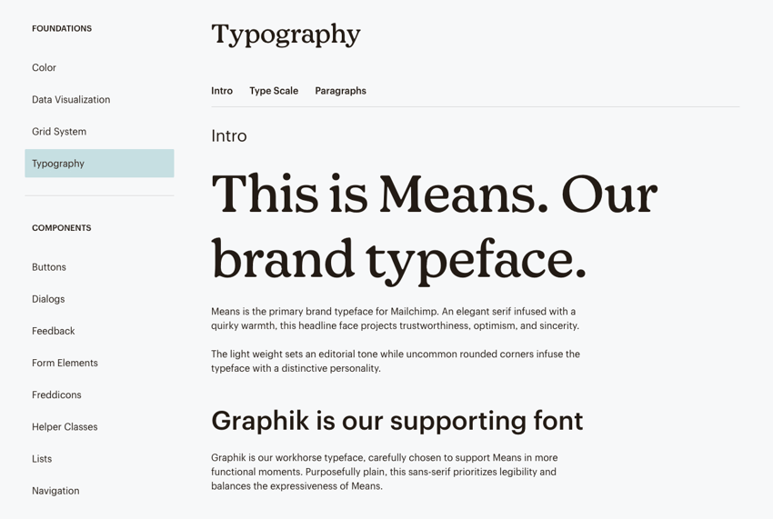
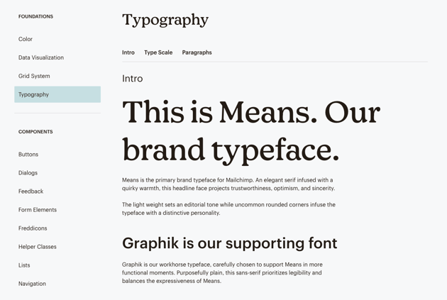
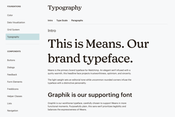
Typographic patterns in the Mailchimp design system
What Is a Design System?
When designing a user interface for a website or app, it’s easy for details to fall through the cracks. Every time you add a new page or component or increase the complexity of a project, it becomes more difficult to keep tabs on everything.
That is, it becomes difficult without a design system.
A design system is a collection of guidelines, styles, components, patterns, and other resources used to create user interfaces for digital products. Think of it as the visual language of a brand.
What to Include in a Design System
A design system is a well-organized and -documented framework that simplifies UI design. At the same time, it makes it easier for digital teams to scale, update, and manage digital products; questions about what to use, why, and when are all answered.
Although each design system has a unique look of its own, the structure is often the same from brand to brand. Here are the most common components of a design system:
Design Principles
This section is called by many names. For instance:
- Overview
- Introduction
- Brand
- Design guidelines
- Design principles
It’s also not always handled the same way. Some use this section to expand on the brand’s goals and mission. Others use it to explain the driving principles behind the design system.
For example, this is the Overview page in the Lightning Design System:

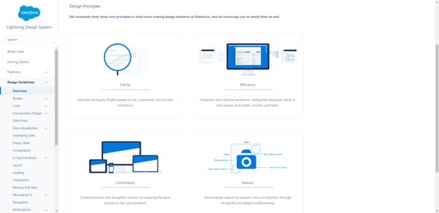
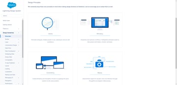
It explains that clarity, efficiency, consistency, and beauty are used to make design decisions for Salesforce’s products.
Style Guide
Style guides can exist within and outside of design systems. But their purpose is always the same: To provide a visual reference and guidelines for the foundational styles used when designing for a brand.
These foundational elements include things like:
- Color
- Typography
- Iconography
- Logos
- Imagery
- Spacing
- Layout
- Motion
It may also include information regarding responsiveness, globalization, and accessibility. It’s becoming more common to find information on design tokens in this section as well.
Each design token has a json key and corresponding value. If you’re looking for a good example of what this looks like, check out Shopify’s Polaris design system:
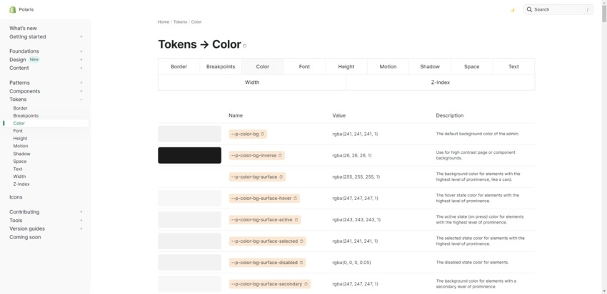

Tokens help bridge the gap between a designer’s decisions and a developer’s implementation of them. By selecting specific design tokens, there can be no disputing the designer’s decision.
They also make it easier to implement and update global styles.
Components
The component library is the next step up in defining a brand’s visual language. In it, you’ll find reusable UI components like:
- Accordions
- Breadcrumbs
- Buttons
- Containers
- Lists
- Progress bars
- Search forms
- Tabs
- Text inputs
These are the basic building blocks of the UI. Each section of the components library unpacks the component, how to use it, and the different variations.
For example, this is the Button page in the Sainsbury’s Luna design system:


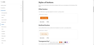
Users will find different button styles explained and visually depicted. Lower down on the page, they’ll also find do’s and don’ts for using the component as well as tips on how to create labels.
Pattern Library
Pattern libraries build upon components. They contain combinations of components that help users perform specific tasks on a website or app.
A good example of this is the form. This pattern may bring together components like:
- Labels
- Text inputs
- Checkboxes
- Dropdowns
- Buttons
- Breadcrumbs
- Progress bars
- Error messages
The Clarity design system for VMware is a good example if you want to see how patterns like Forms are commonly addressed:

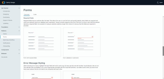

You won’t just find a visual depiction of the styles and components used to create the pattern. You’ll find do’s and don’t on how to present it. Everything from placement to accessibility is covered as well.
Additional Information
Some design systems stick to the basics above. Others include additional information. For example:
- Code snippets
- Content guidelines
- Resources like templates, UI kits, and plugins
What you include in yours all depends on what you and your team will benefit from most. If there’s something that will make it easier for you to design scalable UIs more effectively, it may be worth including the information in your design system.
Design System Examples
In order for design systems to be effective, they need to be accessible and shareable across one’s organization. That’s because it’s not just web designers and developers that use design systems.
While many companies choose to keep their design systems private, some bigger organizations choose to publish them online. So we have plenty of live design system examples to reference.
For example:
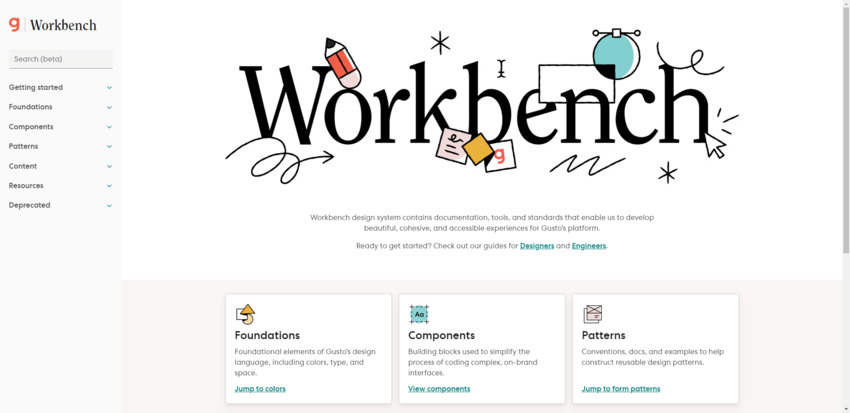
Workbench is the design system for Gusto:

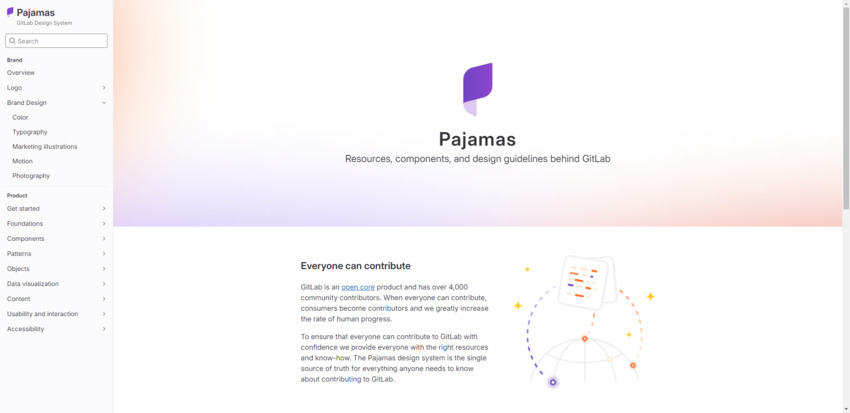
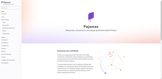
Pajamas is the design system for Gitlab:

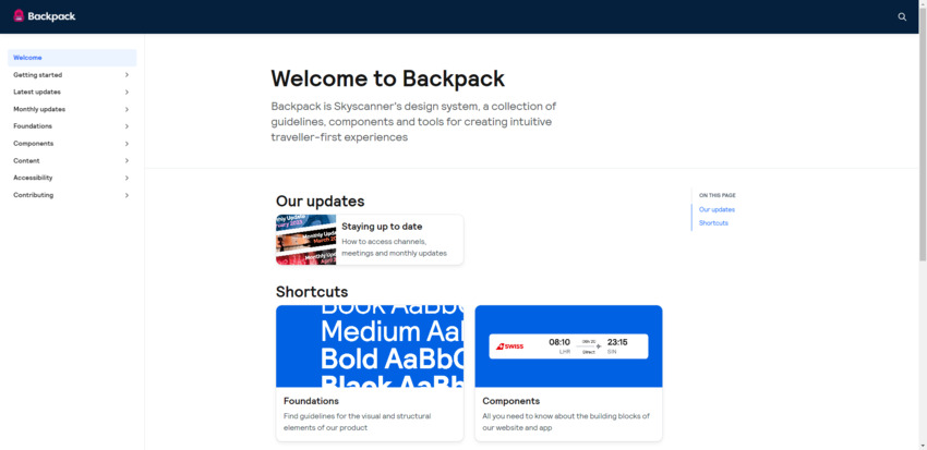
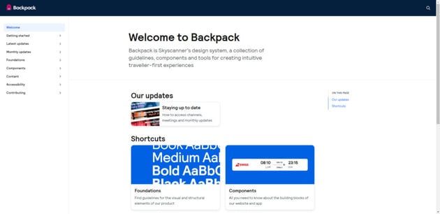
Backpack is the design system for Skyscanner:

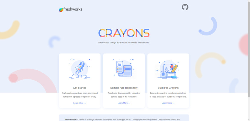
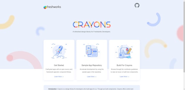
Crayons is the design system for Freshworks:
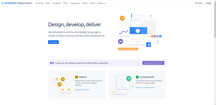
This is the Atlassian design system:

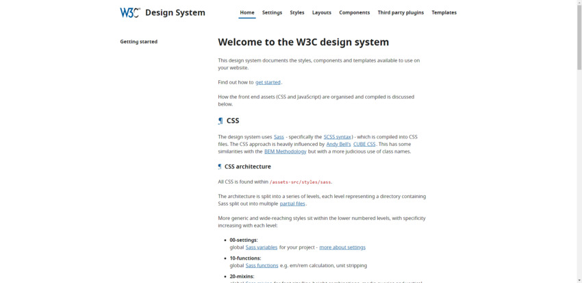
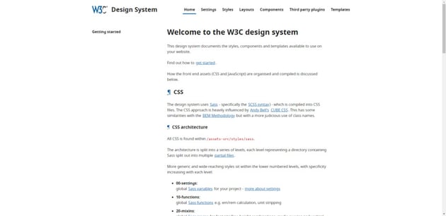
And this is the design system for the World Wide Web Consortium:
The Benefits of Design Systems
There are lots of benefits to creating a design system for your organization:
- Efficiency: Well-designed styles and reusable components and patterns make it easier and faster to design digital products.
- Quality: Reduce errors and inconsistencies when designing and updating your digital products.
- Clarity: Establish a unified visual language so that everyone — including new hires — know exactly how to translate your brand’s vision into a visual interface.
- Effectiveness: Every detail is well-thought-out ahead of time so you don’t have to make decisions on the fly or spend time in countless meetings to get everyone’s buy-in.
- Automation: When a design system is synced with a tool like Figma, UI updates can be pushed out across the entire product in a fraction of the time it would take to do manually.
- Scalability: Create better products that scale faster, look great, and provide users with an awesome experience.
- Unification: Build a cohesive, consistent, and high-quality experience for your users across every one of your digital products and channels.
Because the design system effectively answers all the questions someone might have about designing the UI of a product, you’ll have more time to focus on more important matters — like dealing with complex tasks and refining the user experience.
When Do You Need a Design System?
What we should be asking is when shouldn’t you use a design system. While there are plenty of reasons to create a design system, there are some times when the payoff for such a laborious task is too small.
For example, if you’re building a website for a personal project, a small business, or an entrepreneur, you might not need a design system.
To figure this out, you’ll need to consider how many pages you need as well as the potential for growth for the business and site. If the site will stay more or less the same size and scope over time, then a design system will likely be unnecessary.
You also might not find much use for a design system if you work alone. Design systems are a great way to bridge the gap between web design and development. They’re also useful for providing digital teams (with marketers, writers, and other non-designers) with a single source of truth to work from.
Another thing to consider is the budget. If your client isn’t offering you a ton of money to build a website or app, a design system might be too costly and time-consuming to make. However, that doesn’t mean you can’t pitch it to them down the road as their needs and budget change.
Conclusion
The above intro to design systems covers all the basics you need to get started with design systems.
In sum, a design system is more than just a library of visual components you use when designing a digital product. It’s a framework that details a brand’s visual language and provides rules and guidelines for how to use it.
If you’re building large and scalable websites and apps, a design system is a must these days.