In this tutorial, we’ll construct a card UI design and discuss different CSS ways for smoothly revealing the content of each card on hover.
To see all the effects, be sure to hover over the cards of the upcoming demos!
Card Component
Card components are a common UI pattern often used for representing blog posts, testimonials, products, etc.
Many times, for space-saving, especially on mobile devices, you’ll find them as a part of a horizontal slider.


1. The Markup
To begin with, inside a container, we’ll place six cards.
1 |
<div class="cards"> |
2 |
<article class="card">...</article> |
3 |
<article class="card">...</article> |
4 |
<article class="card">...</article> |
5 |
<article class="card">...</article> |
6 |
<article class="card">...</article> |
7 |
<article class="card">...</article> |
8 |
</div>
|
Each card will have the following structure:
1 |
<article class="card card-top"> |
2 |
<a class="card-link" href="#0"> |
3 |
<img class="card-img" width="900" height="900" src="IMG_URL" alt=""> |
4 |
<div class="card-details"> |
5 |
<div>
|
6 |
<div class="card-subtitle">...</div> |
7 |
<h3 class="card-title">...</h3> |
8 |
<div class="card-content">...</div> |
9 |
</div>
|
10 |
<div class="card-view-more"> |
11 |
View more |
12 |
<svg width="24" height="24" viewBox="0 0 24 24" xmlns="https://www.w3.org/2000/svg" fill-rule="evenodd" clip-rule="evenodd"> |
13 |
<path d="M7 7h8.586L5.293 17.293l1.414 1.414L17 8.414V17h2V5H7v2z" /> |
14 |
</svg>
|
15 |
</div>
|
16 |
</div>
|
17 |
</a>
|
18 |
</article>
|
2. The Styles
We’ll skip the introductory styles and jump directly into the important ones:
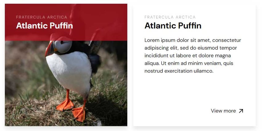
- We’ll give each card a static height determined by the
card-heightCSS variable. - The
.card-detailselement will be absolutely positioned and sit on top of the image. However, by default, only a portion should be visible, specifically its title and subtitle. To achieve this, we’ll also define an initial static height for the.card-detailselement determined by theinitial-visible-card-heightCSS variable. Please note that this height and the breakpoints work for our content here; in your case, you might want something different. - As long as we hover over a card, we’ll animate the height of the
.card-detailselement to 100%, so we’ll achieve a slide animation from top to bottom.

Here’s a part of the corresponding styles:
1 |
/*CUSTOM VARIABLES HERE*/
|
2 |
|
3 |
.card { |
4 |
position: relative; |
5 |
margin: 0; |
6 |
overflow: hidden; |
7 |
box-shadow: 0 10px 15px 0 rgba(0, 0, 0, 0.1); |
8 |
height: var(--card-height); |
9 |
}
|
10 |
|
11 |
.card-details { |
12 |
display: flex; |
13 |
flex-direction: column; |
14 |
justify-content: space-between; |
15 |
position: absolute; |
16 |
top: 0; |
17 |
left: 0; |
18 |
right: 0; |
19 |
bottom: 0; |
20 |
background: rgba(193, 18, 31, 0.7); |
21 |
color: var(--white); |
22 |
padding: 40px; |
23 |
height: var(--initial-visible-card-height); |
24 |
transition: all 0.3s; |
25 |
}
|
26 |
|
27 |
.card-link:hover .card-details { |
28 |
height: 100%; |
29 |
background: var(--white); |
30 |
}
|
And the related demo—be sure to view it on larger screen:
Transform Property
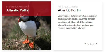
But what if we want to reverse the animation direction? In such a case, all we have to do is to animate the transform CSS property instead of the height one and set the value of the transform-origin property to the bottom.


Here’s a part of the corresponding styles:
1 |
/*CUSTOM VARIABLES*/
|
2 |
|
3 |
.card-details { |
4 |
transform: translateY(calc(100% - var(--initial-visible-card-height))); |
5 |
transform-origin: bottom; |
6 |
}
|
7 |
|
8 |
.card-link:hover .card-details { |
9 |
transform: none; |
10 |
}
|
And the related demo—be sure to view it on larger screen:
Clip-Path Property
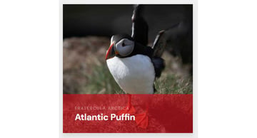
Alternatively, we’re able to achieve the aforementioned effects using the CSS clip-path property. We can also use the circle() function of this property to create some interesting effects.

Here’s a part of the corresponding styles:
1 |
.card-details { |
2 |
clip-path: circle(15% at 0 0); |
3 |
transition: all 0.4s; |
4 |
}
|
5 |
|
6 |
.card-top-right .card-details { |
7 |
clip-path: circle(15% at 100% 0); |
8 |
}
|
9 |
|
10 |
.card-bottom-right .card-details { |
11 |
clip-path: circle(15% at 100% 100%); |
12 |
}
|
13 |
|
14 |
.card-bottom-left .card-details { |
15 |
clip-path: circle(15% at 0 100%); |
16 |
}
|
17 |
|
18 |
.card-details * { |
19 |
opacity: 0; |
20 |
}
|
21 |
|
22 |
.card-link:hover .card-details { |
23 |
clip-path: circle(150% at 100% 100%); |
24 |
}
|
25 |
|
26 |
.card-link:hover .card-details * { |
27 |
opacity: 1; |
28 |
}
|
And the related demo—be sure to view it on larger screen:
Conclusion
That’s all, folks! In this short tutorial, we covered different CSS methods for creating card layouts with animated content. This kind of layout has limitations when you work with static heights, so be aware of it and use it only if you can control the card content.
If you need something more elegant, consider putting JavaScript into the loop.
As a next step, you can also enable these effects only if the user’s primary input mechanism can hover over elements by taking advantage of appropriate media queries.
As always, thanks a lot for reading!