
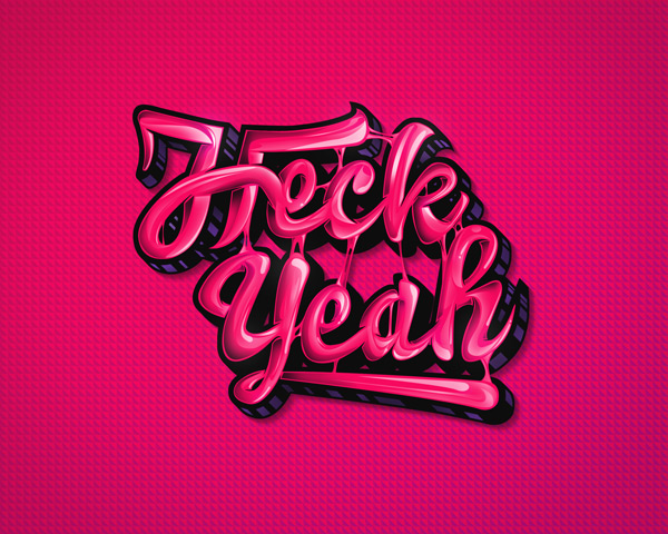
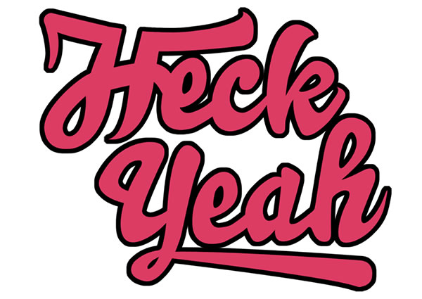
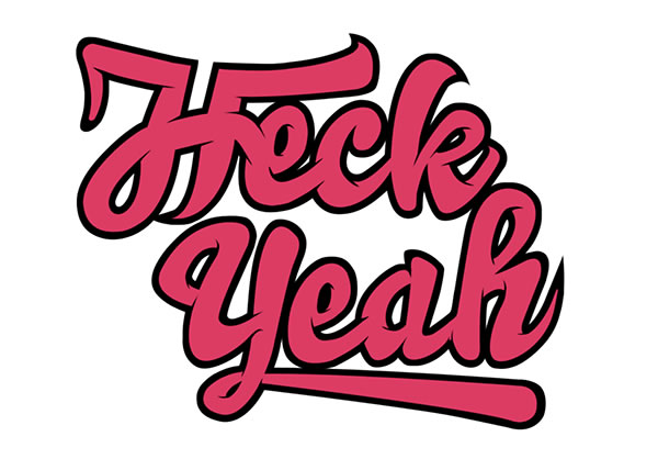
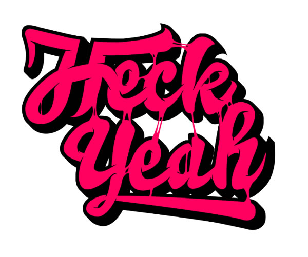
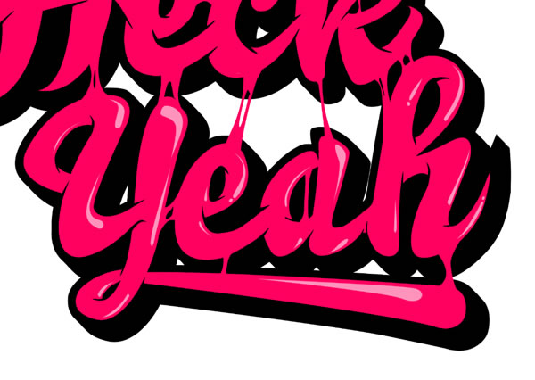
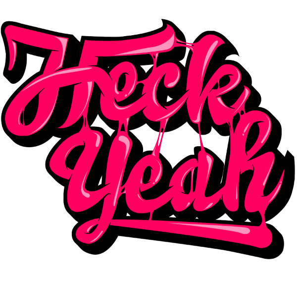
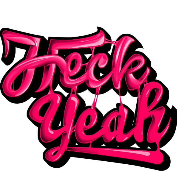
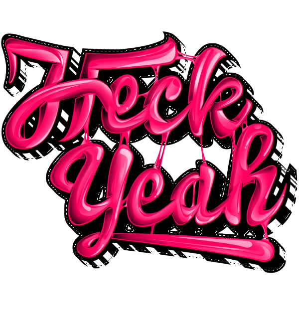
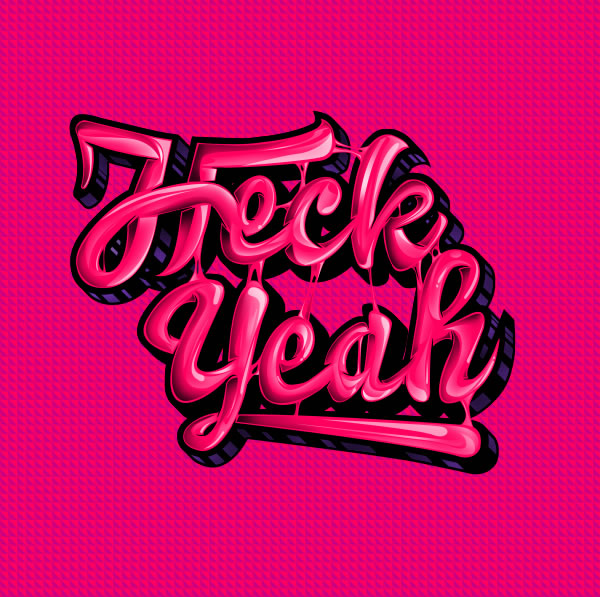
When combined with the right techniques, the Pen Tool in Photoshop is an incredibly powerful tool to help you create your artwork. In this tutorial, I will show you how to create a glossy, bubble gum text effect using a combination of Photoshop’s Pen Tool and Layer Styles. Let’s get started!
1. Create a Sketch
Step 1
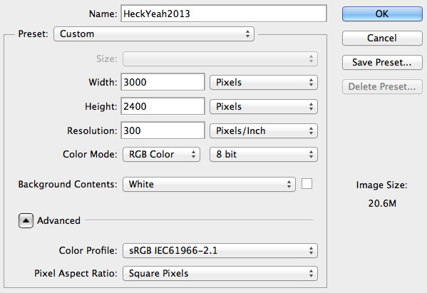
Create a New Document with dimensions 3000×2400. To ensure quality, we will make it with resolution of 300 DPI so our artwork will be good enough to print.
Step 2
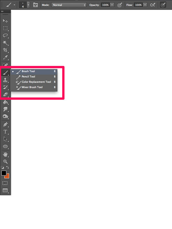
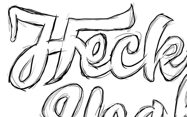
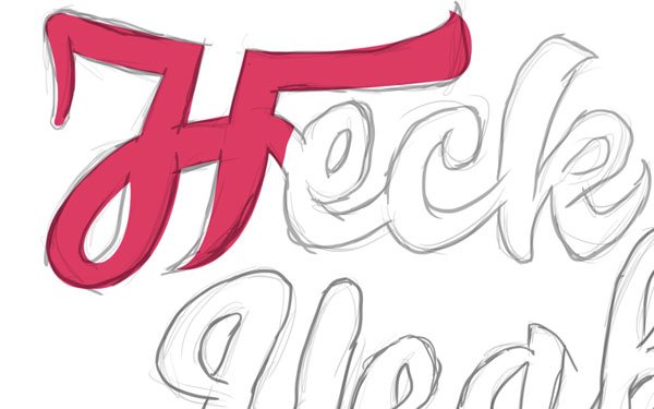
We will now create our base sketch of what our design will be. You should preferably use a Wacom tablet to do this properly. With your Wacom pen in hand, select the Brush Tool and enable pen pressure.
I will be molding my design upon the well-known script typefaceBello. I will be tweaking the shape of certain letters to make them more unique to my design. Create a New Layer and start sketching. Start with a thin pencil to get the general idea, around 4px is fine.
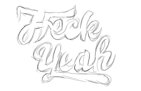
And then move on to the thicker brush setting. 8px brush size will be fine for this part.
Step 3
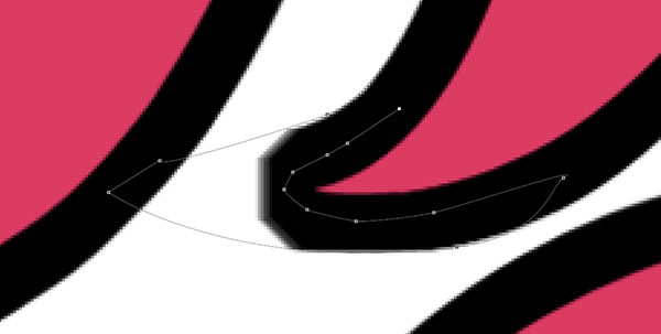
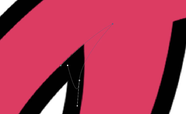
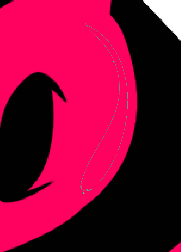
Once you are comfortable with the general outline of your design, it is time to select the Pen Tool (P) to create a proper outline of your design.
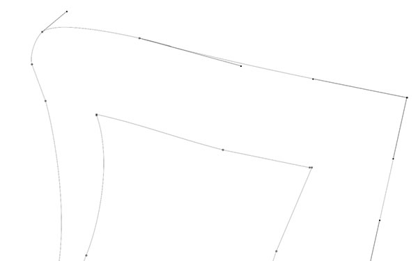
Be sure your Pen Tool (P) mode is on Path, as that is all we will need for now. You can now go around your design creating a smooth flowing path.
Be sure to hold down the Command/Ctrl key while tweaking the anchor points to get the perfect curves you need.
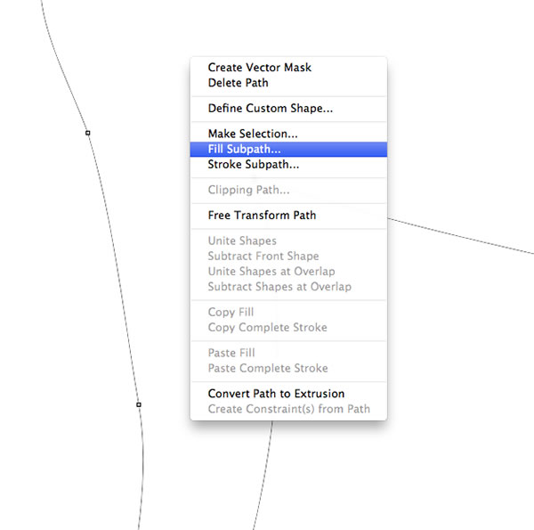
Once you have made your path, the next step is to fill it in. Right Click and select Fill Sub-path. Make sure you do this on a new layer and not on the same one you created your sketch on.
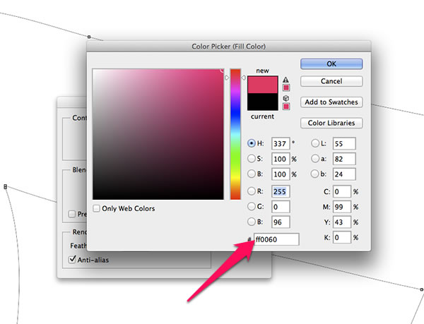
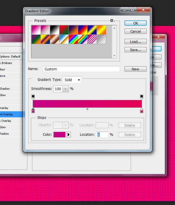
Select the Colour Fill option and we are going to choose this fluorescent pink colour right here with the colour value #ff0060 to be exact.
Use the Pen Tool to go around and fill in all the letters in the entire design.
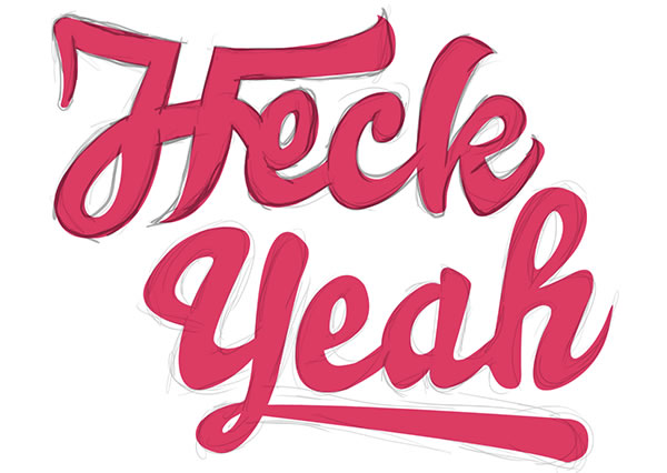
Once you have finished, turn off the visibility of the sketch layer.
2. Creating the 3D Effect
Step 1
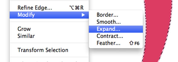
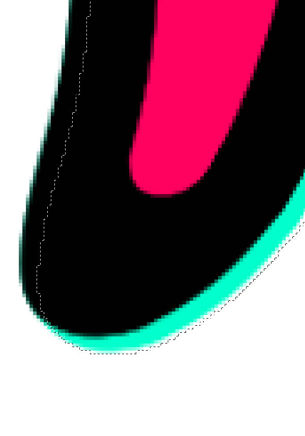
We are now going to begin the process of creating a 3D effect around our design. To do this, we must start by creating a thick border around our letters as a base. Select the layer that contains the entire design and hold Command/Ctrl while hovering over the layer thumbnail.
This will select the design and create the marching ants around it.

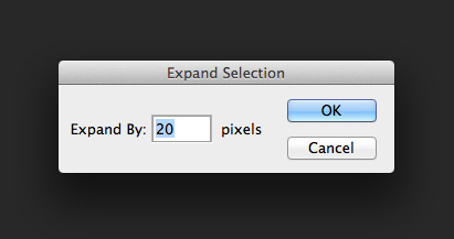
Now create a new layer above the primary layer by pressing Command/Ctrl-Shift-N. Go to the select option on the top menu bar then down to Modify > Expand. We are going to expand the selection by 20px.
Then grab the Paint Bucket Tool (G) and fill in the selection with a colour you may like. Preferably Black so the shadow effect will work more effectively.
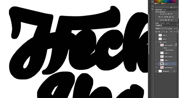
Now move the Shadow Layer behind the main one.
Step 2
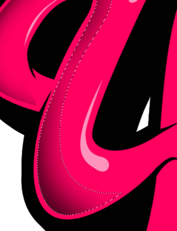
We aren’t done with perfecting this layer. If you look closely there are a few inconsistencies with the shapes and curves of some parts of it.
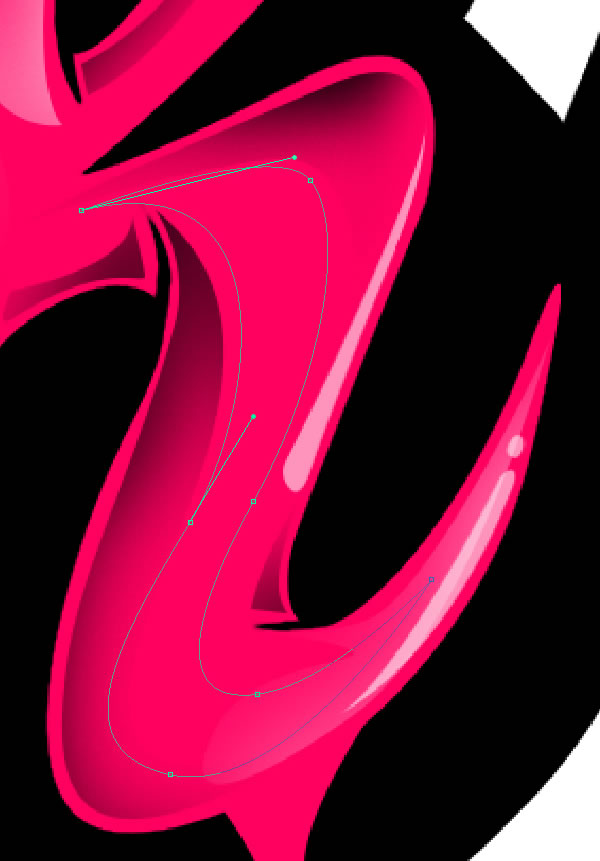
We will now take some time going around and making all the curves and points perfect. So grab your Pen Tool again and round off all the edges. Play with the anchor points as much as you need to, to get the perfect curve.
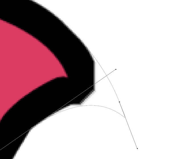
When correcting your curves, be sure to always stay in line with the rest of the layer. This is so your new path, when filled in, will blend better with the rest of the shape and will create a seamless effect rather than an obvious disconnection. So please take your time.
Step 3
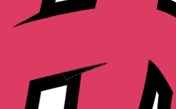
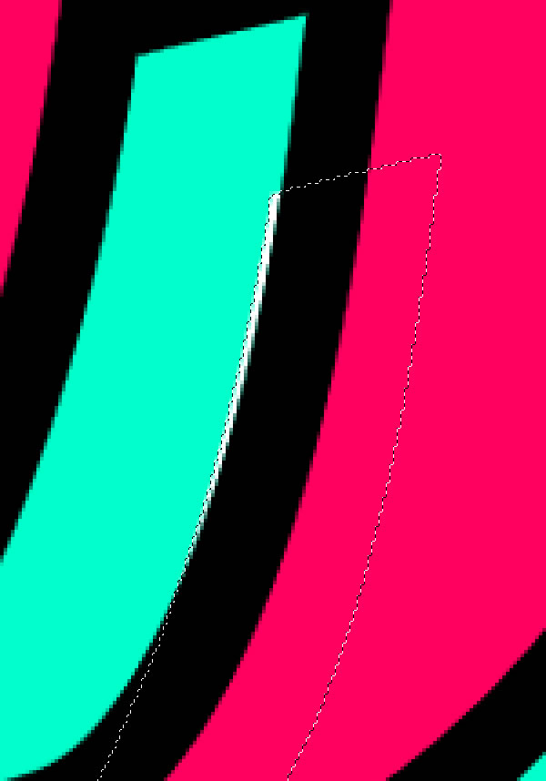
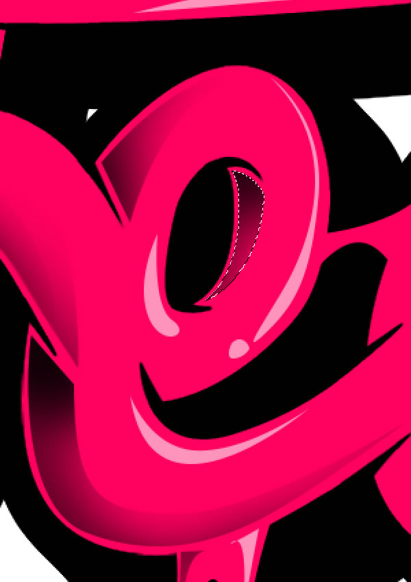
Once you have filled in and corrected all the curves and points on your stroke layer, and are happy with them, it is now time to create some shadow effects by slicing our design a little bit to give it that illustrated typography feel.
To do this, you must begin by selecting the main design layer and selecting the Add Vector Mask option at the bottom of the layer panel. This will make it possible to slice our shape how we want and later cover them up again if they need to be.
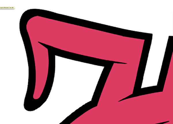
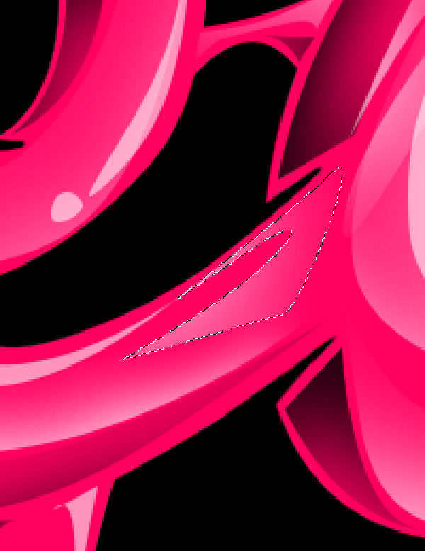
Now we are going to going to go around our design and make slices where necessary. When doing this, it important to use your instinct on what looks right. It is also important to not overdo it and apply too many slices in your design.
A common place to add slices is where one corner meets another or on a curve to exaggerate its movement.
With a design like this, adding slices in the correctly places is really crucial to bringing out that glossy cartoonish feel as realistically as possible.
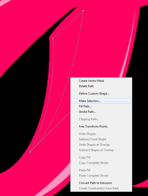
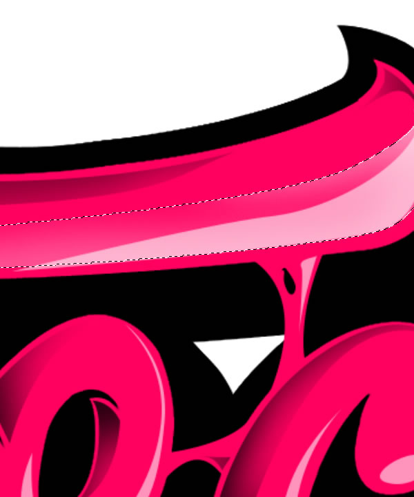
Get your Pen Tool again and draw your path of what you want to slice. Ensure that you have clicked on the Layer Mask Icon itself so you will be erasing that. Once you’ve made your selection, right click and choose Make Selection select a low feather option so the slice is as fine as possible and simply brush out the part of the layer using your Brush Tool.
On the Mask Layer, use a black brush to erase parts you do not want anymore and a white brush to bring them back. Go around and select areas that you feel could do with a slice and implement the same steps.

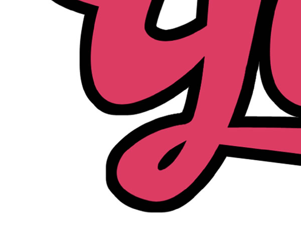
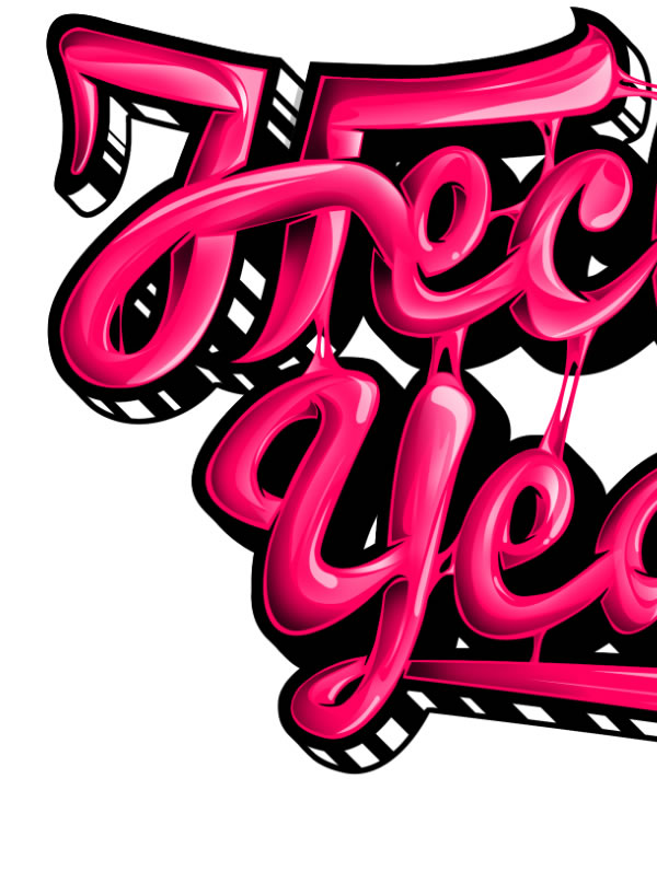
Once you have finished the first word it should look like this.
If you are happy, and like the effect it creates, carry on and finish the second word (Yeah), as well. Once finished, it should look like the below image.
Step 4
Now it’s time to create our first 3D Effect by creating an extrusion of our stroke using basic Selection and Fill Tools.
First, select the outer stroke layer we made earlier and then press M to select the Marquee tool.
Step 5
Once that is selected create a New Layer, this is where your extrude layer will be created.
Pick a colour to make your extrusion. It doesn’t matter what it is for now, we can always change it via Layer Styles later on. It would be advisable to pick something that clashes with the rest of the design so it is very visible while working.
Great! Now that we have our colour selected, let’s go ahead and begin the steps to extrude our layer and make it look 3D. With the outline layer selected click on the Marquee Tool and press Alt-Backspace.
This will create the base layer. If you look closely, you can see it behind the stroke layer. Now that we know we have filled the space we can carry on and carry on filling in the 3D manner.
With the marquee tool still selected we are going to repeat a layer fill method by pressing the Down key, then Right key then repeat the Alt+Backspace fill.
You will see that we are creating a downward 3D effect by merely using this repetition technique.
So we carry on doing this technique steadily making the depth thicker and thicker. When to stop is your choice. I personally am going to stop when there is no more white space left in the gap on this H.
Once we have our 3D layer made. It should look like this.
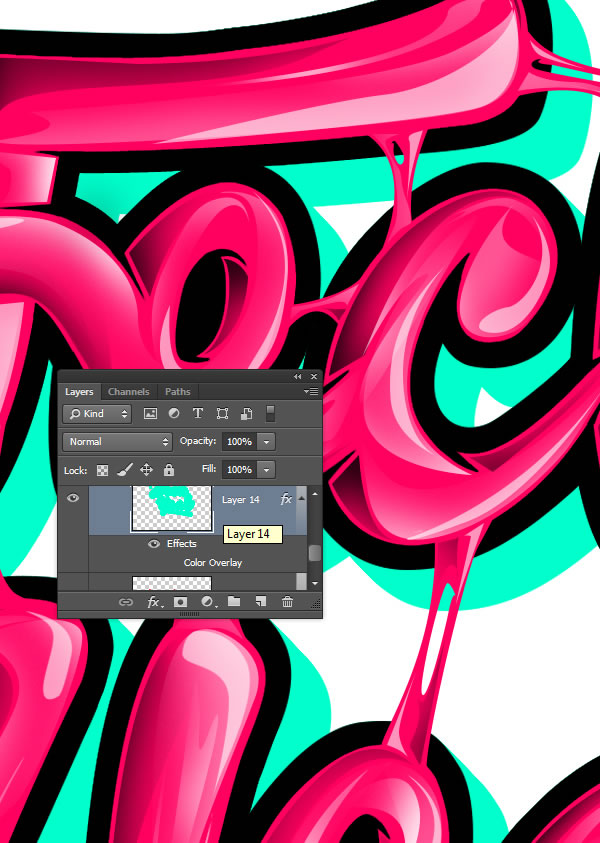
We can also change the Colour Overlay of it by using the layer styles option.
4. Creating Stringy Bubble Gum Bits
Step 1
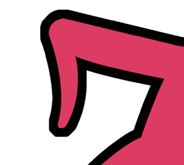
Because we want to give the illusration the effect of real bubble gum, we will now create stringy bits connecting some of the letters.
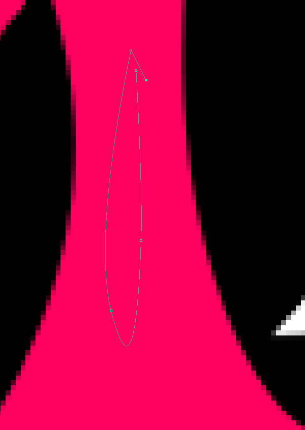
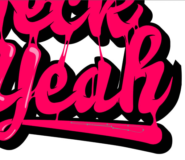
To do this, we will need our Pen Tool (P). Begin by creating a new layer. The style of creating these stringy bits will be to make the end parts thick and the middle parts thin to make it look as if the pieces are being pulled apart.
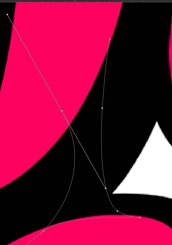
I have created a rough shape of this and filled it in.
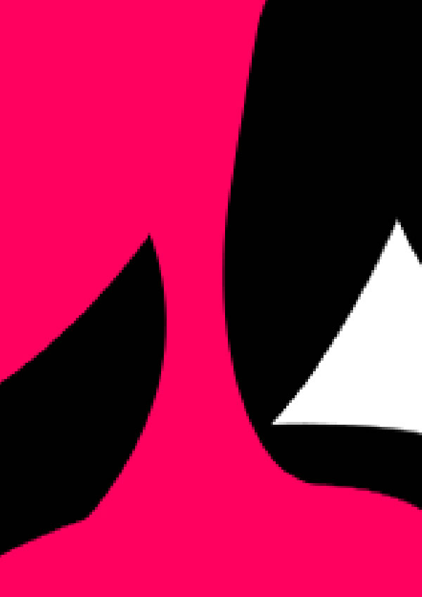
Step 2
To go an extra step, we can create a Layer Mask and make a hole in the stringy bits to again make it look like it’s been torn apart.
Once finished, our first stringy bit should look like this.
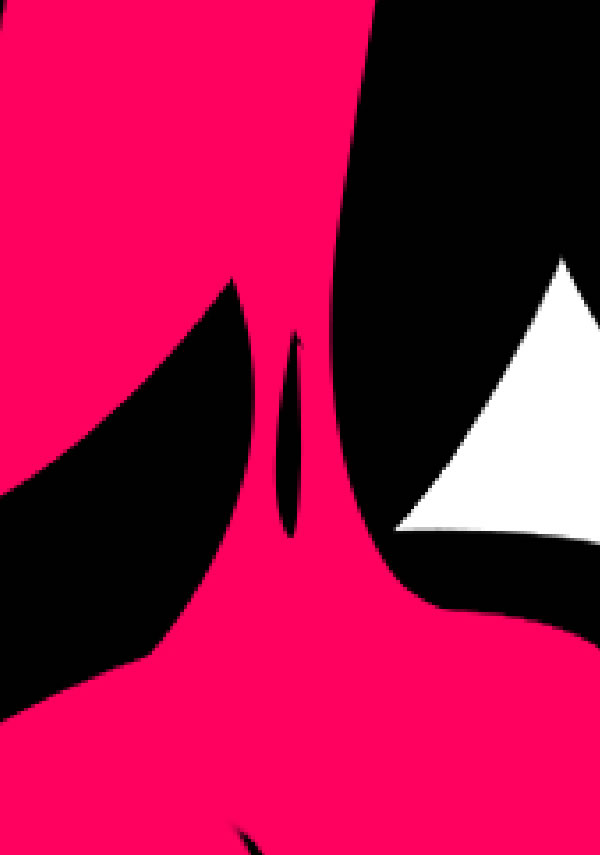
We will now go around the entire design and add stringy bits to liven it up a bit more and give that authentic bubble gum effect. Once completed it should look like this.
5. First Stage Highlights
Step 1
Now here comes the exciting bit. We are going to begin the first stage of making our design look like glossy bubble gum through a series of Fill and Brush Effects.
We are going to begin with the highlights. Create a New Layer above the main design layer. In this design, the light source will come from the right side. Below, I have drawn a rough map of where the light will hit.

This is a rough indication of where our shadows will appear.
We will start very basic for now, adding flat layer highlights. We are going to use the Pen Tool (P) and go around the design adding glossy highlights. You can also make these shape layers if you like.
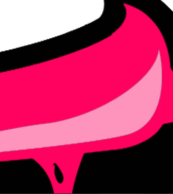
The colour we will use to fill it in is #ff92bb. I am going to start with Yeah. Once the highlights are filled in it should look like this.
Step 2
We are now going to create a new group and begin work on the Heck highlights. They’ll be pretty similar to the other ones.
Go around the word and apply the Highlight effect like you did previously.
Once completed, the first level of highlights your design should look like this.
5. Creating Shadows
Step 1
Now that we have created a base layer of highlights. We are now going to move forward to create our first and single layer of shadows on our text. For this we will require the Pen Tool (P) and brush once again.
To get a rough idea of the pars of the design we will be sophisticatedly shadowing here is a quick sketch of what areas we will be affecting.
Begin by creating a group called Shadows where you will create your new layers for shadows.
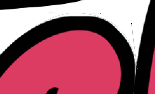
Get your Pen Tool (P) and create outlines that will later be turned into selections for you to brush and shade. When crafting your outlines, always be sure to leave a little gap between your outline and the edge of the character.
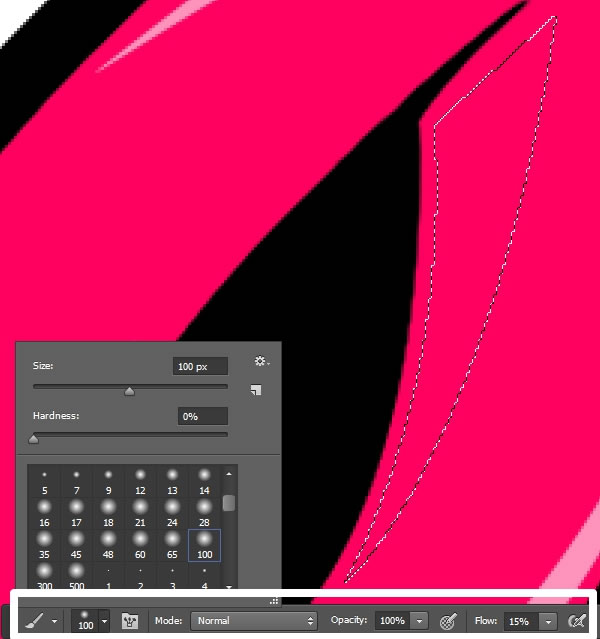
You will now grab your Brush Tool (B). Make sure it’s a soft brush and set it to about 100px with 100% opacity but set flow to about 15% and of course make sure the colour of your brush is set to Black. You can switch on the airbrush function too but it isn’t necessary. You will be able to achieve this effect with a regular mouse or a tablet.
The idea is to brush in the selection in a faded manner to have the top be filled in more than the bottom to create an airbrushed effect.
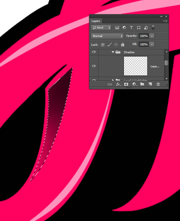
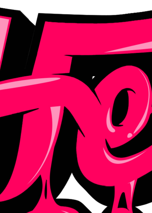
The idea when shading is to start at the slices/cuts of the design and create shadows starting from there. Ensure to also get into the stringy bits and shadow them in.
We are now going to go around the entire word Heck when you are finished it should look like this.
Keep it going for the second word.
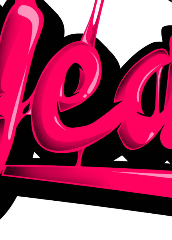
Once complete, the whole phrase should look like this.
6. Second Stage Highlights
Step 1
Now that we have made a decent shadow for our design. You can really see it’s starting to flesh out. We are now going to add another highlight layer to make it really pop. We will be doing it in the same style as the shadow except this time we will opt for a white brush.
With the highlights, we are filling in the rest of the space of the letters, so really play with the curves of the highlight edges this time around, and freestyle. Do not be scared to play with the Flow of the brush either. The more spontaneous, the better. Once complete, the whole phrase should look like this.
Step 2
Overlay/Overlap the highlights to create a much more glossy effect on the letters giving them a juicy texture. Once complete, it should look like this.
The first word it should look like this.
Start working on the second word and continue as usual.
Once this stage of highlighting is complete, the design should look like this.
7. Depth Highlights
So we are now going to begin work on adding highlights to the Depth/3D part of the design. We are going for a retro method of staggered bars to create this effect.
Step 1
Go back to the depth layer and hide the Colour Overlay so we can see it again in contrast.
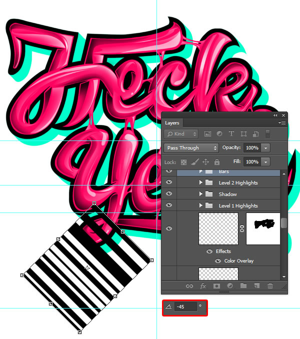
Create a new group called Bars and create a rectangular shape layer along with it. To get started on creating our staggered bars, we will opt for a simple black medium sided bar. Make sure it is long enough, as we are going to rotate it to match the perspective of the depth.
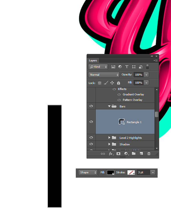
To create a cool effect of staggered highlights, you will duplicate the layer and play with the width of each bar. Just make sure you add a guide just at the base of you bars so they are on the same level.
Once your layout is starting to look like a barcode it probably means you have enough bars to rotate and match the perspective of the depth. To do this you must select the entire group and hit Command/Ctrl-T to free transform the entire group. Then set the angle to rotate to -45 degrees
Step 2
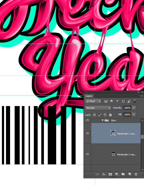
Once you have the bars in this position you are free to control the spacing of each bar to you own liking.
We are going to begin with the bottom area of the design and work our way anti-clockwise. We are also only going to focus on the outside of the design with the highlights for now. Once we have worked our way around the design it should look like this.
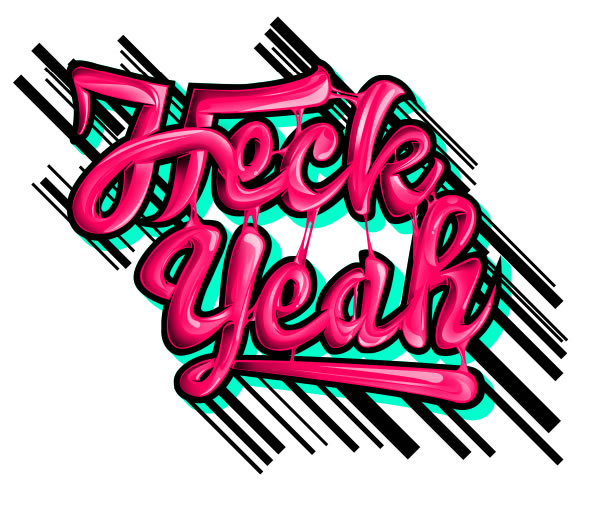
We are now going to create a Clipping Mask for this so the bars fit around the depth layer. To do this, you must duplicate the group then convert it into a smart object to merge the layers. then go to Layer > Create Clipping Mask to create the mask we need.
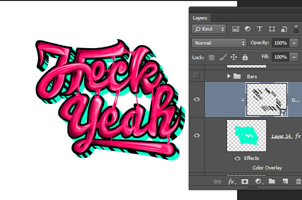
Step 3
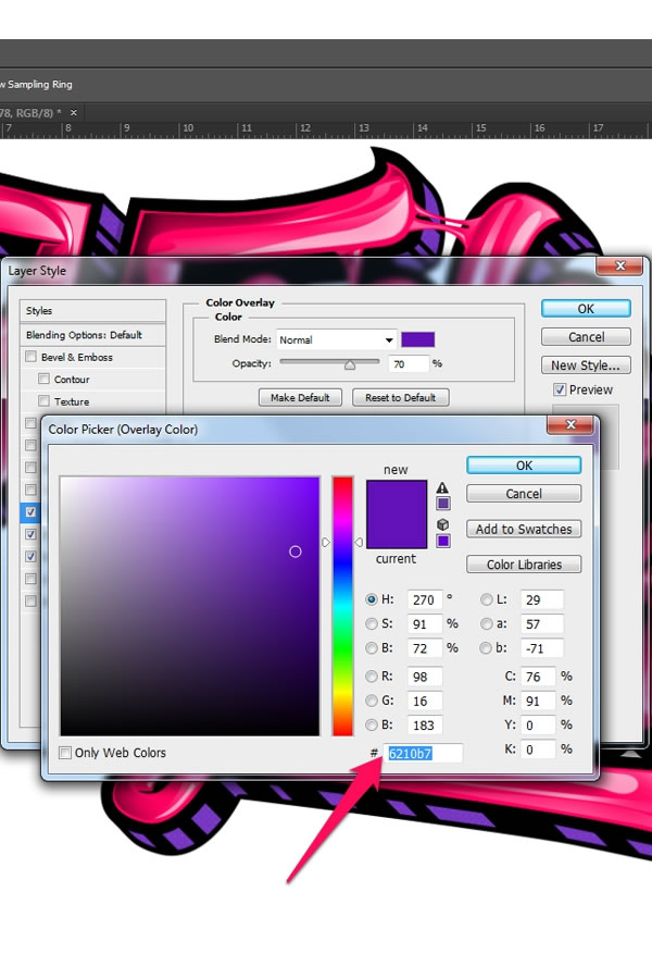
The color of our bars needs to change. You can do that with a simple Color Overlay, switch it to white using a Layer Style. We now need to turn our Color Overlay back on, in our depth layer. Once complete our design should look like this.
We also need to trim the bars slightly so they aren’t touching the edge of the depth. Just Command/Ctrl-click on the depth layer to select it and contract the selection by 10px.
Step 4
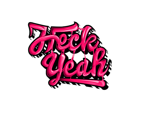
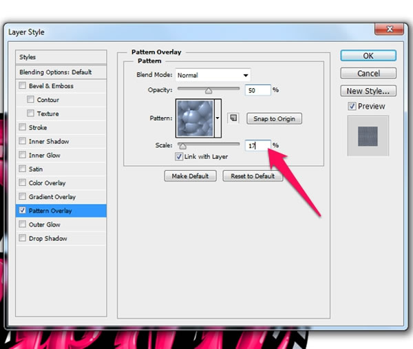
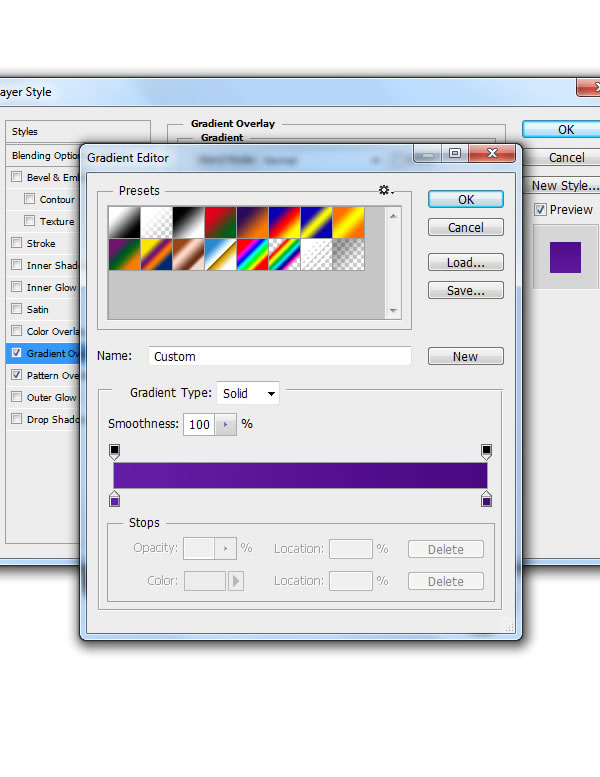
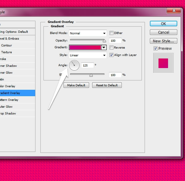
We are now going to create a colourful layer style effect for our highlight too, since we can’t leave it looking all boring like that. We will begin with a Pattern Overlay and then a Gradient Overlay. The colours to use for the Gradient Overlay are – #631ca5 and #4a0882 respectively and set the blend mode to Overlay. We will also add a Colour Overlay
To add a bit more realism to the effect, we will create a new layer get our brush and lightly brush over parts of the layer to create a more sophisticated effect.
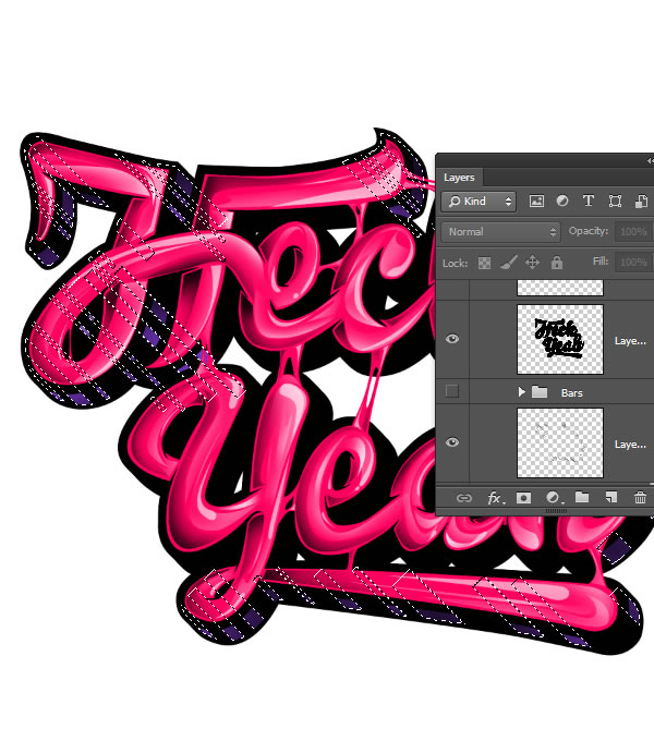
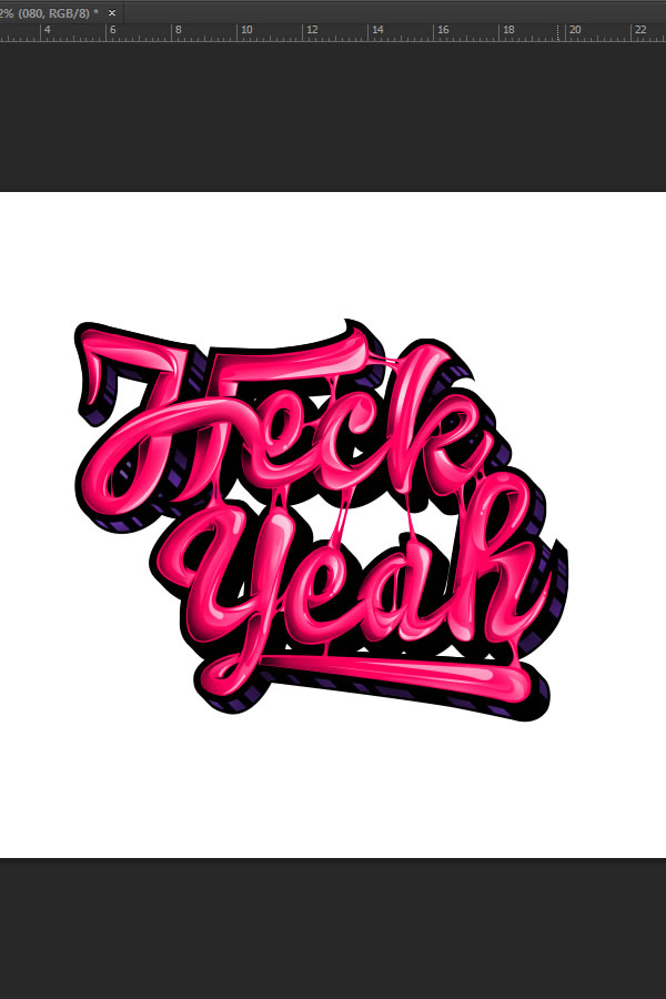
Once completed. It should look like this so far.
8. Creating The Background
Almost done now. Here we are going to create a nice background with a geometric pattern for the typography to sit in front of.
Step 1
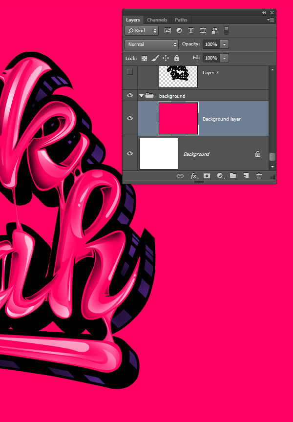
Create another layer to sit behind all your layers. This will be your Background Layer and you should name it as such. Place this layer inside a new group named background, if you like. We are going to colour this background the same colour as the base layer on our typo. If you’ve forgotten its #ff0060
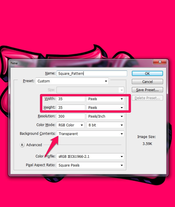
Step 2
We are now going to create a New Document to design our geometric design in. Use these values when creating the new document. It will be a 35px square with a Transparent Background.
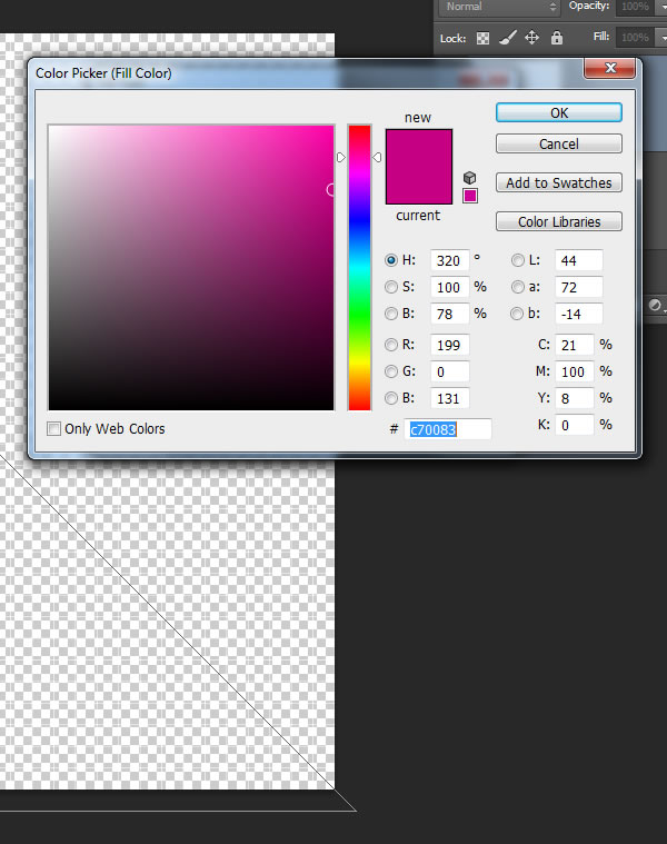
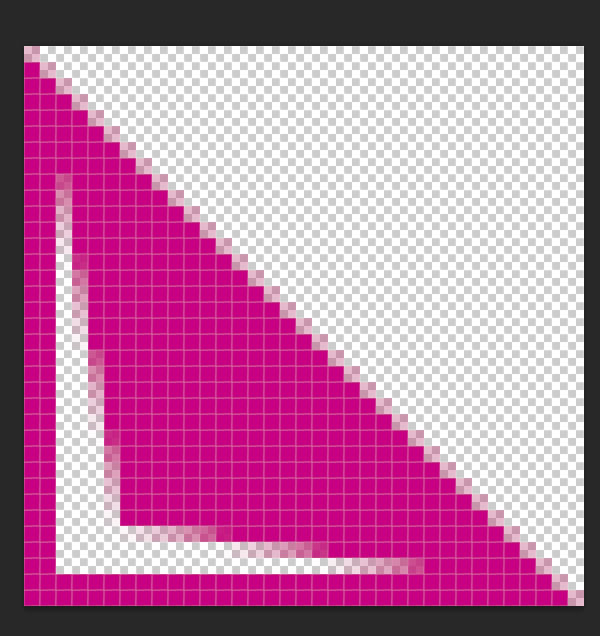
Once this is done, create a new layer and make a right angle triangle from the top left to the bottom right corners of the document using your Pen Tool. We are also going to fill it with this shade of Purple #c70083 so it blends well with the rest of the design.
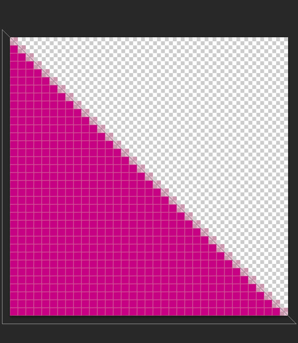
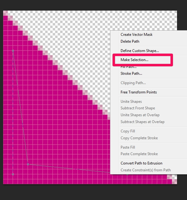
We are now going to slice out a section of our triangle to create a cool pattern within. Select your Pen Tool and create a similar outline to the one in the diagram. Once finished convert the Path to a Selection and erase the slice revealing a nice interior pattern.
Once complete it should look like this.
Step 3
We are now going to slip this layer back into our original document and begin the process of duplication to create a pattern over the whole artwork. Hold down Alt+Click and drag the layer to duplicate them quickly and merge while going along to speed the process up even more.
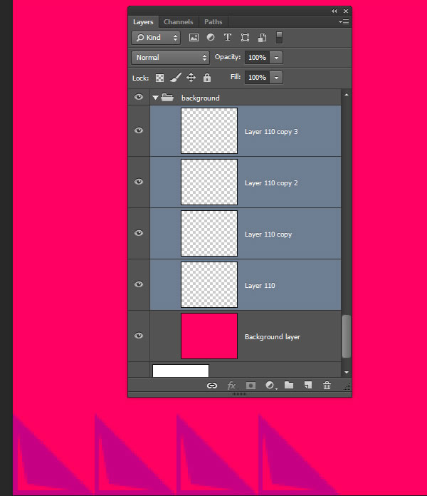
Once duplicated to the end of the page ensure that the final triangle aligns perfectly with the end of the document like this (same with vertically when you begin that also).
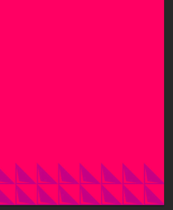
Once finished duplicating the pattern across the while design it should look like this.
Tip: This could also be done by going to Edit > Define Pattern and by filling your background layer with that pattern.
We’re now going to add a bit more colour to our pattern by applying a Gradient Overlay. The two colours we will use to create our gradient will be our purple#c70083 that we’ve been using so far blended with a darker shade of our base pink colour. #e30357. Follow the diagram for the other values you need.
Step 4
Now let’s add a vignette. There are numerous ways to create this. The fastest way I know is to quickly create a New Layer, select the Elliptical Marquee Tool and create a selection over the document. Right-click and add a feather of 250px to the selection
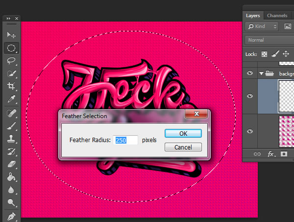
Then Invert the selection and Fill it with Black. Control the Opacity and maybe scale of the layer to get best results. I want my vignette to be relatively subtle so we are going to set the layer’s Opacity to 20%.
9. More Shadows
Step 1
Now we are going to create an authentic shadow effect across the entire design using a similar method we used to create our 3D depth effect.
We are going to begin by merging the group that contains all the layers of the design and converting it into a Smart Object. Then select it to get its outline. Create a New Group and a layer inside it. Contrary to what you may think we are actually going to Fill it with white. I’ll show you why in a moment.
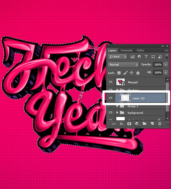
Step 2
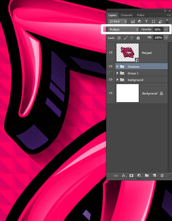
Now that we have our filled in layer we are going to apply the Colour Overlay to make it black and set its opacity to 80%. Most importantly we must set the group’s Blending Mode to Multiply and its opacity to 60%.
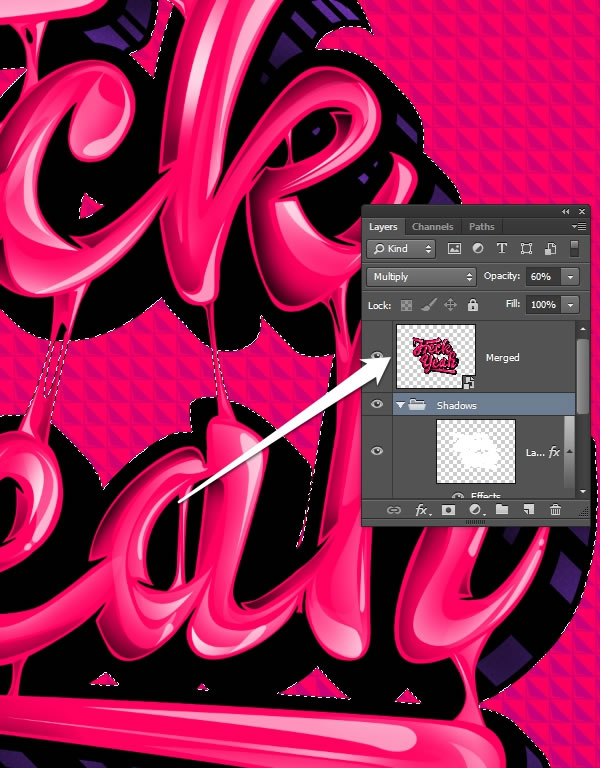
Step 3
We are going to use the Fill-Nudge and repeat method we used earlier to create our depth effect. Only now, the difference is this that this time we will create a fading shadow by reducing the Opacity of the Colour Overlay by 2% each time we Duplicate-Nudge.
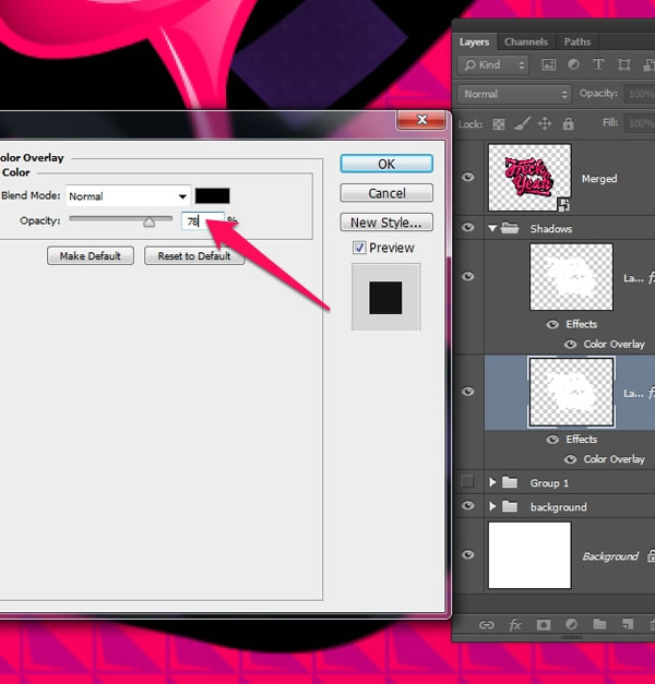
This effect will take some time to complete and you should end up with about 40 duplicate layers if you go all the way down to 2% Opacity. While duplicating the layers, make sure to place the most recent layers beneath the former for the effect to work properly. Once completed it should look like this.
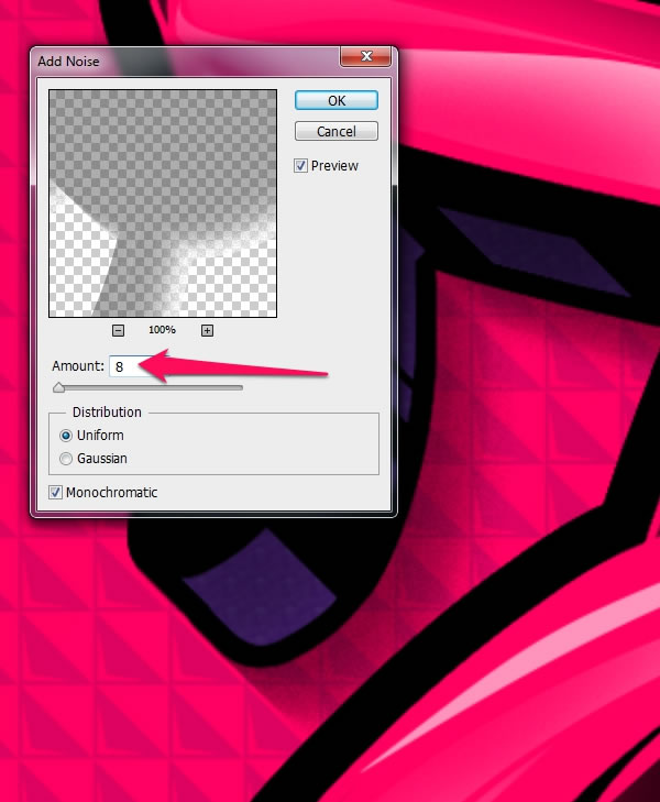
Step 4
The final touch to this shadow is to add Noise Filter after converting the Group into a Smart Object. Use a Noise effect of about 8%.
10. Finishing Effects
Step 1
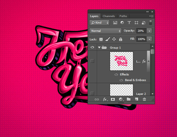
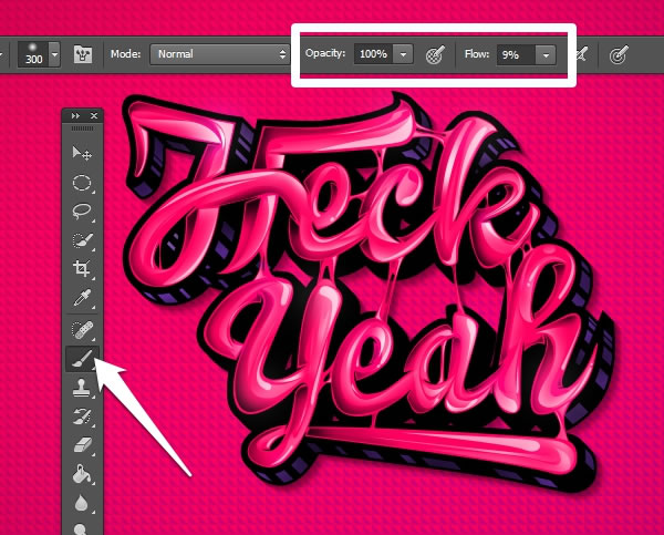
Just before we wrap up this project, we are going to add a few final touches to the design. Beginning with adding a few more glow effects around the highlights of the typography. To do this simply create a New Layer above the merged layer and use a soft brush with varying Flow to brush around the design in spots you feel deserve a glow to them. Once finished, set the Blending Mode of the layer to Soft Light.
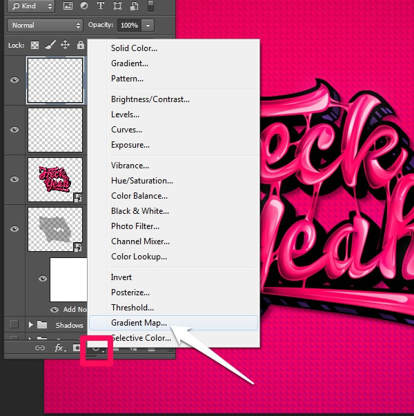
Step 2
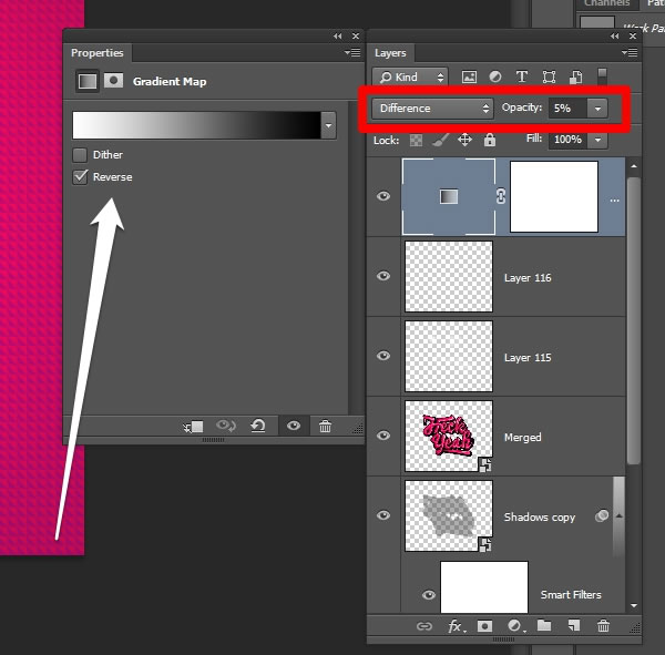
Finally, we are going to add a Gradient Map to our design. Set the colour to to black and white and be sure to set to Reverse.
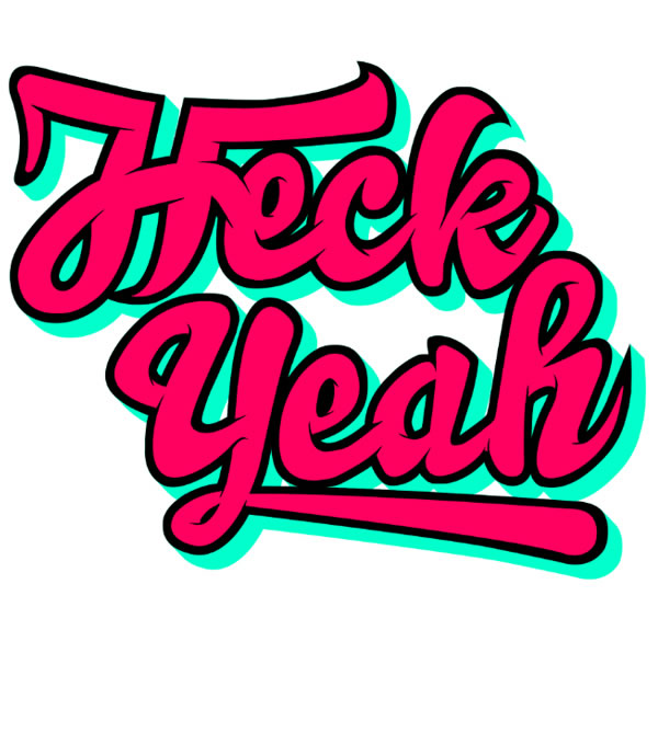
We will then set the Blending Mode to Difference and Opacity to 5%. This will give our illustration a subtle vintage texture which finishes it off nicely.
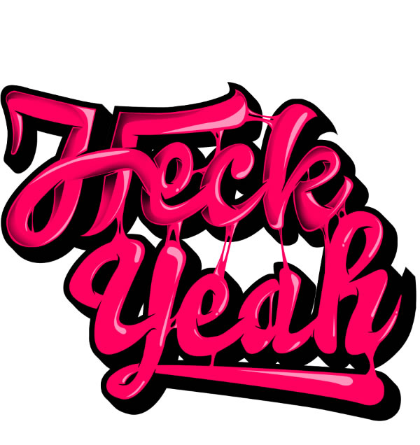
Conclusion
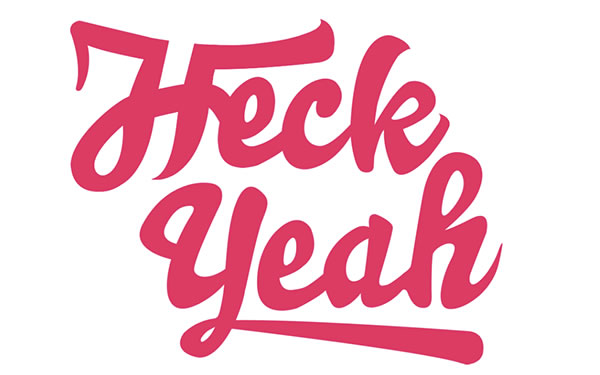
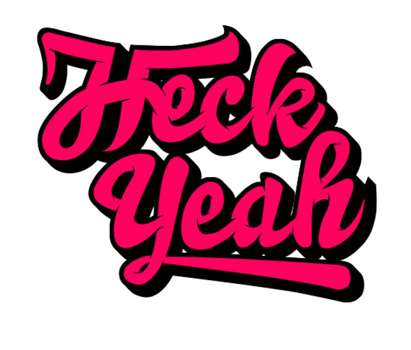
In this tutorial, I showed you how to create a glossy, bubble gum text effect, from a sketch in Photoshop. I hope that you learned something from this tutorial and can apply these techniques to create some bubble gum lettering of your own.
