In this series, you’ll learn how to use React Native to create page layouts commonly used in mobile apps. The layouts you’ll be creating won’t be functional—instead, the main focus of this series is to get your hands dirty in laying out content in your React Native apps.
If you’re new to laying out React Native apps or styling in general, check out our tutorial on layouts in React Native:
To follow this series, I challenge you to try recreating each screen by yourself first before reading my step-by-step instructions in the tutorial. You won’t really benefit much from this tutorial just by reading it! Try first before looking up the answers here. If you succeed in making it look like the original screen, compare your implementation to mine. Then decide for yourself which one is better!
In this first part of the series, you’ll create the following login page:

Getting Started
In this tutorial, we will use the Expo CLI. Expo is a set of tools and services built around React Native and native platforms that help you develop, build, deploy, and quickly iterate on iOS, Android, and web apps from the same JavaScript or TypeScript codebase.
Expo is the easiest and fastest way to build React Native apps. The official Expo get started guide contains detailed instructions on how to download and configure Expo CLI for the major operating systems.
Create a new project
expo init LoginLayout
You will be prompted to choose the type of project to initialize. Choose Managed workflow and blank. Wait a few seconds for Expo to install the project files and change the directory into the new project.
cd LoginLayout
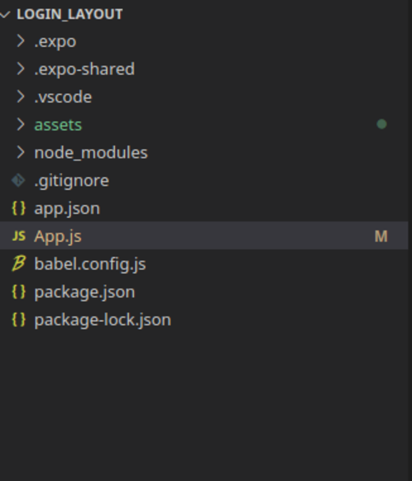
The project structure should look like this.

Open App.js to start working on your application. The starting code App.js should look like this:
import { StatusBar } from 'expo-status-bar';
import React from 'react';
import { StyleSheet, Text, View } from 'react-native';

export default function App() {
  return (
    <View style={styles.container}>
      <Text>Open up App.js to start working on your app!</Text>
      <StatusBar style="auto" />
    </View>
  );
}

const styles = StyleSheet.create({
  container: {
    flex: 1,
    backgroundColor: '#fff',
    alignItems: 'center',
    justifyContent: 'center',
  },
});
On the second line of code, we import React to use JSX, Then we import the StyleSheet, Text, and View components from React Native.
Next is the App function, which returns a view component and a text component as a child of that. <View> is an essential component in React Native and can serve many purposes, such as styling different elements, wrapping elements, or nesting elements. The <View> element is equivalent to <div> in HTML web development. As you can see, the View component has a property, style = {styles.container}, which is used to apply styles to the view
The <Text> component allows us to render text.
Layouts With Flexbox
Flexbox is a critical technique in React Native. Flexbox is designed to provide a consistent layout on different screen sizes. Flexbox works the same way in React Native as it does in CSS on the web, with a few exceptions. (You can learn about CSS Flexbox here.) The defaults are different, though, with the flex direction defaulting to column instead of row and the flex parameter only supporting a single number.
Flex defines how items fill over the available space along the main axis. The available space is divided according to each element’s flex property.
We define the flexbox layout at the bottom of the file in the styles constant. The container has the following styles
-
flex: 1—This defines how elements will fill over space. Space is usually divided according to each element’s flex property. -
justifyContent: "center"—This aligns children of a container in the center of the container’s main axis -
alignItems: "center"—This aligns children of a container in the center of the container’s cross axis.
User Interface and Common Components
A typical React Native will use the following components.
View |
a container for other components |
Text |
displays text |
Image |
displays images |
Stylesheet |
provides a way of styling elements |
TextInput |
an input field |
Button |
a clickable buttons |
Adding an Image
Images in React Native are placed in the assets folder and referenced like this:
<Image source={require('.assets//image.png')} />
Let us add an image in the assets folder. This will be used as the logo image. Start by removing the text component it with the logo image. Don’t forget to import the Image component component at the top.
import React from 'react';
import { StyleSheet, Text, View, Image } from 'react-native';

export default class App extends React.Component {
  render(){
    return (
      <View style={styles.container}>
        <Image source = {require("./assests/logo.png")}/>
      </View>
    );
  }
}
Styling in React Native
Elements in react Native are styled using JavaScript. All the React Native elements accept a prop named style, which accepts an object with style names and values. These style names and values are similar to those used in CSS, except the names are written using camel casing. For example, React Native uses backgroundColor for the CSS property background-color.
Add the following styles to the image.
const styles = StyleSheet.create({
  container: {
    flex: 1,
    backgroundColor: '#fff',
    alignItems: 'center',
    justifyContent: 'center',
   },

   image :{
    marginBottom: 40

  }

});
Here we add a marginBottom: 40 style to make some space between the image and the text inputs.
Next, add text input fields for the email and password. First, add state properties to hold the email and password. State in React Native is used on components that change over time. For example, the information in the TextInput keeps changing as users input their information. The initial state of the email and password will be empty.
Start by importing useState, as shown below. The useState function will allow our functional components to be stateful.
import React, { useState } from 'react';
Then initialize the state by adding the following code in the App function.
export default function App() {
     const [email, setEmail] = useState('');
     const [password, setPassword] = useState('');
  return (
    // rest of the code
  );
}
We use a View to wrap each text input for easy styling. Add this code below the image.
      <View style={styles.inputView}>
        <TextInput
          style={styles.TextInput}
          placeholder="Email."
          placeholderTextColor="#003f5c"
          onChangeText={(email) => setEmail(email)}
        />
      </View>

      <View style={styles.inputView}>
        <TextInput
          style={styles.TextInput}
          placeholder="Password."
          placeholderTextColor="#003f5c"
          secureTextEntry={true}
          onChangeText={(password) => setPassword(password)}
        />
      </View>
The setState method will update the state object with whatever information the user has entered. secureTextEntry is set to true to hide the text entered in the email text input for security purposes.
Add the following styles to the inputView and textInput props.
 inputView: {
    backgroundColor: "#FFC0CB",
    borderRadius: 30,
    width: "70%",
    height: 45,
    marginBottom: 20,
    alignItems: "center",
  },

  TextInput: {
    height: 50,
    flex: 1,
    padding: 10,
    marginLeft: 20,
  }
Add the Forgot Password? button below the text input fields. We’ll use a TouchableOpacity button, which changes opacity when pressed.
      <TouchableOpacity>
        <Text style={styles.forgot_button}>Forgot Password?</Text>
      </TouchableOpacity>
Next, add the following styles for the forgot password button.
  forgot_button: {
    height: 30,
    marginBottom: 30,
  }
Finally, add the Login button. Add the following code below the forgot password button.
      <TouchableOpacity style={styles.loginBtn}>
        <Text style={styles.loginText}>LOGIN</Text>
      </TouchableOpacity>
Add the styles for the login button.
 loginBtn:
  {
    width:"80%",
    borderRadius:25,
    height:50,
    alignItems:"center",
    justifyContent:"center",
    marginTop:40,
    backgroundColor:"#FF1493",
  }
Here we add a border radius style to make the button circular and a marginTop: 40 property to make a space between the two buttons. We also set a custom height and width.
The Final Login Screen Code
The final code for App.js should look like this:
import { StatusBar } from "expo-status-bar";
import React, { useState } from "react";
import {
  StyleSheet,
  Text,
  View,
  Image,
  TextInput,
  Button,
  TouchableOpacity,
} from "react-native";

export default function App() {
  const [email, setEmail] = useState("");
  const [password, setPassword] = useState("");

  return (
    <View style={styles.container}>
      <Image style={styles.image} source={require("./assets/log2.png")} />

      <StatusBar style="auto" />
      <View style={styles.inputView}>
        <TextInput
          style={styles.TextInput}
          placeholder="Email."
          placeholderTextColor="#003f5c"
          onChangeText={(email) => setEmail(email)}
        />
      </View>

      <View style={styles.inputView}>
        <TextInput
          style={styles.TextInput}
          placeholder="Password."
          placeholderTextColor="#003f5c"
          secureTextEntry={true}
          onChangeText={(password) => setPassword(password)}
        />
      </View>

      <TouchableOpacity>
        <Text style={styles.forgot_button}>Forgot Password?</Text>
      </TouchableOpacity>

      <TouchableOpacity style={styles.loginBtn}>
        <Text style={styles.loginText}>LOGIN</Text>
      </TouchableOpacity>
    </View>
  );
}

const styles = StyleSheet.create({
  container: {
    flex: 1,
    backgroundColor: "#fff",
    alignItems: "center",
    justifyContent: "center",
  },

  image: {
    marginBottom: 40,
  },

  inputView: {
    backgroundColor: "#FFC0CB",
    borderRadius: 30,
    width: "70%",
    height: 45,
    marginBottom: 20,

    alignItems: "center",
  },

  TextInput: {
    height: 50,
    flex: 1,
    padding: 10,
    marginLeft: 20,
  },

  forgot_button: {
    height: 30,
    marginBottom: 30,
  },

  loginBtn: {
    width: "80%",
    borderRadius: 25,
    height: 50,
    alignItems: "center",
    justifyContent: "center",
    marginTop: 40,
    backgroundColor: "#FF1493",
  },
});
And here is the final look of the app:

Conclusion
In this tutorial, you’ve successfully created a beautiful login page using your Flexbox knowledge. You have also learned how to use the Expo CLI, an easy way to build and test React Native Apps.
In the next tutorial in this series, you’ll learn how to create a calendar screen. In the meantime, check out some of our other tutorials on React Native and Flexbox.


